View Properties
Table of contents
- View creation
- View properties
- View ID
- View dimensions and position
- View margins and paddings
- View navigation
- View tooltip
- View events
- Custom view data
- View appearance
- View border
- View outline
- View radius
- View shadow
- View background
- View blending
- View clipping
- View masking
- View opacity
- View visibility
- View effects
- View semantics
- View text appearance
- Text cursor color
- Text font name
- Italic text
- Spacing between letters
- Line spacing
- Text translation
- Text overline, strikethrough and underline
- Text tab characters size
- Text in small caps
- Text horizontal alignment
- Text color
- Text direction
- Text indent
- Text shadow
- Text font size
- Text capitalization
- Text font weight
- Text wrap
- Text selection
- Text characters orientation
- Text whitespace behavior
- Text word break behavior
- Text word spacing
- Text writing direction
- View transformation
- View behavior in containers
- View cursor
- View overflow behavior
In this tutorial we'll cover in more details the basic UI element and its properties as well as its relation to other UI controls.
The basic UI element in RUI library is a View.
It occupies a rectangular space on a screen and it is a foundation for other UI controls.
Other UI controls extend view properties and behavior.
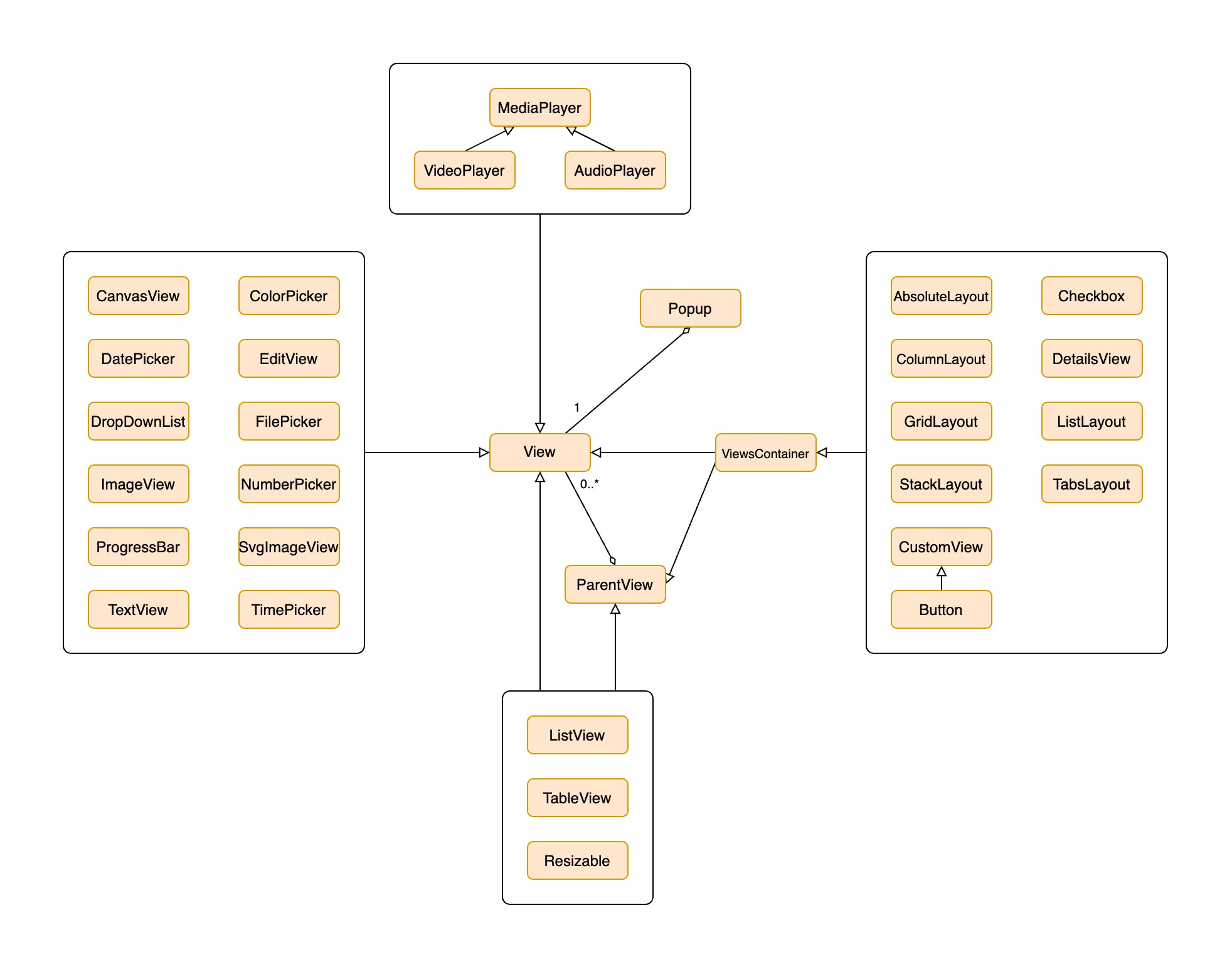
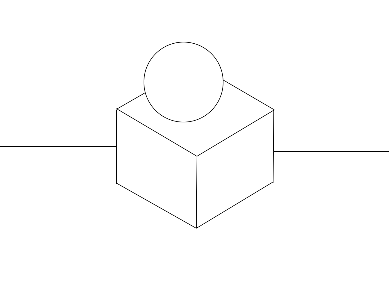
Below is a UI controls hierarchy used in RUI library:
View has a style which is a collection of properties that can be customized either during creation or at runtime.
By properties we mean not only regular attributes like "width" or "height" but also events which may happen during user interaction with the view.
View is not a container by itself, therefore it cannot hold other UI elements, for this a dedicated UI controls exist like ListLayout, TabsLayout and others.
View creation
Each client session can construct UI controls from resource files, hardcoded text descriptions or RUI library APIs at any time which allows us to create a dynamic user interfaces.
Examples
Creation of view from source code
Go
view := rui.NewView(session, rui.Params{
    rui.Width:  rui.Percent(100),
    rui.Height: rui.Percent(100),
})
Creation of view from resource file
RUI
// mainView.rui
View {
    id = view,
    width = 100%,
    height = 100%,
}
Go
view := rui.CreateViewFromResources(session, "mainView")
Creation of view from text representation
Go
const mainViewDesc = `View {
    id = view,
    width = 100%,
    height = 100%,
}`
Go
view := CreateViewFromText(session, mainViewDesc)
View properties
View has a bunch of properties which can be customized. Below are the groups of such properties, we will cover them in the next sections.
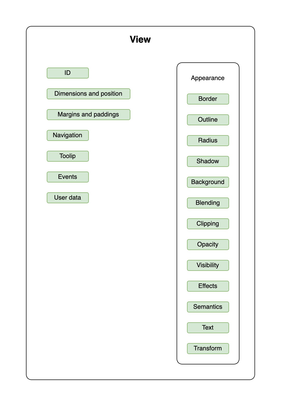
For more information on how to work with view properties refer to the Property System tutorial.
View ID
It is quite often that we need to update values of the view properties but to do this we need to have a reference to the view or know it's ID.
View ID can be set by "id" property, it is an optional textual identifier of the view.
Usually we use that property to be able to find a particular view of the application user interface to read or set its properties.
To find the view by its ID we use a global rui.ViewByID() function which will return a view interface.
Example
RUI
// Root container
ListLayout {
    id = root-layout,
    orientation = up-down,
    width = 100%,
    height = 100%,

    // Children
    content = [
        ListLayout {
            id = buttons-layout,
            orientation = up-down,
            horizontal-align = center,
            content = Button {
                id = button,
                content = "Push me!",
            },
        },
    ],
}
Go
view := rui.ViewByID(session.RootView(), "button")
In the example above, the function is used to get the reference of the view with the ID "button".
The search starts from the root view which is a top most ListLayout element.
If view has not been found, the function returns nil and an error message is written to the log.
When searching, we can specify a chain of identifiers.
In this case, they must be separated by the / character.
Example
Go
view := rui.ViewByID(session.RootView(), "buttons-layout/button")
This code is equivalent to
Go
var button rui.View = nil
if buttonsLayout := rui.ViewByID(rootView, "buttons-layout"); buttonsLayout != nil {
    button = rui.ViewByID(buttonsLayout, "button")
}
We can also provide several view ID's to the ViewByID() function, which might be convenient for some users
Go
if button := rui.ViewByID(rootView, "buttons-layout", "button"); button != nil {
    // ...
}
Usually ID is set when the view is created and is not changed afterwards. But it can be changed at any time if we need it.
Example
Go
view.Set(rui.ID, "myView")
where "view" is a reference to the View interface.
To get the "id" property value of the view we can use rui.Get() or ID() functions.
Examples
Go
if value := view.Get(rui.ID); value != nil {
    id = value.(string)
}
Go
id = view.ID()
When we got the reference to the view we can further manipulate it's properties. As an example the code to hide the button may look like this:
Go
if view := rui.ViewByID(session.RootView(), "button"); view != nil {
    view.Set(rui.Visibility, rui.Gone)
}
It is not necessary to provide a whole path of the IDs to get the desired view reference. We can make the path which will clearly point to a specific view of the hierarchy and does not contain all the IDs. Lets explain this using a more complex example:
Go
view := rui.CreateListLayout {
    rui.ID     : "list1",
    rui.Content: []rui.View {
        rui.CreateListLayout {
            rui.ID     : "list2",
            rui.Content: []rui.View {
                rui.CreateListLayout {
                    rui.ID     : "list3_1",
                    rui.Content: []rui.View {
                        rui.CreateListLayout {
                            rui.ID     : "list4",
                            rui.Content: []rui.View {
                                rui.CreateListLayout {
                                    rui.ID: "list5",
                                },
                            },
                        },
                    },
                },
                rui.CreateListLayout {
                    rui.ID     : "list3_2",
                    rui.Content: []rui.View {
                        rui.CreateListLayout {
                            rui.ID     : "list4",
                            rui.Content: []rui.View {
                                rui.CreateListLayout {
                                    rui.ID: "list5",
                                },
                            },
                        },
                    },
                },
            },
        },
    },
}
To get the reference of the view from the second branch we may use the path "list2/list3_2/list4/list5" but at the same time it will be sufficient for the library to find that view reference by providing a more simpler "list3_2/list5" path.
View dimensions and position
Each view may have a position and dimensions constraint. Below is the list of related view properties.
| Property | Description |
|---|---|
| "width" | The width of the view |
| "height" | The height of the view |
| "min-width" | The minimum width of the view |
| "min-height" | The minimum height of the view |
| "max-width" | The maximum width of the view |
| "max-height" | The maximum height of the view |
| "left" | Left offset from the parent container |
| "right" | Right offset from the parent container |
| "top" | Top offset from the parent container |
| "bottom" | Bottom offset from the parent container |
| "resize" | Describe whether the view can be resized and in which directions |
Properties "left," "right," "top," and "bottom" are used only when the view is placed in an AbsoluteLayout container.
If the "width" or "height" value is not set or is set to "auto", then corresponding view dimension is determined by its content and limited to the minimum or maximum dimensions set.
All properties listed above except "resize" accept values of SizeUnit type as well as its text representation and constants of the same type.
Examples
Go
view.Set("width", rui.Px(8))        // Set view to be 8 pixels in width
view.Set(rui.MaxHeight, "80%")      // Set the view's maximum height to 80% of the parent view's height
view.Set(rui.Height, "@viewHeight") // Set the view's height to the value defined in "viewHeight" constant
Preferred way of getting the values of such properties is to use the global functions:
Go
if width := rui.GetWidth(rootView, viewId); width != nil {
    // Do something with the value
}

if maxHeight := rui.GetMaxHeight(rootView, viewId); maxHeight != nil {
    // Do something with the value
}

if height := rui.GetHeight(rootView, viewId); height != nil {
    // Do something with the value
}
or when we have a reference to the view:
Go
width := view.Get(rui.Width)
if width, ok := value.(SizeUnit); ok {
    // Do something with the value
}

maxHeight := view.Get(rui.MaxHeight)
if maxHeight, ok := value.(SizeUnit); ok {
    // Do something with the value
}

height := view.Get(rui.Height)
if height, ok := value.(SizeUnit); ok {
    // Do something with the value
}
The "resize" property sets whether the view can be resized, and if so, in which directions.
The default value for all view types except multiline EditView is rui.NoneResize or "none" which means that we can't resize them.
Getting or setting the value of that property follow the same steps as for any other property.
Follow View reference documentation for that property to get more information.
View margins and paddings
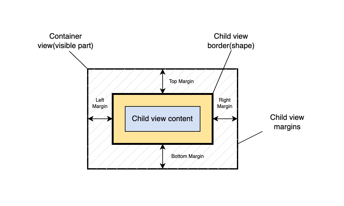
Each view can have margins and paddings. They help manage spaces between views and inside their content, which makes layouts look neat and visually appealing. To have a better understanding lets describe them visually.
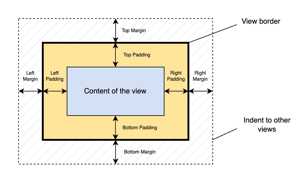
Margin determines the outer indent from the view to its neighbors. While the padding sets the padding from the border of the view to its content. View can't have children by itself therefore these attributes play a big role when we start using a container views.
Below is the list of properties responsible for adjusting margin and padding values.
| Property | Description |
|---|---|
| "margin" | Describe all margins |
| "padding" | Describe all paddings |
| "margin-left" | Left margin |
| "margin-right" | Right margin |
| "margin-top" | Top margin |
| "margin-bottom" | Bottom margin |
| "padding-left" | Left padding |
| "padding-right" | Right padding |
| "padding-top" | Top padding |
| "padding-bottom" | Bottom padding |
The main properties are "margin" and "padding."
Other properties adjust the values of these two.
We can specify one or multiple values for these properties to set all margins and paddings at once.
When using a single value, it will apply to all sides of the view, typically the value has SizeUnit type:
Examples
Setting all margins and paddings to the same value from code.
Go
// Setting margins
view.Set(rui.Margin, rui.Px(8))

// Setting paddings
view.Set(rui.Padding, rui.Px(4))
Setting margins and paddings in the view description file.
RUI
ListLayout {
    content = [
        TextView {
            text = "Item 1",
            margin = 8px,
            padding = 4px,
        },
        TextView {
            text = "Item 2",
            margin = 8px,
            padding = 4px,
        },
    ],
}
Another way of setting margins and paddings is to provide multiple values for these properties.
In this case properties will hold the value of BoundsProperty interface.
To create such interface we use rui.NewBoundsProperty() or rui.NewBounds() global functions.
The interface holds four properties of SizeUnit type:
| Property | Description |
|---|---|
| "left" | Left value |
| "right" | Right value |
| "top" | Top value |
| "bottom" | Bottom value |
Example
Setting margins and paddings from code.
Go
view.Set(rui.Margin, rui.NewBoundsProperty(rui.Params {
    rui.Left:   "@leftMargin", // Setting the value by referring to the constant
    rui.Right:  "1.5em",       // Setting the value as a text representation of SizeUnit type
    rui.Top:    rui.Px(8),     // Setting the value in pixels using SizeUnit type
    rui.Bottom: rui.Inch(0.3), // Setting the value in inches using SizeUnit type
}))

view.Set(rui.Padding, rui.NewBoundsProperty(rui.Params {
    rui.Left:   "@leftPadding",  // Setting the value by referring to the constant
    rui.Right:  "0.5em",         // Setting the value as a text representation of SizeUnit type
    rui.Top:    rui.Px(4),       // Setting the value in pixels using SizeUnit type
    rui.Bottom: rui.Inch(0.1),   // Setting the value in inches using SizeUnit type
}))

view.Set(rui.Margin, rui.NewBounds(
    rui.Px(8),     // Top margin, setting the value in pixels using SizeUnit type
    rui.Em(1.5),   // Right margin, setting the value Em using SizeUnit type
    rui.Inch(0.3), // Bottom margin, setting the value in inches using SizeUnit type
    10,            // Left margin, setting the value in pixels using int type
))

view.Set(rui.Padding, rui.NewBounds(
    rui.Px(8),     // Top padding, setting the value in pixels using SizeUnit type
    rui.Em(1.5),   // Right padding, setting the value Em using SizeUnit type
    rui.Inch(0.3), // Bottom padding, setting the value in inches using SizeUnit type
    10,            // Left padding, setting the value in pixels using int type
))
The BoundsProperty interface has its own text representation, which can be used when describing the view from a resource file, it has the following format:
RUI
_{
    left = <value>,
    right = <value>,
    top = <value>,
    bottom = <value>,
}
where <value> could be a text representation of SizeUnit type or a reference to a constant.
Example
Setting margins and paddings from view description file.
RUI
ListLayout {
    content = [
        TextView {
            text = "Item",
            margin = _{
                top = 8px,          // Setting value in pixels
                left = @leftMargin, // Referring to a constant
                right = 1.5em,      // Setting value in em
                bottom = 0.3in,     // Setting value in inches
            },
            padding = _{
                top = 4px,           // Setting value in pixels
                left = @leftPadding, // Referring to a constant
                right = 0.5em,       // Setting value in em
                bottom = 0.1in,      // Setting value in inches
            },
        },
    ],
}
A convenient way of getting "margin" an "padding" properties value is to use a dedicated global functions GetMargin() and GetPadding():
Go
marginBounds := rui.GetMargin(rootView, viewId)
paddingBounds := rui.GetPadding(rootView, viewId)
The values will be returned in a form of the Bounds structure:
Go
type Bounds struct {
    Top, Right, Bottom, Left SizeUnit
}
We can also use a well known Get() method of the view but remember that we have to perform a type conversion and resolve constants manually in this case.
To grab the values from BoundsProperty we can use its Bounds() method:
Go
if value := view.Get(rui.Margin); value != nil {
    margin := value.(BoundsProperty)
    values := margin.Bounds()
    // Do something with the values
}

if value := view.Get(rui.Padding); value != nil {
    padding := value.(BoundsProperty)
    values := padding.Bounds()
    // Do something with the values
}
Properties beginning with "margin-" or "padding-" have a SizeUnit type and can also accept constants or text representations of the SizeUnit type.
When setting such properties library will first check for existence of "margin" or "padding" properties, create them when needed and update their values based on supplied values in "margin-..." or "padding-..." properties.
Examples
Setting margins and paddings in the view description file.
RUI
ListLayout {
    content = [
        TextView {
            text = "Item 1",
            margin-left = 8px,
            margin-right = 8px,
            padding-top = 4px,
            padding-bottom = 4px,
        },
        TextView {
            text = "Item 2",
            margin-left = 8px,
            margin-right = 8px,
            padding-top = 4px,
            padding-bottom = 4px,
        },
    ],
}
Setting margins and paddings from code.
Go
// Setting margins
view.Set(rui.MarginLeft, rui.Px(8))
view.Set(rui.MarginRight, rui.Px(12))

// Setting paddings
view.Set(rui.PaddingTop, rui.Px(4))
view.Set(rui.PaddingBottom, rui.Px(4))
Margins are not part of the view shape, which is defined by the "width" or "height" properties. To illustrate this, let's assume that we want to place a view inside a container and create some space between the container's border and the child view. We can achieve this by setting the "margin" property of the child view and specifying its "width" and "height" as 100%:
RUI
GridLayout {
    width= 300px,
    height = 200px,
    content = EditView {
        edit-view-type = multiline,
        // Setting child dimensions
        width = 100%,
        height = 100%,
        margin = 1em, // Setting child margin
    }
}
Since margin does not affect the border or shape of the view we'll have something similar to this:
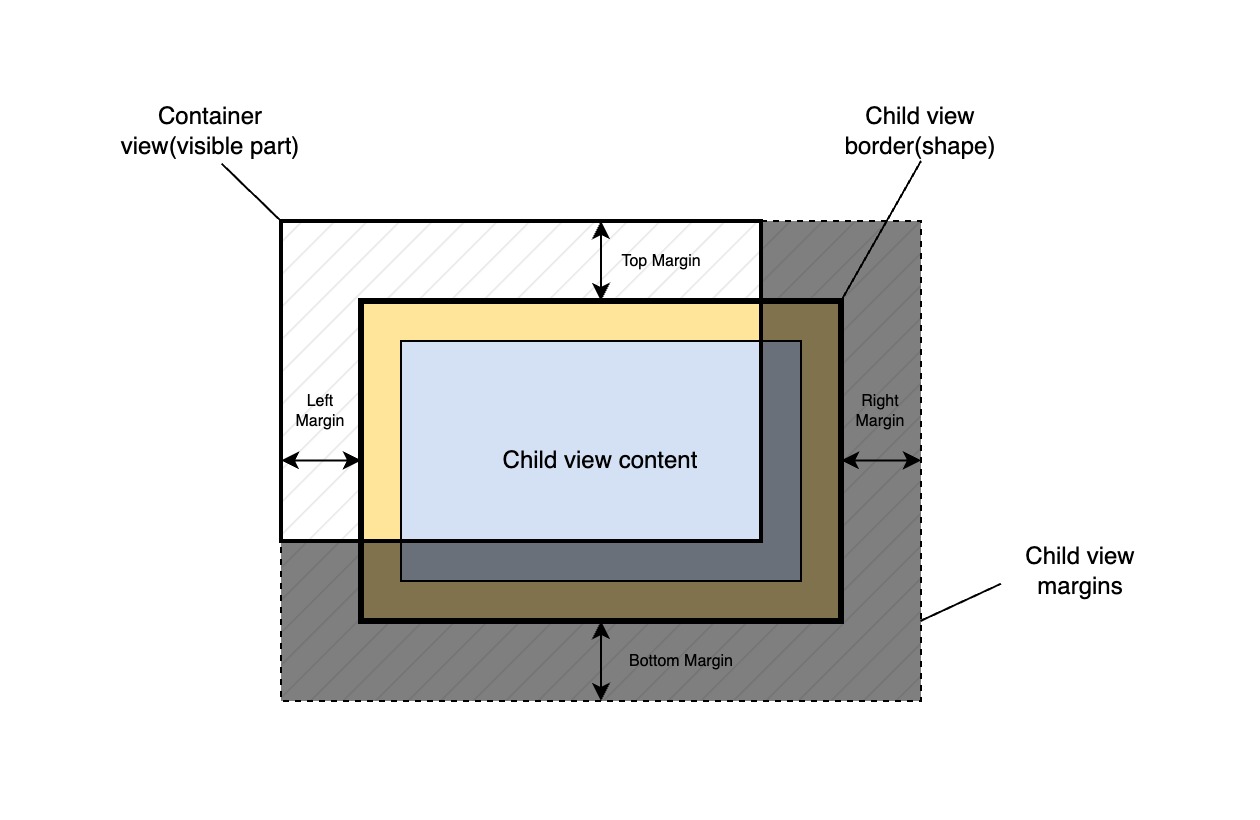
Notice that the child view has the same width and height as a parent container but exceeds the parent's dimensions because of the margins. To overcome this issue, we have to somehow specify correct dimensions for the child view that include its margin. The right way to do this is to utilize a function that subtracts margins from these 100% values of the container's width or height:
RUI
GridLayout {
    width= 300px,
    height = 200px,
    content = EditView {
        width = "sub(100%, 2em)", // Subtracting two margins from the parent's width
        height = "sub(100%, 2em)", // Subtracting two margins from the parent's height
        edit-view-type = multiline,
        margin = 1em, // Setting margin
    }
}
This will fit our child view inside the container nicely without any overflow.
We can use functions like sub() and others to specify property value from the source code as well.
Go
view := rui.NewGridLayout(session, rui.Params{
    rui.Width:  rui.Px(300),
    rui.Height: rui.Px(200),
    rui.Content: rui.NewEditView(session, rui.Params{
        rui.EditViewType: rui.MultiLineText,
        rui.Width:        rui.SubSize(rui.Percent(100), rui.Em(2)), // Subtracting two margins from the parent's width
        rui.Height:       rui.SubSize(rui.Percent(100), rui.Em(2)), // Subtracting two margins from the parent's height
        rui.Margin:       rui.Em(1),                                // Setting margin
    }),
})
For more information on how to use such functions please refer to SizeUnit and SizeFunc reference documentation.
There is also another way to achieve the same result: we can set paddings in the parent container, as padding participates in the width or height calculations of the child view:
RUI
GridLayout {
    width= 300px,
    height = 200px,
    padding = 1em,
    content = EditView {
        width = 100%, // Width of the parent's content area(excluding paddings)
        height = 100%, // Height of the parent's content area(excluding paddings)
        edit-view-type = multiline,
    }
}
View navigation
For some users a preferred way of navigating over UI elements is to utilize a keyboard, specifically by pressing the "Tab" key. To make a proper order of UI elements selection views have a dedicated property called "tabindex".
Property can hold the following values which can be set from code or in the view description file:
| value | Description |
|---|---|
less than 0 |
View can be selected with the mouse or touch, but does not participate in sequential navigation |
0 |
View can be selected and reached using sequential navigation, but the order of the navigation is determined by the browser(usually in order of addition) |
greater than 0 |
View will be reached(and selected) using sequential navigation, and navigation is performed by ascending "tabindex" value |
If multiple UI elements contain the same "tabindex" property value, navigation is done in the order in which they were added.
Example
Setting "tabindex" property in resource description file.
RUI
ListLayout {
    width = 100%,
    height = 100%,
    content = [
        Button {
            content = "Cancel",
            tabindex = 2,
        }
        Button {
            content = "Save",
            tabindex = 1,
        }
    ]
}
To get the property value we can use a Get() method of the view or a dedicated rui.GetTabIndex() global function:
Go
tabIndex := rui.GetTabIndex(rootView, viewId) // Will return an integer number
For more information on how to work with view properties refer to the Property System tutorial.
View tooltip
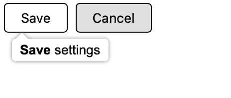
It is a good practice to get more information for the end users of the application during interaction. Especially when our UI interfaces are quite complex and it is not obvious for the users what will happen on a certain actions. For this purpose each view in RUI library may have a tooltip which will popup while hovering over the view. To set the tooltip we utilize a "tooltip" property. That property accept a string value and can contain text in HTML format.
Example
Setting tooltip for the buttons in resource description file.
RUI
ListLayout {
    width = 100%,
    content = [
        Button {
            content = "Save",
            tooltip = "<b>Save</b> settings",
        },
        Button {
            content = "Cancel",
            tooltip = "<b>Discard</b> changes",
        }
    ]
}
Same but using the source code.
Go
view := rui.NewListLayout(session, rui.Params{
    rui.Width: rui.Percent(100),
    rui.Content: []rui.View{
        rui.NewButton(session, rui.Params{
            rui.Content: "Save",
            rui.Tooltip: "<b>Save</b> settings",
        }),
        rui.NewButton(session, rui.Params{
            rui.Content: "Cancel",
            rui.Tooltip: "<b>Discard</b> changes",
        }),
    },
})
And the result.
View events
Views are designed to provide an interactive experience for users. For this purpose each view has different kinds of events. These events help the program respond to various user interactions with the views such as keyboard presses, mouse clicks or movements, touch gestures, and changes in window size or scrolling. Keyboard events allow views to react to keystrokes, enabling users to input text or navigate through the application using their keyboard. Focus events are used to track when a user has shifted focus from one control to another, allowing for proper tab ordering and accessibility. Mouse events help controls respond to mouse clicks or movements. Pointer events allow for touch gestures recognition on devices that support it. Resize event is fired when the window or viewport changes size, enabling the program to update its layout accordingly. Scroll event occurs when a user scrolls through content using their mouse or finger, allowing the control to keep track of where the user is in relation to the content and adjust accordingly. Overall, these events provide an essential layer of interactivity between users and applications, enabling them to respond quickly and appropriately to various forms of input.
Events are part of the view properties system. The only difference is that the internal values of such properties are an arrays of function handlers. When setting event properties library allows to use a different types of function handlers, as well as assigning a single function as a handler. In this case library will wrap the value to its internal representation.
There is no way to define event handlers in resource files. When UI has been constructed either from resource file or from code we have to get the reference to the view and then set handler function(s) as an event property value.
View must be in the focus to be able to receive an events. This behavior can be adjusted by "focusable" property of the view. By default not all views can receive the focus.
If we no longer need to receive an events from the view we can remove all handlers using Set() function with nil as a property value or set the view to not receive the focus.
Keyboard events
Two kinds of keyboard events can be generated for the view that has received an input focus.
| Property | Description |
|---|---|
| "key-down-event" | The key has been pressed |
| "key-up-event" | The key has been released |
The value of such properties is an array of functions which has the following format:
Go
func(rui.View, rui.KeyEvent)
where the second argument is the structure which describes the parameters of the key pressed.
Below is an explanation of each KeyEvent member.
| Field | Type | Description |
|---|---|---|
| TimeStamp | uint64 |
The time when event was generated (in milliseconds). The starting point depends on the browser implementation (EPOCH, browser launch, etc.) |
| Key | string |
The value of the key for which the event has been occurred. The value is returned taking into account the current language and case |
| Code | string |
The key code of the represented event. The value is independent of the current language and case |
| Repeat | bool |
Repeated pressing. The key was pressed until its input began to be automatically repeated |
| CtrlKey | bool |
The "Ctrl" key was active when the event has been occurred |
| ShiftKey | bool |
The "Shift" key was active when the event has been occurred |
| AltKey | bool |
The "Alt" ("Option" or "⌥" in OS X) key was active when the event has been occurred |
| MetaKey | bool |
The "Meta" key (for Mac, this is the "⌘" Command key; for Windows, the Windows key "⊞") was active when the event has been occurred |
Library permit assigning other types of handlers:
Go
// An array of listeners
[]func(rui.KeyEvent)
[]func(rui.View)
[]func()

// A single listener
func(rui.KeyEvent)
func(rui.View)
func()
To get the value of the properties we can use Get() or rui.GetKeyDownListeners() and rui.GetKeyUpListeners() functions.
Examples
Assigning a keyboard event handler when UI described in the resource file.
RUI
AbsoluteLayout {
    id = "game",
    width = 100%,
    height = 100%,
    focusable = true,
    content = CanvasView {
        id = "game-canvas",
        top = 0,
        left = 0,
        width = 100%,
        height = 100%,
    }
}
Go
if layout := rui.ViewByID(rootView, "game"); layout != nil {
    // Setting key down event handler
    layout.Set(rui.KeyDownEvent, keyPressed)
}
Setting keyboard event handler during UI creation from code.
Go
view := rui.NewAbsoluteLayout(session, rui.Params{
    rui.ID:           "game",
    rui.Width:        rui.Percent(100),
    rui.Height:       rui.Percent(100),
    rui.Focusable:    true,
    rui.KeyDownEvent: keyPressed, // Setting key down event handler
    rui.Content: rui.NewCanvasView(session, rui.Params{
        rui.ID:              "game-canvas",
        rui.Top:             0,
        rui.Left:            0,
        rui.Width:           rui.Percent(100),
        rui.Height:          rui.Percent(100),
    }),
})
Keyboard event handler function.
Go
func keyPressed(view rui.View, event rui.KeyEvent) {
    switch event.Code {
    case rui.ArrowLeftKey:
        // Do something
    case rui.ArrowRightKey:
        // Do something
    case rui.ArrowUpKey:
        // Do something
    case rui.ArrowDownKey:
        // Do something
    }
}
Focus events
Focus events are fired when the view gains or loses an input focus. To receive such notifications we've to assign handlers to the following view properties.
| Property | Description |
|---|---|
| "focus-event" | View receives an input focus (become active) |
| "lost-focus-event" | View loses an input focus (become inactive) |
The value of such properties is an array of functions with the following signature:
Go
func(rui.View)
Library permit assigning other types of handlers:
Go
[]func()
func()
To get the value of the properties we can use Get() or rui.GetFocusListeners() and rui.GetLostFocusListeners() functions.
Example
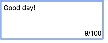
Show the hint of current and max amount of characters in the edit view when it has focus.
Go
view := rui.NewListLayout(session, rui.Params{
    rui.Width:  rui.Percent(50),
    rui.Height: rui.Percent(50),
    rui.Content: rui.NewAbsoluteLayout(session, rui.Params{
        rui.Width:  rui.Percent(100),
        rui.Height: rui.Percent(100),
        rui.Content: []rui.View{
            // EditView
            rui.NewEditView(session, rui.Params{
                rui.Width:                rui.Percent(50),
                rui.Height:               rui.Percent(50),
                rui.EditViewType:         rui.MultiLineText,
                rui.FocusEvent:           onFocusGained, // Focus event handler
                rui.LostFocusEvent:       onFocusLost,   // Lost focus event handler
                rui.EditTextChangedEvent: onTextChanged,
            }),
            // Semi-transparent counter at the bottom-right corner of the edit view
            rui.NewTextView(session, rui.Params{
                rui.ID:              "counter",
                rui.BackgroundColor: "#DEFFFFFF",
                rui.Bottom:          rui.Percent(50),
                rui.Right:           rui.Percent(50),
                rui.Text:            "0/100",
                rui.Visibility:      rui.Invisible,
            }),
        },
    }),
})
Handlers of the events.
Go
func onFocusGained(view rui.View) {
    if view := rui.ViewByID(view.Session().RootView(), "counter"); view != nil {
        view.Set(rui.Visibility, rui.Visible)
    }
}

func onFocusLost(view rui.View) {
    if view := rui.ViewByID(view.Session().RootView(), "counter"); view != nil {
        view.Set(rui.Visibility, rui.Invisible)
    }
}

func onTextChanged(view rui.EditView, newText, oldText string) {
    if view := rui.ViewByID(view.Session().RootView(), "counter"); view != nil {
        view.Set(rui.Text, fmt.Sprintf("%d/%d", len(newText), 100))
    }
}
Here is how it will look like when the edit view is selected and contains some text.
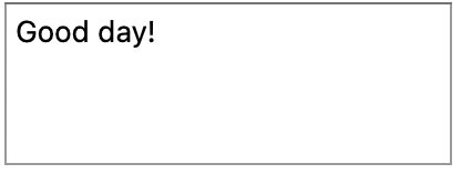
When edit view will loose the focus, counter will gone.
Mouse events
Mouse events are important for creating interactive user interfaces that respond to user input, allowing applications to perform actions associated with clicks or cursor movements and change the appearance or behavior of elements based on where the user's cursor is located. Each view has a variety of mouse events which we can handle. Below is the list of related view properties.
| Property | Description |
|---|---|
| "mouse-down" | The mouse button was pressed |
| "mouse-up" | The mouse button has been released |
| "mouse-move" | Mouse cursor moved |
| "mouse-out" | The mouse cursor has moved outside the view, or entered the child view |
| "mouse-over" | The mouse cursor has moved within the area of the view |
| "click-event" | There was a mouse click |
| "double-click-event" | There was a double mouse click |
| "context-menu-event" | The right mouse click has been pressed |
Each property accept an array of handler functions each of which has the following format:
Go
func(rui.View, rui.MouseEvent)
where the second argument describes the parameters of the mouse event.
Below is the full list of the MouseEvent structure members.
| Member | Type | Description |
|---|---|---|
| TimeStamp | uint64 |
The time the event was created (in milliseconds). The starting point depends on the browser implementation (EPOCH, browser launch, etc.) |
| Button | int |
The number of the mouse button which triggered this event |
| Buttons | int |
Bitmask showing which mouse buttons were pressed when the event occur |
| X | float64 |
The horizontal position of the mouse pointer relative to the origin view |
| Y | float64 |
The vertical position of the mouse pointer relative to the origin view |
| ClientX | float64 |
The horizontal position of the mouse pointer relative to the upper left corner of the application |
| ClientY | float64 |
The vertical position of the mouse pointer relative to the upper left corner of the application |
| ScreenX | float64 |
The horizontal position of the mouse pointer relative to the upper left corner of the screen |
| ScreenY | float64 |
The vertical position of the mouse pointer relative to the upper left corner of the screen |
| CtrlKey | bool |
The "Ctrl" key was active when the event occur |
| ShiftKey | bool |
The "Shift" key was active when the event occur |
| AltKey | bool |
The "Alt" (Option or ⌥ in OS X) key was active when the event occur |
| MetaKey | bool |
The "Meta" key (for Mac this is the ⌘ Command key, for Windows is the Windows key ⊞) was active when the event occur |
Here are the possible values for the "Button" member:
| Value | Constant | Description |
|---|---|---|
| less than 0 | No buttons has been pressed | |
| 0 | rui.PrimaryMouseButton |
Main button. Usually the left mouse button (can be changed in the OS settings) |
| 1 | rui.AuxiliaryMouseButton |
Auxiliary button (wheel or middle mouse button) |
| 2 | rui.SecondaryMouseButton |
Secondary button. Usually the right mouse button (can be changed in the OS settings) |
| 3 | rui.MouseButton4 |
Fourth mouse button. Usually the browser's "Back" button |
| 4 | rui.MouseButton5 |
Fifth mouse button. Usually the browser "Forward" button |
The "Buttons" member is a bit mask combining (using OR) the following values:
| Value | Constant | Description |
|---|---|---|
| 1 | rui.PrimaryMouseMask |
Main button |
| 2 | rui.SecondaryMouseMask |
Secondary button |
| 4 | rui.AuxiliaryMouseMask |
Auxiliary button |
| 8 | rui.MouseMask4 |
Fourth button |
| 16 | rui.MouseMask5 |
Fifth button |
When assigning handler functions library allows to use a shorter variants of the handler functions:
Go
func(rui.MouseEvent)
func(rui.View)
func()
They will be wrapped using the main handler function signature internally.
The corresponding global functions can be used to get back the listeners set: GetMouseDownListeners, GetMouseUpListeners, GetMouseMoveListeners, GetMouseOverListeners, GetMouseOutListeners, GetClickListeners, GetDoubleClickListeners, GetContextMenuListeners.
Check View reference documentation to get more details.
Example
In this example we'll demonstrate on how to use mouse events by implementing a simple drawing application.
First lets define and declare types and variables we'll be using:
Go
// Operations
const (
    ClearScreen = iota
    DrawLine
    DrawRectangle
    DrawEllipse
)

type Point struct {
    X, Y float64 // Point coordinates
}

type Path struct {
    Type  int   // Path type
    Start Point // Path start point
    End   Point // Path end point
}

var drawing bool              // Whether the drawing operation is in progress
var operation int             // The current tool action
var canvasView rui.CanvasView // Main drawing window
var paths []Path              // Collection of paths
Then we need to create a main view of the application.
Since our goal is to draw on the screen we'll utilize CanvasView control which will occupy all screen space:
Go
canvasView = rui.NewCanvasView(session, rui.Params{
    rui.Width:            rui.Percent(100),
    rui.Height:           rui.Percent(100),
    rui.DrawFunction:     draw,      // Set function which will draw our paths
    rui.ContextMenuEvent: showMenu,  // Set handler to show context menu
    rui.MouseDown:        mouseDown, // Set handler for mouse down events
    rui.MouseUp:          mouseUp,   // Set handler for mouse up events
    rui.MouseMove:        mouseMove, // Set handler for mouse move events
})

// Initialize paths to be drawn
paths = make([]Path, 0)
Now lets implement a context menu which will be shown when the right mouse button will be clicked.
To show popup menu will be using rui.ShowMenu() function:
Go
// showMenu shows an actions
func showMenu(view rui.View, event rui.MouseEvent) {
    rui.ShowMenu(view.Session(), rui.Params{
        // Aligning popup with mouse pointer
        rui.VerticalAlign:   rui.TopAlign,
        rui.HorizontalAlign: rui.LeftAlign,
        rui.MarginLeft:      event.ClientX,
        rui.MarginTop:       event.ClientY,

        rui.OutsideClose:    true,
        rui.PopupMenuResult: menuSelected, // Set the function for handling popup menu actions
        rui.Items: []string{
            "Clear screen",
            "Draw line",
            "Draw rectangle",
            "Draw ellipse",
        },
    })
}
To handle menu actions we need to write our handler which will set the operation and handle clear screen action:
Go
// menuSelected handles selected menu popup item
func menuSelected(index int) {
    operation = index

    if operation == ClearScreen {
        clear(paths)
        canvasView.Redraw()
    }
}
Now lets define our mouse events handler functions which will check the current operation and create or update the path:
Go
// mouseDown start drawing a path
func mouseDown(view rui.View, event rui.MouseEvent) {
    if operation == ClearScreen {
        return
    }

    if event.Button == rui.PrimaryMouseButton {
        // Add a new path
        paths = append(paths, Path{
            Type: operation,
            Start: Point{
                X: event.ClientX,
                Y: event.ClientY,
            },
            End: Point{
                X: event.ClientX,
                Y: event.ClientY,
            },
        })

        // Start drawing
        drawing = true
    }
}

// mouseUP finalize drawing operation
func mouseUp(view rui.View, event rui.MouseEvent) {
    if !drawing {
        return
    }

    if event.Button == rui.PrimaryMouseButton {
        // Update recent path and re-draw the canvas view
        if size := len(paths); size > 0 {
            lastPath := paths[size-1]
            lastPath.End.X = event.ClientX
            lastPath.End.Y = event.ClientY
            paths[size-1] = lastPath
            canvasView.Redraw()
            drawing = false
            operation = ClearScreen
        }
    }
}

// mouseMove update the path shape
func mouseMove(view rui.View, event rui.MouseEvent) {
    if !drawing {
        return
    }

    // Update recent path
    if size := len(paths); size > 0 {
        lastPath := paths[size-1]
        lastPath.End.X = event.ClientX
        lastPath.End.Y = event.ClientY
        paths[size-1] = lastPath
        canvasView.Redraw()
    }
}
We are almost done, the final thing is to draw all the paths we have in our collection as well as not finished one:
Go
// draw draws all paths from the collection including not finalized paths
func draw(canvas rui.Canvas) {
    for _, v := range paths {
        path := canvas.NewPath()
        switch v.Type {
        case DrawLine:
            path.MoveTo(v.Start.X, v.Start.Y)
            path.LineTo(v.End.X, v.End.Y)
        case DrawRectangle:
            path.MoveTo(v.Start.X, v.Start.Y)
            path.LineTo(v.End.X, v.Start.Y)
            path.LineTo(v.End.X, v.End.Y)
            path.LineTo(v.Start.X, v.End.Y)
            path.Close()
        case DrawEllipse:
            path.Ellipse(
                v.Start.X+(v.End.X-v.Start.X)/2,
                v.Start.Y+(v.End.Y-v.Start.Y)/2,
                math.Abs(v.End.X-v.Start.X)/2,
                math.Abs(v.End.Y-v.Start.Y)/2,
                0,
                0,
                2*math.Pi,
                false,
            )
        }
        canvas.StrokePath(path)
    }
}
After building and running such application we can use a right mouse button to select the tool and use left mouse button to start drawing.
Here is what we've got after playing with this simple drawing application.
Pointer Events
A pointer is a device-independent representation of input devices (such as a mouse, pen, or point of contact on a touch surface). It can point to a specific coordinate (or set of coordinates) on a contact surface such as a screen.
All pointers can generate a several kinds of events, below is a view related properties.
| Property | Description |
|---|---|
| "pointer-down" | The pointer was pressed |
| "pointer-up" | The pointer was released |
| "pointer-move" | The pointer has been moved |
| "pointer-cancel" | Pointer events aborted |
| "pointer-out" | The pointer went out of bounds of the view, or went into the child view |
| "pointer-over" | The pointer is within the limits of the view |
Each property accept an array of handler functions each of which has the following format:
Go
func(rui.View, rui.PointerEvent)
We can use a shorter variants as well if we want to:
Go
func(rui.PointerEvent)
func(rui.View)
func()
where rui.PointerEvent is the structure which describes the parameters of the pointer data and has the following members:
| Member | Type | Description |
|---|---|---|
| PointerID | int |
The unique identifier of the pointer that raised the event |
| Width | float64 |
The width (X-axis value) in pixels of the pointer's contact geometry |
| Height | float64 |
The height (Y-axis value) in pixels of the pointer's contact geometry |
| Pressure | float64 |
Normalized gauge inlet pressure ranging from 0 to 1, where 0 and 1 represent the minimum and maximum pressure that the hardware is capable of detecting |
| TangentialPressure | float64 |
Normalized gauge inlet tangential pressure (also known as cylinder pressure or cylinder voltage) ranges from -1 to 1, where 0 is the neutral position of the control |
| TiltX | float64 |
The planar angle (in degrees, ranging from -90 to 90) between the Y – Z plane and the plane that contains both the pointer (such as a stylus) axis and the Y axis |
| TiltY | float64 |
The planar angle (in degrees, ranging from -90 to 90) between the X – Z plane and the plane containing both the pointer (such as a stylus) axis and the X axis |
| Twist | float64 |
Rotation of a pointer (for example, a stylus) clockwise around its main axis in degrees with a value in the range from 0 to 359 |
| PointerType | string |
The type of device that triggered the event: "mouse", "pen", "touch", etc. |
| IsPrimary | bool |
A pointer is the primary pointer of this type |
As usual we can grab the values of such view properties using the following global functions: GetPointerDownListeners, GetPointerUpListeners, GetPointerMoveListeners, GetPointerCancelListeners, GetPointerOverListeners, GetPointerOutListeners.
Touch events
To give end users a more intuitive way of interaction with UI elements on touchscreen enabled devices we can utilize a touch events. They can be used to track a multi-point touches. Single touches also generate a mouse events, therefore if we do not need to track a multi-point touches, then it is easier to use a mouse events instead.
To incorporate touch events into our application we can use the following properties.
| Event | Description |
|---|---|
| "touch-start" | The surface touched |
| "touch-end" | Surface touch completed |
| "touch-move" | One or more touches changed position |
| "touch-cancel" | The touch is interrupted |
The general event listener has the following format:
Go
func(rui.View, rui.TouchEvent)
where the second argument describes the touch parameters. The TouchEvent structure has the following members:
| Member | Type | Description |
|---|---|---|
| TimeStamp | uint64 |
The time the event was created (in milliseconds). The starting point depends on the browser implementation (EPOCH, browser launch, etc.) |
| Touches | []Touch |
An array of appeared touches each represented by a Touch structure |
| CtrlKey | bool |
The Ctrl key was active when the event is occurred |
| ShiftKey | bool |
The Shift key was active when the event is occurred |
| AltKey | bool |
The Alt (Option or ⌥ in OS X) key was active when the event is occurred |
| MetaKey | bool |
The Meta key (for Mac, this is the ⌘ Command key; for Windows, the Windows key ⊞) was active when the event is occurred |
The Touch structure describes a single touch and has the following members.
| Member | Type | Description |
|---|---|---|
| Identifier | int |
A unique identifier assigned to each touch and does not change until it is completed |
| X | float64 |
The horizontal position of the mouse relative to the view origin |
| Y | float64 |
The vertical position of the mouse relative to the view origin |
| ClientX | float64 |
The horizontal position of the mouse relative to the upper left corner of the application |
| ClientY | float64 |
The vertical position of the mouse relative to the upper left corner of the application |
| ScreenX | float64 |
The horizontal position of the mouse relative to the upper left corner of the screen |
| ScreenY | float64 |
The vertical position of the mouse relative to the upper left corner of the screen |
| RadiusX | float64 |
The x-radius of the ellipse, in pixels, that most closely delimits the area of contact with the screen |
| RadiusY | float64 |
The y-radius of the ellipse, in pixels, that most closely delimits the area of contact with the screen |
| RotationAngle | float64 |
The angle (in degrees) to rotate the ellipse clockwise, described by the radiusX and radiusY parameters, to best cover the contact area between the user and the surface |
| Force | float64 |
The amount of pressure from 0.0 (no pressure) to 1.0 (maximum pressure) that the user applies to the surface |
As usual it is not mandatory to utilize the general listener signature all of the time we can also use listeners in the following formats.
Go
func(rui.TouchEvent)
func(rui.View)
func()
To get the list of current assigned listeners we can use a global functions: GetTouchStartListeners, GetTouchEndListeners, GetTouchMoveListeners, GetTouchCancelListeners.
Resize event
While positioning the views on the screen sometimes it is useful to adjust the settings based on dimensions of other UI elements. We can track dimensions of the view using a "resize-event" property. Resize event usually appear when the view changes its position or size.
The property's general value is an array of the listener functions of the following format.
Go
func(rui.View, rui.Frame)
where the Frame is the structure which defines view position and size.
| Member | Type | Description |
|---|---|---|
| Left | float64 |
The recent horizontal offset in pixels relative to the parent view |
| Top | float64 |
The recent vertical offset in pixels relative to the parent view |
| Width | float64 |
The recent width of the visible part of the view in pixels |
| Height | float64 |
The recent height of the visible part of the view in pixels |
If we prefer we can use a shorter variants of the listeners.
Go
func(rui.Frame)
func(rui.View)
func()
To get the current list of resize event handlers we can use a global function GetResizeListeners.
Using resize event is not the only way of getting the view's current visible dimensions.
Each view interface has a dedicated method for that called Frame() or its global counterpart rui.GetViewFrame().
Scroll event
Some dynamic applications may benefit from utilizing a view scroll event either by tracking the user current position on the page or adjusting UI in a visible area. This is done by assigning the listeners to a "scroll-event" property.
The listener formats are identical to what we have for "resize-event" of the view and can describe the view's current visible scroll area position and the overall view size.
The rui.GetScrollListeners() global function can be used to retrieve the listeners.
To get the view current visible position we can also use a Scroll() method of the view interface or its global counterpart function rui.GetViewScroll().
Sometimes it is not enough to know the view scroll position but also to navigate the user to a certain point, specifically when going back using a StackLayout container.
For this purpose a global functions rui.ScrollViewTo(), rui.ScrollViewToStart(), and rui.ScrollViewToEnd() can be used.
Custom view data
Each view may store a custom data of any type. This is achieved by incorporating a "user-data" property.
We can manipulate that property value by Get() or Set() methods of the view interface or using a similar global functions.
This property can be handy when storing some states in particular.
View appearance
In this section we'll cover properties of the view which describe its appearance.
View border
Each UI element or simpler view can have a border. The border lines like left, right, top and bottom are described by their style, width(thickness) and color. Each border line can be configured separately and have a different settings.
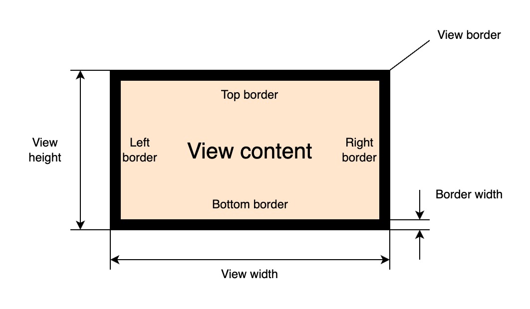
The values of the border lines thickness is added to corresponding padding values of the view. The border of the view can be set by the following primary property:
| Property | Type | Description |
|---|---|---|
| "border" | BorderProperty |
All borders settings |
The "border" property is a generic one and holds the value of the BorderProperty interface.
An instance of that interface can be created using the global rui.NewBorder() function:
Go
func NewBorder(params rui.Params) rui.BorderProperty
where rui.Params is a map which can contain the following properties:
| Property | Type | Description |
|---|---|---|
| "style" | int |
All borders line style |
| "left-style" | int |
Left border line style |
| "right-style" | int |
Right border line style |
| "top-style" | int |
Top border line style |
| "bottom-style" | int |
Bottom border line style |
| "width" | SizeUnit |
All borders line width |
| "left-width" | SizeUnit |
Left border line width |
| "right-width" | SizeUnit |
Right border line width |
| "top-width" | SizeUnit |
Top border line width |
| "bottom-width" | SizeUnit |
Bottom border line width |
| "color" | Color |
All borders line color |
| "left-color" | Color |
Left border line color |
| "right-color" | Color |
Right border line color |
| "top-color" | Color |
Top border line color |
| "bottom-color" | Color |
Bottom border line color |
Each border line style can be different and accept the following values:
| Value | Name | Description |
|---|---|---|
| NoneLine | "none" | No frame |
| SolidLine | "solid" | Solid line |
| DashedLine | "dashed" | Dashed line |
| DottedLine | "dotted" | Dotted line |
| DoubleLine | "double" | Double solid line |
If some of the border lines are not necessary they can be omitted.
Example
Setting a view border using the "border" property.
Go
view.Set(rui.Border, rui.NewBorder(rui.Params{
    rui.LeftStyle:   rui.SolidLine,
    rui.RightStyle:  rui.SolidLine,
    rui.TopStyle:    rui.SolidLine,
    rui.BottomStyle: rui.SolidLine,
    rui.LeftWidth:   rui.Px(1),
    rui.RightWidth:  rui.Px(1),
    rui.TopWidth:    rui.Px(1),
    rui.BottomWidth: rui.Px(1),
    rui.LeftColor:   rui.Black,
    rui.RightColor:  rui.Black,
    rui.TopColor:    rui.Black,
    rui.BottomColor: rui.Black,
}))
If all sides of the view border have the same look then we can simplify example above to this form:
Go
view.Set(rui.Border, rui.NewBorder(rui.Params{
    rui.Style   : rui.SolidLine,
    rui.Width   : rui.Px(1),
    rui.ColorTag: rui.Black,
}))
When setting the "border" property in resource description file it has a dedicated object format:
RUI
_{
    // All border lines settings
    style = <style> | "<top_style>, <right_style>, <bottom_style>, <left_style>",
    width = <width> | "<top_width>, <right_width>, <bottom_width>, <left_width>",
    color = <color> | "<top-color>, <right_color>, <bottom_color>, <left_color>",

    // Separate border lines settings
    top = _{
        style = <style>,
        width = <width>,
        color = <color>,
    },
    bottom = _{
        style = <style>,
        width = <width>,
        color = <color>,
    },
    left = _{
        style = <style>,
        width = <width>,
        color = <color>,
    },
    right = _{
        style = <style>,
        width = <width>,
        color = <color>,
    },
}
where <style>, <width>, and <color> are the specific border line attributes.
The top most properties "style", "width", and "color" may contain a single value or a string representation of multiple values.
Example
Setting a view border using the "border" property from resource description file.
RUI
GridLayout {
    width = 100%,
    height = 100%,
    // Center content on the screen
    cell-horizontal-align = center,
    cell-vertical-align = center,
    // Use plain View as a child
    content = View {
        width = 100px,
        height = 30px,
        border = _{
            // Setting all border lines style to have a solid line
            style = solid,
            // Customize each border line
            top = _{
                width = 2px,
                color = lightgray,
            },
            bottom = _{
                width = 2px,
                color = gray,
            },
            left = _{
                width = 1px,
                color = gray,
            },
            right = _{
                width = 1px,
                color = gray,
            },
        }
    }
}
which is equivalent to:
RUI
GridLayout {
    width = 100%,
    height = 100%,
    // Center content on the screen
    cell-horizontal-align = center,
    cell-vertical-align = center,
    // Use plain View as a child
    content = View {
        width = 100px,
        height = 30px,
        border = _{
            // Setting all border lines style to have a solid line
            style = solid,
            // Customize each border line (top, right, bottom, and left)
            width = "2px, 1px, 2px, 1px",
            color = "lightgray, gray, gray, gray",
        }
    }
}
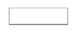
Here is how the above examples will look like:
To read the actual values of the view border we can use ViewBorders() method of the BorderProperty interface:
Go
switch bordersProp := view.Get(rui.Border).(type) {
case rui.BorderProperty:
    borders := bordersProp.ViewBorders(session)
    // Do something with the values
}
The ViewBorders() method will return top, bottom, left, and right borders attributes in a form of rui.ViewBorders structure.
Another way of getting these values is by using the global function rui.GetBorder():
Go
borders := rui.GetBorder(view, "view-id")
// Do something with the values
In this case there is no need to perform a type conversion and resolving a possible constant, everything is done behind the scene.
The rui.ViewBorders structure can be passed as a parameter to the Set() function when setting the value of the "border" property.
This converts the ViewBorders to the BorderProperty.
The view also support other border related properties that may be convenient to use:
| Property | Type | Description |
|---|---|---|
| "border-style" | int |
All borders line style |
| "border-width" | SizeUnit |
All borders line width |
| "border-color" | Color |
All borders line color |
| "border-left" | BorderProperty |
Left border line settings |
| "border-right" | BorderProperty |
Right border line settings |
| "border-top" | BorderProperty |
Top border line settings |
| "border-bottom" | BorderProperty |
Bottom border line settings |
| "border-left-style" | int |
Left border line style |
| "border-right-style" | int |
Right border line style |
| "border-top-style" | int |
Top border line style |
| "border-bottom-style" | int |
Bottom border line style |
| "border-left-width" | SizeUnit |
Left border line width |
| "border-right-width" | SizeUnit |
Right border line width |
| "border-top-width" | SizeUnit |
Top border line width |
| "border-bottom-width" | SizeUnit |
Bottom border line width |
| "border-left-color" | Color |
Left border line color |
| "border-right-color" | Color |
Right border line color |
| "border-top-color" | Color |
Top border line color |
| "border-bottom-color" | Color |
Bottom border line color |
When setting such properties library will first check whether the "border" property has been set and if not will create it implicitly, then update the corresponding values.
Properties "border-left", "border-right", "border-top", and "border-bottom" hold the BorderProperty interface which we discussed early.
The difference between these properties and the "border" property is that they only contain the attributes of the border like "style", "width", and "color".
Here is an example of how we can set them from the resource description file and code:
RUI
GridLayout {
    width = 100%,
    height = 100%,
    cell-horizontal-align = center,
    cell-vertical-align = center,
    content = View {
        id = "view-id",
        width = 100px,
        height = 30px,
        border-top = _{
            style = solid,
            width = 2px,
            color = lightgray,
        },
        border-bottom = _{
            style = solid,
            width = 2px,
            color = gray,
        },
        border-left = _{
            style = solid,
            width = 1px,
            color = gray,
        },
        border-right = _{
            style = solid,
            width = 1px,
            color = gray,
        },
    }
}
Go
view := rui.NewGridLayout(session, rui.Params{
    rui.Width:               rui.Percent(100),
    rui.Height:              rui.Percent(100),
    rui.CellHorizontalAlign: rui.CenterAlign,
    rui.CellVerticalAlign:   rui.CenterAlign,
    rui.Content: rui.NewView(session, rui.Params{
        rui.Width:  rui.Px(100),
        rui.Height: rui.Px(30),
        rui.BorderTop: rui.NewBorder(rui.Params{
            rui.Style:    rui.SolidLine,
            rui.Width:    rui.Px(2),
            rui.ColorTag: rui.LightGray,
        }),
        rui.BorderBottom: rui.NewBorder(rui.Params{
            rui.Style:    rui.SolidLine,
            rui.Width:    rui.Px(2),
            rui.ColorTag: rui.Gray,
        }),
        rui.BorderLeft: rui.NewBorder(rui.Params{
            rui.Style:    rui.SolidLine,
            rui.Width:    rui.Px(1),
            rui.ColorTag: rui.Gray,
        }),
        rui.BorderRight: rui.NewBorder(rui.Params{
            rui.Style:    rui.SolidLine,
            rui.Width:    rui.Px(1),
            rui.ColorTag: rui.Gray,
        }),
    }),
})
Not only BorderProperty can be passed as a value of these properties, library allows to use rui.ViewBorder structure as well:
Go
view := rui.NewGridLayout(session, rui.Params{
    rui.Width:               rui.Percent(100),
    rui.Height:              rui.Percent(100),
    rui.CellHorizontalAlign: rui.CenterAlign,
    rui.CellVerticalAlign:   rui.CenterAlign,
    rui.Content: rui.NewView(session, rui.Params{
        rui.Width:  rui.Px(100),
        rui.Height: rui.Px(30),

        // Setting all borders attributes to the same values
        rui.Border: rui.ViewBorder{
            Style: rui.SolidLine,
            Width: rui.Px(1),
            Color: rui.Black,
        },
    }),
})
and
Go
view := rui.NewGridLayout(session, rui.Params{
    rui.Width:               rui.Percent(100),
    rui.Height:              rui.Percent(100),
    rui.CellHorizontalAlign: rui.CenterAlign,
    rui.CellVerticalAlign:   rui.CenterAlign,
    rui.Content: rui.NewView(session, rui.Params{
        rui.Width:  rui.Px(100),
        rui.Height: rui.Px(30),

        // Setting border lines separately
        rui.BorderTop: rui.ViewBorder{
            Style: rui.SolidLine,
            Width: rui.Px(2),
            Color: rui.LightGray,
        },
        rui.BorderBottom: rui.ViewBorder{
            Style: rui.SolidLine,
            Width: rui.Px(2),
            Color: rui.Gray,
        },
        rui.BorderLeft: rui.ViewBorder{
            Style: rui.SolidLine,
            Width: rui.Px(1),
            Color: rui.Gray,
        },
        rui.BorderRight: rui.ViewBorder{
            Style: rui.SolidLine,
            Width: rui.Px(1),
            Color: rui.Gray,
        },
    }),
})
In some cases it might be convenient to use other border related view properties starting with "border-top-", "border-bottom-", "border-left-", and "border-right-" prefix, especially if we need to touch only a few attributes.
Go
view := rui.NewGridLayout(session, rui.Params{
    rui.Width:               rui.Percent(100),
    rui.Height:              rui.Percent(100),
    rui.CellHorizontalAlign: rui.CenterAlign,
    rui.CellVerticalAlign:   rui.CenterAlign,
    rui.Content: rui.NewView(session, rui.Params{
        rui.Width:  rui.Px(100),
        rui.Height: rui.Px(30),

        // Setting border lines separately
        rui.BorderBottomStyle: rui.DottedLine,
        rui.BorderBottomWidth: rui.Px(1),
        rui.BorderBottomColor: rui.Black,
    }),
})
For more information please refer to BorderProperty, ViewBorder, ViewBorders and specific property name of the View in our Reference documentation.
View outline
Besides the view border there is also another way to emphasize the shape of the view which is called an outline. It is represented by four attributes like style, width, color and an offset. Below is the schematic view of the outline.
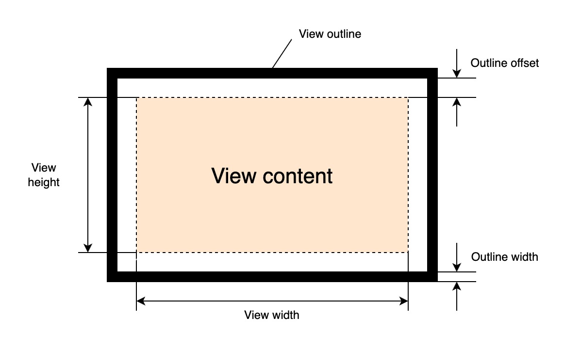
It can be drawn outside or inside of the view shape using a positive or negative values of the offset. The outline is displayed above the view content it corresponds to. Compared to the view border we can't control each side of the outline independently. The outline does not take up space in the layout, unlike the view border.
To manipulate outline attributes we can use the following view properties:
| Property | Type | Description |
|---|---|---|
| "outline" | OutlineProperty |
Controls outline style, width and color |
| "outline-offset" | SizeUnit |
An offset from the view shape |
The "outline" property is a generic one and holds the value of the OutlineProperty interface.
An instance of that interface can be created using the global rui.NewOutlineProperty() function:
Go
func NewOutlineProperty(params rui.Params) rui.OutlineProperty
where Params is a map which can contain the following properties:
| Property | Type | Description |
|---|---|---|
| "style" | int |
Outline line style |
| "width" | SizeUnit |
Outline line width |
| "color" | Color |
Outline line color |
The style of the outline can have one of the following accepted values:
| Value | Name | Description |
|---|---|---|
NoneLine |
"none" | No line |
SolidLine |
"solid" | Solid line |
DashedLine |
"dashed" | Dashed line |
DottedLine |
"dotted" | Dotted line |
DoubleLine |
"double" | Double solid line |
Example
Setting a view outline using the "outline" property.
Go
view.Set(rui.Outline, rui.NewOutlineProperty(rui.Params{
    rui.Style:   rui.SolidLine,
    rui.Width:   rui.Px(2),
    rui.Color:   rui.LightGray,
}))
When setting this property in resource description file it has a dedicated object format:
RUI
_{
    style = <style>,
    width = <width>,
    color = <color>,
}
where <style>, <width>, and <color> are the outline attributes values.
Example
Setting the view outline from resource description file.
RUI
GridLayout {
    width = 100%,
    height = 100%,
    // Center content on the screen
    cell-horizontal-align = center,
    cell-vertical-align = center,
    // Use plain View as a child
    content = View {
        width = 100px,
        height = 30px,
        // Setting an outline attributes
        outline = _{
            style = solid,
            width = 2px,
            color = lightgray,
        }
        outline-offset = 1px,
    }
}
Here is how the above example will look like:
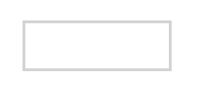
To read the actual values of the view outline we can use ViewOutline() method of the OutlineProperty interface:
Go
switch outlineProp := view.Get(rui.Outline).(type) {
case rui.OutlineProperty:
    outline := outlineProp.ViewOutline(session)
    // Do something with the values
}
The ViewOutline() method will return values in a form of ViewOutline structure.
Another way of getting these values is by using the global function rui.GetOutline():
Go
outline := rui.GetOutline(view, "view-id")
// Do something with the values
In this case there is no need to perform a type conversion or resolving a possible constant, everything is done behind the scene.
The rui.ViewOutline and rui.ViewBorder structures can be passed as "outline" property value to the Set() function of the view or during the view construction.
Values of the rui.ViewOutline and rui.ViewBorder types will be converted to the OutlineProperty during assignment.
Examples
Go
// Setting outline attributes using ViewOutline as a value
view.Set(rui.Outline, rui.ViewOutline{
    Style: rui.SolidLine,
    Width: rui.Px(2),
    Color: rui.LightGray,
})

// Setting outline attributes using ViewBorder as a value
view.Set(rui.Outline, rui.ViewBorder{
    Style: rui.SolidLine,
    Width: rui.Px(2),
    Color: rui.Gray,
})
Go
// Setting outline attributes during the view construction
view := rui.NewGridLayout(session, rui.Params{
    rui.Width:               rui.Percent(100),
    rui.Height:              rui.Percent(100),
    rui.CellHorizontalAlign: rui.CenterAlign,
    rui.CellVerticalAlign:   rui.CenterAlign,
    rui.Content: rui.NewTextView(session, rui.Params{
        rui.Text: "Some text",
        // Use ViewOutline as a value
        rui.Outline: rui.ViewOutline{
            Style: rui.SolidLine,
            Width: rui.Px(2),
            Color: rui.LightGray,
        },
    }),
})
Besides the "outline" property we can use other convenient properties:
| Property | Type | Description |
|---|---|---|
| "outline-style" | int |
Outline line style |
| "outline-width" | SizeUnit |
Outline line width |
| "outline-color" | Color |
Outline line color |
When setting such properties library will check for existence of "outline" property first and will create it implicitly if not present, then set the corresponding values.
Outline offset from the view border is controlled by "outline-offset" property which is not part of the OutlineProperty interface.
As usual we can set or get the value using Set() and Get() methods of the view or set the value during the view construction.
Library also provides a global function rui.GetOutlineOffset() to read the value without necessity manually converting the types:
Go
outlineOffset := rui.GetOutlineOffset(rootView, "view-id")
// Do something with the value
View radius
To create a nice looking user interface sometimes it is not enough to use a view with а rectangular shape. Each corner of the view shape can be customized by supplying the values of the horizontal and vertical radii.
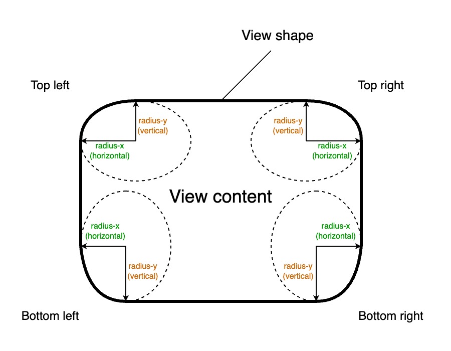
Since the corner radius changes the shape of the view it will affect the appearance of the view border and outline. The following primary view property is used to control the shape of the corners:
| Property | Type | Description |
|---|---|---|
| "radius" | RadiusProperty |
Controls radius of all corners of the view |
Lets have a look at some examples of radius settings and how they affect the shape of the view.
RUI
EditView {
    radius = 8px,
    padding = 4px,
    hint = "User name"
},

RUI
EditView {
    radius = _{
        top-left = 4px,
        top-right = 8px,
        bottom-left = 8px,
        bottom-right = 4px,
    },
    padding = 4px,
    hint = "User name"
}

RUI
EditView {
    radius = _{
        top-left = 8px,
        top-right = 4px,
        bottom-left = 4px,
        bottom-right = 8px,
    },
    padding = 4px,
    hint = "User name"
}

RUI
EditView {
    radius = _{
        top-left = 1em,
        top-right = 1em,
        bottom-left = 1em,
        bottom-right = 1em,
    },
    padding = 4px,
    hint = "User name"
}

RUI
EditView {
    radius = _{
        top-left = 4px,
        top-right = 10px,
        bottom-left = 10px,
        bottom-right = 6px,
    },
    padding = 4px,
    hint = "User name"
}

RUI
EditView {
    radius = _{
        x = 4px,
        y = 10px,
    },
    padding = 4px,
    hint = "User name"
}

RUI
EditView {
    radius = _{
        x = 10px,
        y = 4px,
    },
    padding = 4px,
    hint = "User name"
}

We can experiment with properties to match the design of our application.
The "radius" property holds the value of the RadiusProperty interface.
An instance of that interface can be created using the global rui.NewRadiusProperty() function:
Go
func NewRadiusProperty(params rui.Params) rui.OutlineProperty
where Params is a map which can contain the following properties:
| Property | Type | Description |
|---|---|---|
| "x" | SizeUnit |
All corners horizontal radius |
| "y" | SizeUnit |
All corners vertical radius |
| "bottom-left" | SizeUnit |
Bottom left corner horizontal and vertical radius |
| "bottom-left-x" | SizeUnit |
Bottom left corner horizontal radius |
| "bottom-left-y" | SizeUnit |
Bottom left corner vertical radius |
| "bottom-right" | SizeUnit |
Bottom right corner horizontal and vertical radius |
| "bottom-right-x" | SizeUnit |
Bottom right corner horizontal radius |
| "bottom-right-y" | SizeUnit |
Bottom right corner vertical radius |
| "top-left" | SizeUnit |
Top left corner horizontal and vertical radius |
| "top-left-x" | SizeUnit |
Top left corner horizontal radius |
| "top-left-y" | SizeUnit |
Top left corner vertical radius |
| "top-right" | SizeUnit |
Top right corner horizontal and vertical radius |
| "top-right-x" | SizeUnit |
Top right corner horizontal radius |
| "top-right-y" | SizeUnit |
Top right corner vertical radius |
Example
Setting a view radius using the "radius" property.
Go
view.Set(rui.Radius, rui.NewRadiusProperty(rui.Params{
    rui.X:           rui.Px(4),
    rui.Y:           rui.Px(4),
    rui.TopLeft:     rui.Px(8),
    rui.BottomRight: rui.Px(8),
}))
There are also other ways of creating an instance of RadiusProperty interface using rui.NewEllipticRadius() and rui.NewRadii() global functions:
Go
view.Set(rui.Radius, rui.NewEllipticRadius(
    rui.Px(4), // The x-axis elliptic rounding radius for all corners
    rui.Px(4), // The y-axis elliptic rounding radius for all corners
))

view.Set(rui.Radius, rui.NewRadii(
    rui.Px(4), // The top-right corner x and y axis elliptic rounding radius
    rui.Px(4), // The bottom-right corner x and y axis elliptic rounding radius
    rui.Px(8), // The bottom-left corner x and y axis elliptic rounding radius
    rui.Px(8), // The top-left corner x and y axis elliptic rounding radius
))
When setting "radius" property in resource description file it has a dedicated object format:
RUI
_{
    bottom-left = <val> | "<x_val>/<y_val>",
    bottom-left-x = <val>,
    bottom-left-y = <val>,
    bottom-right = <val> | "<x_val>/<y_val>",
    bottom-right-x = <val>,
    bottom-right-y = <val>,
    top-left = <val> | "<x_val>/<y_val>",
    top-left-x = <val>,
    top-left-y = <val>,
    top-right = <val> | "<x_val>/<y_val>",
    top-right-x = <val>,
    top-right-y = <val>,
    x = <val>,
    y = <val>,
}
where <x_val>, <y_val> are the horizontal and vertical radius values.
The <val> is holding one value either for both horizontal and vertical radius or for specific one.
All values are the text representation of SizeUnit type.
The corner properties like "bottom-left", "bottom-right", "top-left", and "top-right" can contain one value for both "x" and "y" radiuses or two values separated by / which describe "x" and "y" radiuses respectively.
Pay attention that if two values are specified, they must be enclosed in double quotes.
If some properties are not required we can omit them, by default their values are equal to 0.
Example
Setting the view radius from resource description file.
RUI
GridLayout {
    width = 100%,
    height = 100%,
    // Center content on the screen
    cell-horizontal-align = center,
    cell-vertical-align = center,
    // Use EditView as a child
    content = EditView {
        // Setting view radius attributes
        radius = _{
            x = 4px,
            y = 4px,
            top-left = 8px,
            bottom-right = "4px/8px",
        },
        hint = "User name",
    }
}
To read the actual values of the view radius we can use BoxRadius() method of the RadiusProperty interface:
Go
switch radiusProp := view.Get(rui.Radius).(type) {
case rui.RadiusProperty:
    radius := radiusProp.BoxRadius(session)
    // Do something with the values
}
The BoxRadius() method will return values in a form of BoxRadius structure.
Another way of getting these values is by using the global function rui.GetRadius():
Go
radius := rui.GetRadius(view, "view-id")
// Do something with the values
In this case there is no need to perform a type conversion and resolving a possible constant, everything is done behind the scene.
When setting "radius" property using Set() method or during the view construction we can pass values of multiple types like SizeUnit, BoxRadius, string and others, see View reference documentation for "radius" property to get more details.
Examples
Go
// Setting radius attributes using a value of SizeUnit type
view.Set(rui.Radius, rui.NewRadiusProperty(rui.Params{
        rui.X:           rui.Px(4),
        rui.Y:           rui.Px(4),
        rui.TopLeft:     rui.Px(8),
        rui.BottomRight: rui.Px(8),
    })
)

// Setting radius attributes using a value of BoxRadius type
view.Set(rui.Radius, rui.BoxRadius{
    TopLeftX:     rui.Percent(10),
    TopLeftY:     rui.Percent(50),
    BottomRightX: rui.Percent(10),
    BottomRightY: rui.Percent(50),
})

// Setting radius attributes using a value of string type
view.Set(rui.Radius, "2/4") // values without postfix will be treated as values in pixels
Go
// Setting radius attributes during the view construction
view := rui.NewGridLayout(session, rui.Params{
    rui.Width:               rui.Percent(100),
    rui.Height:              rui.Percent(100),
    rui.CellHorizontalAlign: rui.CenterAlign,
    rui.CellVerticalAlign:   rui.CenterAlign,
    rui.Content: rui.NewEditView(session, rui.Params{
        rui.Hint: "User name",
        // We can use other supported types as well
        rui.Radius: rui.NewRadiusProperty(rui.Params{
            rui.X:           rui.Px(4),
            rui.Y:           rui.Px(4),
            rui.TopLeft:     rui.Px(8),
            rui.BottomRight: rui.Px(8),
        }),
    }),
})
Besides the "radius" property we can use other convenient properties which are starting with "radius-" prefix:
| Property | Type | Description |
|---|---|---|
| "radius-x" | SizeUnit |
All corners horizontal radius |
| "radius-y" | SizeUnit |
All corners vertical radius |
| "radius-bottom-left" | SizeUnit |
Bottom left corner horizontal and vertical radius |
| "radius-bottom-left-x" | SizeUnit |
Bottom left corner horizontal radius |
| "radius-bottom-left-y" | SizeUnit |
Bottom left corner vertical radius |
| "radius-bottom-right" | SizeUnit |
Bottom right corner horizontal and vertical radius |
| "radius-bottom-right-x" | SizeUnit |
Bottom right corner horizontal radius |
| "radius-bottom-right-y" | SizeUnit |
Bottom right corner vertical radius |
| "radius-top-left" | SizeUnit |
Top left corner horizontal and vertical radius |
| "radius-top-left-x" | SizeUnit |
Top left corner horizontal radius |
| "radius-top-left-y" | SizeUnit |
Top left corner vertical radius |
| "radius-top-right" | SizeUnit |
Top right corner horizontal and vertical radius |
| "radius-top-right-x" | SizeUnit |
Top right corner horizontal radius |
| "radius-top-right-y" | SizeUnit |
Top right corner vertical radius |
To work with them we can use the Set() or Get() methods of the View object or the global methods with the same name.
When setting such properties library first check whether the view has "radius" property set, if not it will create it and then update it's corresponding corner radius values.
View shadow
Shadow casting can be used to create a nice looking 3D effect or highlight a selected view. If required we can set several shadows for the view. Each shadow represented by its offset relative to the view, blur, spread radius, color and whether it's spreading direction like inner or outer.
The view shadows are described by the "shadow" property:
| Property | Type | Description |
|---|---|---|
| "shadow" | []ShadowProperty |
An array of view shadow settings |
Property holds the value of the array of ShadowProperty interface.
If one instance of the ShadowProperty will be provided then it will be converted to an array automatically.
An instance of that interface can be created using several global methods:
Go
func NewShadow[xOffsetType SizeUnit | int | float64, yOffsetType SizeUnit | int | float64, blurType SizeUnit | int | float64, spreadType SizeUnit | int | float64](xOffset xOffsetType, yOffset yOffsetType, blurRadius blurType, spreadRadius spreadType, color Color) ShadowProperty
func NewInsetShadow[xOffsetType SizeUnit | int | float64, yOffsetType SizeUnit | int | float64, blurType SizeUnit | int | float64, spreadType SizeUnit | int | float64](xOffset xOffsetType, yOffset yOffsetType, blurRadius blurType, spreadRadius spreadType, color Color) ShadowProperty
func NewShadowProperty(params Params) ShadowProperty
where Params is a map which can contain the following properties:
| Property | Type | Description |
|---|---|---|
| "blur" | SizeUnit |
Shadow blur radius |
| "color" | Color |
Shadow color |
| "inset" | bool |
Shadow spreading direction |
| "spread-radius" | SizeUnit |
Shadow area |
| "x-offset" | SizeUnit |
Shadow offset along horizontal axis |
| "y-offset" | SizeUnit |
Shadow offset along vertical axis |
Example
Setting the view shadow using the "shadow" property.
Go
view.Set(rui.Shadow, rui.NewShadowProperty(rui.Params{
    rui.Blur:         rui.Px(3),
    rui.ColorTag:     rui.Red,
    rui.Inset:        false,
    rui.SpreadRadius: rui.Px(2),
    rui.XOffset:      rui.Px(0),
    rui.YOffset:      rui.Px(0),
}))
By the way, it might be simpler to use rui.NewShadow() and rui.NewInsetShadow() functions.
When setting this property in resource description file it has a dedicated object format:
RUI
_{
    blur = <val>,
    color = <val>,
    inset = <val>,
    spread-radius = <val>,
    x-offset = <val>,
    y-offset = <val>,
}
where <val> is the text representation of the corresponding property type.
The format doesn't enforce to have all attributes listed, at least "color" and "spread-radius" must be provided.
Example
Setting the view shadow from resource description file.
RUI
GridLayout {
    width = 100%,
    height = 100%,
    // Center content on the screen
    cell-horizontal-align = center,
    cell-vertical-align = center,
    // Use EditView as a child
    content = EditView {
        id = "view-id",
        padding = 4px,
        radius = 1em,
        // Setting view shadow attributes
        shadow = [
            // Outer shadow
            _{
                blur = 3px,
                color = red,
                spread-radius = 2px,
            },
        ],
        hint = "User name",
    }
}
Setting multiple view shadows from resource description file.
RUI
GridLayout {
    width = 100%,
    height = 100%,
    // Center content on the screen
    cell-horizontal-align = center,
    cell-vertical-align = center,
    // Use EditView as a child
    content = EditView {
        id = "view-id",
        padding = 4px,
        radius = 1em,
        // Setting view shadow attributes
        shadow = [
            // Outer shadow
            _{
                blur = 3px,
                color = red,
                spread-radius = 2px,
            },
            // Inner shadow
            _{
                blur = 2px,
                color = black,
                spread-radius = 1px,
                inset = true,
            },
        ],
        // Remove border
        border = _{
            style = none,
        },
        hint = "User name",
    }
}
Lets have a look at a few examples of shadows which might inspire you for your designs.
We will use an EditView UI control for demonstration.
RUI
EditView {
    edit-view-type = password,
    hint = "Password",
    shadow = _{
        blur = 3px,
        color = red,
        spread-radius = 2px,
    },
}

Same but with adjusted view shape using "radius" property.
RUI
EditView {
    edit-view-type = password,
    hint = "Password",
    radius = 1em,
    shadow = _{
        blur = 3px,
        color = red,
        spread-radius = 2px,
    },
}

Combining inner, outer shadows and removing the border.
RUI
EditView {
    hint = "User name",
    padding = 4px,
    radius = 1em,
    shadow = [
        _{
            blur = 3px,
            color = black,
            spread-radius = 2px,
        },
        _{
            inset = true,
            blur = 3px,
            color = lightgray,
            spread-radius = 2px,
        },
    ],
}

Adding even more shadows and changing colors a bit.
RUI
EditView {
    hint = "User name",
    padding = 4px,
    radius = 1em,
    shadow = [
        _{
            blur = 3px,
            color = purple,
            spread-radius = 2px,
        },
        _{
            blur = 3px,
            color = lightgray,
            spread-radius = 2px,
            x-offset = 6px,
            y-offset = 6px,
        },
        _{
            inset = true,
            blur = 3px,
            color = lightgray,
            spread-radius = 2px,
        },
    ],
}

RUI
EditView {
    hint = "User name",
    padding = 4px,
    radius = 1em,
    shadow = [
        _{
            color = lightgray,
            spread-radius = 2px,
        },
    ],
}

RUI
EditView {
    hint = "User name",
    padding = 4px,
    radius = 6px,
    shadow = [
        _{
            blur = 10px,
            color = lightgray,
            spread-radius = 2px,
        },
    ],
}
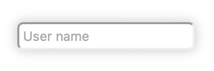
Same but without the view border.
RUI
EditView {
    hint = "User name",
    padding = 4px,
    radius = 6px,
    border = _{style=none},
    shadow = [
        _{
            blur = 10px,
            color = lightgray,
            spread-radius = 2px,
        },
    ],
}

Using an offset and the negative spread radius.
RUI
EditView {
    hint = "User name",
    padding = 4px,
    border = _{style=none},
    shadow = [
        _{
            blur = 30px,
            color = black,
            spread-radius = -5px,
            y-offset = 10px
        },
    ],
}
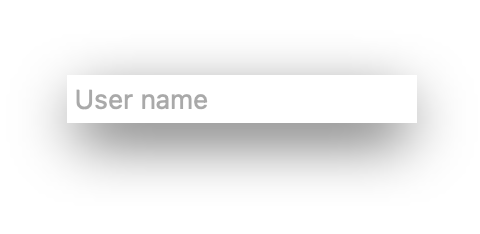
To read the actual values of the view shadow we can use a Get() method of the ShadowProperty interface:
Go
switch shadowProp := view.Get(rui.Shadow).(type) {
    case []rui.ShadowProperty :
        for _, shadow := range shadowProp {
            // We can get any shadow attributes here, not just a "color"
            if colorProp := shadow.Get(rui.ColorTag); colorProp != nil {
                switch colorProp.(type) {
                case rui.Color:
                    // Do something with the value
                }
            }
        }
}
We can simplify it a bit by using a global function rui.GetShadowPropertys():
Go
shadows := rui.GetShadowPropertys(view, "view-id")
for _, shadow := range shadows {
    // We can get any shadow attributes here, not just a "color"
    if colorProp := shadow.Get(rui.ColorTag); colorProp != nil {
        switch colorProp.(type){
        case rui.Color:
            // Do something with the value
        }
    }
}
View background
To enhance the visual appearance of a view, we have multiple options for configuring its background. The background offers a versatile way to apply styles, including colors, images, and gradients. Understanding how these backgrounds interact with each other and with the element's border is crucial. When multiple background layers are applied, they are drawn in a specific order.
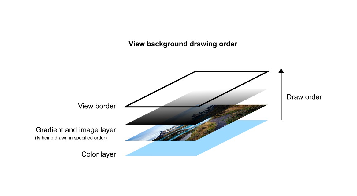
Image and gradient backgrounds have equal drawing priority. They will be displayed in the order we specify.
Below are all properties which we can use to manipulate view's background.
| Property | Type | Description |
|---|---|---|
| "background" | []BackgroundElement |
An array of background layers, either image or gradient |
| "background-blend-mode" | int |
Blending mode between view content and its background |
| "background-clip" | int |
Specifies the painting area for the background |
| "background-origin" | int |
Specifies the origin area from which the background will be displayed |
| "background-color" | Color |
Specifies a solid background color |
The easiest way to change a view's background is by setting its color using "background-color" property. Lets have a look at some simple examples.
User name prompt with light blue background described in the resource file:
RUI
GridLayout {
    width = 100%,
    height = 100%,
    cell-horizontal-align = center,
    cell-vertical-align = center,
    // Setting a background color of the user name prompt
    background-color = lightblue,
    content = EditView {
        hint = "User name",
        border = _{style = none}, // Get rid of the default border
        radius = 1em,
        opacity = 0.8,
        padding = 6px,
    },
}
We can do the same from the source code as well:
Go
view := rui.NewGridLayout(session, rui.Params{
    rui.Width:               rui.Percent(100),
    rui.Height:              rui.Percent(100),
    rui.CellHorizontalAlign: rui.CenterAlign,
    rui.CellVerticalAlign:   rui.CenterAlign,
    // Setting a background color of the user name prompt
    rui.BackgroundColor:     rui.LightBlue,
    rui.Content: rui.NewEditView(session, rui.Params{
        rui.Hint: "User name",
        rui.Border: rui.NewBorder(rui.Params{
            rui.Style: rui.NoneLine,
        }),
        rui.Radius:  rui.Em(1),
        rui.Opacity: 0.8,
        rui.Padding: rui.Px(6),
    }),
})
Here's an example of what it looks like:
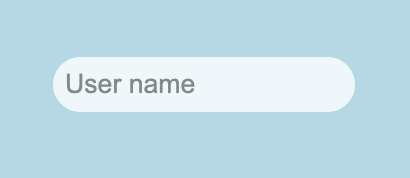
For more information on the values that can be used with the "background-color" property, please refer to the Color type reference documentation.
To get the value of the background color property we can either use a global rui.GetBackgroundColor() function or Get() method of the view.
Go
color := rui.GetBackgroundColor(rootView, "view-id")
// Do something with the value
Besides the background color setting we can have a multiple layers of background images and gradients, all of them are set using "background" property.
The "background" property holds the value of the array of BackgroundElement interface.
An instance of that interface can be created using the several global functions:
Go
func NewBackgroundImage(params Params) BackgroundElement
func NewBackgroundLinearGradient(params Params) BackgroundElement
func NewBackgroundRadialGradient(params Params) BackgroundElement
func NewBackgroundConicGradient(params Params) BackgroundElement
func NewLinearGradient[DirectionType LinearGradientDirectionType | AngleUnit](direction DirectionType, repeating bool, point1 GradientPoint, point2 GradientPoint, points ...GradientPoint) BackgroundElement
func NewCircleRadialGradient[radiusType SizeUnit | RadialGradientRadiusType](xCenter, yCenter SizeUnit, radius radiusType, repeating bool, point1 GradientPoint, point2 GradientPoint, points ...GradientPoint) BackgroundElement
func NewEllipseRadialGradient[radiusType []SizeUnit | RadialGradientRadiusType](xCenter, yCenter SizeUnit, radius radiusType, repeating bool, point1 GradientPoint, point2 GradientPoint, points ...GradientPoint) BackgroundElement
where Params is a map which can contain the following properties:
| Property | Type | Applicability | Description |
|---|---|---|---|
| "src" | string |
Image background | Image file location |
| "attachment" | int |
Image background | Image scrolling behavior |
| "fit" | int |
Image background | Controls image scaling |
| "repeat" | int |
Image background | Controls repetition of the image |
| "width" | SizeUnit |
Image background | Image width |
| "height" | SizeUnit |
Image background | Image height |
| "image-horizontal-align" | int |
Image background | Image horizontal alignment |
| "image-vertical-align" | int |
Image background | Image vertical alignment |
| "direction" | AngleUnit |
Linear background gradient | Direction of the gradient line |
| "radial-gradient-radius" | SizeUnit |
Radial gradient background | Controls gradient radius |
| "radius" | SizeUnit |
Radial gradient background | Same as previous one |
| "radial-gradient-shape" | int |
Radial gradient background | Controls radial gradient shape type |
| "shape" | int |
Radial gradient background | Same as previous one |
| "center-x" | SizeUnit |
Radial and conic background gradients | Horizontal center point of the gradient |
| "center-y" | SizeUnit |
Radial and conic background gradients | Vertical center point of the gradient |
| "from" | AngleUnit |
Conic gradient background | Controls start angle position of the gradient |
| "gradient" | []BackgroundGradientPoint or []BackgroundGradientAngle |
All gradient backgrounds | Controls gradient stop points |
| "repeating" | bool |
All gradient backgrounds | Repetition of stop points after the last one |
Each property is dedicated to a specific type of the background like an image or some sort of the color gradient.
The best place to get more information on these properties is to check BackgroundElement reference documentation where each property described in detail.
Lets have a look on how we can set an image background using rui.NewBackgroundImage() function.
Go
view := rui.NewGridLayout(session, rui.Params{
    rui.Width:  rui.Percent(100),
    rui.Height: rui.Percent(100),
    // Setting background image
    rui.Background: rui.NewBackgroundImage(rui.Params{
        rui.Source: "background.jpg",
        rui.Fit:    rui.CoverFit,
    }),
    rui.CellVerticalAlign:   rui.CenterAlign,
    rui.CellHorizontalAlign: rui.CenterAlign,
    rui.Content: rui.NewTextView(session, rui.Params{
        rui.Text:      "Welcome",
        rui.TextColor: rui.White,
        rui.TextSize:  rui.Em(5),
    }),
})
When referencing property names such as "src" and "fit", we utilize library's predefined constants.
Possible outcome of the code above depending on an image used may look like:

When dealing with "background" property in resource description file it accepts the values of a several objects in a specific format which describe an image or different kinds of color gradients.
Below is an object format for describing an image background:
RUI
image {
    src = <image-location>,                                            // Image file location
    attachment = scroll | fixed | local,                               // Image scrolling behavior
    fit = none | contain | cover,                                      // Controls image scaling
    repeat = no-repeat | repeat | repeat-x | repeat-y | round | space, // Controls repetition of the image
}
, where <image-location> is the path to a background image file.
Some of the attributes of the object can be omitted if needed, in this case the default value will be used.
Let's explore how to define an image background using the specified object format in our resource file:
RUI
GridLayout {
    width = 100%,
    height = 100%,
    // Setting background image
    background = image {
        src = "background.jpg",
        fit = cover,
    },
    cell-vertical-align = center,
    cell-horizontal-align = center,
    content = TextView{
        text = Welcome,
        text-color = white,
        text-size = 5em,
    },
}
There are cases when setting a solid background color or an image is not enough, in this case we have a possibility to define a color gradient which can be blended with underneath layers.
Linear color gradient is the simplest one and can be created using rui.NewBackgroundLinearGradient() or rui.NewLinearGradient() global functions.
Go
view := rui.NewGridLayout(session, rui.Params{
    rui.Width:  rui.Percent(100),
    rui.Height: rui.Percent(100),
    // Setting background linear gradient
    rui.Background: rui.NewBackgroundLinearGradient(rui.Params{
        rui.Direction: rui.ToRightTopGradient, //Either predefined direction or an angle
        rui.Gradient: []rui.BackgroundGradientPoint{
            {Pos: rui.Percent(0), Color: "#FF6138C6"},   // Bottom-left point color
            {Pos: rui.Percent(100), Color: "#FFD38039"}, // Top-right point color
        },
    }),
    rui.CellVerticalAlign:   rui.CenterAlign,
    rui.CellHorizontalAlign: rui.CenterAlign,
    rui.Content: rui.NewTextView(session, rui.Params{
        rui.Text:      "Welcome",
        rui.TextColor: rui.White,
        rui.TextSize:  rui.Em(5),
    }),
})

view := rui.NewGridLayout(session, rui.Params{
    rui.Width:  rui.Percent(100),
    rui.Height: rui.Percent(100),
    // Setting background linear gradient
    rui.Background: rui.NewLinearGradient(
        rui.ToRightTopGradient, // Either predefined direction or an angle
        false,                  // Repetition
        rui.GradientPoint{Offset: 0, Color: 0xFF6138C6}, // Bottom-left point color
        rui.GradientPoint{Offset: 1, Color: 0xFFD38039}, // Top-right point color
    ),
    rui.CellVerticalAlign:   rui.CenterAlign,
    rui.CellHorizontalAlign: rui.CenterAlign,
    rui.Content: rui.NewTextView(session, rui.Params{
        rui.Text:      "Welcome",
        rui.TextColor: rui.White,
        rui.TextSize:  rui.Em(5),
    }),
})
We can configure the same background from the resource file, the following object format is used to describe linear color gradient:
RUI
linear-gradient {
    direction = <angle> | to-top | to-right-top | to-right | to-right-bottom | to-bottom | to-left-bottom | to-left | to-left-top, // Direction of the gradient line
    gradient = "<color>[ <position>][,<color>[ <position>]]", // An array of gradient stop points
    repeating = true | false,                             // Repetition of stop points after the last one
}
, where <angle> is a text representation of an AngleUnit value, we can also assign a predefined direction values if needed.
The <color> is the text representation of the Color value, and the <position> is the text representation of the SizeUnit value.
The <position> is an optional value when describing gradient stop points.
If it is not set then colors listed as a stop points will be evenly distributed along the direction of the gradient.
Here is an above example of setting the linear gradient but described in resource description file:
RUI
GridLayout {
    width = 100%,
    height = 100%,
    // Setting background linear gradient
    background = linear-gradient {
        direction = to-right-top,                  // Either predefined direction or an angle
        gradient = "#FF6138C6 0%, #FFD38039 100%", // Bottom-left and top-right colors with their offsets
    },
    cell-vertical-align = center,
    cell-horizontal-align = center,
    content = TextView{
        text = Welcome,
        text-color = white,
        text-size = 5em,
    },
}
Upon executing these examples, we'll observe a visually appealing diagonal gradient transitioning smoothly from the bottom-left to the top-right corner of the window:
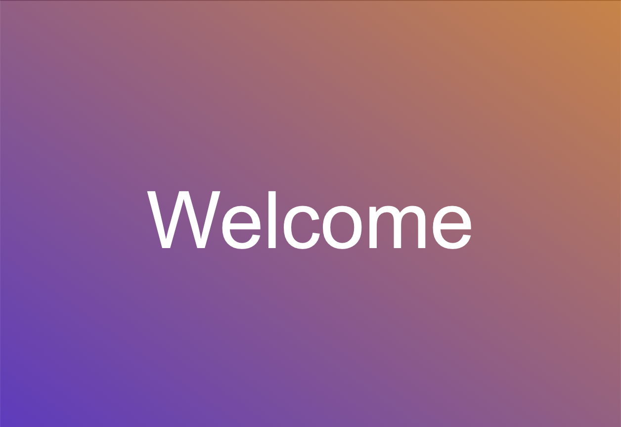
The radial gradient can be created using the rui.NewBackgroundRadialGradient(), rui.NewCircleRadialGradient(), and rui.NewEllipseRadialGradient() global functions.
Go
view := rui.NewGridLayout(session, rui.Params{
    rui.Width:  rui.Percent(100),
    rui.Height: rui.Percent(100),
    // Setting background radial gradient
    rui.Background: rui.NewBackgroundRadialGradient(rui.Params{
        rui.RadialGradientRadius: rui.Percent(50),
        rui.Gradient: []rui.BackgroundGradientPoint{
            {Pos: rui.Percent(0), Color: "#FF7EDFAB"},
            {Pos: rui.Percent(100), Color: "#FF66A1A1"},
        },
    }),
    rui.CellVerticalAlign:   rui.CenterAlign,
    rui.CellHorizontalAlign: rui.CenterAlign,
    rui.Content: rui.NewTextView(session, rui.Params{
        rui.Text:      "Welcome",
        rui.TextColor: rui.White,
        rui.TextSize:  rui.Em(5),
    }),
})

view := rui.NewGridLayout(session, rui.Params{
    rui.Width:  rui.Percent(100),
    rui.Height: rui.Percent(100),
    // Setting background radial gradient
    rui.Background: rui.NewCircleRadialGradient(
        rui.Percent(50), // Center point x-coordinate
        rui.Percent(50), // Center point y-coordinate
        rui.Percent(50), // Gradient radius
        false,           // Repeating
        rui.GradientPoint{Offset: 0, Color: 0xFF7EDFAB}, // Center point color
        rui.GradientPoint{Offset: 1, Color: 0xFF66A1A1}, // Edge point color
    ),
    rui.CellVerticalAlign:   rui.CenterAlign,
    rui.CellHorizontalAlign: rui.CenterAlign,
    rui.Content: rui.NewTextView(session, rui.Params{
        rui.Text:      "Welcome",
        rui.TextColor: rui.White,
        rui.TextSize:  rui.Em(5),
    }),
})

view := rui.NewGridLayout(session, rui.Params{
    rui.Width:  rui.Percent(100),
    rui.Height: rui.Percent(100),
    // Setting background radial gradient
    rui.Background: rui.NewEllipseRadialGradient(
        rui.Percent(50),           // Center point x-coordinate
        rui.Percent(50),           // Center point y-coordinate
        rui.ClosestCornerGradient, // Gradient radius
        false,                     // Repeating
        rui.GradientPoint{Offset: 0, Color: 0xFF7EDFAB}, // Center point color
        rui.GradientPoint{Offset: 1, Color: 0xFF66A1A1}, // Edge point color
    ),
    rui.CellVerticalAlign:   rui.CenterAlign,
    rui.CellHorizontalAlign: rui.CenterAlign,
    rui.Content: rui.NewTextView(session, rui.Params{
        rui.Text:      "Welcome",
        rui.TextColor: rui.White,
        rui.TextSize:  rui.Em(5),
    }),
})
When describing radial gradient background in resource description file the following object format is accepted:
RUI
radial-gradient {
    radial-gradient-radius = <radius>,         // Gradient radius
    radius                 = <radius>,         // Same as above
    radial-gradient-shape = ellipse | circle,  // Gradient shape type
    shape                 = ellipse | circle,  // Same as above
    center-x = <x>,                                             // Horizontal center point of the gradient
    center-y = <y>,                                             // Vertical center point of the gradient
    gradient = "<color>[ <position>][,<color>[ <position>]]",   // An array of gradient stop points
    repeating = <boolval>,                                      // Repetition of stop points after the last one
}
, where <radius>, <x>, <y>, and <position> are text representation of SizeUnit value type.
The <color> is a text representation of Color value type.
And <boolval> is a text representation of the boolean type which can hold the following values: "true", "yes", "on", "1", and "false", "no", "off", "0".
The <position> is an optional value when describing gradient stop points.
If it is not set then colors listed as a stop points will be evenly distributed along the radius of the gradient.
Lets repeat our above example but describe it in the resource file for now:
RUI
GridLayout {
    width = 100%,
    height = 100%,
    // Setting background radial gradient
    background = radial-gradient {
        radius = 50%,
        gradient = "#FF7EDFAB 0%, #FF66A1A1 100%",
    },
    cell-vertical-align = center,
    cell-horizontal-align = center,
    content = TextView{
        text = Welcome,
        text-color = white,
        text-size = 5em,
    },
}
After launching such example we'll have something similar to the image below:
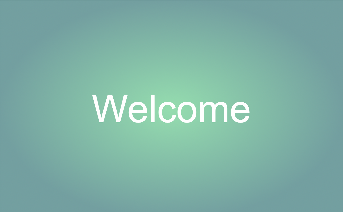
Remember that the amount of stop points can be different and they can be repeated using "repeating" property. Also the radius of the gradient can exceed the dimensions of the view itself this will allow to create some nice looking gradients.
The last type of the background gradient we'll discuss is a conic gradient.
To make one we've to use rui.NewBackgroundConicGradient() global function:
Go
view := rui.NewGridLayout(session, rui.Params{
    rui.Width:  rui.Percent(100),
    rui.Height: rui.Percent(100),
    // Setting background conic gradient
    rui.Background: rui.NewBackgroundConicGradient(rui.Params{
        rui.From:     rui.Deg(0),      // Starting from 0 angle
        rui.CenterX:  rui.Percent(50),
        rui.CenterY:  rui.Percent(50),
        rui.Gradient: "red,orange,yellow,green,skyblue,blue,purple,red", // Rainbow
    }),
    rui.CellVerticalAlign:   rui.CenterAlign,
    rui.CellHorizontalAlign: rui.CenterAlign,
    rui.Content: rui.NewTextView(session, rui.Params{
        rui.Text:      "Welcome",
        rui.TextColor: rui.White,
        rui.TextSize:  rui.Em(5),
    }),
})
Default starting point or 0 degree is facing up from the center of the gradient. The center point of the gradient can be placed anywhere we want including points which are outside of the view shape. This technique is perfect for creating visually appealing gradients in our designs.
In the resource description file, we can also define a conic gradient background for a view. For this purpose, a specific object in the following format should be utilized:
RUI
conic-gradient {
    center-x = <x>,                                           // Horizontal center point of the gradient
    center-y = <y>,                                           // Vertical center point of the gradient
    from = <angle>,                                           // Starting angle
    gradient = "<color>[ <position>][,<color>[ <position>]]", // An array of gradient stop points
    repeating = <boolval>,                                    // Repetition of stop points after the last one
}
, where <x>, <y>, and <position> are text representation of SizeUnit value type.
The <color> is a text representation of Color value type.
The <angle> is a starting point for the gradient and is a text representation of the AngleUnit value type.
Finally, <boolval> is a text representation of the boolean type which can hold the following values: "true", "yes", "on", "1", and "false", "no", "off", "0".
The <position> is an optional value when describing gradient stop points.
If it is not set then colors listed as a stop points will be evenly distributed along the circumference of the gradient.
Below is an example of the same conic gradient we made above but described in resource description file:
RUI
GridLayout {
    width = 100%,
    height = 100%,
    // Setting background conic gradient
    background = conic-gradient {
        from = 0deg, // Starting from 0 angle
        gradient = "red,orange,yellow,green,skyblue,blue,purple,red", // Rainbow
    },
    cell-vertical-align = center,
    cell-horizontal-align = center,
    content = TextView{
        text = Welcome,
        text-color = white,
        text-size = 5em,
    },
}
Here's what the gradient looks like:
Instead of setting the background appearance when creating a view, we can change it at any time using either the global rui.Set() function or the Set() method on the view object:
Go
view.Set(rui.Background, rui.NewBackgroundConicGradient(rui.Params{
    rui.From:     rui.Deg(0),
    rui.CenterX:  rui.Percent(50),
    rui.CenterY:  rui.Percent(50),
    rui.Gradient: "red,orange,yellow,green,skyblue,blue,purple,red",
}))
Even if the "background" property uses an array of BackgroundElement as its internal data type, we can still assign a single value, and it will be wrapped into an array automatically.
To read the current values of the "background" property, we can use the rui.GetBackground() global function, which will return an array of the BackgroundElement values.
Go
backgrounds := rui.GetBackground(view, "view-id")
for _, bgElement := range backgrounds {
    rui.DebugLogF("View has background of type %s\n", bgElement.Tag()) // Tag could be "image", "linear-gradient", "radial-gradient", and "conic-gradient"

    switch bgElement.Tag() {
    case "image":
        // Do something with the value
    case "linear-gradient", "radial-gradient", "conic-gradient":
        // Do something with the value
    }
}
The BackgroundElement itself also contains properties the values of which can be retrieved using the Get() method of that interface.
By default, the background extends to the outer edge of the border, but using the "background-clip" property, we can restrict this to other areas.
The property can contain one of the following values:
| Value | Name | Description |
|---|---|---|
BorderBox |
"border-box" | The background extends to the outer edge of the border(but below the border in z-order) |
PaddingBox |
"padding-box" | The background extends to the outer edge of the padding. No background is drawn below the border |
ContentBox |
"content-box" | The background is displayed inside of the content box |
When using rui.BorderBox as the background clip value, the background will conform to the shape of the view.
In this scenario, the border is drawn on top of the background, making it particularly noticeable when the border has a non-solid appearance.
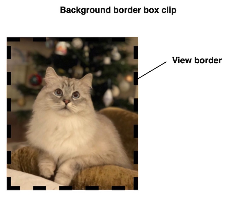
To exclude the border of the view from the background we can use the rui.PaddingBox value:
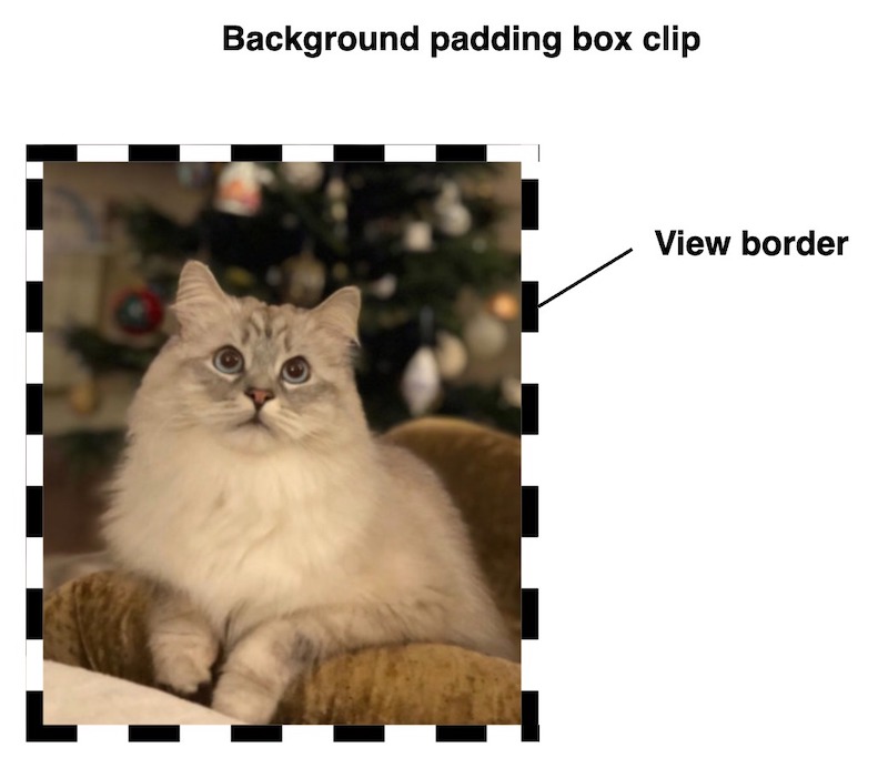
If this still does not meet our requirements, we can configure the background to appear only inside of the view content area by using the rui.ContentBox value:
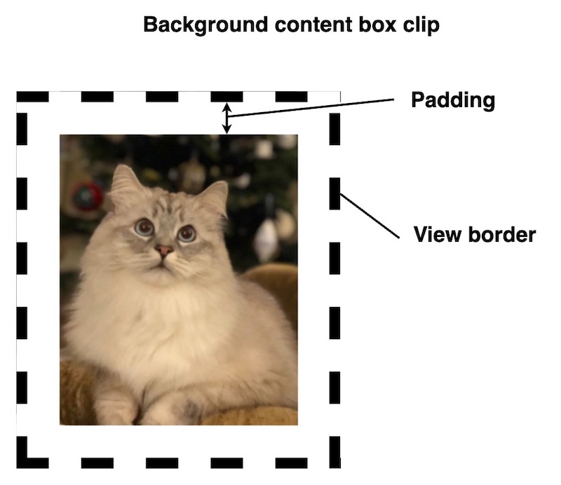
As any other property we can set it either during creation of the view(from resource file or code) and at runtime. Lets take a look at some examples.
Setting background clip property from code.
Go
if ok := view.Set(rui.BackgroundClip, rui.ContentBox); ok {
    // Success
}
Setting property from the resource file.
RUI
// View hierarchy
...
    // Setting view property
    background-clip = content-box,

// The rest of view hierarchy
...
To get back the value of the "background-clip" property we can use the rui.GetBackgroundClip() global function, which will return a numeric value of the constant.
Go
bgClip := rui.GetBackgroundClip(view, "view-id")

// Do something with the value
Besides the background clipping functionality we can control the origin point of the background, this is done by utilizing the "background-origin" property.
The property can contain one of the following values:
| Value | Name | Description |
|---|---|---|
BorderBox |
"none" | The background is positioned relative to the border box |
PaddingBox |
"solid" | The background is positioned relative to the padding box |
ContentBox |
"dashed" | The background is positioned relative to the content box |
When using rui.BorderBox as the background origin value, the background will be displayed starting from the shape of the view.
In this scenario, the border is drawn on top of the background, making it particularly noticeable when the border has a non-solid appearance.

To display the background starting from the internal border edge we can use the rui.PaddingBox value:
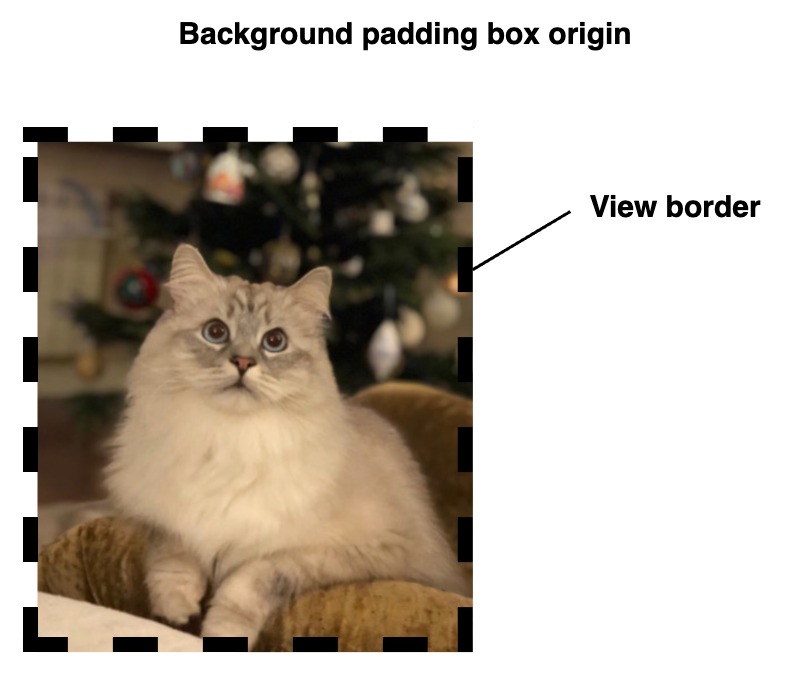
Depending on the requirements, we may wish to display the background starting from the content box.
For this purpose, the rui.ContentBox value is used:
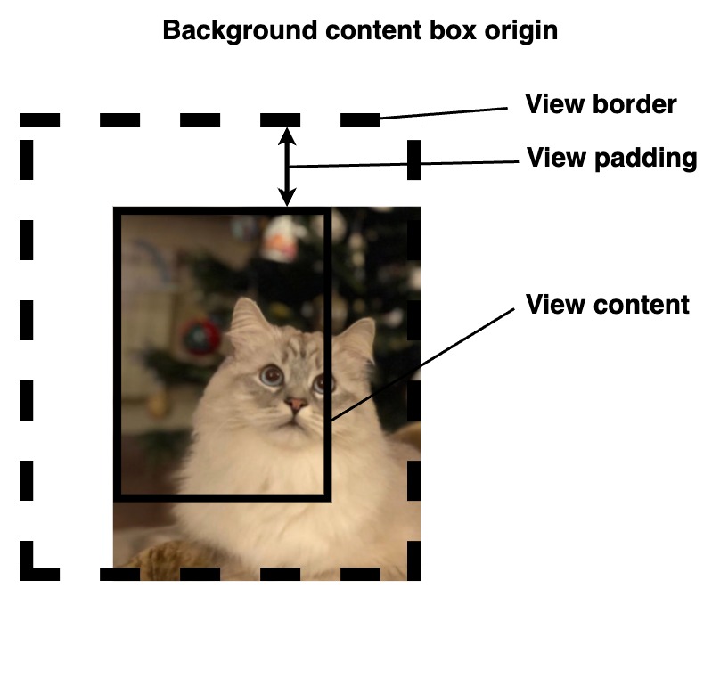
As any other property we can set it either during creation of the view(from resource file or code) and at runtime. Lets take a look at some examples.
Setting background origin property from code.
Go
if ok := view.Set(rui.BackgroundOrigin, rui.PaddingBox); ok {
    // Success
}
Setting property from the resource file.
RUI
// View hierarchy
...
    // Setting view property
    background-origin = padding-box,

// The rest of view hierarchy
...
To retrieve the value of the "background-origin" property we can use the rui.GetBackgroundOrigin() global function, which will return a numeric value of the constant.
Go
bgOrigin := rui.GetBackgroundOrigin(view, "view-id")

// Do something with the value
When dealing with multiple background layers we can set how they will be blended between each other.
For this purpose "background-blend-mode" property is used.
Each blending mode has its name and related integer constant, we can use either of them when setting this property.
To see all possible values of blending modes please check out the View's "background-blend-mode" property reference documentation.
To blend between background layers like color, image or gradient first we need to set them up. At least two background layers needs to be configured. It could be a background color with background image or gradient, or a few gradients, whatever suit your design.
As an example lets see how to combine two types of gradients:
Go
view := rui.NewGridLayout(session, rui.Params{
    rui.Width:               rui.Percent(100),
    rui.Height:              rui.Percent(100),
    rui.CellVerticalAlign:   rui.CenterAlign,
    rui.CellHorizontalAlign: rui.CenterAlign,
    // Setting background
    rui.Background: []rui.BackgroundElement{
        // Conic gradient with the center which is out of the view shape by -10%
        rui.NewBackgroundConicGradient(rui.Params{
            rui.CenterX:  rui.Percent(-10),
            rui.CenterY:  rui.Percent(-10),
            rui.From:     rui.Deg(45),
            rui.Gradient: "purple 0deg, blue 180deg, purple 360deg",
        }),
        // Radial gradient at the 0,0 (top left) point of the view shape
        rui.NewBackgroundRadialGradient(rui.Params{
            rui.CenterX:              rui.Percent(0),
            rui.CenterY:              rui.Percent(0),
            rui.Gradient:             "white,black",
            rui.RadialGradientRadius: rui.Percent(100),
        }),
    },
    // Multiply background layers
    rui.BackgroundBlendMode: rui.BlendMultiply,
    rui.Content: rui.NewTextView(session, rui.Params{
        rui.Text:      "Welcome",
        rui.TextColor: rui.White,
        rui.TextSize:  rui.Em(5),
    }),
})
For completeness lets make it in resource file as well.
RUI
GridLayout {
    width = 100%,
    height = 100%,
    // Setting background
    background = [
        conic-gradient {
            // Conic gradient with the center which is out of the view shape by -10%
            center-x = -10%,
            center-y = -10%,
            from = 45deg, // Starting from 45 degrees
            gradient = "purple 0deg, blue 180deg, purple 360deg",
        },
        // Radial gradient at the 0,0 (top left) point of the view shape
        radial-gradient {
            center-x = 0%,
            center-y = 0%,
            gradient = "white,black",
            radial-gradient-radius = 100%,
        },
    ],
    // Multiply background layers
    background-blend-mode = multiply,
    cell-vertical-align = center,
    cell-horizontal-align = center,
    content = TextView{
        text = Welcome,
        text-color = white,
        text-size = 5em,
    },
}
We can get an endless appealing results by mixing different types of gradients, below is a result of our example.
Lets have a look at some other variants of the backgrounds for inspiration.
Two linear gradients with multiply blending mode.
RUI
StackLayout {
    width = 100%,
    height = 100%,
    background = [
        linear-gradient {
            gradient = "#FF86BFB0 0px, #FF86BFB0 30px, #FFB7D9D1 30px, #FFB7D9D1 50px",
            direction = to-right,
            repeating = true,
        },
        linear-gradient {
            direction = to-bottom,
            gradient = "white,lightgray",
        },
    ],
    background-blend-mode = multiply,
}
Crossed linear gradients with multiply blending effect using similar patterns.
RUI
StackLayout {
    width = 100%,
    height = 100%,
    background = [
        linear-gradient {
            gradient = "#FF7A528E 0px, #FF7A528E 30px, #FFAE94B9 30px, #FFAE94B9 50px",
            direction = 45deg,
            repeating = true,
        },
        linear-gradient {
            gradient = "#FF7A528E 0px, #FF7A528E 30px, #FFAE94B9 30px, #FFAE94B9 50px",
            direction = -45deg,
            repeating = true,
        },
    ],
    background-blend-mode = multiply,
}
Notebook paper.
RUI
StackLayout {
    width = 100%,
    height = 100%,
    background = [
        image {
            src = "view_background_pattern.svg",
            repeat = repeat,
            width = 16px,
            height = 16px,
        },
        linear-gradient {
            direction = to-bottom,
            gradient = "#FFF3F3F3 0%, #FFF3F3F3 100%",
        },
    ],
    background-blend-mode = multiply,
}

Scrollable notebook paper.
RUI
ListLayout {
    width = 100%,
    height = 100%,
    orientation = up-down,
    padding = 1em,
    gap = 1em,
    background = [
        image {
            src = "view_background_pattern.svg",
            // Enable scrolling of the background with container's content
            attachment = local,
            repeat = repeat,
            width = 16px,
            height = 16px,
        },
        linear-gradient {
            direction = to-bottom,
            gradient = "#FFF3F3F3 0%, #FFF3F3F3 100%",
        },
    ],
    background-blend-mode = multiply,
    content = [
        // Some random data
        "93.246.72.48",
        "122.118.251.78",
        "21.98.71.230",
        "234.138.136.150",
        "46.102.90.241",
        "141.44.97.63",
        "64.240.172.86",
        "129.45.115.237",
        "65.123.121.130",
        "176.224.76.179",
    ]
}
View blending
Besides mixing different background layers of the view which we've covered in our View background section we can control how the view's content blends with its background and other elements behind it. This is done by the "mix-blend-mode" property of the view.
| Property | Type | Description |
|---|---|---|
| "mix-blend-mode" | int |
Blending mode between view content(including background) and parent view |
The property holds the type of blending to apply between views. Keep in mind that blending can have performance implications, especially for complex graphics or large numbers of overlapping views, so use it judiciously.
Below is the list of all possible blending modes which we can apply.
| Value | Name | Description |
|---|---|---|
BlendNormal |
"normal" | The final color is the top color, regardless of what the bottom color is. The effect is like two opaque pieces of paper overlapping |
BlendMultiply |
"multiply" | The final color is the result of multiplying the top and bottom colors. A black layer leads to a black final layer, and a white layer leads to no change. The effect is like two images printed on transparent film overlapping |
BlendScreen |
"screen" | The final color is the result of inverting the colors, multiplying them, and inverting that value. A black layer leads to no change, and a white layer leads to a white final layer. The effect is like two images shone onto a projection screen |
BlendOverlay |
"overlay" | The final color is the result of multiply if the bottom color is darker, or screen if the bottom color is lighter. This blend mode is equivalent to hard-light but with the layers swapped |
BlendDarken |
"darken" | The final color is composed of the darkest values of each color channel |
BlendLighten |
"lighten" | The final color is composed of the lightest values of each color channel |
BlendColorDodge |
"color-dodge" | The final color is the result of dividing the bottom color by the inverse of the top color. A black foreground leads to no change. A foreground with the inverse color of the backdrop leads to a fully lit color. This blend mode is similar to screen, but the foreground need only be as light as the inverse of the backdrop to create a fully lit color |
BlendColorBurn |
"color-burn" | The final color is the result of inverting the bottom color, dividing the value by the top color, and inverting that value. A white foreground leads to no change. A foreground with the inverse color of the backdrop leads to a black final image. This blend mode is similar to multiply, but the foreground need only be as dark as the inverse of the backdrop to make the final image black |
BlendHardLight |
"hard-light" | The final color is the result of multiply if the top color is darker, or screen if the top color is lighter. This blend mode is equivalent to overlay but with the layers swapped. The effect is similar to shining a harsh spotlight on the backdrop |
BlendSoftLight |
"soft-light" | The final color is similar to hard-light, but softer. This blend mode behaves similar to hard-light. The effect is similar to shining a diffused spotlight on the backdrop |
BlendDifference |
"difference" | The final color is the result of subtracting the darker of the two colors from the lighter one. A black layer has no effect, while a white layer inverts the other layer's color |
BlendExclusion |
"exclusion" | The final color is similar to difference, but with less contrast. As with difference, a black layer has no effect, while a white layer inverts the other layer's color |
BlendHue |
"hue" | The final color has the hue of the top color, while using the saturation and luminosity of the bottom color |
BlendSaturation |
"saturation" | The final color has the saturation of the top color, while using the hue and luminosity of the bottom color. A pure gray backdrop, having no saturation, will have no effect |
BlendColor |
"color" | The final color has the hue and saturation of the top color, while using the luminosity of the bottom color. The effect preserves gray levels and can be used to colorize the foreground |
BlendLuminosity |
"luminosity" | The final color has the luminosity of the top color, while using the hue and saturation of the bottom color. This blend mode is equivalent to BlendColor, but with the layers swapped |
Lets have a look at a simple example where we've a few controls and configure mix blending mode for them.
RUI
GridLayout {
    width = 100%,
    height = 100%,
    cell-vertical-align = center,
    cell-horizontal-align = center,
    background-color = peachpuff,
    content = ListLayout {
        content = [
            EditView {
                radius = 4px,
                // Mixing with parent
                mix-blend-mode = multiply,
            },
            Button {
                content = Search,
                // Mixing with parent
                mix-blend-mode = multiply,
            }
        ]
    }
}
Go
view := rui.NewGridLayout(session, rui.Params{
    rui.Width:               rui.Percent(100),
    rui.Height:              rui.Percent(100),
    rui.CellHorizontalAlign: rui.CenterAlign,
    rui.CellVerticalAlign:   rui.CenterAlign,
    rui.BackgroundColor:     rui.PeachPuff,
    rui.Content: rui.NewListLayout(session, rui.Params{
        rui.Content: []rui.View{
            rui.NewEditView(session, rui.Params{
                rui.Radius: rui.Px(4),
                // Mixing with parent
                rui.MixBlendMode: rui.BlendMultiply,
            }),
            rui.NewButton(session, rui.Params{
                rui.Content: "Search",
                // Mixing with parent
                rui.MixBlendMode: rui.BlendMultiply,
            }),
        },
    }),
})
Here is how the mix blending mode multiply works, as illustrated in the following image.
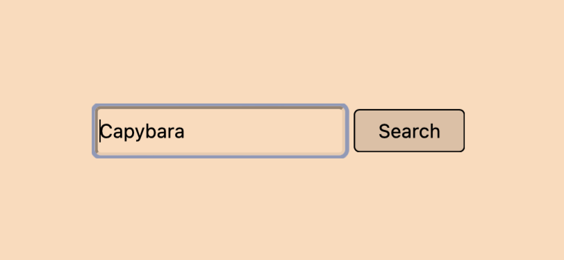
We can manipulate that property at any time we want using the Set() method of the view object or using a similar global function.
If someone would like to query the current value of that property we can use a convenient rui.GetMixBlendMode() global function or a well known rui.Get() or Get() method of the view object using rui.MixBlendMode as a property name.
Go
blendMode := rui.GetMixBlendMode(rootView, "view-id")
// Do something with the value
View clipping
Often to fit a particular UI design it is not enough to have views with a regular shapes. Library provides the ability to define a specific visible area of the view, allowing us to create complex shapes or crop views. It works by defining a clipping region using "clip" property that limits the rendering of the views's content.
| Property | Type | Description |
|---|---|---|
| "clip" | ClipShapeProperty |
Clipping region |
The value of the property is a ClipShapeProperty interface.
Lets have a look at different types of clip shapes supported by the library and how to define them.
Inset clip
An inset clip defines a rectangle that clips the content, leaving a margin between the actual view borders and the clip region. Optionally, we can define a radius for the corners.
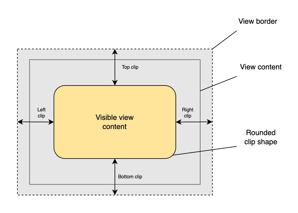
To create an inset clip shape we can use a global rui.NewInsetClip() function:
Go
func NewInsetClip(top, right, bottom, left SizeUnit, radius RadiusProperty) ClipShapeProperty
To get more information on RadiusProperty please check the View radius section of this tutorial.
Here is an example of how we can make an inset clip from the source code:
Go
view := rui.NewImageView(session, rui.Params{
    rui.Width:  rui.Px(128),
    rui.Height: rui.Px(128),
    rui.Fit:    rui.CoverFit,
    rui.Source: "avatar.png",
    rui.Clip: rui.NewInsetClip(
        rui.Percent(5), // top
        rui.Percent(5), // right
        rui.Percent(5), // bottom
        rui.Percent(5), // left
        rui.NewRadiusProperty(rui.Params{
            rui.X: rui.Percent(10), // radius-x
            rui.Y: rui.Percent(10), // radius-y
        }),
    ),
})
The inset clip can also be configured in resource description file. For this a special object format is used:
inset {
    left = <value>,
    top = <value>,
    right = <value>,
    bottom = <value>,
    radius = <value> | <RadiusProperty>,
}
where <value> is a text representation of the SizeUnit type.
The "radius" property also can contain text representation of the RadiusProperty type, you can find it in View radius section of this tutorial.
Below is an example of how we can define a clip shape for the avatar image using a resource description file.
RUI
ImageView {
    width = 128px,
    height = 128px,
    fit = cover,
    src = "avatar.png",
    clip = inset {    // Setting inset clip
        left = 5%,
        top = 5%,
        right = 5%,
        bottom = 5%,
        radius = _{   // Text representation of the RadiusProperty
            x = 10%,
            y = 10%,
        },
    }
}
Here is how the result of the above code may look like:

Circle clip
The circle clip creates a circular clipping region with a radius and the center coordinates.
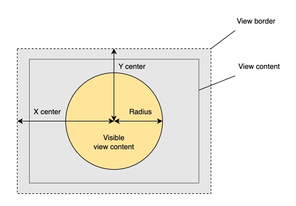
To create a circle clip shape we can use a global NewCircleClip() function:
Go
func NewCircleClip(x, y, radius SizeUnit) ClipShapeProperty
Here is an example of how we can make a circle clip from the source code:
Go
view := rui.NewImageView(session, rui.Params{
    rui.Width:  rui.Px(128),
    rui.Height: rui.Px(128),
    rui.Fit:    rui.CoverFit,
    rui.Source: "avatar.png",
    rui.Clip: rui.NewCircleClip(
        rui.Percent(50), // x
        rui.Percent(50), // y
        rui.Percent(45), // radius
    ),
})
The circle clip can also be configured in resource description file. For this a special object format is used:
circle {
    x = <value>,
    y = <value>,
    radius = <value>,
}
where <value> is a text representation of the SizeUnit type.
Notice that the "radius" property accept only the values of the SizeUnit type.
Below is an example of how we can define a clip shape for the avatar image using a resource description file.
RUI
ImageView {
    width = 128px,
    height = 128px,
    fit = cover,
    src = "avatar.png",
    clip = circle {    // Setting circle clip
        x = 50%,
        y = 50%,
        radius = 45%,
    }
}
Here is how the result of the above code may look like:

Ellipse clip
The ellipse clip creates an elliptical clipping region with specified horizontal and vertical radii, as well as center coordinates.
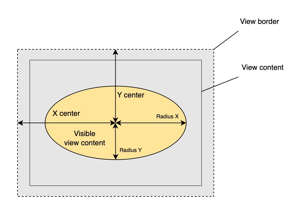
To create an elliptical clipping shape we can use a global rui.NewEllipseClip() function:
Go
func NewEllipseClip(x, y, rx, ry SizeUnit) ClipShapeProperty
Here is an example of how we can define an elliptical clipping shape in the source code:
Go
view := rui.NewImageView(session, rui.Params{
    rui.Width:  rui.Px(128),
    rui.Height: rui.Px(128),
    rui.Fit:    rui.CoverFit,
    rui.Source: "avatar.png",
    rui.Clip: rui.NewEllipseClip(
        rui.Percent(50), // x
        rui.Percent(50), // y
        rui.Percent(40), // rx
        rui.Percent(45), // ry
    ),
})
The elliptical clip can also be configured in resource description file. For this a special object format is used:
ellipse {
    x = <value>,
    y = <value>,
    radius-x = <value>,
    radius-y = <value>,
}
where <value> is a text representation of the SizeUnit type.
Below is an example of how we can define a clip shape for the avatar image using a resource description file.
RUI
ImageView {
    width = 128px,
    height = 128px,
    fit = cover,
    src = "avatar.png",
    clip = ellipse {    // Setting elliptical clip
        x = 50%,
        y = 50%,
        radius-x = 40%,
        radius-y = 45%,
    }
}
Here is how the result of the above code may look like:

Polygon clip
The polygon clip establishes a clipping region shaped as a polygon, using specified coordinate points.
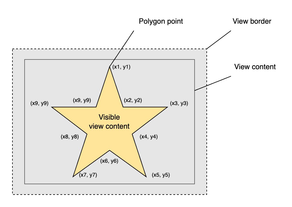
To create a polygon clipping shape we can use a following global functions:
Go
func NewPolygonClip(points []any) ClipShapeProperty
func NewPolygonPointsClip(points []SizeUnit) ClipShapeProperty
where "points" is an array of point coordinates in the format: x1, y1, x2, y2 ...
The NewPolygonClip() function can accept point coordinates in different types.
They could be names of constants, text representation of the SizeUnit type, or SizeUnit type itself.
Here is an example of how we can define a start polygon clipping shape in the source code:
Go
view := rui.NewImageView(session, rui.Params{
    rui.Width:  rui.Px(128),
    rui.Height: rui.Px(128),
    rui.Fit:    rui.CoverFit,
    rui.Source: "avatar.png",
    rui.Clip: rui.NewPolygonPointsClip( // Setting polygon clip
        []rui.SizeUnit{
            rui.Percent(50), rui.Percent(0), // Point 1
            rui.Percent(70), rui.Percent(25), // Point 2
            rui.Percent(100), rui.Percent(38), // Point 3
            rui.Percent(83), rui.Percent(67), // Point 4
            rui.Percent(80), rui.Percent(100), // Point 5
            rui.Percent(50), rui.Percent(92), // Point 6
            rui.Percent(19), rui.Percent(100), // Point 7
            rui.Percent(16), rui.Percent(67), // Point 8
            rui.Percent(0), rui.Percent(38), // Point 9
            rui.Percent(30), rui.Percent(26), // Point 10
        },
    ),
})
The polygon clip can also be configured in resource description file. For this a special object format is used:
polygon {
    points = "x1, y1, x2, y2, ..., xn, yn",
}
where x1, x2, ..., xn and y1, y2, ..., yn are the polygon point coordinate values in the form of the text representation of SizeUnit type.
Below is an example demonstrating how to define a clip shape for an avatar image using a resource description file.
RUI
ImageView {
    width = 128px,
    height = 128px,
    fit = cover,
    src = "avatar.png",
    clip = polygon {    // Setting polygon clip
        points = "50%, 0%, 70%, 25%, 100%, 38%, 83%, 67%, 80%, 100%, 50%, 92%, 19%, 100%, 16%, 67%, 0%, 38%, 30%, 26%",
    }
}
Here is how the result of the above code may look like:

Updating clip shape properties
To retrieve the clip shape of the view a global function rui.GetClip() is used:
Go
func GetClip(view View, subviewID ...string) ClipShapeProperty
The ClipShapeProperty interface inherit the Properties interface which allows us to manipulate the properties of already constructed clip shape.
For this we can use Get() and Set() methods.
Below is the list of properties we can work with:
| Property | Type | Applicability | Description |
|---|---|---|---|
| "left" | SizeUnit |
Inset clip shape | Left border position |
| "top" | SizeUnit |
Inset clip shape | Top border position |
| "right" | SizeUnit |
Inset clip shape | Right border position |
| "bottom" | SizeUnit |
Inset clip shape | Bottom border position |
| "radius" | SizeUnit |
Inset and circle clip shapes | The radius of the corners of the inset clip shape or the radius of the circle clip shape |
| "x" | SizeUnit |
Circle and ellipse clip shape | Horizontal center position of the clip shape |
| "y" | SizeUnit |
Circle and ellipse clip shape | Vertical center position of the clip shape |
| "radius-x" | SizeUnit |
Ellipse clip shape | Horizontal radius of elliptic clip shape |
| "radius-y" | SizeUnit |
Ellipse clip shape | Vertical radius of elliptic clip shape |
An example which demonstrate how to update the circle clip shape properties at runtime:
Go
if clipShape := rui.GetClip(view, "view-id"); clipShape != nil {
    if !clipShape.Set(rui.Radius, rui.Percent(30)) {
        // Something went wrong
    }
}
The clip shape can also be constructed by the rui.NewClipShapeProperty() global function, which might be convenient for some users.
It utilizes the rui.Params type that accepts all listed above properties for the specific clip shape type.
Go
view := rui.NewImageView(session, rui.Params{
    rui.Width:  rui.Px(128),
    rui.Height: rui.Px(128),
    rui.Fit:    rui.CoverFit,
    rui.Source: "avatar.png",
    rui.Clip: rui.NewClipShapeProperty(
        rui.EllipseClip, // Ellipse clip shape type
        rui.Params{
            rui.X:       rui.Percent(50), // Center point x-coordinate
            rui.Y:       rui.Percent(50), // Center point y-coordinate
            rui.RadiusX: rui.Percent(40), // x-radius
            rui.RadiusY: rui.Percent(45), // y-radius
        }),
})
The first parameter of the rui.NewClipShapeProperty() function has a ClipShape type which accepts the following values: rui.InsetClip, rui.CircleClip, rui.EllipseClip, and rui.PolygonClip.
Be careful when setting properties using that function because some of them are valid only for specific types of the clip shapes.
To get back the type of the clip shape we can use the Shape() method of the ClipShapeProperty interface:
Go
if clipShape := rui.GetClip(view, "view-id"); clipShape != nil {
    shapeType := clipShape.Shape()
    // Do something with the value
}
View masking
Besides the view clipping functionality provided by the library there is another approach for creating a visually complex designs where precise control over a view's content visibility is required. We call it view masking. It allows us to reveal or hide parts of a view based on the transparency or opacity of a specified mask image or gradient. This can be particularly useful for applying intricate clipping paths, creating fade effects, or overlaying images with custom shapes. The alpha channel of an image or gradient is used for masking the view. Below are the list of properties used to control the mask behavior.
| Property | Type | Description |
|---|---|---|
| "mask" | []BackgroundElement |
Image or gradient which are used as a view mask |
| "mask-clip" | int |
Specifies the painting area for the mask |
| "mask-origin" | int |
Specifies the origin area from which the mask will be applied |
Internally, the "mask" property holds an array of BackgroundElement values, each of which is described in the same way as outlined in the View background section.
Let's have a look at the example where radial gradient is used to create a view mask.
RUI
GridLayout {
    width = 10em,
    height = 10em,
    padding = 1em,
    cell-vertical-align = center,
    cell-horizontal-align = center,
    content = ImageView {
        width = 100%,
        height = 100%,
        image-horizontal-align = center,
        image-vertical-align = center,
        src = avatar.jpg,
        fit = contain,
        // Setting view mask
        mask = radial-gradient {
            gradient = "#FF000000 0%, #FF000000 40%, #00000000 50%"
        },
    }
}
Go
view := rui.NewGridLayout(session, rui.Params{
    rui.Width:               rui.Em(10),
    rui.Height:              rui.Em(10),
    rui.Padding:             rui.Em(1),
    rui.CellVerticalAlign:   rui.CenterAlign,
    rui.CellHorizontalAlign: rui.CenterAlign,
    rui.Content: rui.NewImageView(session, rui.Params{
        rui.Width:                rui.Percent(100),
        rui.Height:               rui.Percent(100),
        rui.ImageHorizontalAlign: rui.CenterAlign,
        rui.ImageVerticalAlign:   rui.CenterAlign,
        rui.Source:               "avatar.jpg",
        rui.Fit:                  rui.ContainFit,
        // Setting view mask
        rui.Mask: rui.NewBackgroundRadialGradient(rui.Params{
            rui.Gradient: "#FF000000 0%, #FF000000 40%, #00000000 50%",
        }),
    }),
})
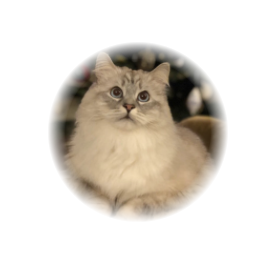
As mentioned earlier view mask can be any type of the gradient or an image, lets see how to define them and what will be the results based on avatar image we've used earlier.
Linear gradient mask.
RUI
GridLayout {
    width = 10em,
    height = 10em,
    padding = 1em,
    cell-vertical-align = center,
    cell-horizontal-align = center,
    content = ImageView {
        width = 100%,
        height = 100%,
        image-horizontal-align = center,
        image-vertical-align = center,
        src = avatar.jpg,
        fit = contain,
        // Setting view mask
        mask = linear-gradient {
            gradient = "#FF000000 0%, #FF000000 70%, #00000000 100%",
        },
    }
}
Go
view := rui.NewGridLayout(session, rui.Params{
    rui.Width:               rui.Em(10),
    rui.Height:              rui.Em(10),
    rui.Padding:             rui.Em(1),
    rui.CellVerticalAlign:   rui.CenterAlign,
    rui.CellHorizontalAlign: rui.CenterAlign,
    rui.Content: rui.NewImageView(session, rui.Params{
        rui.Width:                rui.Percent(100),
        rui.Height:               rui.Percent(100),
        rui.ImageHorizontalAlign: rui.CenterAlign,
        rui.ImageVerticalAlign:   rui.CenterAlign,
        rui.Source:               "avatar.jpg",
        rui.Fit:                  rui.ContainFit,
        // Setting view mask
        rui.Mask: rui.NewBackgroundLinearGradient(rui.Params{
            rui.Gradient: "#FF000000 0%, #FF000000 70%, #00000000 100%",
        }),
    }),
})
An image used as a mask.
RUI
GridLayout {
    width = 10em,
    height = 10em,
    padding = 1em,
    cell-vertical-align = center,
    cell-horizontal-align = center,
    content = ImageView {
        width = 100%,
        height = 100%,
        image-horizontal-align = center,
        image-vertical-align = center,
        src = avatar3.jpg,
        fit = contain,
        // Setting view mask
        mask = image {
            width = 100%,
            height = 100%,
            fit = contain,
            src = mask.svg,
        },
    }
}
Go
view := rui.NewGridLayout(session, rui.Params{
    rui.Width:               rui.Em(10),
    rui.Height:              rui.Em(10),
    rui.Padding:             rui.Em(1),
    rui.CellVerticalAlign:   rui.CenterAlign,
    rui.CellHorizontalAlign: rui.CenterAlign,
    rui.Content: rui.NewImageView(session, rui.Params{
        rui.Width:                rui.Percent(100),
        rui.Height:               rui.Percent(100),
        rui.ImageHorizontalAlign: rui.CenterAlign,
        rui.ImageVerticalAlign:   rui.CenterAlign,
        rui.Source:               "avatar3.jpg",
        rui.Fit:                  rui.ContainFit,
        // Setting view mask
        rui.Mask: rui.NewBackgroundImage(rui.Params{
            rui.Width:  rui.Percent(100),
            rui.Height: rui.Percent(100),
            rui.Fit:    rui.ContainFit,
            rui.Source: "mask.svg",
        }),
    }),
})
To retrieve the values of the "mask" property we can use the rui.GetMask() global function, which will return an array of the BackgroundElement values.
Go
masks := rui.GetMask(view, "view-id")
for _, mask := range masks {
    rui.DebugLogF("View has a mask of type %s\n", mask.Tag()) // Tag could be "image", "linear-gradient", "radial-gradient", and "conic-gradient"

    switch mask.Tag() {
    case "image":
        // Do something with the value
    case "linear-gradient", "radial-gradient", "conic-gradient":
        // Do something with the value
    }
}
The BackgroundElement itself also contains properties the values of which can be retrieved using the Get() method of that interface.
By default, the mask extends to the outer edge of the border, but using the "mask-clip" property, we can restrict this to other areas.
The property can contain one of the following values:
| Value | Name | Description |
|---|---|---|
BorderBox |
"border-box" | The mask extends to the outer edge of the border(but below the border in z-order) |
PaddingBox |
"padding-box" | The mask extends to the outer edge of the padding |
ContentBox |
"content-box" | The mask is restricted to the content box area |
When using rui.BorderBox as the mak clip value, the mask will conform to the shape of the view.
To exclude the border of the view from the mask we can use the rui.PaddingBox value.
Also we can configure the mask to appear only inside the view content area by using the rui.ContentBox value.
As any other property we can set the "mask-clip" property either during creation of the view(from resource file or code) and at runtime. Lets take a look at a few examples.
Setting mask clip property from code.
Go
if ok := view.Set(rui.MaskClip, rui.ContentBox); ok {
    // Success
}
Setting property from the resource file.
RUI
// View hierarchy
...
    // Setting view property
    mask-clip = content-box,

// The rest of view hierarchy
...
To retrieve the value of the "mask-clip" property we can use the rui.GetMaskClip() global function, which will return a numeric value of the constant.
Go
maskClip := rui.GetMaskClip(view, "view-id")

// Do something with the value
Besides the mask clipping functionality we can control the origin point of the mask, this is done by utilizing the "mask-origin" property.
The property can contain one of the following values:
| Value | Name | Description |
|---|---|---|
BorderBox |
"none" | The mask is positioned relative to the border box |
PaddingBox |
"solid" | The mask is positioned relative to the padding box |
ContentBox |
"dashed" | The mask is positioned relative to the content box |
When using the rui.BorderBox as the mask origin value, the mask will be applied starting from the shape of the view.
To apply the mask starting from the internal border edge we can use the rui.PaddingBox value.
Depending on the requirements, we may wish to apply the mask starting from the content box.
For this purpose, the rui.ContentBox value is used.
As any other property we can set the "mask-origin" property either during creation of the view(from resource file or code) and at runtime. Lets take a look at a few examples.
Setting mask origin property from code.
Go
if ok := view.Set(rui.MaskOrigin, rui.PaddingBox); ok {
    // Success
}
Setting property from the resource file.
RUI
// View hierarchy
...
    // Setting view property
    mask-origin = padding-box,

// The rest of view hierarchy
...
To retrieve the value of the "mask-origin" property we can use the rui.GetMaskOrigin() global function, which will return a numeric value of the constant.
Go
maskOrigin := rui.GetMaskOrigin(view, "view-id")

// Do something with the value
View opacity
To enhance accessibility, create dimming effects, visually appealing transitions and hover effects, or improve user interaction, we can use the "opacity" property. It's value is in range from 0 to 100 percent, where 0% means that the view is fully transparent.
| Property | Type | Description |
|---|---|---|
| "opacity" | float |
Degree of the view opacity |
As an example to demonstrate this property lets have a look at the login screen of the application where input fields for the user name and password will be semi-transparent. We'll first implement it using the Golang and then show how to use that property in the resource file.
Go
view := rui.NewGridLayout(session, rui.Params{
    rui.Width:               rui.Percent(100),
    rui.Height:              rui.Percent(100),
    rui.CellVerticalAlign:   rui.CenterAlign,
    rui.CellHorizontalAlign: rui.CenterAlign,
    rui.Background: rui.NewBackgroundImage(rui.Params{
        rui.Source: "background.jpg",
        rui.Fit:    rui.CoverFit,
    }),
    rui.Content: rui.NewListLayout(session, rui.Params{
        rui.Orientation: rui.TopDownOrientation,
        rui.Opacity:     0.8, // Setting an opacity of the view
        rui.Content: []rui.View{
            rui.NewEditView(session, rui.Params{
                rui.Radius: rui.Em(1),
                rui.Hint:   "Username",
            }),
            rui.NewEditView(session, rui.Params{
                rui.Radius:       rui.Em(1),
                rui.Hint:         "Password",
                rui.EditViewType: rui.PasswordText,
            }),
        },
    }),
})
When describing "opacity" property in resource description file we can use either string representation of the float or integer type.
Below is the same login view but created in resources:
RUI
GridLayout {
    width = 100%,
    height = 100%,
    background = image {
        src = "background.jpg",
        fit = cover,
    },
    cell-vertical-align = center,
    cell-horizontal-align = center,
    content = ListLayout {
        opacity = 0.8, // Setting an opacity of the view
        gap = 0.5em,
        orientation = up-down,
        content = [
            EditView {
                radius = 1em,
                hint = "Username",
            },
            EditView {
                radius = 1em,
                hint = "Password",
                edit-view-type = "password",
            }
        ]
    }
}
Depending on the browser we ran our application on the results may be different but here is the variant where we ran it in Safari:
The library has a convenient global function of getting back the value of the view opacity called GetOpacity().
Go
opacity := rui.GetOpacity(rootView, "view-id")
// Do something with the value
To get more information on how to work with view properties please check Property System tutorial.
View visibility
There are many cases where we need to hide some non-relevant views from the application page like error messages, menu or list items, loading indicators, collapsible sections, conditional content display and more. For this purpose each view has a property called "visibility".
| Property | Type | Description |
|---|---|---|
| "visibility" | int |
The view visibility status |
That property has only three possible values:
0- The view is visible1- The view is invisible but still take up space2- The view is not visible and does not take up any space
The library has a dedicated constants for these values which are rui.Visible, rui.Invisible, and rui.Gone.
When describing user interface in resource files we must use the following corresponding text constants: visible, invisible, and gone.
The best way to retrieve the value of that property is to use the global GetVisibility() function.
To demonstrate that property lets create a login page with error message which will be displayed when wrong credentials will be supplied. In first part we describe our UI structure in "mainView.rui" resource description file, this will be our root window of the application:
RUI
GridLayout {
    width = 100%,
    height = 100%,
    background = image {
        src = "background.jpg",
        fit = cover,
    },
    cell-vertical-align = center,
    cell-horizontal-align = center,
    content = ListLayout {
        gap = 0.5em,
        orientation = up-down,
        content = [
            EditView {
                id = "user-name",
                radius = 1em,
                hint = "Username",
                opacity = 0.8,
            },
            EditView {
                id = "user-pwd",
                radius = 1em,
                hint = "Password",
                edit-view-type = "password",
                opacity = 0.8,
            },
            TextView {
                id = "error-msg",
                text = "Please check your username and password.",
                text-color = red,
                visibility = invisible,
            },
            Button {
                width = 5em,
                id = "login-btn",
                content = "Login",
            }
        ]
    }
}
Then we have to construct our root view when user opens our application page and setup event handlers. Remember that event handlers can only be assigned in the source code.
Go
// Creation of the root view for the session
func (app *appSession) CreateRootView(session rui.Session) rui.View {
    rootView := rui.CreateViewFromResources(session, "mainView")

    // Setting text changed event handler
    if view := rui.ViewByID(rooView, "user-name"); view != nil {
        view.Set(rui.EditTextChangedEvent, credentialsChangedEvent)
    }

    // Setting text changed event handler
    if view := rui.ViewByID(rooView, "user-pwd"); view != nil {
        view.Set(rui.EditTextChangedEvent, credentialsChangedEvent)
    }

    // Setting login button clicked event handler
    if view := rui.ViewByID(rooView, "login-btn"); view != nil {
        view.Set(rui.ClickEvent, loginClickedEvent)
    }

    return rootView
}
And finally define our event handlers.
Go
// Handler of the text changes in user name and password edit views
func credentialsChangedEvent(editView rui.EditView, newText, oldText string) {
    // Getting the root view of the session
    rootView := editView.Session().RootView()

    // Hide error message if user changed credentials text
    if errMsgView := rui.ViewByID(rootView, "error-msg"); errMsgView != nil {
        if rui.GetVisibility(errMsgView, "") == rui.Visible {
            errMsgView.Set(rui.Visibility, rui.Invisible)
        }
    }
}

// Handler for login button
func loginClickedEvent(view rui.View, event rui.MouseEvent) {
    // Getting the root view of the session
    rootView := view.Session().RootView()

    // Get user name and password
    userName := rui.GetText(rootView, "user-name")
    userPassword := rui.GetText(rootView, "user-pwd")

    // Show error message if credentials are not valid
    if !credentialsValid(userName, userPassword) {
        if errMsgView := rui.ViewByID(rootView, "error-msg"); errMsgView != nil {
            if rui.GetVisibility(errMsgView, "") != rui.Visible {
                errMsgView.Set(rui.Visibility, rui.Visible)
            }
        }
    }

    // Proceed further
}

// Logic for credentials verification
func credentialsValid(userName string, userPassword string) bool {
    return false
}
When we launch that application and open its page an error message will not be shown initially:
But when start playing with input fields and press login button it will appear. Every time we'll update our credentials error message will be hidden but still occupy the space:
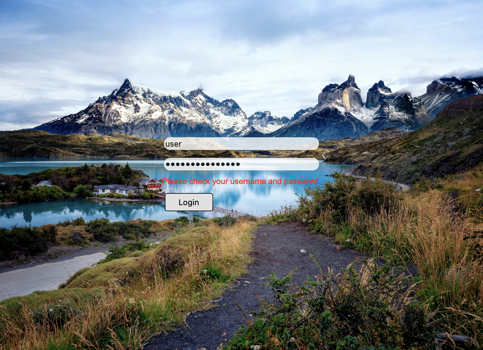
View effects
Accent color
If working with themes to customize appearance of controls is an overhead we can use an accent color which is an easiest way of customizing controls to match our brand colors. It can be useful as well in cases when we need to enhance the visual feedback of user interactions, making the interface more engaging and improve contrast and visibility for users with disabilities by using high-contrast colors. Accent color usually affect appearance of standard controls like checkboxes, progress bars, drop down lists etc. It sets an accent color of the controls and controlled by the "accent-color" property:
| Property | Type | Description |
|---|---|---|
| "accent-color" | Color |
The accent color |
The property holds the values of the Color type and accept color constants and text representation of the colors.
Example of setting the property from the source code:
Go
view := rui.NewProgressBar(session, rui.Params{
    rui.ProgressBarValue: 0.7,
    rui.AccentColor:      rui.Red, // Red color constant
})
When setting that property in resource description file we can use color constants and color text representations:
RUI
ProgressBar {
    value = 0.7,
    accent-color = red, // Red color constant
}
using color text representation:
RUI
ProgressBar {
    value = 0.7,
    accent-color = "#FF0000", // Red color
}
Below is how the defined progress bar will look like.

The convenient way of getting back the value of the "accent-color" property is to use a global GetAccentColor() function:
Go
color := rui.GetAccentColor(view, "view-id")
// Do something with the value
We can find more information on how to apply a different color to that property by checking Color type in our reference manual.
Filter and backdrop filter
To make our user interface more appealing we can use several filter effects. These effects can be applied to the content of the view or to the content behind the view. Filter effects are good when we need to apply some blur, change brightness, contrast and more. We can set filter effects using "filter" and "backdrop-filter" properties:
| Property | Type | Description |
|---|---|---|
| "filter" | FilterProperty |
View content filter settings |
| "backdrop-filter" | FilterProperty |
Backdrop view filter settings |
Both properties hold the value of the FilterProperty type which is an interface.
That type inherit Properties interface which allows us to set and get specific filter properties:
| Property | Type | Description |
|---|---|---|
| "blur" | float |
Content blur amount |
| "brightness" | float |
Brightness of the content |
| "contrast" | float |
Contrast of the content |
| "drop-shadow" | []ShadowProperty |
Content shadow effects |
| "grayscale" | float |
Content grayscaling |
| "hue-rotate" | AngleUnit |
Content hue rotation |
| "invert" | float |
Content colors inversion |
| "opacity" | float |
Content opacity |
| "saturate" | float |
Content saturation |
| "sepia" | float |
Content sepia effect |
To create an instance of the FilterProperty interface a global function rui.NewFilterProperty() is used:
Go
func NewFilterProperty(params Params) FilterProperty
To get more information on how to work with "drop-shadow" nested property follow the information in View shadow section or ShadowProperty reference documentation.
When dealing with these properties in resource description file an object of specific format is used:
RUI
filter {
    blur = <value>,
    brightness = <value>,
    contrast = <value>,
    grayscale = <value>,
    hue-rotate = <angle-value>,
    invert = <value>,
    opacity = <value>,
    saturate = <value>,
    sepia = <value>,
    drop-shadow = _{
        blur = <value>,
        color = <color-value>,
        inset = <bool-value>,
        spread-radius = <size-value>,
        x-offset = <size-value>,
        y-offset = <size-value>,
    },
}
where <value> is the string representation of the float type, <angle-value> - string representation of the AngleUnit type, <color-value> is a string representation of the Color type, and <size-value> - string representation of the SizeUnit type.
We can get more information on these types in Reference documentation.
Now lets have a look at some examples of the "backdrop-filter" property to compare different effects:
RUI
ListLayout {
    width = 600px,
    height = 200px,
    padding = 20px,
    gap = 20px,
    background = image {
        src = background.jpg,
        fit = cover,
    },
    content = [
        TextView {
            width = 160px,
            height = 160px,
            text = "Blur 2px",
            border = _ {
                style = solid,
                width = 1px,
                color = white,
            },
            backdrop-filter = filter {
                blur = 2,
            }
        },
        TextView {
            width = 160px,
            height = 160px,
            text = "Brightness 150",
            border = _ {
                style = solid,
                width = 1px,
                color = white,
            },
            backdrop-filter = filter {
                brightness = 150,
            }
        },
        TextView {
            width = 160px,
            height = 160px,
            text = "Contrast 50",
            border = _ {
                style = solid,
                width = 1px,
                color = white,
            },
            backdrop-filter = filter {
                contrast = 50,
            },
        },
        TextView {
            width = 160px,
            height = 160px,
            text = "Grayscale 100",
            border = _ {
                style = solid,
                width = 1px,
                color = white,
            },
            backdrop-filter = filter {
                grayscale = 100,
            },
        },
        TextView {
            width = 160px,
            height = 160px,
            text = "Hue rotate 45deg",
            border = _ {
                style = solid,
                width = 1px,
                color = white,
            },
            backdrop-filter = filter {
                hue-rotate = 45deg,
            },
        },
        TextView {
            width = 160px,
            height = 160px,
            text = "Invert 100%",
            border = _ {
                style = solid,
                width = 1px,
                color = white,
            },
            backdrop-filter = filter {
                invert = 100,
            },
        },
        TextView {
            width = 160px,
            height = 160px,
            text = "Opacity 50%",
            border = _ {
                style = solid,
                width = 1px,
                color = white,
            },
            backdrop-filter = filter {
                opacity = 50,
            },
        },
        TextView {
            width = 160px,
            height = 160px,
            text = "Saturate 150%",
            border = _ {
                style = solid,
                width = 1px,
                color = white,
            },
            backdrop-filter = filter {
                saturate = 150,
            },
        },
        TextView {
            width = 160px,
            height = 160px,
            text = "Sepia 100%",
            border = _ {
                style = solid,
                width = 1px,
                color = white,
            },
            backdrop-filter = filter {
                sepia = 100,
            },
        },
    ]
}
We can also implement the same application with Go lang:
Go
view := rui.NewListLayout(session, rui.Params{
    rui.Width:   rui.Px(600),
    rui.Height:  rui.Px(200),
    rui.Padding: rui.Px(20),
    rui.Gap:     rui.Px(20),
    rui.Background: rui.NewBackgroundImage(rui.Params{
        rui.Source: "background.jpg",
        rui.Fit:    rui.CoverFit,
    }),
    rui.Content: []rui.View{
        rui.NewTextView(session, rui.Params{
            rui.Width:  rui.Px(160),
            rui.Height: rui.Px(160),
            rui.Text:   "Blur 2px",
            rui.Border: rui.NewBorder(rui.Params{
                rui.Style:    rui.SolidLine,
                rui.Width:    rui.Px(1),
                rui.ColorTag: rui.White,
            }),
            rui.BackdropFilter: rui.NewFilterProperty(rui.Params{
                rui.Blur: 2,
            }),
        }),
        rui.NewTextView(session, rui.Params{
            rui.Width:  rui.Px(160),
            rui.Height: rui.Px(160),
            rui.Text:   "Brightness 150",
            rui.Border: rui.NewBorder(rui.Params{
                rui.Style:    rui.SolidLine,
                rui.Width:    rui.Px(1),
                rui.ColorTag: rui.White,
            }),
            rui.BackdropFilter: rui.NewFilterProperty(rui.Params{
                rui.Brightness: 150,
            }),
        }),
        rui.NewTextView(session, rui.Params{
            rui.Width:  rui.Px(160),
            rui.Height: rui.Px(160),
            rui.Text:   "Contrast 50",
            rui.Border: rui.NewBorder(rui.Params{
                rui.Style:    rui.SolidLine,
                rui.Width:    rui.Px(1),
                rui.ColorTag: rui.White,
            }),
            rui.BackdropFilter: rui.NewFilterProperty(rui.Params{
                rui.Contrast: 50,
            }),
        }),
        rui.NewTextView(session, rui.Params{
            rui.Width:  rui.Px(160),
            rui.Height: rui.Px(160),
            rui.Text:   "Grayscale 100",
            rui.Border: rui.NewBorder(rui.Params{
                rui.Style:    rui.SolidLine,
                rui.Width:    rui.Px(1),
                rui.ColorTag: rui.White,
            }),
            rui.BackdropFilter: rui.NewFilterProperty(rui.Params{
                rui.Grayscale: 100,
            }),
        }),
        rui.NewTextView(session, rui.Params{
            rui.Width:  rui.Px(160),
            rui.Height: rui.Px(160),
            rui.Text:   "Hue rotate 45deg",
            rui.Border: rui.NewBorder(rui.Params{
                rui.Style:    rui.SolidLine,
                rui.Width:    rui.Px(1),
                rui.ColorTag: rui.White,
            }),
            rui.BackdropFilter: rui.NewFilterProperty(rui.Params{
                rui.HueRotate: rui.Deg(45),
            }),
        }),
        rui.NewTextView(session, rui.Params{
            rui.Width:  rui.Px(160),
            rui.Height: rui.Px(160),
            rui.Text:   "Invert 100%",
            rui.Border: rui.NewBorder(rui.Params{
                rui.Style:    rui.SolidLine,
                rui.Width:    rui.Px(1),
                rui.ColorTag: rui.White,
            }),
            rui.BackdropFilter: rui.NewFilterProperty(rui.Params{
                rui.Invert: 100,
            }),
        }),
        rui.NewTextView(session, rui.Params{
            rui.Width:  rui.Px(160),
            rui.Height: rui.Px(160),
            rui.Text:   "Opacity 50%",
            rui.Border: rui.NewBorder(rui.Params{
                rui.Style:    rui.SolidLine,
                rui.Width:    rui.Px(1),
                rui.ColorTag: rui.White,
            }),
            rui.BackdropFilter: rui.NewFilterProperty(rui.Params{
                rui.Opacity: 50,
            }),
        }),
        rui.NewTextView(session, rui.Params{
            rui.Width:  rui.Px(160),
            rui.Height: rui.Px(160),
            rui.Text:   "Saturate 150%",
            rui.Border: rui.NewBorder(rui.Params{
                rui.Style:    rui.SolidLine,
                rui.Width:    rui.Px(1),
                rui.ColorTag: rui.White,
            }),
            rui.BackdropFilter: rui.NewFilterProperty(rui.Params{
                rui.Saturate: 150,
            }),
        }),
        rui.NewTextView(session, rui.Params{
            rui.Width:  rui.Px(160),
            rui.Height: rui.Px(160),
            rui.Text:   "Sepia 100%",
            rui.Border: rui.NewBorder(rui.Params{
                rui.Style:    rui.SolidLine,
                rui.Width:    rui.Px(1),
                rui.ColorTag: rui.White,
            }),
            rui.BackdropFilter: rui.NewFilterProperty(rui.Params{
                rui.Sepia: 100,
            }),
        }),
    },
})
When we launch this application we can scroll the view to the right to see how backdrop filter affects content below the text view.
Here are a few screenshots which demonstrate the effects:
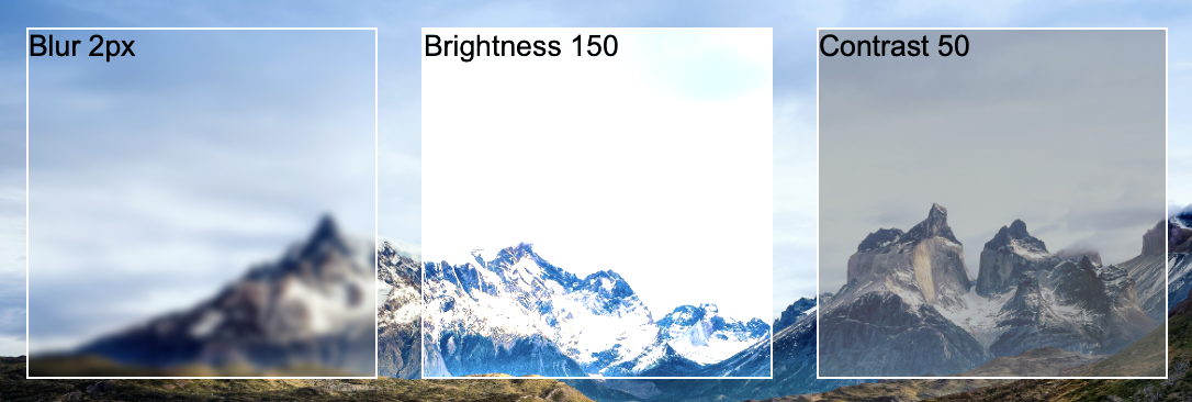


Keep in mind that the properties of filter have different nature. As an example the "blur" property is set in pixels, "hue-rotate" in angles and "brightness", "contrast", "saturate" accept the values greater than 100.
The difference between "filter" and "backdrop-filter" properties are that the former applied to the content of the view itself. Lets illustrate that using the same example but in that case we will use the avatar image instead of the text view:
RUI
ListLayout {
    width = 600px,
    height = 200px,
    padding = 20px,
    gap = 20px,
    background = image {
        src = background.jpg,
        fit = cover,
    },
    content = [
        ImageView {
            width = 160px,
            height = 160px,
            src = "avatar.png",
            fit = contain,
            filter = filter {
                blur = 2,
            }
        },
        ImageView {
            width = 160px,
            height = 160px,
            src = "avatar.png",
            fit = contain,
            filter = filter {
                brightness = 150,
            }
        },
        ImageView {
            width = 160px,
            height = 160px,
            src = "avatar.png",
            fit = contain,
            filter = filter {
                contrast = 50,
            },
        },
        ImageView {
            width = 160px,
            height = 160px,
            src = "avatar.png",
            fit = contain,
            filter = filter {
                grayscale = 100,
            },
        },
        ImageView {
            width = 160px,
            height = 160px,
            src = "avatar.png",
            fit = contain,
            filter = filter {
                hue-rotate = 45deg,
            },
        },
        ImageView {
            width = 160px,
            height = 160px,
            src = "avatar.png",
            fit = contain,
            filter = filter {
                invert = 100,
            },
        },
        ImageView {
            width = 160px,
            height = 160px,
            src = "avatar.png",
            fit = contain,
            filter = filter {
                opacity = 50,
            },
        },
        ImageView {
            width = 160px,
            height = 160px,
            src = "avatar.png",
            fit = contain,
            filter = filter {
                saturate = 150,
            },
        },
        ImageView {
            width = 160px,
            height = 160px,
            src = "avatar.png",
            fit = contain,
            filter = filter {
                sepia = 100,
            },
        },
    ]
}
For your convenience here is the Go lang implementation:
Go
view := rui.NewListLayout(session, rui.Params{
    rui.Width:   rui.Px(600),
    rui.Height:  rui.Px(200),
    rui.Padding: rui.Px(20),
    rui.Gap:     rui.Px(20),
    rui.Background: rui.NewBackgroundImage(rui.Params{
        rui.Source: "background.jpg",
        rui.Fit:    rui.CoverFit,
    }),
    rui.Content: []rui.View{
        rui.NewImageView(session, rui.Params{
            rui.Width:  rui.Px(160),
            rui.Height: rui.Px(160),
            rui.Source: "avatar.png",
            rui.Fit:    rui.ContainFit,
            rui.Filter: rui.NewFilterProperty(rui.Params{
                rui.Blur: 2,
            }),
        }),
        rui.NewImageView(session, rui.Params{
            rui.Width:  rui.Px(160),
            rui.Height: rui.Px(160),
            rui.Source: "avatar.png",
            rui.Fit:    rui.ContainFit,
            rui.Filter: rui.NewFilterProperty(rui.Params{
                rui.Brightness: 150,
            }),
        }),
        rui.NewImageView(session, rui.Params{
            rui.Width:  rui.Px(160),
            rui.Height: rui.Px(160),
            rui.Source: "avatar.png",
            rui.Fit:    rui.ContainFit,
            rui.Filter: rui.NewFilterProperty(rui.Params{
                rui.Contrast: 50,
            }),
        }),
        rui.NewImageView(session, rui.Params{
            rui.Width:  rui.Px(160),
            rui.Height: rui.Px(160),
            rui.Source: "avatar.png",
            rui.Fit:    rui.ContainFit,
            rui.Filter: rui.NewFilterProperty(rui.Params{
                rui.Grayscale: 100,
            }),
        }),
        rui.NewImageView(session, rui.Params{
            rui.Width:  rui.Px(160),
            rui.Height: rui.Px(160),
            rui.Source: "avatar.png",
            rui.Fit:    rui.ContainFit,
            rui.Filter: rui.NewFilterProperty(rui.Params{
                rui.HueRotate: rui.Deg(45),
            }),
        }),
        rui.NewImageView(session, rui.Params{
            rui.Width:  rui.Px(160),
            rui.Height: rui.Px(160),
            rui.Source: "avatar.png",
            rui.Fit:    rui.ContainFit,
            rui.Filter: rui.NewFilterProperty(rui.Params{
                rui.Invert: 100,
            }),
        }),
        rui.NewImageView(session, rui.Params{
            rui.Width:  rui.Px(160),
            rui.Height: rui.Px(160),
            rui.Source: "avatar.png",
            rui.Fit:    rui.ContainFit,
            rui.Filter: rui.NewFilterProperty(rui.Params{
                rui.Opacity: 50,
            }),
        }),
        rui.NewImageView(session, rui.Params{
            rui.Width:  rui.Px(160),
            rui.Height: rui.Px(160),
            rui.Source: "avatar.png",
            rui.Fit:    rui.ContainFit,
            rui.Filter: rui.NewFilterProperty(rui.Params{
                rui.Saturate: 150,
            }),
        }),
        rui.NewImageView(session, rui.Params{
            rui.Width:  rui.Px(160),
            rui.Height: rui.Px(160),
            rui.Source: "avatar.png",
            rui.Fit:    rui.ContainFit,
            rui.Filter: rui.NewFilterProperty(rui.Params{
                rui.Sepia: 100,
            }),
        }),
    },
})
Below are the results of execution of such application with filter applied to the same avatar image:


If we need to retrieve or update the values of the "filter" or "backdrop-filter" properties at runtime we can use rui.GetFilter() and rui.GetBackdropFilter() global methods and change properties to the desired values:
Go
// Assume that the filter was set during the view creation
if filter := rui.GetFilter(view, "view-id"); filter != nil {
    filter.Set(rui.Blur, 5)
    // Set other properties
}

// Assume that the backdrop filter was set during the view creation
if filter := rui.GetBackdropFilter(view, "view-id"); filter != nil {
    filter.Set(rui.Blur, 5)
    // Set other properties
}
View semantics
While we can create a stunning application pages for our end users it doesn't mean that that content will be good enough for other parties like search engines or other assistive tools. To help them understand our content better library provides a "semantics" property:
| Property | Type | Description |
|---|---|---|
| "semantics" | int |
Semantic meaning of the view |
Property can be set either from the source code or from the resource description file for different kind of views and containers. When setting the value in resource description file a text representation of the value is used. Allowed values are represented in the following table with their brief description:
| Value | Name | Description |
|---|---|---|
DefaultSemantics |
"default" | Has no semantic meaning |
ArticleSemantics |
"article" | Represents a self-contained piece of content that could stand alone, such as a blog post or news article |
SectionSemantics |
"section" | Sections within an HTML document. Each section should logically group related content together |
AsideSemantics |
"aside" | Represents content that is tangentially related to the main content but can be considered separate from it. Often used for sidebars or pull quotes |
HeaderSemantics |
"header" | Contains introductory content or navigational links for its parent view. It typically includes headings (H1Semantics to H6Semantics) |
MainSemantics |
"main" | Represents the dominant content of a document, which is unique to the page. There should be only one main element per page |
FooterSemantics |
"footer" | Contains footer information for its nearest ancestor sectioning view. This can include copyright details, contact info, or links to other pages within the application |
NavigationSemantics |
"navigation" | Represents a set of navigational links. Typically used for menus and other navigation aids |
FigureSemantics |
"figure" | Used to group media content (like images or diagrams) with their captions or explanations |
FigureCaptionSemantics |
"figure-caption" | Provides a caption or description for an image or diagram contained in a view with FigureSemantics semantic set |
ButtonSemantics |
"button" | An interactive control view that can be activated by the user, typically used to perform actions such as submitting forms |
ParagraphSemantics |
"p" | A paragraph view. It represents a block of structured text, which is usually separated from other blocks by blank lines |
H1Semantics to H6Semantics |
"h1" to "h6" | Heading views that define titles within our content, with H1Semantics being the most important and H6Semantics the least |
BlockquoteSemantics |
"blockquote" | Represents a section that is quoted from another source. It often includes a citation |
CodeSemantics |
"code" | Code snippets. It typically formats the text as monospaced and slightly different from regular text |
Let's assume that we have a news portal application, one of it's pages can be logically divided into the following areas:
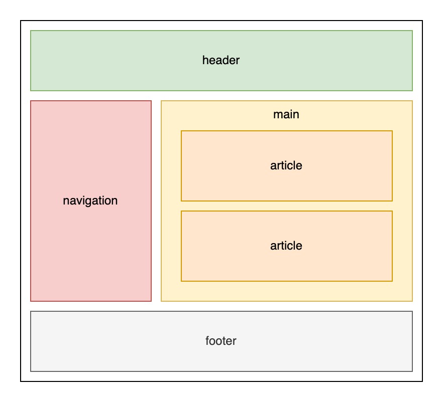
These areas can be constructed using different types of views like ListView, GridLayout, TextView, TabsLayout and others.
For them we can specify the specific semantic they belong to.
Here are a few examples on how to set the semantic for a different views:
RUI
ListView {
    id = main,
    width = 100%,
    semantics = main, // Semantics used for the main content
    orientation = up-down,
    gap = 1em,
    padding = 1em,
}
RUI
ListView {
    id = header,
    width = 100%,
    semantics = header, // Semantics used for the header
    gap = 1em,
    padding = 1em,
}
Few examples on how we can do this in the source code:
Go
main := rui.NewListView(session, rui.Params{
    rui.ID:        "main",
    rui.Width:     rui.Percent(100),
    rui.Semantics: rui.MainSemantics, // Semantics used for the main content
    rui.Gap:       rui.Em(1),
    rui.Padding:   rui.Em(1),
})

// Populate main list view content
Go
header := rui.NewListView(session, rui.Params{
    rui.ID:        "header",
    rui.Width:     rui.Percent(100),
    rui.Semantics: rui.HeaderSemantics, // Semantics used for the header
    rui.Gap:       rui.Em(1),
    rui.Padding:   rui.Em(1),
})

// Populate header list view content
To get back the value of the "semantics" property, we can use the global function GetSemantics(), which will return an integer constant of the current value.
By default each view has DefaultSemantics value.
Go
semantic := rui.GetSemantics(rootView, "header")

// Do something with the value
View text appearance
Regardless of whether the view has some text we still can provide some text settings which are propagated down below the view hierarchy. This is useful especially when we need to set our branding fonts and their attributes to the whole pages of the application. Each view can still use the different font settings.
The font and other text attributes are controlled by the following properties:
| Property | Type | Description |
|---|---|---|
| "caret-color" | Color |
Text cursor color |
| "font-name" | string |
Text font name |
| "italic" | bool |
Italic text |
| "letter-spacing" | SizeUnit |
Spacing between letters |
| "line-height" | SizeUnit |
Text line height. Not affect the font size |
| "not-translate" | bool |
Specify whether the text is localized and require a translation lookup |
| "overline" | bool |
The line above the text |
| "small-caps" | bool |
Specify whether the text displayed using small caps characters |
| "strikethrough" | bool |
Strike-through line over the text |
| "tab-size" | int |
Number of spaces in tab characters |
| "text-align" | int |
Horizontal alignment of the text |
| "text-color" | Color |
Font color |
| "text-direction" | int |
Text direction |
| "text-indent" | SizeUnit |
The text first line indentation |
| "text-line-color" | Color |
The color of the "strikethrough", "overline" and "underline" lines |
| "text-line-style" | int |
The style of the "strikethrough", "overline" and "underline" lines |
| "text-line-thickness" | SizeUnit |
The thickness of the "strikethrough", "overline" and "underline" lines |
| "text-shadow" | []ShadowProperty |
The text shadows |
| "text-size" | SizeUnit |
Font size |
| "text-transform" | int |
Text letters capitalization |
| "text-weight" | int |
Font weight |
| "text-wrap" | int |
Text wrapping |
| "underline" | bool |
The line below the text |
| "user-select" | bool |
Specify whether the user can select the text |
| "vertical-text-orientation" | int |
Vertical text letters orientation, see "writing-mode" |
| "white-space" | int |
Text white space characters behavior |
| "word-break" | int |
Behavior of the text word break |
| "word-spacing" | SizeUnit |
Spacing between the words |
| "writing-mode" | int |
Specify the direction of the text |
Let's quickly touch each of them and provide some examples.
Text cursor color
Depending on our branding we can set the text caret color to a particular color. This is done by setting the "caret-color" property.
RUI
ListLayout {
    width = 100%,
    caret-color = red,
    content = EditView {
        id = input,
    }
}
Go
view := rui.NewListLayout(session, rui.Params{
    rui.Width:      rui.Percent(100),
    rui.CaretColor: rui.Red,
    rui.Content: rui.NewEditView(session, rui.Params{
        rui.ID: "input",
    }),
})

As mentioned early the text properties are inherited therefore they can be applied directly to the view which has the text data or to the parent views.
To read the value of the "caret-color" property we can use the GetCaretColor() global function which will return the color of the caret.
Go
caretColor := rui.GetCaretColor(rootView, "input")

// Do something with the value
Text font name
To change the name of the font we can use the "font-name" property. The property may have several fonts listed separated by comma. The first font listed is applied first, if it is not available then the next font will be used. If non of the listed fonts are available then the default one will be used.
RUI
ListLayout {
    width = 100%,
    font-name = "Helvetica, Arial",
    content = TextView {
        id = text,
        text = "Good day!",
    }
}
Go
view := rui.NewListLayout(session, rui.Params{
    rui.Width:    rui.Percent(100),
    rui.FontName: "Helvetica, Arial",
    rui.Content: rui.NewTextView(session, rui.Params{
        rui.ID:   "text",
        rui.Text: "Good day!",
    }),
})

Here are a few fonts commonly used in web applications: "Arial", "Helvetica", "Verdana", "Times New Roman", "Georgia", "Courier New", "Tahoma", and "Impact".
To get the list of currently set fonts we can use the GetFontName() global function.
Go
fonts := rui.GetFontName(rootView, "text")

// Do something with the value
Italic text
To make our font to have an italic look we can use "italic" property. When setting the value in resource description file we can use a different values which are all mapped to the boolean value: "true", "yes", "on", "1", and "false", "no", "off", "0".
RUI
ListLayout {
    width = 100%,
    italic = "yes",
    content = TextView {
        id = text,
        text = "Good day!",
    }
}
Go
view := rui.NewListLayout(session, rui.Params{
    rui.Width:  rui.Percent(100),
    rui.Italic: true,
    rui.Content: rui.NewTextView(session, rui.Params{
        rui.ID:   "text",
        rui.Text: "Good day!",
    }),
})

To get the current property setting we can use the IsItalic() global function which will return a boolean value.
Go
italic := rui.IsItalic(rootView, "text")

// Do something with the value
Spacing between letters
According to our design if we need our text to look less condense we can use the "letter-spacing" property.
It's value has a SizeUnit type and can be specified in different units like pixels, percentages inches and other unit types.
RUI
ListLayout {
    width = 100%,
    letter-spacing = 2px,
    content = TextView {
        id = text,
        text = "Good day!",
    }
}
Go
view := rui.NewListLayout(session, rui.Params{
    rui.Width:         rui.Percent(100),
    rui.LetterSpacing: rui.Px(2),
    rui.Content: rui.NewTextView(session, rui.Params{
        rui.ID:   "text",
        rui.Text: "Good day!",
    }),
})

To get the current property value we can use the GetLetterSpacing() global function which will return a SizeUnit value.
Go
spacing := rui.GetLetterSpacing(rootView, "text")

// Do something with the value
Line spacing
When we displaying a large amount of text on the page or trying to make it more appealing to the end user we can use the "line-height" property which allows us to put some space between the text lines. This property controls the overall text line height and does not affect the font size.
RUI
ListLayout {
    width = 100%,
    line-height = 1em,
    content = TextView {
        id = text,
        text = "In a historic milestone for space exploration, astronauts have successfully landed on Exoplanet X-23, marking humanity's first steps on a distant world beyond our solar system. The mission, launched aboard the spacecraft Odyssey, took over a decade to reach its destination, located approximately 50 light-years away. As the crew set foot on the alien terrain, they conducted initial experiments to study the planet's atmosphere and geological features, paving the way for future exploration and potential colonization. This groundbreaking achievement not only expands our understanding of the universe but also ignites hope for the possibility of life beyond Earth.",
    }
}
Go
view := rui.NewListLayout(session, rui.Params{
    rui.Width:      rui.Percent(100),
    rui.LineHeight: rui.Em(1),
    rui.Content: rui.NewTextView(session, rui.Params{
        rui.ID:   "text",
        rui.Text: "In a historic milestone for space exploration, astronauts have successfully landed on Exoplanet X-23, marking humanity's first steps on a distant world beyond our solar system. The mission, launched aboard the spacecraft Odyssey, took over a decade to reach its destination, located approximately 50 light-years away. As the crew set foot on the alien terrain, they conducted initial experiments to study the planet's atmosphere and geological features, paving the way for future exploration and potential colonization. This groundbreaking achievement not only expands our understanding of the universe but also ignites hope for the possibility of life beyond Earth.",
    }),
})
The result of the above code for the line height set to "1em" value:

The same but for the line height set to "2em":

To get the current property value we can use the GetLineHeight() global function which will return a SizeUnit value.
Go
lineHeight := rui.GetLineHeight(rootView, "text")

// Do something with the value
Text translation
By default, the library tries to find translations for any text in a view by checking the resource files. Therefore if the text content for the view is generated on the fly (at run time) we can disable the translation lookup using "not-translate" property. More information regarding application localization can be found in Application Resources tutorial, section Localization files.
RUI
ListLayout {
    width = 100%,
    content = TextView {
        id = text,
        not-translate = true,
        // The "text" property will be set later by the application logic
    }
}
Go
view := rui.NewListLayout(session, rui.Params{
    rui.Width:   rui.Percent(100),
    rui.Content: rui.NewTextView(session, rui.Params{
        rui.ID:           "text",
        rui.NotTranslate: true,
        // The rui.Text property will be set later by the application logic
    }),
})
Sometimes, the text we want to display includes parts that need localization.
In such cases, we have to construct the text manually.
Library provides a GetString() method of a client session to retrieve the localized text which then can be combined with generated one.
To get the current property value we can use a GetNotTranslate() global function which will return a boolean value.
Go
notTranslate := rui.GetNotTranslate(rootView, "text")

// Do something with the value
Text overline, strikethrough and underline
The overline, strikethrough and underline text decorations are controlled by the corresponding "overline", "strikethrough", and "underline" properties. While these properties control the line appearance, there are other properties like "text-line-color," "text-line-style," and "text-line-thickness" that allow for further customization. Keep in mind that the later properties control all types of the lines at ones and there is no way to specify different color, style and line thickness for each of the line type.
Let's have a look at some examples.
RUI
TextView {
    id = text,
    overline = true, // Overline text
    text = "Good day!",
}
Go
view := rui.NewTextView(session, rui.Params{
    rui.ID:       "text",
    rui.Overline: true, // Overline text
    rui.Text:     "Good day!",
})

RUI
TextView {
id = text,
strikethrough = true, // Strikethrough text
text = "Good day!",
}
Go
view := rui.NewTextView(session, rui.Params{
rui.ID: "text",
rui.Strikethrough: true, // Strikethrough text
rui.Text: "Good day!",
})

RUI
TextView {
id = text,
underline = true, // Underline text
text = "Good day!",
}
Go
view := rui.NewTextView(session, rui.Params{
rui.ID: "text",
rui.Underline: true, // Underline text
rui.Text: "Good day!",
})

To get back the values of "overline", "strikethrough", and "underline" properties, we can use global functions like IsOverline(), IsStrikethrough(), and IsUnderline() which will return a boolean value.
Go
overline := rui.IsOverline(rootView, "text")
// Do something with the value
Go
strikethrough := rui.IsStrikethrough(rootView, "text")
// Do something with the value
Go
underline := rui.IsUnderline(rootView, "text")
// Do something with the value
If straight line is not what we want, we can change the line style using the "text-line-style" property. That property has a list of allowed line style values, see below. When describing the line style in resource description file, a name of the value is used.
| Value | Name | Description |
|---|---|---|
SolidLine |
"solid" | Solid line as a text line |
DashedLine |
"dashed" | Dashed line as a text line |
DottedLine |
"dotted" | Dotted line as a text line |
DoubleLine |
"double" | Double line as a text line |
WavyLine |
"wavy" | Wavy line as a text line |
For simplicity, we'll omit repetitive code that creates a TextView in the following examples and leave only relevant property settings.
Examples for dashed line:
RUI
overline = true,
text-line-style = dashed,
text = "Good day!",
Go
rui.Overline: true,
rui.TextLineStyle: rui.DashedLine,
rui.Text: "Good day!",

RUI
strikethrough = true,
text-line-style = dashed,
text = "Good day!",
Go
rui.Strikethrough: true,
rui.TextLineStyle: rui.DashedLine,
rui.Text: "Good day!",

RUI
underline = true,
text-line-style = dashed,
text = "Good day!",
Go
rui.Underline: true,
rui.TextLineStyle: rui.DashedLine,
rui.Text: "Good day!",

Examples for dotted line:
RUI
overline = true,
text-line-style = dotted,
text = "Good day!",
Go
rui.Overline: true,
rui.TextLineStyle: rui.DottedLine,
rui.Text: "Good day!",

RUI
strikethrough = true,
text-line-style = dotted,
text = "Good day!",
Go
rui.Strikethrough: true,
rui.TextLineStyle: rui.DottedLine,
rui.Text: "Good day!",

RUI
underline = true,
text-line-style = dotted,
text = "Good day!",
Go
rui.Underline: true,
rui.TextLineStyle: rui.DottedLine,
rui.Text: "Good day!",

Examples for double line:
RUI
overline = true,
text-line-style = double,
text = "Good day!",
Go
rui.Overline: true,
rui.TextLineStyle: rui.DoubleLine,
rui.Text: "Good day!",

TIP: While showing overline text the line may not be completely visible, in this case just increase the value of "line-height" property.
RUI
strikethrough = true,
text-line-style = double,
text = "Good day!",
Go
rui.Strikethrough: true,
rui.TextLineStyle: rui.DoubleLine,
rui.Text: "Good day!",

RUI
underline = true,
text-line-style = double,
text = "Good day!",
Go
rui.Underline: true,
rui.TextLineStyle: rui.DoubleLine,
rui.Text: "Good day!",

TIP: While showing underline text the line may not be completely visible, in this case just increase the value of "line-height" property.
Examples for wavy line:
RUI
overline = true,
text-line-style = wavy,
text = "Good day!",
Go
rui.Overline: true,
rui.TextLineStyle: rui.WavyLine,
rui.Text: "Good day!",

TIP: While showing overline text the line may not be completely visible, in this case just increase the value of "line-height" property.
RUI
strikethrough = true,
text-line-style = wavy,
text = "Good day!",
Go
rui.Strikethrough: true,
rui.TextLineStyle: rui.WavyLine,
rui.Text: "Good day!",

RUI
underline = true,
text-line-style = wavy,
text = "Good day!",
Go
rui.Underline: true,
rui.TextLineStyle: rui.WavyLine,
rui.Text: "Good day!",

TIP: While showing underline text the line may not be completely visible, in this case just increase the value of "line-height" property.
To get back the value of the "text-line-style" property, we can use the global function GetTextLineStyle(), which will return an integer constant value corresponding to current line style.
Go
lineStyle := rui.GetTextLineStyle(rootView, "text")
// Do something with the value
There are cases when the default color of the line does not match our design. For this purpose, the "text-line-color" property can be used. If you have set the "text-color" property, it will also affect the line color. If the text and line have the same color, it's better to use only the "text-color" property instead of setting values for both properties.
RUI
overline = true,
text-line-color = #FFED762F,
text = "Good day!",
Go
rui.Overline: true,
rui.TextLineColor: 0xFFED762F,
rui.Text: "Good day!",

RUI
strikethrough = true,
text-line-color = #FFED762F,
text = "Good day!",
Go
rui.Strikethrough: true,
rui.TextLineColor: 0xFFED762F,
rui.Text: "Good day!",

RUI
underline = true,
text-line-color = #FFED762F,
text = "Good day!",
Go
rui.Underline: true,
rui.TextLineColor: 0xFFED762F,
rui.Text: "Good day!",

To get back the value of the "text-line-color" property, we can use the global function GetTextLineColor(), which will return the current color value of the line.
Go
lineColor := rui.GetTextLineColor(rootView, "text")
// Do something with the value
If, according to our design, the line thickness differs from the default value, we can specify it with the "text-line-thickness" property. By default, the thickness of the line (if not specified) is scaled proportionally with "text-size".
RUI
overline = true,
text-line-thickness = 3px,
text = "Good day!",
Go
rui.Overline: true,
rui.TextLineThickness: rui.Px(3),
rui.Text: "Good day!",

TIP: While showing overline text the line may not be completely visible, in this case just increase the value of "line-height" property.
RUI
strikethrough = true,
text-line-thickness = 3px,
text = "Good day!",
Go
rui.Strikethrough: true,
rui.TextLineThickness: rui.Px(3),
rui.Text: "Good day!",

RUI
underline = true,
text-line-thickness = 3px,
text = "Good day!",
Go
rui.Underline: true,
rui.TextLineThickness: rui.Px(3),
rui.Text: "Good day!",

TIP: While showing underline text the line may not be completely visible, in this case just increase the value of "line-height" property.
To retrieve the value of the "text-line-thickness" property, we can use the global function GetTextLineThickness(), which will return the current line thickness value as a SizeUnit type.
Go
lineColor := rui.GetTextLineThickness(rootView, "text")
// Do something with the value
If you are still unsure about which decoration to choose for your text, please find the table with some examples below.

Text tab characters size
For controlling the width of tab characters in text content, and allowing to achieve consistent spacing and improve readability across different clients we can use the "tab-size" property. By adjusting the tab size, we can ensure proper alignment of formatted text, leading to a more polished and user-friendly interface. Property holding the value of an integer type and by default has the value of 8 characters.
Browsers combine multiple whitespaces characters including tabs into a single space when displaying text. To show tabs correctly in our text, we can use the "white-space" property. Set it to either "pre" or "pre-wrap" to keep all whitespace characters intact. Another solution could be to utilize the "semantics" property with the value "code".
When setting the value of the "tab-size" property in resource description file a text representation of an integer type is used.
RUI
ListLayout {
width = 210px,
padding = 1em,
gap = 1em,
orientation = up-down,
content = [
TextView {
white-space = pre-wrap, // Whitespace behavior
text = "Default 8 characters:<br>if rootView == nil {<br>\treturn<br>}",
},
TextView {
tab-size = 4, // Tab size in characters
white-space = pre-wrap, // Whitespace behavior
text = "Use 4 characters per tab:<br>if rootView == nil {<br>\treturn<br>}",
}
]
}
Go
view := rui.NewListLayout(session, rui.Params{
rui.Width: rui.Px(210),
rui.Padding: rui.Em(1),
rui.Gap: rui.Em(1),
rui.Orientation: rui.TopDownOrientation,
rui.Content: []rui.View{
rui.NewTextView(session, rui.Params{
rui.WhiteSpace: rui.WhiteSpacePreWrap, // Whitespace behavior
rui.Text: "Default 8 characters:<br>if rootView == nil{<br>\treturn<br>}",
}),
rui.NewTextView(session, rui.Params{
rui.TabSize: 4, // Tab size in characters
rui.WhiteSpace: rui.WhiteSpacePreWrap, // Whitespace behavior
rui.Text: "Use 4 characters per tab:<br>if rootView == nil{<br>\treturn<br>}",
}),
},
})
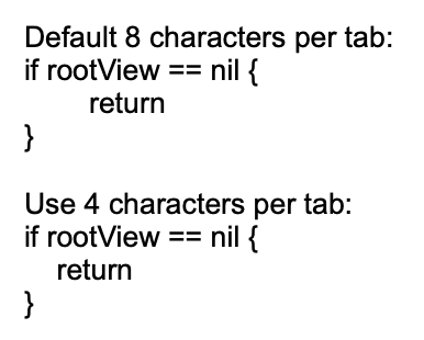
We can easily retrieve the tab size value by using the global function rui.GetTabSize().
This function will return the number of space characters that represent a tab.
Go
tabSize := rui.GetTabSize(rootView, "view-id")
// Do something with the value
Text in small caps
Depending on your design there might be cases when we need to show the text in small caps letters. It can be particularly useful in various contexts where we want to draw attention, add visual interest, or adhere to specific design guidelines. The small caps text is controlled by "small-caps" property.
As other properties "small-caps" can be set either from resource description file or from code.
RUI
ListLayout {
width = 100%,
orientation = up-down,
gap = 1em,
content = [
"© Some Awesome Company", // Implicitly converted to TextView
TextView {
id = text,
small-caps = true, // Use small caps
text = "© Some Awesome Company",
},
]
}
Go
view := rui.NewListLayout(session, rui.Params{
rui.Width: rui.Percent(100),
rui.Orientation: rui.TopDownOrientation,
rui.Gap: rui.Em(1),
rui.Content: []any{
"© Some Awesome Company", // Implicitly converted to TextView
rui.NewTextView(session, rui.Params{
rui.ID: "text",
rui.SmallCaps: true, // Use small caps
rui.Text: "© Some Awesome Company",
}),
},
})

To retrieve the value of the property we can use a convenient global function IsSmallCaps(), which will return a boolean value.
Go
smallCaps := IsSmallCaps(rootView, "text")
// Do something with the value
Text horizontal alignment
Displayed text can be aligned horizontally using the "text-align" property. The possible values for that property listed in table below. When specifying the value of that property in the resource description file, a name for the value must be used.
| Value | Name | Description |
|---|---|---|
LeftAlign |
"left" | Text left alignment |
RightAlign |
"right" | Text right alignment |
CenterAlign |
"center" | Test center alignment |
JustifyAlign |
"justify" | Text justify alignment |
Let's see a few examples.
RUI
ListLayout {
width = 100%,
padding = 2em,
gap = 1em,
content = [
TextView {
text-align = left,
text = "left:<br>A quick brown fox jumps over the lazy dog while wearing a tiny sombrero!",
width = 150px,
},
TextView {
text-align = center,
text = "center:<br>A quick brown fox jumps over the lazy dog while wearing a tiny sombrero!",
width = 150px,
},
TextView {
text-align = right,
text = "right:<br>A quick brown fox jumps over the lazy dog while wearing a tiny sombrero!",
width = 150px,
},
TextView {
text-align = justify,
text = "justify:<br>A quick brown fox jumps over the lazy dog while wearing a tiny sombrero!",
width = 150px,
},
]
}
Go
view := rui.NewListLayout(session, rui.Params{
rui.Width: rui.Percent(100),
rui.Padding: rui.Em(2),
rui.Gap: rui.Em(1),
rui.Content: []rui.View{
rui.NewTextView(session, rui.Params{
rui.TextAlign: rui.LeftAlign,
rui.Text: "left:<br>A quick brown fox jumps over the lazy dog while wearing a tiny sombrero!",
rui.Width: rui.Px(150),
}),
rui.NewTextView(session, rui.Params{
rui.TextAlign: rui.CenterAlign,
rui.Text: "center:<br>A quick brown fox jumps over the lazy dog while wearing a tiny sombrero!",
rui.Width: rui.Px(150),
}),
rui.NewTextView(session, rui.Params{
rui.TextAlign: rui.RightAlign,
rui.Text: "right:<br>A quick brown fox jumps over the lazy dog while wearing a tiny sombrero!",
rui.Width: rui.Px(150),
}),
rui.NewTextView(session, rui.Params{
rui.TextAlign: rui.JustifyAlign,
rui.Text: "justify:<br>A quick brown fox jumps over the lazy dog while wearing a tiny sombrero!",
rui.Width: rui.Px(150),
}),
},
})

The convenient way of reading the property value back is to utilize a global GetTextAlign() function, which will return a numeric value of the alignment constant.
Go
align := GetTextAlign(rootView, "text")
// Do something with the value
Text color
To change the default font color of the text we can use the "text-color" property.
That property is also used to set the color of the "overline", "strikethrough," and "underline" text lines if the "text-line-color" property was not defined.
The value of the property can contain a value of the Color type as well as its text representation.
Below are a few examples on how to set the value for that property.
RUI
TextView {
width = 100%,
text-color = red, // Red color constant
text = "A quick brown fox jumps over the lazy dog while wearing a tiny sombrero!",
}
RUI
TextView {
width = 100%,
text-color = #FFAAAA00, // A color value
text = "A quick brown fox jumps over the lazy dog while wearing a tiny sombrero!",
}
Go
view := rui.NewTextView(session, rui.Params{
rui.Width: rui.Percent(100),
rui.TextColor: rui.Red, // Red color constant
rui.Text: "A quick brown fox jumps over the lazy dog while wearing a tiny sombrero!",
})
Go
view := rui.NewTextView(session, rui.Params{
rui.Width: rui.Percent(100),
rui.TextColor: 0xFFAAAA00, // A color value
rui.Text: "A quick brown fox jumps over the lazy dog while wearing a tiny sombrero!",
})


To get more information on how to set the color property value, check our Color type reference documentation.
To retrieve the current value of the font color we can use the global GetTextColor() function, which will return the value using the Color type.
Go
fontColor := GetTextColor(rootView, "text")
// Do something with the value
Text direction
By default, text direction is using the system settings and depends on current locale. If we want to change the default behavior we can use the "text-direction" property.
The values of the property are restricted to the following set.
| Value | Name | Description |
|---|---|---|
SystemTextDirection |
"system" | Use the system text direction |
LeftToRightDirection |
"left-to-right" | For languages written from left to right (like English and most other languages) |
RightToLeftDirection |
"right-to-left" | For languages written from right to left (like Hebrew or Arabic) |
That property is also controls what will be the layout of the children for the several containers like ListLayout, GridLayout, ListView and other.
When setting the value in resource description file the name of the value has to be used.
RUI
TextView {
width = 100%,
text-direction = right-to-left, // Right to left text orientation
text = "שועל חום מהיר קופץ מעל הכלב העצלן כשהוא לובש סומבררו זעיר!",
}
Go
view := rui.NewTextView(session, rui.Params{
rui.Width: rui.Percent(100),
rui.TextDirection: rui.RightToLeftDirection, // Right to left text orientation
rui.Text: "שועל חום מהיר קופץ מעל הכלב העצלן כשהוא לובש סומבררו זעיר!",
})

To get back the value of that property conveniently we can use the global GetTextDirection() function, which will return the value of the corresponding constant.
Go
textDirection := GetTextDirection(rootView, "text")
// Do something with the value
Text indent
When first line of the text require an indentation that can be achieved by utilizing the "text-indent" property.
It allows the value to be set using different units since it is holding a SizeUnit type.
Indenting the first line of text in a paragraph enhances readability by creating visual separation between paragraphs, improving aesthetic appeal and maintaining consistency with traditional formatting standards.
RUI
ListLayout {
width = 100%,
orientation = up-down,
gap = 1em,
text-indent = 1em,
content = [
"Artificial Intelligence (AI) systems are sophisticated computer programs designed to perform tasks that typically require human intelligence. These systems are built using algorithms and statistical models that enable them to learn from data, recognize patterns, make decisions, and adapt to new situations. AI can be categorized into two main types: supervised learning, where the system is trained on labeled data to predict outcomes; and unsupervised learning, which involves analyzing unlabeled data to identify hidden patterns or structures. AI systems are used in various applications such as natural language processing, image recognition, autonomous vehicles, and personalized recommendations, transforming industries by enhancing efficiency and accuracy.",
"Recent advancements in AI have been driven by the development of deep learning techniques, which use neural networks inspired by the human brain's structure. These models can process vast amounts of complex information, enabling breakthroughs in areas like computer vision and speech recognition. AI systems are increasingly integrated into daily life through virtual assistants, chatbots, and smart home devices. However, their widespread adoption also raises ethical considerations, such as privacy concerns, bias in decision-making, and the potential displacement of human jobs. As AI continues to evolve, it will be crucial to develop frameworks that ensure its responsible use and mitigate potential negative impacts on society.",
]
}
Go
view := rui.NewListLayout(session, rui.Params{
rui.Width: rui.Percent(100),
rui.Orientation: rui.TopDownOrientation,
rui.Gap: rui.Em(1),
rui.TextIndent: rui.Em(1),
rui.Content: []string{
"Artificial Intelligence (AI) systems are sophisticated computer programs designed to perform tasks that typically require human intelligence. These systems are built using algorithms and statistical models that enable them to learn from data, recognize patterns, make decisions, and adapt to new situations. AI can be categorized into two main types: supervised learning, where the system is trained on labeled data to predict outcomes; and unsupervised learning, which involves analyzing unlabeled data to identify hidden patterns or structures. AI systems are used in various applications such as natural language processing, image recognition, autonomous vehicles, and personalized recommendations, transforming industries by enhancing efficiency and accuracy.",
"Recent advancements in AI have been driven by the development of deep learning techniques, which use neural networks inspired by the human brain's structure. These models can process vast amounts of complex information, enabling breakthroughs in areas like computer vision and speech recognition. AI systems are increasingly integrated into daily life through virtual assistants, chatbots, and smart home devices. However, their widespread adoption also raises ethical considerations, such as privacy concerns, bias in decision-making, and the potential displacement of human jobs. As AI continues to evolve, it will be crucial to develop frameworks that ensure its responsible use and mitigate potential negative impacts on society.",
},
})

The convenient way of getting back the property value is to use the GetTextIndent() global function, which will return the value using the SizeUnit type.
Go
indent := GetTextIndent(rootView, "text")
//Do something with the value
Text shadow
Text shadows enhance readability, create visual interest, add depth, and guide focus by separating text from its background and simulating light effects. The library allows us to specify several text shadows which is controlled by the "text-shadow" property.
Internally the value of the property is an array of ShadowProperty interface.
It is allowed to set just one shadow for the text, this value will internally be wrapped to an array.
For more information on how to work with the ShadowProperty please check our View shadow section.
Text shadow has a few limitations comparing to "shadow" view property, it only accept "color", "blur", "x-offset", and "y-offset" properties. Other properties like "inset" and "spread-radius" will be ignored. Both the "color" and "blur" properties are essential, if they are not specified, no text shadow will appear.
RUI
TextView {
width = 100%,
text = "Good day!",
text-shadow = _{
color = black,
blur = 2px,
x-offset = 0px,
y-offset = 0px,
},
}
When creating the text shadow from source code there are two options, using either NewTextShadow() or NewShadowProperty().
Go
view := rui.NewTextView(session, rui.Params{
rui.ID: "text",
rui.Width: rui.Percent(100),
rui.Text: "Good day!",
rui.TextShadow: rui.NewTextShadow(rui.Px(0), rui.Px(0), rui.Px(2), rui.Black),
})
Go
view := rui.NewTextView(session, rui.Params{
rui.ID: "text",
rui.Width: rui.Percent(100),
rui.Text: "Good day!",
rui.TextShadow: rui.NewShadowProperty(rui.Params{
rui.ColorTag: rui.Black,
rui.Blur: rui.Px(2),
rui.XOffset: rui.Px(0),
rui.YOffset: rui.Px(0),
}),
})

We can set the text shadow at any time using the Set() method of the view interface.
Go
if !view.Set(rui.TextShadow, rui.NewTextShadow(rui.Px(0), rui.Px(0), rui.Px(2), rui.Black)) {
// Something went wrong
}
To retrieve the current text shadows, we can use the GetTextShadows() global method.
This method will return an array of ShadowProperty values, regardless of how many shadows the text has.
Go
shadows := rui.GetTextShadows(view, "text")
for _, shadow := range shadows {
colorValue := shadow.Get(rui.ColorTag)
if color, ok := colorValue.(rui.Color); ok {
// Do something with the value
}
}
As mentioned earlier we can specify several text shadows as well:
RUI
TextView {
width = 100%,
text = "Good day!",
text-shadow = [
// First shadow
_{
color = black,
blur = 1px,
x-offset = 0px,
y-offset = 0px,
},
// Second shadow
_{
color = lime,
blur = 2px,
x-offset = 1px,
y-offset = 1px,
},
]
}
Go
view := rui.NewTextView(session, rui.Params{
rui.Width: rui.Percent(100),
rui.Text: "Good day!",
rui.TextShadow: []rui.ShadowProperty{
rui.NewTextShadow(rui.Px(0), rui.Px(0), rui.Px(1), rui.Black),
rui.NewTextShadow(rui.Px(1), rui.Px(1), rui.Px(2), rui.Lime),
},
})
Or using the Set() method of the view.
Go
if !view.Set(rui.TextShadow, []rui.ShadowProperty{
rui.NewTextShadow(rui.Px(0), rui.Px(0), rui.Px(1), rui.Black),
rui.NewTextShadow(rui.Px(1), rui.Px(1), rui.Px(2), rui.Red),
}) {
// Something went wrong
}

Example of combining the "text-color" property with a few text shadows:
RUI
TextView {
width = 100%,
text = "Good day!",
text-color = white,
text-shadow = [
_{
color = blue,
blur = 1px,
x-offset = -1px,
y-offset = -1px,
},
_{
color = red,
blur = 1px,
x-offset = 1px,
y-offset = 1px,
},
]
}

Text font size
Setting a font size is essential for ensuring text readability, maintaining design consistency, enhancing accessibility, and optimizing the overall user experience across various devices.
To control the font size a "text-size" property is used.
When setting the font size we can use different units since property support the values of the SizeUnit type.
RUI
ListLayout {
width = 100%,
orientation = up-down,
gap = 1em,
content = [
TextView {
text = "default:<br>A quick brown fox jumps over the lazy dog while wearing a tiny sombrero!",
},
TextView {
text = "0.2 inches:<br>A quick brown fox jumps over the lazy dog while wearing a tiny sombrero!",
text-size = 0.2in,
},
TextView {
text = "1em:<br>A quick brown fox jumps over the lazy dog while wearing a tiny sombrero!",
text-size = 1em,
},
TextView {
text = "16 pixels:<br>A quick brown fox jumps over the lazy dog while wearing a tiny sombrero!",
text-size = 16px,
},
TextView {
text = "80%:<br>A quick brown fox jumps over the lazy dog while wearing a tiny sombrero!",
text-size = 80%,
},
]
}
Go
view := rui.NewListLayout(session, rui.Params{
rui.Width: rui.Percent(100),
rui.Orientation: rui.TopDownOrientation,
rui.Gap: rui.Em(1),
rui.Content: []rui.View{
rui.NewTextView(session, rui.Params{
rui.Text: "default:<br>A quick brown fox jumps over the lazy dog while wearing a tiny sombrero!",
}),
rui.NewTextView(session, rui.Params{
rui.Text: "0.2 inches:<br>A quick brown fox jumps over the lazy dog while wearing a tiny sombrero!",
rui.TextSize: rui.Inch(0.2),
}),
rui.NewTextView(session, rui.Params{
rui.Text: "1em:<br>A quick brown fox jumps over the lazy dog while wearing a tiny sombrero!",
rui.TextSize: rui.Em(1),
}),
rui.NewTextView(session, rui.Params{
rui.Text: "16 pixels:<br>A quick brown fox jumps over the lazy dog while wearing a tiny sombrero!",
rui.TextSize: rui.Px(16),
}),
rui.NewTextView(session, rui.Params{
rui.Text: "80%:<br>A quick brown fox jumps over the lazy dog while wearing a tiny sombrero!",
rui.TextSize: rui.Percent(80),
}),
},
})
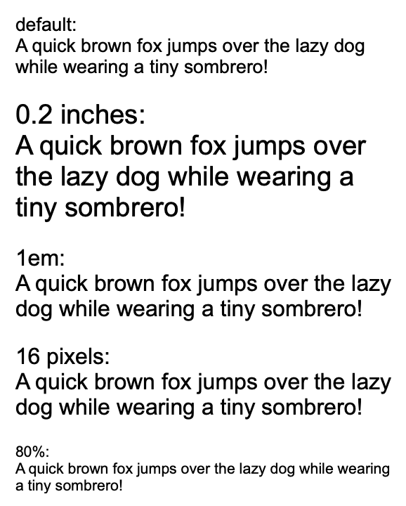
As usual the property can be set at any time using the Set() method of the view:
Go
if !view.Set(rui.TextSize, rui.Em(0.8)) {
// Something went wrong
}
To retrieve the current value of the font size we can use the GetTextSize() global function, which will return the value using the SizeUnit type.
Go
fontSize := rui.GetTextSize(rootView, "text")
// Do something with the value
Text capitalization
Text capitalization is essential for controlling the case of text, ensuring consistency, improving readability, and achieving a desired visual style across application pages. To change the behavior we can use the "text-transform" property which accept the values listed in table below.
| Value | Name | Description |
|---|---|---|
NoneTextTransform |
"none" | Original case of the characters |
CapitalizeTextTransform |
"capitalize" | Every word starts with a capital letter |
LowerCaseTextTransform |
"lowercase" | All characters are converted to lowercase |
UpperCaseTextTransform |
"uppercase" | All characters are converted to uppercase |
When setting the value of the property from resource description file the name of the value is used.
RUI
TextView {
width = 100%px,
text-transform = none,
text = "Good day!",
}
Go
view := rui.NewTextView(session, rui.Params{
rui.Width: rui.Percent(100),
rui.TextTransform: rui.NoneTextTransform,
rui.Text: "Good day!",
})

Here is how the text appears for other property values, for simplicity we omit the repetitive code:
RUI
text-transform = capitalize,

RUI
text-transform = lowercase,

RUI
text-transform = uppercase,

As usual property can be set at any time through the source code by using the Set() method of the view.
Go
if !view.Set(rui.TextTransform, rui.CapitalizeTextTransform) {
// Something went wrong
}
To retrieve the current value of the property we can use the convenient global function GetTextTransform(), which will return the numeric value of the constant.
Go
textTransform := rui.GetTextTransform(rootView, "text")
// Do something with the value
Text font weight
To emphasize certain elements and enhance the visual hierarchy of an application page effectively we can use the "text-weight" property which is essential for controlling the boldness or thickness of text. When certain fonts are only available in normal or bold styles, the specified value for this property will not have any effect. Below are accepted values we can pass in.
| Value | Name | Description |
|---|---|---|
ThinFont |
"thin" | Thin font |
ExtraLightFont |
"extra-light" | Extra light font |
LightFont |
"light" | Light font |
NormalFont |
"normal" | Normal font |
MediumFont |
"medium" | Medium font |
SemiBoldFont |
"semi-bold" | Semi-bold font |
BoldFont |
"bold" | Bold font |
ExtraBoldFont |
"extra-bold" | Extra bold font |
BlackFont |
"black" | Black font |
When setting the value of the property from resource description file the name of the value is used.
Below is an example that illustrate the normal and bold font.
RUI
ListLayout {
width = 100%,
orientation = up-down,
gap = 1em,
content = [
TextView{
text-weight = normal,
text = "normal:<br>A quick brown fox jumps over the lazy dog while wearing a tiny sombrero!",
},
TextView{
text-weight = bold,
text = "bold:<br>A quick brown fox jumps over the lazy dog while wearing a tiny sombrero!",
},
]
}
Go
view := rui.NewListLayout(session, rui.Params{
rui.Width: rui.Percent(100),
rui.Orientation: rui.TopDownOrientation,
rui.Gap: rui.Em(1),
rui.Content: []rui.View{
rui.NewTextView(session, rui.Params{
rui.TextWeight: rui.NormalFont,
rui.Text: "normal:<br>A quick brown fox jumps over the lazy dog while wearing a tiny sombrero!",
}),
rui.NewTextView(session, rui.Params{
rui.TextWeight: rui.BoldFont,
rui.Text: "bold:<br>A quick brown fox jumps over the lazy dog while wearing a tiny sombrero!",
}),
},
})

To get back the current value of the font weight we can use the global GetTextWeight() function, which will return the numeric value of the constant.
Go
textWeight := rui.GetTextWeight(rootView, "text")
// Do something with the value
Text wrap
To control how view's text wraps, ensuring text fits within its view or behaves according to specified wrapping rules to prevent overflow we can use the "text-wrap" property. By default the text is wrapped when exceeding the content box of the view.
Below are all the acceptable values we can use for this property.
| Value | Name | Description |
|---|---|---|
TextWrapOn |
"wrap" | Text is wrapped at appropriate characters to minimize overflow |
TextWrapOff |
"nowrap" | Text does not wrap and will overflow the content box of the view |
TextWrapBalance |
"balance" | Text is wrapped in a way that best balances the number of characters on each line |
When setting the value of the property from resource description file the name of the value is used.
RUI
ListLayout {
width = 100%,
orientation = up-down,
gap = 1em,
content = [
TextView{
text-wrap = wrap,
text = "wrap:<br>A quick brown fox jumps over the lazy dog while wearing a tiny sombrero!",
},
TextView{
text-wrap = nowrap,
text = "nowrap:<br>A quick brown fox jumps over the lazy dog while wearing a tiny sombrero!",
},
TextView{
text-wrap = balance,
text = "balance:<br>A quick brown fox jumps over the lazy dog while wearing a tiny sombrero!",
},
]
}
Go
view := rui.NewListLayout(session, rui.Params{
rui.Width: rui.Percent(100),
rui.Orientation: rui.TopDownOrientation,
rui.Gap: rui.Em(1),
rui.Content: []rui.View{
rui.NewTextView(session, rui.Params{
rui.TextWrap: rui.TextWrapOn,
rui.Text: "wrap:<br>A quick brown fox jumps over the lazy dog while wearing a tiny sombrero!",
}),
rui.NewTextView(session, rui.Params{
rui.TextWrap: rui.TextWrapOff,
rui.Text: "nowrap:<br>A quick brown fox jumps over the lazy dog while wearing a tiny sombrero!",
}),
rui.NewTextView(session, rui.Params{
rui.TextWrap: rui.TextWrapBalance,
rui.Text: "balance:<br>A quick brown fox jumps over the lazy dog while wearing a tiny sombrero!",
}),
},
})
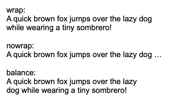
To get back the current value of the text wrap behavior we can use the global GetTextWrap() function, which will return the numeric value of the constant.
Go
textWeight := rui.GetTextWrap(rootView, "text")
// Do something with the value
Text selection
To prevent accidental highlighting or copying of view's content we can use the "user-select" property.
When setting values in the resource description file, we can use various representations that map to boolean values: "true", "yes", "on", "1" for true, and "false", "no", "off", "0" for false.
However, by default user is not capable to select the text in the view(exceptions are: EditView and a few other views which contain editable fields, when "semantics" property is set to a specific values).
RUI
ListLayout {
width = 100%,
orientation = up-down,
gap = 1em,
content = [
TextView{
user-select = true,
text = "selectable:<br>A quick brown fox jumps over the lazy dog while wearing a tiny sombrero!",
},
TextView{
text = "non selectable:<br>A quick brown fox jumps over the lazy dog while wearing a tiny sombrero!",
},
]
}
Go
view := rui.NewListLayout(session, rui.Params{
rui.Width: rui.Percent(100),
rui.Orientation: rui.TopDownOrientation,
rui.Gap: rui.Em(1),
rui.Content: []rui.View{
rui.NewTextView(session, rui.Params{
rui.UserSelect: true,
rui.Text: "selectable:<br>A quick brown fox jumps over the lazy dog while wearing a tiny sombrero!",
}),
rui.NewTextView(session, rui.Params{
rui.Text: "non selectable:<br>A quick brown fox jumps over the lazy dog while wearing a tiny sombrero!",
}),
},
})
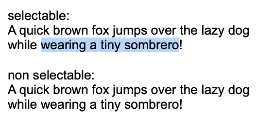
As usual the property can be set at any time, not only during initial view hierarchy creation.
For this we can use a Set() method of the view.
Go
if !view.Set(rui.UserSelect, true) {
// Something went wrong
}
For more information on how to work with properties see Property System tutorial.
To read back the current value we can use the global IsUserSelect() function, which will return the boolean value.
Go
selectable := rui.IsUserSelect(rootView, "text")
// Do something with the value
Text characters orientation
When the text is set to be displayed vertically(see "writing-mode" property description or Text writing mode section below) it is possible to control how the characters will appear itself, whether they will be rotated or not. The behavior is controlled by the "vertical-text-orientation" which accept the following values:
| Value | Name | Description |
|---|---|---|
MixedTextOrientation |
"mixed" | Characters rotated 90° clockwise |
UprightTextOrientation |
"upright" | Characters are arranged normally(vertically) |
When setting the value of the property from resource description file the name of the value is used.
RUI
ListLayout {
width = 100%,
gap = 1em,
content = [
EditView{
writing-mode = vertical-left-to-right,
vertical-text-orientation = mixed,
},
EditView{
writing-mode = vertical-left-to-right,
vertical-text-orientation = upright,
},
]
}
Go
view := rui.NewListLayout(session, rui.Params{
rui.Width: rui.Percent(100),
rui.Gap: rui.Em(1),
rui.Content: []rui.View{
rui.NewEditView(session, rui.Params{
rui.WritingMode: rui.VerticalLeftToRight,
rui.VerticalTextOrientation: rui.MixedTextOrientation,
}),
rui.NewEditView(session, rui.Params{
rui.WritingMode: rui.VerticalLeftToRight,
rui.VerticalTextOrientation: rui.UprightTextOrientation,
}),
},
})
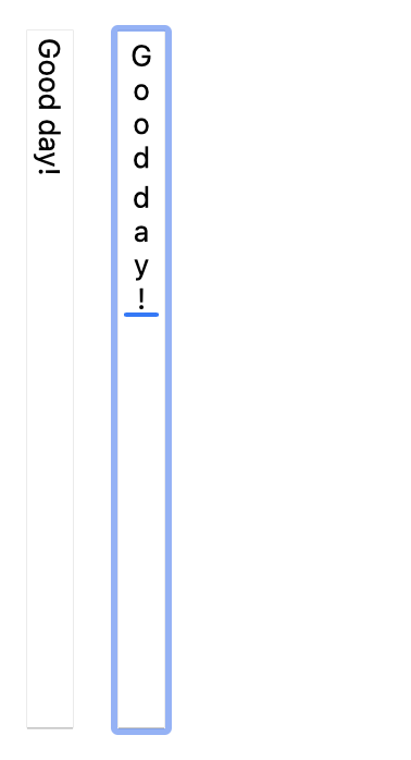
To change the value of the "vertical-text-orientation" property at run time we can use the Set() method of the view or the global rui.Set() function, see Property System tutorial to get more details on that.
Go
if !view.Set(rui.VerticalTextOrientation, rui.MixedTextOrientation) {
//Something went wrong
}
When retrieving the value back there is a convenient global function GetVerticalTextOrientation(), which will return a numeric value of the constant.
Go
textOrientation := rui.GetVerticalTextOrientation(rootView, "text")
// Do something with the value
Text whitespace behavior
To control how whitespace, such as spaces and line breaks, is handled within a view we can use the "white-space" property. It allows us to maintain the exact formatting of text as it appears in the source or manage how text wraps within a view.
Property accept the following values.
| Value | Name | Description |
|---|---|---|
WhiteSpaceNormal |
"normal" | This is the default value. Whitespace is collapsed into a single space, and lines are wrapped as needed |
WhiteSpaceNowrap |
"nowrap" | Sequences of whitespace are collapsed into a single space, but lines are not wrapped. Text will continue on to the next line if it exceeds the width of the view content box |
WhiteSpacePre |
"pre" | Whitespace is preserved exactly as typed in the source. Spaces, tabs, and line breaks are all displayed as they appear in the code |
WhiteSpacePreWrap |
"pre-wrap" | This value preserves whitespace while allowing lines to wrap normally if needed. It's similar to WhiteSpacePre, but it allows line wrapping where necessary |
WhiteSpacePreLine |
"pre-line" | Whitespace is collapsed into a single space, but line breaks are preserved. Lines will wrap as needed to fit the view's width |
WhiteSpaceBreakSpaces |
"break-spaces" | This value collapses sequences of whitespace and preserves line breaks, while also allowing for better line breaking control |
The following table illustrates the behavior of different property values across various scenarios.
| New lines | Spaces and Tabs | Text wrapping | End of line spaces | End of line other space separators | |
|---|---|---|---|---|---|
WhiteSpaceNormal |
Collapse | Collapse | Wrap | Remove | Hang |
WhiteSpaceNowrap |
Collapse | Collapse | No wrap | Remove | Hang |
WhiteSpacePre |
Preserve | Preserve | No wrap | Preserve | No wrap |
WhiteSpacePreWrap |
Preserve | Preserve | Wrap | Hang | Hang |
WhiteSpacePreLine |
Preserve | Collapse | Wrap | Remove | Hang |
WhiteSpaceBreakSpaces |
Preserve | Preserve | Wrap | Wrap | Wrap |
Below is an example which demonstrates the behavior and usage of all the values.
RUI
GridLayout {
width = 100%,
gap = 1em,
content = [
TextView{
row = 0,
column = 0,
text = "normal:",
},
TextView{
row = 1,
column = 0,
text = "nowrap:",
},
TextView{
row = 2,
column = 0,
text = "pre:",
},
TextView{
row = 3,
column = 0,
text = "pre-wrap:",
},
TextView{
row = 4,
column = 0,
text = "pre-line:",
},
TextView{
row = 5,
column = 0,
text = "break-spaces:",
},
TextView{
row = 0,
column = 1,
white-space = normal,
text = "A quick brown fox <br>jumps over the lazy dog while wearing a tiny sombrero!",
},
TextView{
row = 1,
column = 1,
white-space = nowrap,
text = "A quick brown fox <br>jumps over the lazy dog while wearing a tiny sombrero!",
},
TextView{
row = 2,
column = 1,
white-space = pre,
text = "A quick brown fox <br>jumps over the lazy dog while wearing a tiny sombrero!",
},
TextView{
row = 3,
column = 1,
white-space = pre-wrap,
text = "A quick brown fox <br>jumps over the lazy dog while wearing a tiny sombrero!",
},
TextView{
row = 4,
column = 1,
white-space = pre-line,
text = "A quick brown fox <br>jumps over the lazy dog while wearing a tiny sombrero!",
},
TextView{
row = 5,
column = 1,
white-space = break-spaces,
text = "A quick brown fox <br>jumps over the lazy dog while wearing a tiny sombrero!",
},
]
}
Go
view := rui.NewGridLayout(session, rui.Params{
rui.Width: rui.Percent(100),
rui.Gap: rui.Em(1),
rui.Content: []rui.View{
rui.NewTextView(session, rui.Params{
rui.Row: 0,
rui.Column: 0,
rui.Text: "normal:",
}),
rui.NewTextView(session, rui.Params{
rui.Row: 1,
rui.Column: 0,
rui.Text: "nowrap:",
}),
rui.NewTextView(session, rui.Params{
rui.Row: 2,
rui.Column: 0,
rui.Text: "pre:",
}),
rui.NewTextView(session, rui.Params{
rui.Row: 3,
rui.Column: 0,
rui.Text: "pre-wrap:",
}),
rui.NewTextView(session, rui.Params{
rui.Row: 4,
rui.Column: 0,
rui.Text: "pre-line:",
}),
rui.NewTextView(session, rui.Params{
rui.Row: 5,
rui.Column: 0,
rui.Text: "break-spaces:",
}),
rui.NewTextView(session, rui.Params{
rui.Row: 0,
rui.Column: 1,
rui.WhiteSpace: rui.WhiteSpaceNormal,
rui.Text: "A quick brown fox <br>jumps over the lazy dog while wearing a tiny sombrero!",
}),
rui.NewTextView(session, rui.Params{
rui.Row: 1,
rui.Column: 1,
rui.WhiteSpace: rui.WhiteSpaceNowrap,
rui.Text: "A quick brown fox <br>jumps over the lazy dog while wearing a tiny sombrero!",
}),
rui.NewTextView(session, rui.Params{
rui.Row: 2,
rui.Column: 1,
rui.WhiteSpace: rui.WhiteSpacePre,
rui.Text: "A quick brown fox <br>jumps over the lazy dog while wearing a tiny sombrero!",
}),
rui.NewTextView(session, rui.Params{
rui.Row: 3,
rui.Column: 1,
rui.WhiteSpace: rui.WhiteSpacePreWrap,
rui.Text: "A quick brown fox <br>jumps over the lazy dog while wearing a tiny sombrero!",
}),
rui.NewTextView(session, rui.Params{
rui.Row: 4,
rui.Column: 1,
rui.WhiteSpace: rui.WhiteSpacePreLine,
rui.Text: "A quick brown fox <br>jumps over the lazy dog while wearing a tiny sombrero!",
}),
rui.NewTextView(session, rui.Params{
rui.Row: 5,
rui.Column: 1,
rui.WhiteSpace: rui.WhiteSpaceBreakSpaces,
rui.Text: "A quick brown fox <br>jumps over the lazy dog while wearing a tiny sombrero!",
}),
},
})
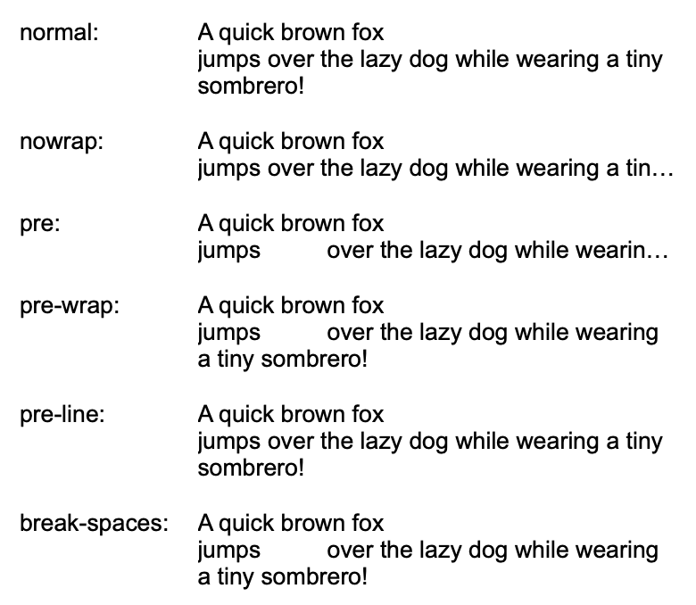
Setting the value at runtime is achieved by the Set() method of the view or the global rui.Set() function.
Go
if !view.Set(rui.WhiteSpace, rui.WhiteSpaceNowrap) {
//Something went wrong
}
To get more information regarding how to set or retrieve the value of the property check our Property System tutorial.
Text word break behavior
For controlling how words are broken when they reach the end of a line, preventing overflow and ensuring text remains readable we can use the "word-break" property. It allows us to handle different scenarios, such as breaking long words or preserving word boundaries in languages like CJK (Chinese, Japanese, Korean), thus enhancing the overall layout and user experience.
Below is the table with allowed values which we can pass in.
| Value | Name | Description |
|---|---|---|
WordBreakNormal |
"normal" | Default behavior for linefeed placement. Words are broken according to their natural word boundaries (spaces, hyphens etc.) |
WordBreakAll |
"break-all" | If the view boundaries are exceeded, a line break will be inserted between any two characters except for CJK (Chinese/Japanese/Korean) text |
WordBreakKeepAll |
"keep-all" | Line break will not be used in CJK text. For text in other languages, the default behavior(normal) will be applied |
WordBreakWord |
"break-word" | When the view boundaries are exceeded, the remaining whole words can be broken in an arbitrary place, if a more suitable place for line break is not found |
An example of using all the possible values of the property.
RUI
GridLayout {
width = 100%,
gap = 1em,
content = [
TextView{
row = 0,
column = 0,
text = "normal:",
},
TextView{
row = 1,
column = 0,
text = "break-all:",
},
TextView{
row = 2,
column = 0,
text = "keep-all:",
},
TextView{
row = 3,
column = 0,
text = "break-word:",
},
TextView{
row = 0,
column = 1,
word-break = normal,
text = "A quick brown fox jumps over the lazy dog while wearing a tiny sombrero!<br>一只敏捷的棕色狐狸戴着一顶小宽边帽,跳过了那只懒狗!",
},
TextView{
row = 1,
column = 1,
word-break = break-all,
text = "A quick brown fox jumps over the lazy dog while wearing a tiny sombrero!<br>一只敏捷的棕色狐狸戴着一顶小宽边帽,跳过了那只懒狗!",
},
TextView{
row = 2,
column = 1,
word-break = keep-all,
text = "A quick brown fox jumps over the lazy dog while wearing a tiny sombrero!<br>一只敏捷的棕色狐狸戴着一顶小宽边帽,跳过了那只懒狗!",
},
TextView{
row = 3,
column = 1,
word-break = break-word,
text = "A quick brown fox jumps over the lazy dog while wearing a tiny sombrero!<br>一只敏捷的棕色狐狸戴着一顶小宽边帽,跳过了那只懒狗!",
},
]
}
Go
view := rui.NewGridLayout(session, rui.Params{
rui.Width: rui.Percent(100),
rui.Gap: rui.Em(1),
rui.Content: []rui.View{
rui.NewTextView(session, rui.Params{
rui.Row: 0,
rui.Column: 0,
rui.Text: "normal:",
}),
rui.NewTextView(session, rui.Params{
rui.Row: 1,
rui.Column: 0,
rui.Text: "break-all:",
}),
rui.NewTextView(session, rui.Params{
rui.Row: 2,
rui.Column: 0,
rui.Text: "keep-all:",
}),
rui.NewTextView(session, rui.Params{
rui.Row: 3,
rui.Column: 0,
rui.Text: "break-word:",
}),
rui.NewTextView(session, rui.Params{
rui.Row: 0,
rui.Column: 1,
rui.WordBreak: rui.WordBreakNormal,
rui.Text: "A quick brown fox jumps over the lazy dog while wearing a tiny sombrero!<br>一只敏捷的棕色狐狸戴着一顶小宽边帽,跳过了那只懒狗!",
}),
rui.NewTextView(session, rui.Params{
rui.Row: 1,
rui.Column: 1,
rui.WordBreak: rui.WordBreakAll,
rui.Text: "A quick brown fox jumps over the lazy dog while wearing a tiny sombrero!<br>一只敏捷的棕色狐狸戴着一顶小宽边帽,跳过了那只懒狗!",
}),
rui.NewTextView(session, rui.Params{
rui.Row: 2,
rui.Column: 1,
rui.WordBreak: rui.WordBreakKeepAll,
rui.Text: "A quick brown fox jumps over the lazy dog while wearing a tiny sombrero!<br>一只敏捷的棕色狐狸戴着一顶小宽边帽,跳过了那只懒狗!",
}),
rui.NewTextView(session, rui.Params{
rui.Row: 3,
rui.Column: 1,
rui.WordBreak: rui.WordBreakWord,
rui.Text: "A quick brown fox jumps over the lazy dog while wearing a tiny sombrero!<br>一只敏捷的棕色狐狸戴着一顶小宽边帽,跳过了那只懒狗!",
}),
},
})
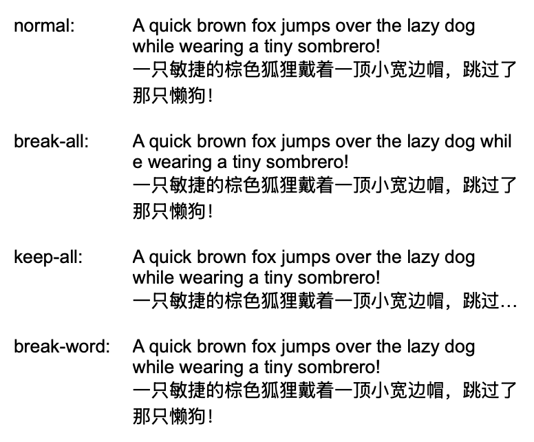
We can manipulate the property value at runtime using the Set() method of the view or the rui.Set() global function.
Go
if !view.Set(rui.WordBreak, rui.WordBreakWord) {
// Something went wrong
}
Please check out our Property System tutorial to get more information on how to work with the view's properties.
Text word spacing
For controlling the space between words within a view, enabling adjustments to enhance readability, create specific visual effects, and ensure consistent text spacing across different devices and browsers we can use the property "word-spacing".
The property holds the value of the SizeUnit type which allows us to specify value in different units.
The value can also be a negative one which will reduce the spacing by the specified amount.
RUI
ListLayout {
width = 100%,
orientation = up-down,
gap = 1em,
content = [
TextView{
word-spacing = -1px,
text = "-1px:<br>A quick brown fox jumps over the lazy dog while wearing a tiny sombrero!",
},
TextView{
text = "normal:<br>A quick brown fox jumps over the lazy dog while wearing a tiny sombrero!",
},
TextView{
word-spacing = 5px,
text = "5px:<br>A quick brown fox jumps over the lazy dog while wearing a tiny sombrero!",
},
TextView{
word-spacing = 0.5em,
text = "0.5em:<br>A quick brown fox jumps over the lazy dog while wearing a tiny sombrero!",
},
]
}
Go
view := rui.NewListLayout(session, rui.Params{
rui.Width: rui.Percent(100),
rui.Orientation: rui.TopDownOrientation,
rui.Gap: rui.Em(1),
rui.Content: []rui.View{
rui.NewTextView(session, rui.Params{
rui.WordSpacing: rui.Px(-1),
rui.Text: "-1px:<br>A quick brown fox jumps over the lazy dog while wearing a tiny sombrero!",
}),
rui.NewTextView(session, rui.Params{
rui.Text: "normal:<br>A quick brown fox jumps over the lazy dog while wearing a tiny sombrero!",
}),
rui.NewTextView(session, rui.Params{
rui.WordSpacing: rui.Px(5),
rui.Text: "5px:<br>A quick brown fox jumps over the lazy dog while wearing a tiny sombrero!",
}),
rui.NewTextView(session, rui.Params{
rui.WordSpacing: rui.Em(0.5),
rui.Text: "0.5em:<br>A quick brown fox jumps over the lazy dog while wearing a tiny sombrero!",
}),
},
})
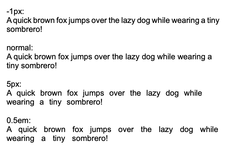
Setting the value at runtime is easy by using the Set() method of the view or the global rui.Set() function.
Go
if !view.Set(rui.WordSpacing, rui.In(0.1)) {
//Something went wrong
}
To get back the value of the property we can use the convenient global function GetWordSpacing(), which will return the value in a SizeUnit type.
Go
spacing := rui.GetWordSpacing(rootView, "text")
//Do something with the value
Text writing direction
To control the orientation of text within a view, enabling designers to create layouts that adapt to different writing systems and orientations, such as horizontal or vertical text flow
we can use the "writing-mode" property.
This property enhances flexibility by allowing for more dynamic and culturally diverse content presentation.
The property also affects the layout of the several UI controls like EditView and others.
| Value | Name | Description |
|---|---|---|
HorizontalTopToBottom |
"horizontal-top-to-bottom" | This is the default value. Text flows from left to right, and lines stack from top to bottom |
HorizontalBottomToTop |
"horizontal-bottom-to-top" | Text flows from left to right, and lines stack from bottom to top |
VerticalRightToLeft |
"vertical-right-to-left" | Vertical lines are output from right to left |
VerticalLeftToRight |
"vertical-left-to-right" | Vertical lines are output from left to right |
Check also the Text characters orientation section which explains how to change the behavior of the characters when the writing direction is set to one of the vertical variants.
RUI
ListLayout {
width = 100%,
gap = 1em,
content = [
EditView{
writing-mode = horizontal-top-to-bottom,
edit-view-type = multiline,
text = "A quick brown fox jumps over the lazy dog while wearing a tiny sombrero!",
},
EditView{
writing-mode = horizontal-bottom-to-top,
edit-view-type = multiline,
text = "A quick brown fox jumps over the lazy dog while wearing a tiny sombrero!",
},
EditView{
writing-mode = vertical-right-to-left,
edit-view-type = multiline,
text = "A quick brown fox jumps over the lazy dog while wearing a tiny sombrero!",
},
EditView{
writing-mode = vertical-left-to-right,
edit-view-type = multiline,
text = "A quick brown fox jumps over the lazy dog while wearing a tiny sombrero!",
},
]
}
Go
view := rui.NewListLayout(session, rui.Params{
rui.Width: rui.Percent(100),
rui.Gap: rui.Em(1),
rui.Content: []rui.View{
rui.NewEditView(session, rui.Params{
rui.WritingMode: rui.HorizontalTopToBottom,
rui.EditViewType: rui.MultiLineText,
rui.Text: "A quick brown fox jumps over the lazy dog while wearing a tiny sombrero!",
}),
rui.NewEditView(session, rui.Params{
rui.WritingMode: rui.HorizontalBottomToTop,
rui.EditViewType: rui.MultiLineText,
rui.Text: "A quick brown fox jumps over the lazy dog while wearing a tiny sombrero!",
}),
rui.NewEditView(session, rui.Params{
rui.WritingMode: rui.VerticalRightToLeft,
rui.EditViewType: rui.MultiLineText,
rui.Text: "A quick brown fox jumps over the lazy dog while wearing a tiny sombrero!",
}),
rui.NewEditView(session, rui.Params{
rui.WritingMode: rui.VerticalLeftToRight,
rui.EditViewType: rui.MultiLineText,
rui.Text: "A quick brown fox jumps over the lazy dog while wearing a tiny sombrero!",
}),
},
})
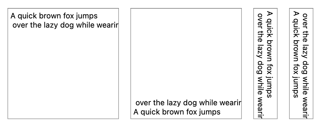
As any other property that one can be changed at runtime using the Set() method of the view or the rui.Set() global function.
Go
if !view.Set(rui.WritingMode, rui.HorizontalBottomToTop) {
//Something went wrong
}
To retrieve the value back we can use the convenient global function GetWritingMode(), which will return the numeric value of the constant.
Go
writingMode := rui.GetWritingMode(rootView, "text")
//Do something with the value
View transformation
View transformation enables a wide range of visual effects by manipulating views through translation, rotation, scaling, and skewing. These transformations are essential for creating dynamic, interactive designs, enhancing user experience with engaging visual content.
Below are the frequently used properties that participate in view transformation.
| Property | Type | Description |
|---|---|---|
| "transform" | TransformProperty |
Auxiliary property which maintain view translation, rotation, scale, and skew |
| "transform-origin-x" | SizeUnit |
The X-coordinate of the point around which a view transformation is applied |
| "transform-origin-y" | SizeUnit |
The Y-coordinate of the point around which a view transformation is applied |
| "transform-origin-z" | SizeUnit |
The Z-coordinate of the point around which a view transformation is applied |
| "perspective" | SizeUnit |
Distance between the z-plane and the user in order to give a 3D-positioned view some perspective |
| "perspective-origin-x" | SizeUnit |
The vanishing point of the "perspective" property |
| "perspective-origin-y" | SizeUnit |
The vanishing point of the "perspective" property |
| "backface-visibility" | bool |
Controls whether the back face of a view is visible when turned towards the user |
Besides these properties, there are others, but for simplicity, we'll cover them later in this section since they are just a shorthand to the "transform" property.
The "transform" property is a generic one and holds the value of the TransformProperty interface.
An instance of that interface can be created using the global rui.NewTransformProperty() function:
Go
func NewTransformProperty(params rui.Params) rui.TransformProperty
where rui.Params is a map which can contain the following properties:
| Property | Type | Description |
|---|---|---|
| "perspective" | SizeUnit |
Distance between the z-plane and the user in order to give a view some perspective transformation |
| "rotate" | AngleUnit |
The angle of the view rotation around specified axis by "rotate-x", "rotate-y", and "rotate-z" properties |
| "rotate-x" | float |
The X-coordinate of the vector denoting the axis of rotation in range 0 to 1 |
| "rotate-y" | float |
The Y-coordinate of the vector denoting the axis of rotation in range 0 to 1 |
| "rotate-z" | float |
The Z-coordinate of the vector denoting the axis of rotation in range 0 to 1 |
| "scale-x" | float |
The X-axis scaling factor |
| "scale-y" | float |
The Y-axis scaling factor |
| "scale-z" | float |
The Z-axis scaling factor |
| "skew-x" | AngleUnit |
The angle to use to distort the view along the X-axis |
| "skew-y" | AngleUnit |
The angle to use to distort the view along the Y-axis |
| "translate-x" | SizeUnit |
Translation of the view along X-axis |
| "translate-y" | SizeUnit |
Translation of the view along Y-axis |
| "translate-z" | SizeUnit |
Translation of the view along Z-axis |
As most of other properties of the view, "transform" can be set during the view creation process.
Go
view := rui.NewGridLayout(session, rui.Params{
rui.Width: rui.Percent(100),
rui.Height: rui.Percent(100),
// Center content on the screen
rui.CellHorizontalAlign: rui.CenterAlign,
rui.CellVerticalAlign: rui.CenterAlign,
rui.Content: rui.NewTextView(session, rui.Params{
rui.Text: "Transformed text",
rui.Transform: rui.NewTransformProperty(rui.Params{
rui.TranslateX: rui.Px(10), // Move view by 10 pixels in positive X-axis direction
rui.Rotate: rui.Deg(45), // Rotate the view by 45 degrees
rui.ScaleX: 0.9, // Scale down the view by 10%
rui.ScaleY: 0.9, // Scale down the view by 10%
}),
}),
})
Or we can change the property at any time using the Set() method of the view or its global function variant.
Go
view.Set(rui.Transform, rui.NewTransformProperty(rui.Params{
rui.TranslateX: rui.Px(50), // Move view by 50 pixels in positive X-axis direction
rui.Rotate: rui.Deg(45), // Rotate the view by 45 degrees
rui.ScaleX: 0.9, // Scale down the view by 10%
rui.ScaleY: 0.9, // Scale down the view by 10%
}))
When describing that property in resource description file a specific object format is used:
RUI
_{
perspective = <size-value>,
rotate-x = <float-value>,
rotate-y = <float-value>,
rotate-z = <float-value>,
rotate = <angle-value>,
translate-x = <size-value>,
translate-y = <size-value>,
translate-z = <size-value>,
scale-x = <float-value>,
scale-y = <float-value>,
scale-z = <float-value>,
skew-x = <angle-value>,
skew-y = <angle-value>,
}
Where <float-value> is a text representation of the float value, <angle-value> is a text representation of the AngleUnit value, and <size-value> is a text representation of the SizeUnit value.
Transforming the view using the "transform" property from resource description file:
RUI
GridLayout {
width = 100%,
height = 100%,
// Center content on the screen
cell-horizontal-align = center,
cell-vertical-align = center,
content = TextView {
text = "Transformed text",
transform = _{
translate-x = 50px, // Move view by 50 pixels in positive X-axis direction
rotate = 45deg, // Rotate the view by 45 degrees
scale-x = 0.9, // Scale down the view by 10%
scale-y = 0.9, // Scale down the view by 10%
}
}
}
Here’s how the above examples look:
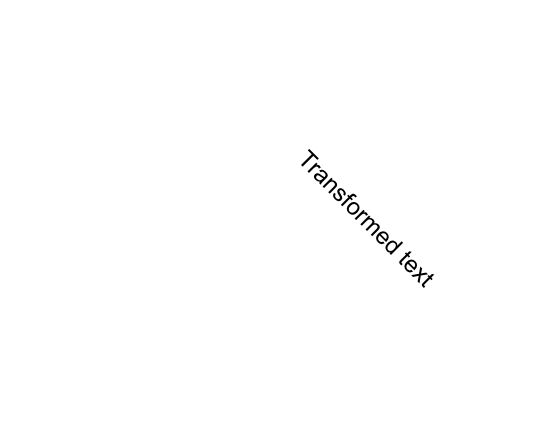
To read the actual values of the view transform, we can use the global rui.GetTransform() function, which will return a TransformProperty interface.
Go
if transform := rui.GetTransform(rootView, "view-id"); transform != nil {
if angle, ok := transform.Get(rui.Rotate).(rui.AngleUnit); ok {
// Do something with the angle value
}
// ...
}
The view also supports other transform-related properties, which may be convenient to use in some cases:
| Property | Type | Description |
|---|---|---|
| "rotate" | AngleUnit |
The angle of the view rotation around specified axis or Z-axis by default |
| "rotate-x" | float |
The X-coordinate of the vector denoting the axis of rotation in range 0 to 1 |
| "rotate-y" | float |
The Y-coordinate of the vector denoting the axis of rotation in range 0 to 1 |
| "rotate-z" | float |
The Z-coordinate of the vector denoting the axis of rotation in range 0 to 1 |
| "scale-x" | float |
The X-axis scaling factor |
| "scale-y" | float |
The Y-axis scaling factor |
| "scale-z" | float |
The Z-axis scaling factor |
| "skew-x" | AngleUnit |
The angle to use to distort the view along the X-axis |
| "skew-y" | AngleUnit |
The angle to use to distort the view along the Y-axis |
| "translate-x" | SizeUnit |
Translation of the view along X-axis |
| "translate-y" | SizeUnit |
Translation of the view along Y-axis |
| "translate-z" | SizeUnit |
Translation of the view along Z-axis |
They are exactly the same as what rui.TransformProperty interface accepts.
When setting such properties library will first check whether the "transform" property has been set and if not will create it implicitly, then update its corresponding values.
Below are a few examples that use such properties.
RUI
GridLayout {
width = 100%,
height = 100%,
// Center content on the screen
cell-horizontal-align = center,
cell-vertical-align = center,
content = TextView {
text = "Transformed text",
translate-x = 50px, // Move view by 50 pixels in positive X-axis direction
rotate-z = 1.0, // Specify the vector over which the view will be rotated
rotate = 45deg, // Rotate the view by 45 degrees
scale-x = 0.9, // Scale down the view by 10%
scale-y = 0.9, // Scale down the view by 10%
}
}
Go
view := rui.NewGridLayout(session, rui.Params{
rui.Width: rui.Percent(100),
rui.Height: rui.Percent(100),
// Center content on the screen
rui.CellHorizontalAlign: rui.CenterAlign,
rui.CellVerticalAlign: rui.CenterAlign,
rui.Content: rui.NewTextView(session, rui.Params{
rui.Text: "Transformed text",
rui.TranslateX: rui.Px(10), // Move view by 10 pixels in positive X-axis direction
rui.RotateZ: 1.0, // Specify the vector over which the view will be rotated
rui.Rotate: rui.Deg(45), // Rotate the view by 45 degrees
rui.ScaleX: 0.9, // Scale down the view by 10%
rui.ScaleY: 0.9, // Scale down the view by 10%
}),
})
There is a set of convenient global functions we can use to get back the values of the listed properties. These functions are different from what we saw for other properties of the view. They return values for several transform-related properties at once:
Go
rotateX, rotateY, rotateZ, rotateAngle := rui.GetRotate(rootView, "view-id")
// Do something with the view rotation
scaleX, scaleY, scaleZ := rui.GetScale(rootView, "view-id")
// Do something with the view scaling
translateX, translateY, translateZ := rui.GetTranslate(rootView, "view-id")
// Do something with the view translation
skewX, skewY := rui.GetSkew(rootView, "view-id")
// Do something with the view slanting
For more information please refer to TransformProperty interface and View reference documentation.
All transformations of the view are applied against the origin point, by default this is the center of the view, but it can be changed using the "transform-origin-x", "transform-origin-y", and "transform-origin-z" properties.
These properties are not part of the "transform" property and must be set directly on the view.
We can use a different types of units here since properties hold the values of the SizeUnit type.
Below is an example of how to scale the text starting from the left border of the view while hovering the mouse.
Go
// View creation code
view := rui.NewGridLayout(session, rui.Params{
rui.Width: rui.Percent(100),
rui.Height: rui.Percent(100),
// Center content on the screen
rui.CellHorizontalAlign: rui.CenterAlign,
rui.CellVerticalAlign: rui.CenterAlign,
rui.Content: rui.NewTextView(session, rui.Params{
rui.Text: "Transformed text",
rui.TransformOriginX: rui.Px(0), // The border of the view
rui.MouseOver: mouseOver, // Mouse over event handler
rui.MouseOut: mouseOut, // Mouse out event handler
}),
})
// mouseOver event handler function
func mouseOver(view rui.View, _ rui.MouseEvent) {
view.Set(rui.Transform, rui.NewTransformProperty(rui.Params{
rui.ScaleX: 1.1,
}))
}
// mouseOut event handler function
func mouseOut(view rui.View, _ rui.MouseEvent) {
view.Set(rui.Transform, rui.NewTransformProperty(rui.Params{
rui.ScaleX: 1,
}))
}
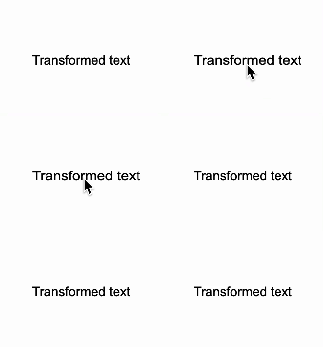
TODO: add explanation of 3D transform operations with examples and uncover properties which miss the explanations
Missing properties
View behavior in containers
The view can be a child of any container supported by the library, such as ListLayout, GridLayout, or TabsLayout.
For proper view appearance and layout, some containers require additional information.
For this purpose, the base view control has additional properties.
Below is the list of such properties with their respective internal type and a short description.
We'll cover them one by one.
| Property | Type | Description |
|---|---|---|
| "column" | Range |
The column index or range of column indexes that the view occupies when placed inside a GridLayout container |
| "row" | Range |
The row index or range of row indexes that the view occupies when placed inside a GridLayout container |
| "orientation" | int |
The container orientation |
| "Order" | int |
View order inside of the container |
| "z-index" | int |
View display order |
| "float" | int |
A floating view that allows text to wrap around it |
| "title" | string |
Title of the tab view placed into TabsLayout |
| "icon" | string |
Icon of the tab view placed into TabsLayout |
| "tab-close-button" | bool |
Appearance of the tab close button. For tab view placed into TabsLayout |
When dealing with GridLayout we often want to place child views at the specific cell for precise layout.
This is done by specifying the cell where we want to place the view using the "column" and "row" properties.
When using these properties, we can specify either the index of the cell, which starts from 0, or the range of cells indices if the view spans multiple cells.
To specify the range we use the Range structure.
The specific text format is used when define the values of these properties in resource description file:
RUI
"<start_index>:<end_index>" | "<index>"
, where <start_index> is the first cell row or column index which view will occupy, and <end_index> is the last cell row or column index.
If child view occupy only one cell then we can use just one <index> value.
Indexes are positive integers.
Example of the search bar:
RUI
GridLayout {
width = 100%,
padding = 1em,
cell-vertical-align = center,
cell-width = [auto, 1fr, auto], // Cell auto size for image and button. All the rest space for the text view.
background = linear-gradient {
direction = to-right-top,
gradient = "#FF6138C6 0%, #FFD38039 100%",
},
content = [
TextView {
row = 0, // First row
column = 0:2, // Spans the entire first row
margin = 1em,
text = "Search Bar",
text-color = white,
text-align = center,
},
ImageView {
row = 1, // Second row
column = 0, // First column
margin = 0.5em,
src = search.svg,
height = 1.5em,
fit = contain,
},
EditView {
id = search-text,
row = 1, // Second row
column = 1, // Second column
hint = "Product name...",
radius = 1em,
padding = 0.3em,
border = _{
style = none,
},
},
Button {
row = 1, // Second row
column = 2, // Third column
id = search-btn,
content = "Search",
radius = 1em,
},
],
}
Go
view := rui.NewGridLayout(session, rui.Params{
rui.Width: rui.Percent(100),
rui.Padding: rui.Em(1),
rui.CellVerticalAlign: rui.CenterAlign,
rui.CellWidth: []rui.SizeUnit{rui.AutoSize(), rui.Fr(1), rui.AutoSize()}, // Cell auto size for image and button. All the rest space for the text view.
rui.Background: rui.NewBackgroundLinearGradient(rui.Params{
rui.Direction: rui.ToRightTopGradient,
rui.Gradient: " #FF6138C6, #FFD38039",
}),
rui.Content: []rui.View{
rui.NewTextView(session, rui.Params{
rui.Row: 0, // First row
rui.Column: rui.Range{First: 0, Last: 2}, // Spans the entire first row
rui.Margin: rui.Em(1),
rui.Text: "Search Bar",
rui.TextColor: rui.White,
rui.TextAlign: rui.CenterAlign,
}),
rui.NewImageView(session, rui.Params{
rui.Row: 1, // Second row
rui.Column: 0, // First column
rui.Margin: rui.Em(0.5),
rui.Source: "search.svg",
rui.Height: rui.Em(1.5),
rui.Fit: rui.ContainFit,
}),
rui.NewEditView(session, rui.Params{
rui.ID: "search-text",
rui.Row: 1, // Second row
rui.Column: 1, // Second column
rui.Hint: "Product name...",
rui.Radius: rui.Em(1),
rui.Padding: rui.Em(0.3),
rui.Border: rui.NewBorder(rui.Params{
rui.Style: rui.NoneLine,
}),
}),
rui.NewButton(session, rui.Params{
rui.Row: 1, // Second row
rui.Column: 2, // Third column
rui.ID: "search-btn",
rui.Content: "Search",
rui.Radius: rui.Em(1),
}),
},
})
To retrieve back the values of "row" and "column" properties we can use the rui.GetRow() and rui.GetColumn() global functions, which will return the value of Range type.
Go
rows := rui.GetRow(rootView, "view-id")
// Do something with the value
columns := rui.GetColumn(rootView, "view-id")
// Do something with the value
For several containers like ListLayout, ListView it is crucial for controlling the orientation and direction of the items within a container, allowing us to create responsive layouts that adapt to different screen sizes and design requirements.
By specifying whether items should be laid out horizontally or vertically, and in what order, we enable precise control over the layout structure and flow of content on an application page.
The "orientation" property is used for this purpose which accept the following values:
| Value | Name | Description |
|---|---|---|
TopDownOrientation |
"up-down" | Child views are arranged in a column from top to bottom |
StartToEndOrientation |
"start-to-end" | Child views are laid out in a row from start to end |
BottomUpOrientation |
"bottom-up" | Child views are arranged in a column from bottom to top |
EndToStartOrientation |
"end-to-start" | Child views are laid out in a line from end to start |
When specifying property value in resource description file the name of the value is used. By default all child views are laid out from start to end.
RUI
GridLayout {
width = 100%,
height = 100%,
background-color = salmon,
cell-vertical-align = center,
cell-horizontal-align = center,
content = ListLayout {
padding = 1em,
radius = 0.5em,
background-color = #AAFFFFFF, // Semitransparent background
orientation = up-down, // Top-down layout
gap = 1em,
content = [
TextView {
text = "Item description",
},
ImageView {
src = "product.png",
fit = contain,
width = 100px,
height = 100px,
}
]
}
}
Go
view := rui.NewGridLayout(session, rui.Params{
rui.Width: rui.Percent(100),
rui.Height: rui.Percent(100),
rui.BackgroundColor: rui.Salmon,
rui.CellVerticalAlign: rui.CenterAlign,
rui.CellHorizontalAlign: rui.CenterAlign,
rui.Content: rui.NewListLayout(session, rui.Params{
rui.Padding: rui.Em(1),
rui.Radius: rui.Em(0.5),
rui.BackgroundColor: 0xAAFFFFFF, // Semitransparent background
rui.Orientation: rui.TopDownOrientation, // Top-down layout
rui.Gap: rui.Em(1),
rui.Content: []rui.View{
rui.NewTextView(session, rui.Params{
rui.Text: "Item description",
}),
rui.NewImageView(session, rui.Params{
rui.Source: "product.png",
rui.Fit: rui.ContainFit,
rui.Width: rui.Px(100),
rui.Height: rui.Px(100),
}),
},
}),
})
Lets have a look at other "orientation" property values.
RUI
orientation = bottom-up,
RUI
orientation = start-to-end,
RUI
orientation = end-to-start,
To get back the value of the "orientation" property we can use the global function rui.GetListOrientation(), which will return the value of the constant which was set.
Go
orientation := rui.GetListOrientation(rootView, "view-id")
// Do something with the value
In addition to orientation of the child views within the container we can group similar items so they will appear near each other, for this purpose the "Order" property is used. The "Order" property accepts an integer that signifies its group. The items are displayed in ascending order based on these integers, with lower values appearing first. In cases where multiple items share the same integer value, they are positioned in the order they were added to the container.
The default "Order" property value is 0 which means that the order of the elements follows the order in which they were added to the container. To place a view or groups of views at the beginning of the sequence, we use negative values. The property only affects the visual order and does not impact the logical order or tabs.
Below is an example of news sections whose order differs from the order in which they were added to the container. We can re-order them at any time by assigning different values to the "Order" property.
RUI
ListLayout {
width = 100%,
height = 100%,
padding = 1em,
gap = 1em,
background = linear-gradient {
direction = to-right-top,
gradient = "#FF6138C6 0%, #FFD38039 100%",
},
orientation = up-down,
content = [
// News sections
TextView {
width = 100%,
semantics = h2,
Order = -2, // Top-most Science group
text-color = white,
text = Science,
},
TextView {
width = 100%,
semantics = h2,
Order = -1, // Sport group
text-color = white,
text = Sport,
},
TextView{
width = 100%,
padding = 0.5em,
Order = -2, // In Science group
radius = 0.5em,
background-color = #88FFFFFF,
text = "Revolutionizing medicine: new breakthrough in gene editing technology",
},
TextView {
width = 100%,
padding = 0.5em,
Order = -2, // In Science group
radius = 0.5em,
background-color = #88FFFFFF,
text = "Deep dive into climate change: expert discusses latest scientific findings",
},
// Sport news group
TextView{
width = 100%,
padding = 0.5em,
Order = -1, // In Sport group
radius = 0.5em,
background-color = #88FFFFFF,
text = "Unprecedented turnaround: underdog team surpasses expectations, wins championship",
},
TextView {
width = 100%,
padding = 0.5em,
Order = -1, // In Sport group
radius = 0.5em,
background-color = #88FFFFFF,
text = "Star player's injury update: team faces uncertainty going forward",
},
TextView {
width = 100%,
padding = 0.5em,
Order = -1, // In Sport group
radius = 0.5em,
background-color = #88FFFFFF,
text = "Historic match decides world cup title: final showdown draws global attention",
},
]
}
Go
view := rui.NewListLayout(session, rui.Params{
rui.Width: rui.Percent(100),
rui.Height: rui.Percent(100),
rui.Padding: rui.Em(1),
rui.Gap: rui.Em(1),
rui.Background: rui.NewBackgroundLinearGradient(rui.Params{
rui.Direction: rui.ToRightTopGradient,
rui.Gradient: []rui.BackgroundGradientPoint{
{Pos: rui.Percent(0), Color: "#FF6138C6"},
{Pos: rui.Percent(100), Color: "#FFD38039"},
},
}),
rui.Orientation: rui.TopDownOrientation,
rui.Content: []rui.View{
rui.NewTextView(session, rui.Params{
rui.Width: rui.Percent(100),
rui.Semantics: rui.H2Semantics,
rui.Order: -2,
rui.TextColor: rui.White,
rui.Text: "Science",
}),
rui.NewTextView(session, rui.Params{
rui.Width: rui.Percent(100),
rui.Semantics: rui.H2Semantics,
rui.Order: -1,
rui.TextColor: rui.White,
rui.Text: "Sport",
}),
rui.NewTextView(session, rui.Params{
rui.Width: rui.Percent(100),
rui.Padding: rui.Em(0.5),
rui.Order: -2,
rui.Radius: rui.Em(0.5),
rui.BackgroundColor: 0x88FFFFFF,
rui.Text: "Revolutionizing medicine: new breakthrough in gene editing technology",
}),
rui.NewTextView(session, rui.Params{
rui.Width: rui.Percent(100),
rui.Padding: rui.Em(0.5),
rui.Order: -2,
rui.Radius: rui.Em(0.5),
rui.BackgroundColor: 0x88FFFFFF,
rui.Text: "Deep dive into climate change: expert discusses latest scientific findings",
}),
rui.NewTextView(session, rui.Params{
rui.Width: rui.Percent(100),
rui.Padding: rui.Em(0.5),
rui.Order: -1,
rui.Radius: rui.Em(0.5),
rui.BackgroundColor: 0x88FFFFFF,
rui.Text: "Unprecedented turnaround: underdog team surpasses expectations, wins championship",
}),
rui.NewTextView(session, rui.Params{
rui.Width: rui.Percent(100),
rui.Padding: rui.Em(0.5),
rui.Order: -1,
rui.Radius: rui.Em(0.5),
rui.BackgroundColor: 0x88FFFFFF,
rui.Text: "Star player's injury update: team faces uncertainty going forward",
}),
rui.NewTextView(session, rui.Params{
rui.Width: rui.Percent(100),
rui.Padding: rui.Em(0.5),
rui.Order: -1,
rui.Radius: rui.Em(0.5),
rui.BackgroundColor: 0x88FFFFFF,
rui.Text: "Historic match decides world cup title: final showdown draws global attention",
}),
},
})
To retrieve the value of the "Order" property we can use the global convenient method rui.GetOrder(), which will return the integer value.
Go
order := rui.GetOrder(rootView, "view-id")
// Do something with the value
When working with positioned views like with these which were added to AbsoluteLayout there might be cases where we need to control the display order if views which overlap each other.
For this purpose the "z-index" property could be quite handy, by setting specific values we ensure that certain elements appear on top of others.
This is crucial for creating layered designs, enhancing user experience by keeping interactive elements accessible, and managing complex layouts with multiple layers.
The property accept the negative and positive integer values. Views with the higher values of "z-index" property will be displayed on top of the views with lower values.
RUI
AbsoluteLayout {
width = 300px,
height = 300px,
content = [
GridLayout {
width = 100%,
height = 20%,
bottom = 0px,
left = 0px,
z-index = 1, // Place the image caption above the image
cell-vertical-align = center,
cell-horizontal-align = center,
background-color = #CCFFFFFF,
content = TextView {
width = 100%,
text = "Starry Night by Vincent van Gogh",
text-align= center,
}
},
ImageView {
width = 100%,
height = 100%,
fit = cover,
src = art.png,
},
]
}
Go
view := rui.NewAbsoluteLayout(session, rui.Params{
rui.Width: rui.Px(300),
rui.Height: rui.Px(300),
rui.Content: []rui.View{
rui.NewGridLayout(session, rui.Params{
rui.Width: rui.Percent(100),
rui.Height: rui.Percent(20),
rui.Bottom: rui.Px(0),
rui.Left: rui.Px(0),
rui.ZIndex: 1, // Display the image caption above the image
rui.CellVerticalAlign: rui.CenterAlign,
rui.CellHorizontalAlign: rui.CenterAlign,
rui.BackgroundColor: 0xCCFFFFFF,
rui.Content: rui.NewTextView(session, rui.Params{
rui.Width: rui.Percent(100),
rui.Text: "Starry Night by Vincent van Gogh",
rui.TextAlign: rui.CenterAlign,
}),
}),
rui.NewImageView(session, rui.Params{
rui.Width: rui.Percent(100),
rui.Height: rui.Percent(100),
rui.Fit: rui.CoverFit,
rui.Source: "art.png",
}),
},
})
To get back the value of the "z-index" property we can use the convenient global function rui.GetZIndex(), which will return an integer value.
Go
zIndex := rui.GetZIndex(rootView, "view-id")
// Do something with the value
When organizing content on a page with multiple columns, we can easily achieve this layout by using the "float" property. This method allows text to wrap around images or other inline elements, similar to how it appears in print media.
See also GridLayout or ColumnLayout if you need more precise control on multi-column layouts.
The accepted values for the "float" property are listed below.
| Value | Name | Description |
|---|---|---|
NoneFloat |
"none" | Text and other views inside the container will not wrap around this view |
LeftFloat |
"left" | Text and other views inside the container will wrap around this view on the right side |
RightFloat |
"right" | Text and other views inside the container will wrap around this view on the left side |
When setting the value from a resource description file, we use the name of the value.
RUI
ColumnLayout {
width = 400px,
padding = 1em,
orientation = up-down,
content = [
ImageView{
width = 150px,
height = 150px,
float = right, // Place image on the right side
margin-left = 1em,
src = art.png,
fit = contain,
},
TextView {
text-indent = 1em,
text-align = justify,
text = "Vincent van Gogh is renowned for his numerous famous artworks; nevertheless, \"Starry Night\" is generally regarded as his masterpiece. Created in 1889, this painting was executed from memory and imaginatively captures the vista from his room at the sanitarium where he was staying at that time.",
}
]
}
Go
view := rui.NewColumnLayout(session, rui.Params{
rui.Width: rui.Px(400),
rui.Padding: rui.Em(1),
rui.Orientation: rui.TopDownOrientation,
rui.Content: []rui.View{
rui.NewImageView(session, rui.Params{
rui.Width: rui.Px(150),
rui.Height: rui.Px(150),
rui.Float: rui.RightFloat, // Place image on the right side
rui.MarginLeft: rui.Em(1),
rui.Source: "art.png",
rui.Fit: rui.ContainFit,
}),
rui.NewTextView(session, rui.Params{
rui.TextIndent: rui.Em(1),
rui.TextAlign: rui.JustifyAlign,
rui.Text: "Vincent van Gogh is renowned for his numerous famous artworks; nevertheless, \"Starry Night\" is generally regarded as his masterpiece. Created in 1889, this painting was executed from memory and imaginatively captures the vista from his room at the sanitarium where he was staying at that time.",
}),
},
})
When working with the TabsLayout container, it's often necessary to control how tab buttons look.
The library provides several properties for this purpose.
These properties should be set on the top-most child views within the tabs layout.
The "title" property is used to specify the text displayed on each tab.
We can also add an optional image to a tab using the "icon" property.
If our tabs need to be dynamic, we can enable a close button on each tab by using the "tab-close-button" property.
To handle the tab close event, supply an event handler function to the "tab-close-event" property.
Below is a common use case of the tabs layout which demonstrate the "title" property.
RUI
GridLayout {
width = 650px,
height = 400px,
padding = 1em,
content = [
ImageView {
width = 100%,
height = 100%,
row = 0,
column = 0,
src = product.png,
fit = contain,
},
ListLayout {
width = 100%,
height = 100%,
gap = 1em,
orientation = up-down,
padding = 1em,
row = 0,
column = 1,
content = [
TextView {
width = 100%,
semantics = h1,
text = "115 Prom. des Anglais",
},
TextView {
width = 100%,
text = "Price starts at",
},
TextView {
width = 100%,
semantics = h3,
text = "650000€",
},
TabsLayout {
width = 100%,
height = 100%,
content = [
ColumnLayout {
title = "Property Info", // Title of the tab
width = 100%,
column-gap = 1em,
column-count = 2,
padding = 1em,
content = [
"2,000 square feet",
"2 Bedroom",
"2 Bathrooms",
"Accessible location",
"Comes with security",
],
},
ColumnLayout {
title = "Nearby Landmarks", // Title of the tab
width = 100%,
padding = 1em,
content = [
"Parks",
"Country Club",
"Schools and Universities",
],
},
],
},
],
},
],
}
Go
view := rui.NewGridLayout(session, rui.Params{
rui.Width: rui.Px(650),
rui.Height: rui.Px(400),
rui.Padding: rui.Em(1),
rui.Content: []rui.View{
rui.NewImageView(session, rui.Params{
rui.Width: rui.Percent(100),
rui.Height: rui.Percent(100),
rui.Row: 0,
rui.Column: 0,
rui.Source: "product.png",
rui.Fit: rui.ContainFit,
}),
rui.NewListLayout(session, rui.Params{
rui.Width: rui.Percent(100),
rui.Height: rui.Percent(100),
rui.Gap: rui.Em(1),
rui.Orientation: rui.TopDownOrientation,
rui.Padding: rui.Em(1),
rui.Row: 0,
rui.Column: 1,
rui.Content: []rui.View{
rui.NewTextView(session, rui.Params{
rui.Width: rui.Percent(100),
rui.Semantics: rui.H1Semantics,
rui.Text: "115 Prom. des Anglais",
}),
rui.NewTextView(session, rui.Params{
rui.Width: rui.Percent(100),
rui.Text: "Price starts at",
}),
rui.NewTextView(session, rui.Params{
rui.Width: rui.Percent(100),
rui.Semantics: rui.H3Semantics,
rui.Text: "650000€",
}),
rui.NewTabsLayout(session, rui.Params{
rui.Width: rui.Percent(100),
rui.Height: rui.Percent(100),
rui.Content: []rui.View{
rui.NewColumnLayout(session, rui.Params{
rui.Title: "Property Info", // Title of the tab
rui.Width: rui.Percent(100),
rui.ColumnGap: rui.Em(1),
rui.ColumnCount: 2,
rui.Padding: rui.Em(1),
rui.Content: []string{
"2,000 square feet",
"2 Bedroom",
"2 Bathrooms",
"Accessible location",
"Comes with security",
},
}),
rui.NewColumnLayout(session, rui.Params{
rui.Title: "Nearby Landmarks", // Title of the tab
rui.Width: rui.Percent(100),
rui.Padding: rui.Em(1),
rui.Content: []string{
"Parks",
"Country Club",
"Schools and Universities",
},
}),
},
}),
},
}),
},
})
Appearance of the tabs is customizable, check out our Application Resources tutorial, section Theme files->Styles.
If according to our design we need only an icon in the tab we can do this by setting the image file path as a value for "icon" property:
RUI
TabsLayout {
width = 400px,
height = 200px,
padding = 1em,
content = [
TextView {
icon = go_logo.svg, // Tab icon
width = 100%,
padding = 1em,
semantics = code,
white-space = pre,
tab-size = 4,
text = "view := rui.NewView(session, rui.Params{\n\tid: view,\n\trui.Width: rui.Percent(100),\n\trui.Height: rui.Percent(100),\n})",
},
TextView {
icon = rui_logo.svg, // Tab icon
width = 100%,
padding = 1em,
semantics = code,
white-space = pre,
tab-size = 4,
text = "View {\n\tid = view,\n\twidth = 100%,\n\theight = 100%,\n}",
},
],
}
Go
view := rui.NewTabsLayout(session, rui.Params{
rui.Width: rui.Percent(100),
rui.Height: rui.Percent(100),
rui.Padding: rui.Em(1),
rui.Content: []rui.View{
rui.NewTextView(session, rui.Params{
rui.Icon: "go_logo.svg",
rui.Width: rui.Percent(100),
rui.Padding: rui.Em(1),
rui.Semantics: rui.CodeSemantics,
rui.WhiteSpace: rui.WhiteSpacePre,
rui.TabSize: 4,
rui.Text: "view := rui.NewView(session, rui.Params{<br>\tid: view,<br>\trui.Width: rui.Percent(100),<br>\trui.Height: rui.Percent(100),<br>})",
}),
rui.NewTextView(session, rui.Params{
rui.Icon: "rui_logo.svg",
rui.Width: rui.Percent(100),
rui.Padding: rui.Em(1),
rui.Semantics: rui.CodeSemantics,
rui.WhiteSpace: rui.WhiteSpacePre,
rui.TabSize: 4,
rui.Text: "View {<br>\tid = view,<br>\twidth = 100%,<br>\theight = 100%,<br>}",
}),
},
})
![]()
When implementing Multi-Document Interface (MDI) applications we can enable tabs close button by using the "tab-close-button" property. Internally property holds the value of the boolean type and accepts the following text values : "true", "yes", "on", "1", and "false", "no", "off", "0".
To handle the tab close event, supply an event handler function to the "tab-close-event" property.
RUI
TabsLayout {
width = 100%,
height = 100%,
padding = 1em,
content = [
EditView {
title = "README.txt",
tab-close-button = yes, // Show tab close button
width = 100%,
edit-view-type = multiline,
text = "My awesome new project",
},
EditView {
title = "main.go",
tab-close-button = yes, // Show tab close button
width = 100%,
edit-view-type = multiline,
text = "package main\n\n// Import RUI library\nimport (\n\t\"github.com/anoshenko/rui\"\n)",
},
],
}
Go
view := rui.NewTabsLayout(session, rui.Params{
rui.Width: rui.Percent(100),
rui.Height: rui.Percent(100),
rui.Padding: rui.Em(1),
rui.Content: []rui.View{
rui.NewEditView(session, rui.Params{
rui.Title: "README.txt",
rui.TabCloseButton: true, // Show tab close button
rui.Width: rui.Percent(100),
rui.EditViewType: rui.MultiLineText,
rui.Text: "My awesome new project",
}),
rui.NewEditView(session, rui.Params{
rui.Title: "main.go",
rui.TabCloseButton: true, // Show tab close button
rui.Width: rui.Percent(100),
rui.EditViewType: rui.MultiLineText,
rui.WhiteSpace: rui.WhiteSpacePre,
rui.Text: "package main<br>// Import RUI library<br>import (<br>\t\"github.com/anoshenko/rui\"<br>)",
}),
},
})
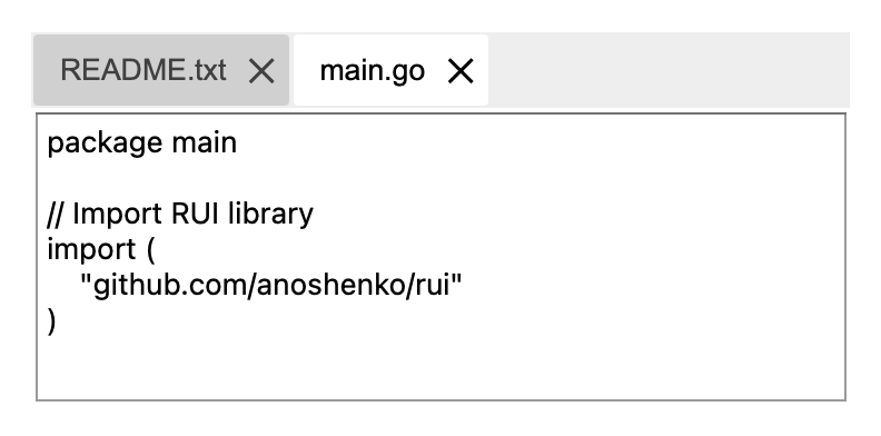
View cursor
For enhancing user experience by providing visual feedback about interactive elements on a webpage we can use the "cursor" property. It allows us to change the appearance of the mouse pointer when hovering over specific views of the application's page, such as buttons, links, etc. This helps users intuitively understand the functionality and interactivity of these elements, making the interface more intuitive and accessible. Additionally, using appropriate cursor styles can indicate system states like loading or disabled actions, guiding users on how to interact with the application effectively.
Internally "cursor" property holds the values of the integer type and accepts the following values:
| Value | Name | Description |
|---|---|---|
0 |
"auto" | Auto cursor |
1 |
"default" | Default cursor |
2 |
"none" | None cursor |
3 |
"context-menu" | Context menu cursor |
4 |
"help" | Help cursor |
5 |
"pointer" | Pointer cursor |
6 |
"progress" | Progress cursor |
7 |
"wait" | Wait cursor |
8 |
"cell" | Cell cursor |
9 |
"crosshair" | Crosshair cursor |
10 |
"text" | Text cursor |
11 |
"vertical-text" | Vertical text cursor |
12 |
"alias" | Alias cursor |
13 |
"copy" | Copy cursor |
14 |
"move" | Move cursor |
15 |
"no-drop" | No drop cursor |
16 |
"not-allowed" | Not allowed cursor |
17 |
"e-resize" | Resize cursor |
18 |
"n-resize" | Resize cursor |
19 |
"ne-resize" | Resize cursor |
20 |
"nw-resize" | Resize cursor |
21 |
"s-resize" | Resize cursor |
22 |
"se-resize" | Resize cursor |
23 |
"sw-resize" | Resize cursor |
24 |
"w-resize" | Resize cursor |
25 |
"ew-resize" | Resize cursor |
26 |
"ns-resize" | Resize cursor |
27 |
"nesw-resize" | Resize cursor |
28 |
"nwse-resize" | Resize cursor |
29 |
"col-resize" | Col resize cursor |
30 |
"row-resize" | Row resize cursor |
31 |
"all-scroll" | All scroll cursor |
32 |
"zoom-in" | Zoom in cursor |
33 |
"zoom-out" | Zoom out cursor |
34 |
"grab" | Grab cursor |
35 |
"grabbing" | Grabbing cursor |
When setting cursor value in resource description file we use the name of the value.
Below is an example which demostrate all possible types of the cursors supported by the library. When hovering mouse over the text views cursor will be changed to specified type. The results may be different depending on your operating system and browser.
RUI
ListLayout {
width = 100%,
height = 100%,
padding = 1em,
gap = 0.3em,
orientation = up-down,
content = [
TextView{width = 100%, cursor = "auto", text = "Auto cursor"},
TextView{width = 100%, cursor = "default", text = "Default cursor"},
TextView{width = 100%, cursor = "none", text = "None cursor"},
TextView{width = 100%, cursor = "context-menu", text = "Context menu cursor"},
TextView{width = 100%, cursor = "help", text = "Help cursor"},
TextView{width = 100%, cursor = "pointer", text = "Pointer cursor"},
TextView{width = 100%, cursor = "progress", text = "Progress cursor"},
TextView{width = 100%, cursor = "wait", text = "Wait cursor"},
TextView{width = 100%, cursor = "cell", text = "Cell cursor"},
TextView{width = 100%, cursor = "crosshair", text = "Crosshair cursor"},
TextView{width = 100%, cursor = "text", text = "Text cursor"},
TextView{width = 100%, cursor = "vertical-text", text = "Vertical text cursor"},
TextView{width = 100%, cursor = "alias", text = "Alias cursor"},
TextView{width = 100%, cursor = "copy", text = "Copy cursor"},
TextView{width = 100%, cursor = "move", text = "Move cursor"},
TextView{width = 100%, cursor = "no-drop", text = "No drop cursor"},
TextView{width = 100%, cursor = "not-allowed", text = "Not allowed cursor"},
TextView{width = 100%, cursor = "e-resize", text = "Resize cursor"},
TextView{width = 100%, cursor = "n-resize", text = "Resize cursor"},
TextView{width = 100%, cursor = "ne-resize", text = "Resize cursor"},
TextView{width = 100%, cursor = "nw-resize", text = "Resize cursor"},
TextView{width = 100%, cursor = "s-resize", text = "Resize cursor"},
TextView{width = 100%, cursor = "se-resize", text = "Resize cursor"},
TextView{width = 100%, cursor = "sw-resize", text = "Resize cursor"},
TextView{width = 100%, cursor = "w-resize", text = "Resize cursor"},
TextView{width = 100%, cursor = "ew-resize", text = "Resize cursor"},
TextView{width = 100%, cursor = "ns-resize", text = "Resize cursor"},
TextView{width = 100%, cursor = "nesw-resize", text = "Resize cursor"},
TextView{width = 100%, cursor = "nwse-resize", text = "Resize cursor"},
TextView{width = 100%, cursor = "col-resize", text = "Col resize cursor"},
TextView{width = 100%, cursor = "row-resize", text = "Row resize cursor"},
TextView{width = 100%, cursor = "all-scroll", text = "All scroll cursor"},
TextView{width = 100%, cursor = "zoom-in", text = "Zoom in cursor"},
TextView{width = 100%, cursor = "zoom-out", text = "Zoom out cursor"},
TextView{width = 100%, cursor = "grab", text = "Grab cursor"},
TextView{width = 100%, cursor = "grabbing", text = "Grabbing cursor"},
]
}
Go
view := rui.NewListLayout(session, rui.Params{
rui.Width: rui.Percent(100),
rui.Height: rui.Percent(100),
rui.Padding: rui.Em(1),
rui.Gap: rui.Em(0.3),
rui.Orientation: rui.TopDownOrientation,
rui.Content: []rui.View{
rui.NewTextView(session, rui.Params{rui.Width: rui.Percent(100), rui.Cursor: 0, rui.Text: "Auto cursor"}),
rui.NewTextView(session, rui.Params{rui.Width: rui.Percent(100), rui.Cursor: 1, rui.Text: "Default cursor"}),
rui.NewTextView(session, rui.Params{rui.Width: rui.Percent(100), rui.Cursor: 2, rui.Text: "None cursor"}),
rui.NewTextView(session, rui.Params{rui.Width: rui.Percent(100), rui.Cursor: 3, rui.Text: "Context menu cursor"}),
rui.NewTextView(session, rui.Params{rui.Width: rui.Percent(100), rui.Cursor: 4, rui.Text: "Help cursor"}),
rui.NewTextView(session, rui.Params{rui.Width: rui.Percent(100), rui.Cursor: 5, rui.Text: "Pointer cursor"}),
rui.NewTextView(session, rui.Params{rui.Width: rui.Percent(100), rui.Cursor: 6, rui.Text: "Progress cursor"}),
rui.NewTextView(session, rui.Params{rui.Width: rui.Percent(100), rui.Cursor: 7, rui.Text: "Wait cursor"}),
rui.NewTextView(session, rui.Params{rui.Width: rui.Percent(100), rui.Cursor: 8, rui.Text: "Cell cursor"}),
rui.NewTextView(session, rui.Params{rui.Width: rui.Percent(100), rui.Cursor: 9, rui.Text: "Crosshair cursor"}),
rui.NewTextView(session, rui.Params{rui.Width: rui.Percent(100), rui.Cursor: 10, rui.Text: "Text cursor"}),
rui.NewTextView(session, rui.Params{rui.Width: rui.Percent(100), rui.Cursor: 11, rui.Text: "Vertical text cursor"}),
rui.NewTextView(session, rui.Params{rui.Width: rui.Percent(100), rui.Cursor: 12, rui.Text: "Alias cursor"}),
rui.NewTextView(session, rui.Params{rui.Width: rui.Percent(100), rui.Cursor: 13, rui.Text: "Copy cursor"}),
rui.NewTextView(session, rui.Params{rui.Width: rui.Percent(100), rui.Cursor: 14, rui.Text: "Move cursor"}),
rui.NewTextView(session, rui.Params{rui.Width: rui.Percent(100), rui.Cursor: 15, rui.Text: "No drop cursor"}),
rui.NewTextView(session, rui.Params{rui.Width: rui.Percent(100), rui.Cursor: 16, rui.Text: "Not allowed cursor"}),
rui.NewTextView(session, rui.Params{rui.Width: rui.Percent(100), rui.Cursor: 17, rui.Text: "Resize cursor"}),
rui.NewTextView(session, rui.Params{rui.Width: rui.Percent(100), rui.Cursor: 18, rui.Text: "Resize cursor"}),
rui.NewTextView(session, rui.Params{rui.Width: rui.Percent(100), rui.Cursor: 19, rui.Text: "Resize cursor"}),
rui.NewTextView(session, rui.Params{rui.Width: rui.Percent(100), rui.Cursor: 20, rui.Text: "Resize cursor"}),
rui.NewTextView(session, rui.Params{rui.Width: rui.Percent(100), rui.Cursor: 21, rui.Text: "Resize cursor"}),
rui.NewTextView(session, rui.Params{rui.Width: rui.Percent(100), rui.Cursor: 22, rui.Text: "Resize cursor"}),
rui.NewTextView(session, rui.Params{rui.Width: rui.Percent(100), rui.Cursor: 23, rui.Text: "Resize cursor"}),
rui.NewTextView(session, rui.Params{rui.Width: rui.Percent(100), rui.Cursor: 24, rui.Text: "Resize cursor"}),
rui.NewTextView(session, rui.Params{rui.Width: rui.Percent(100), rui.Cursor: 25, rui.Text: "Resize cursor"}),
rui.NewTextView(session, rui.Params{rui.Width: rui.Percent(100), rui.Cursor: 26, rui.Text: "Resize cursor"}),
rui.NewTextView(session, rui.Params{rui.Width: rui.Percent(100), rui.Cursor: 27, rui.Text: "Resize cursor"}),
rui.NewTextView(session, rui.Params{rui.Width: rui.Percent(100), rui.Cursor: 28, rui.Text: "Resize cursor"}),
rui.NewTextView(session, rui.Params{rui.Width: rui.Percent(100), rui.Cursor: 29, rui.Text: "Col resize cursor"}),
rui.NewTextView(session, rui.Params{rui.Width: rui.Percent(100), rui.Cursor: 30, rui.Text: "Row resize cursor"}),
rui.NewTextView(session, rui.Params{rui.Width: rui.Percent(100), rui.Cursor: 31, rui.Text: "All scroll cursor"}),
rui.NewTextView(session, rui.Params{rui.Width: rui.Percent(100), rui.Cursor: 32, rui.Text: "Zoom in cursor"}),
rui.NewTextView(session, rui.Params{rui.Width: rui.Percent(100), rui.Cursor: 33, rui.Text: "Zoom out cursor"}),
rui.NewTextView(session, rui.Params{rui.Width: rui.Percent(100), rui.Cursor: 34, rui.Text: "Grab cursor"}),
rui.NewTextView(session, rui.Params{rui.Width: rui.Percent(100), rui.Cursor: 35, rui.Text: "Grabbing cursor"}),
},
})

View overflow behavior
It is essential for managing content that exceeds the dimensions of its containing view. For this purpose the library provides the "overflow" property. It allows us to control how overflowed content is handled, such as by clipping it, displaying scrollbars, or making it visible outside the container. This property is crucial for maintaining layout integrity and enhancing user experience in responsive designs, where content size may vary based on screen dimensions.
Internally property holds the integer value and accepts the following values.
| Value | Name | Description |
|---|---|---|
OverflowHidden |
"hidden" | The overflow is clipped, and the rest of the content will be invisible |
OverflowVisible |
"visible" | The overflow is not clipped. The content renders outside the element's box |
OverflowScroll |
"scroll" | The overflow is clipped, and a scrollbar is added to see the rest of the content |
OverflowAuto |
"auto" | Similar to OverflowScroll, but it adds scrollbars when necessary |
When setting the "overflow" property value from resource description file the name of the value is used.
RUI
ListLayout {
width = 100%,
padding = 1em,
orientation = up-down,
content = [
TextView {
width = 100%,
padding = 1em,
semantics = h1,
text = "Covert mov files to a gif image",
},
TextView {
width = 100%,
padding = 1em,
semantics = code,
radius = 0.5em,
background-color = #FFDEDEDE,
white-space = nowrap,
text-overflow = clip,
overflow = auto, // Add content scrollbars when necessary
text = "$ ffmpeg -i movie.mov -vf \"fps=30,scale=640:-1:flags=lanczos,split[s0][s1];[s0]palettegen[p];[s1][p]paletteuse\" image.gif",
}
]
}
Go
view := rui.NewListLayout(session, rui.Params{
rui.Width: rui.Percent(100),
rui.Padding: rui.Em(1),
rui.Orientation: rui.TopDownOrientation,
rui.Content: []rui.View{
rui.NewTextView(session, rui.Params{
rui.Width: rui.Percent(100),
rui.Padding: rui.Em(1),
rui.Semantics: rui.H1Semantics,
rui.Text: "Covert mov files to a gif image",
}),
rui.NewTextView(session, rui.Params{
rui.Width: rui.Percent(100),
rui.Padding: rui.Em(1),
rui.Semantics: rui.CodeSemantics,
rui.Radius: rui.Em(0.5),
rui.BackgroundColor: 0xFFDEDEDE,
rui.WhiteSpace: rui.WhiteSpaceNowrap,
rui.TextOverflow: rui.TextOverflowClip,
rui.Overflow: rui.OverflowAuto, // Add content scrollbars when necessary
rui.Text: "$ ffmpeg -i movie.mov -vf \"fps=30,scale=640:-1:flags=lanczos,split[s0][s1];[s0]palettegen[p];[s1][p]paletteuse\" image.gif",
}),
},
})


