

View Text Appearance
Table of contents
- Text cursor color
- Text font name
- Italic text
- Spacing between letters
- Line spacing
- Text translation
- Text overline, strikethrough and underline
- Text tab characters size
- Text in small caps
- Text horizontal alignment
- Text color
- Text direction
- Text indent
- Text shadow
- Text font size
- Text capitalization
- Text font weight
- Text wrap
- Text selection
- Text characters orientation
- Text whitespace behavior
- Text word break behavior
- Text word spacing
- Text writing direction
Regardless of whether the view has some text we still can provide some text settings which are propagated down below the view hierarchy. This is useful especially when we need to set our branding fonts and their attributes to the whole pages of the application. Each view can still use the different font settings.
The font and other text attributes are controlled by the following properties:
| Property | Type | Description |
|---|---|---|
| "caret-color" | Color |
Text cursor color |
| "font-name" | string |
Text font name |
| "italic" | bool |
Italic text |
| "letter-spacing" | SizeUnit |
Spacing between letters |
| "line-height" | SizeUnit |
Text line height. Not affect the font size |
| "not-translate" | bool |
Specify whether the text is localized and require a translation lookup |
| "overline" | bool |
The line above the text |
| "small-caps" | bool |
Specify whether the text displayed using small caps characters |
| "strikethrough" | bool |
Strike-through line over the text |
| "tab-size" | int |
Number of spaces in tab characters |
| "text-align" | int |
Horizontal alignment of the text |
| "text-color" | Color |
Font color |
| "text-direction" | int |
Text direction |
| "text-indent" | SizeUnit |
The text first line indentation |
| "text-line-color" | Color |
The color of the "strikethrough", "overline" and "underline" lines |
| "text-line-style" | int |
The style of the "strikethrough", "overline" and "underline" lines |
| "text-line-thickness" | SizeUnit |
The thickness of the "strikethrough", "overline" and "underline" lines |
| "text-shadow" | []ShadowProperty |
The text shadows |
| "text-size" | SizeUnit |
Font size |
| "text-transform" | int |
Text letters capitalization |
| "text-weight" | int |
Font weight |
| "text-wrap" | int |
Text wrapping |
| "underline" | bool |
The line below the text |
| "user-select" | bool |
Specify whether the user can select the text |
| "vertical-text-orientation" | int |
Vertical text letters orientation, see "writing-mode" |
| "white-space" | int |
Text white space characters behavior |
| "word-break" | int |
Behavior of the text word break |
| "word-spacing" | SizeUnit |
Spacing between the words |
| "writing-mode" | int |
Specify the direction of the text |
Let's quickly touch each of them and provide some examples.
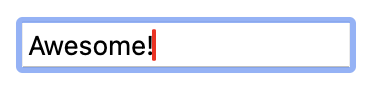
Text cursor color
Depending on our branding we can set the text caret color to a particular color. This is done by setting the "caret-color" property.
RUI
ListLayout {
    width = 100%,
    caret-color = red,
    content = EditView {
        id = input,
    }
}
Go
view := rui.NewListLayout(session, rui.Params{
    rui.Width:      rui.Percent(100),
    rui.CaretColor: rui.Red,
    rui.Content: rui.NewEditView(session, rui.Params{
        rui.ID: "input",
    }),
})
As mentioned early the text properties are inherited therefore they can be applied directly to the view which has the text data or to the parent views.
To read the value of the "caret-color" property we can use the GetCaretColor() global function which will return the color of the caret.
Go
caretColor := rui.GetCaretColor(rootView, "input")

// Do something with the value
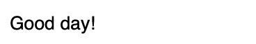
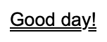
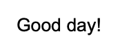
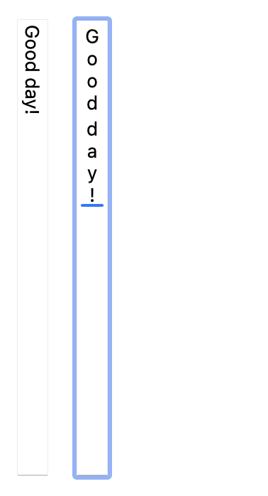
Text font name
To change the name of the font we can use the "font-name" property. The property may have several fonts listed separated by comma. The first font listed is applied first, if it is not available then the next font will be used. If non of the listed fonts are available then the default one will be used.
RUI
ListLayout {
    width = 100%,
    font-name = "Helvetica, Arial",
    content = TextView {
        id = text,
        text = "Good day!",
    }
}
Go
view := rui.NewListLayout(session, rui.Params{
    rui.Width:    rui.Percent(100),
    rui.FontName: "Helvetica, Arial",
    rui.Content: rui.NewTextView(session, rui.Params{
        rui.ID:   "text",
        rui.Text: "Good day!",
    }),
})
Here are a few fonts commonly used in web applications: "Arial", "Helvetica", "Verdana", "Times New Roman", "Georgia", "Courier New", "Tahoma", and "Impact".
To get the list of currently set fonts we can use the GetFontName() global function.
Go
fonts := rui.GetFontName(rootView, "text")

// Do something with the value
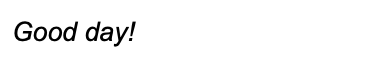
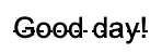
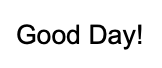
Italic text
To make our font to have an italic look we can use "italic" property. When setting the value in resource description file we can use a different values which are all mapped to the boolean value: "true", "yes", "on", "1", and "false", "no", "off", "0".
RUI
ListLayout {
    width = 100%,
    italic = "yes",
    content = TextView {
        id = text,
        text = "Good day!",
    }
}
Go
view := rui.NewListLayout(session, rui.Params{
    rui.Width:  rui.Percent(100),
    rui.Italic: true,
    rui.Content: rui.NewTextView(session, rui.Params{
        rui.ID:   "text",
        rui.Text: "Good day!",
    }),
})
To get the current property setting we can use the IsItalic() global function which will return a boolean value.
Go
italic := rui.IsItalic(rootView, "text")

// Do something with the value
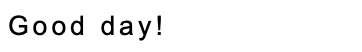
Spacing between letters
According to our design if we need our text to look less condense we can use the "letter-spacing" property.
It's value has a SizeUnit type and can be specified in different units like pixels, percentages inches and other unit types.
RUI
ListLayout {
    width = 100%,
    letter-spacing = 2px,
    content = TextView {
        id = text,
        text = "Good day!",
    }
}
Go
view := rui.NewListLayout(session, rui.Params{
    rui.Width:         rui.Percent(100),
    rui.LetterSpacing: rui.Px(2),
    rui.Content: rui.NewTextView(session, rui.Params{
        rui.ID:   "text",
        rui.Text: "Good day!",
    }),
})
To get the current property value we can use the GetLetterSpacing() global function which will return a SizeUnit value.
Go
spacing := rui.GetLetterSpacing(rootView, "text")

// Do something with the value
Line spacing
When we displaying a large amount of text on the page or trying to make it more appealing to the end user we can use the "line-height" property which allows us to put some space between the text lines. This property controls the overall text line height and does not affect the font size.
RUI
ListLayout {
    width = 100%,
    line-height = 1em,
    content = TextView {
        id = text,
        text = "In a historic milestone for space exploration, astronauts have successfully landed on Exoplanet X-23, marking humanity's first steps on a distant world beyond our solar system. The mission, launched aboard the spacecraft Odyssey, took over a decade to reach its destination, located approximately 50 light-years away. As the crew set foot on the alien terrain, they conducted initial experiments to study the planet's atmosphere and geological features, paving the way for future exploration and potential colonization. This groundbreaking achievement not only expands our understanding of the universe but also ignites hope for the possibility of life beyond Earth.",
    }
}
Go
view := rui.NewListLayout(session, rui.Params{
    rui.Width:      rui.Percent(100),
    rui.LineHeight: rui.Em(1),
    rui.Content: rui.NewTextView(session, rui.Params{
        rui.ID:   "text",
        rui.Text: "In a historic milestone for space exploration, astronauts have successfully landed on Exoplanet X-23, marking humanity's first steps on a distant world beyond our solar system. The mission, launched aboard the spacecraft Odyssey, took over a decade to reach its destination, located approximately 50 light-years away. As the crew set foot on the alien terrain, they conducted initial experiments to study the planet's atmosphere and geological features, paving the way for future exploration and potential colonization. This groundbreaking achievement not only expands our understanding of the universe but also ignites hope for the possibility of life beyond Earth.",
    }),
})
The result of the above code for the line height set to "1em" value:

The same but for the line height set to "2em":

To get the current property value we can use the GetLineHeight() global function which will return a SizeUnit value.
Go
lineHeight := rui.GetLineHeight(rootView, "text")

// Do something with the value
Text translation
By default, the library tries to find translations for any text in a view by checking the resource files. Therefore if the text content for the view is generated on the fly (at run time) we can disable the translation lookup using "not-translate" property. More information regarding application localization can be found in Application Resources tutorial, section Localization files.
RUI
ListLayout {
    width = 100%,
    content = TextView {
        id = text,
        not-translate = true,
        // The "text" property will be set later by the application logic
    }
}
Go
view := rui.NewListLayout(session, rui.Params{
    rui.Width:   rui.Percent(100),
    rui.Content: rui.NewTextView(session, rui.Params{
        rui.ID:           "text",
        rui.NotTranslate: true,
        // The rui.Text property will be set later by the application logic
    }),
})
Sometimes, the text we want to display includes parts that need localization.
In such cases, we have to construct the text manually.
Library provides a GetString() method of a client session to retrieve the localized text which then can be combined with generated one.
To get the current property value we can use a GetNotTranslate() global function which will return a boolean value.
Go
notTranslate := rui.GetNotTranslate(rootView, "text")

// Do something with the value
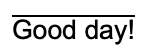
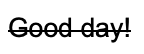
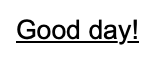
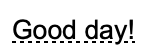
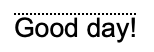
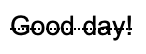
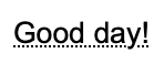
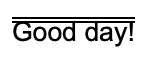
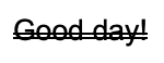
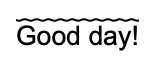
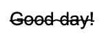
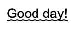
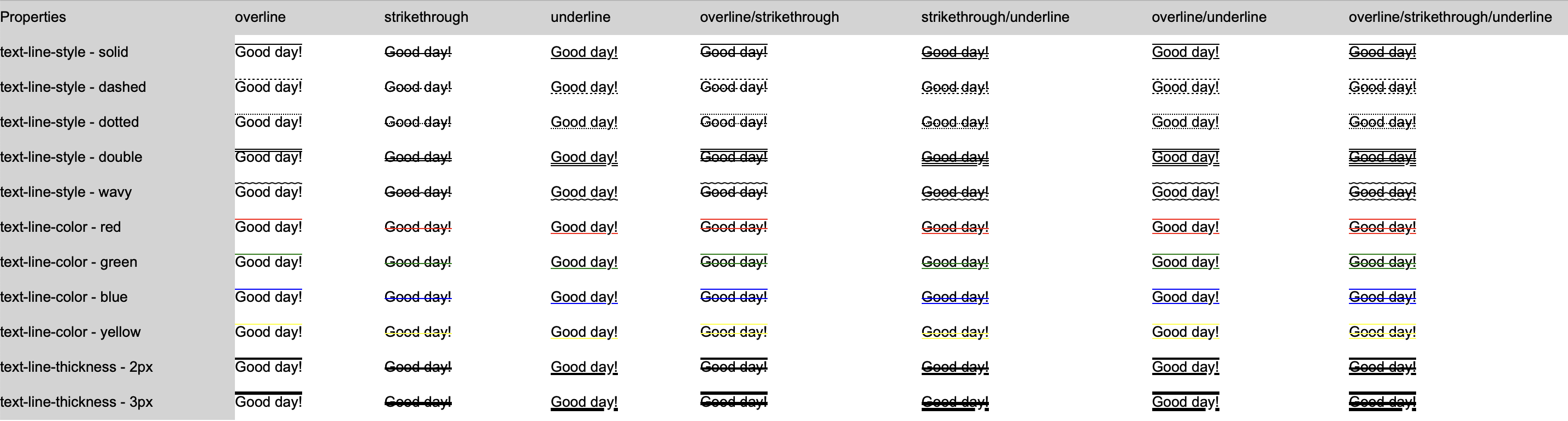
Text overline, strikethrough and underline
The overline, strikethrough and underline text decorations are controlled by the corresponding "overline", "strikethrough", and "underline" properties. While these properties control the line appearance, there are other properties like "text-line-color," "text-line-style," and "text-line-thickness" that allow for further customization. Keep in mind that the later properties control all types of the lines at ones and there is no way to specify different color, style and line thickness for each of the line type.
Let's have a look at some examples.
RUI
TextView {
id = text,
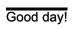
overline = true, // Overline text
text = "Good day!",
}
Go
view := rui.NewTextView(session, rui.Params{
    rui.ID:       "text",
    rui.Overline: true, // Overline text
    rui.Text:     "Good day!",
})
RUI
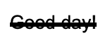
TextView {
    id = text,
    strikethrough = true, // Strikethrough text
    text = "Good day!",
}
Go
view := rui.NewTextView(session, rui.Params{
    rui.ID:            "text",
    rui.Strikethrough: true, // Strikethrough text
    rui.Text:          "Good day!",
})
RUI
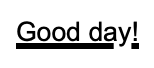
TextView {
    id = text,
    underline = true, // Underline text
    text = "Good day!",
}
Go
view := rui.NewTextView(session, rui.Params{
    rui.ID:        "text",
    rui.Underline: true, // Underline text
    rui.Text:      "Good day!",
})
To get back the values of "overline", "strikethrough", and "underline" properties, we can use global functions like IsOverline(), IsStrikethrough(), and IsUnderline() which will return a boolean value.
Go
overline := rui.IsOverline(rootView, "text")

// Do something with the value
Go
strikethrough := rui.IsStrikethrough(rootView, "text")

// Do something with the value
Go
underline := rui.IsUnderline(rootView, "text")

// Do something with the value
If straight line is not what we want, we can change the line style using the "text-line-style" property. That property has a list of allowed line style values, see below. When describing the line style in resource description file, a name of the value is used.
| Value | Name | Description |
|---|---|---|
SolidLine |
"solid" | Solid line as a text line |
DashedLine |
"dashed" | Dashed line as a text line |
DottedLine |
"dotted" | Dotted line as a text line |
DoubleLine |
"double" | Double line as a text line |
WavyLine |
"wavy" | Wavy line as a text line |
For simplicity, we'll omit repetitive code that creates a TextView in the following examples and leave only relevant property settings.
Examples for dashed line:
RUI
overline = true,
text-line-style = dashed,
text = "Good day!",
Go
rui.Overline:      true,
rui.TextLineStyle: rui.DashedLine,
rui.Text:          "Good day!",
RUI
strikethrough = true,
text-line-style = dashed,
text = "Good day!",
Go
rui.Strikethrough: true,
rui.TextLineStyle: rui.DashedLine,
rui.Text:          "Good day!",
RUI
underline = true,
text-line-style = dashed,
text = "Good day!",
Go
rui.Underline:     true,
rui.TextLineStyle: rui.DashedLine,
rui.Text:          "Good day!",
Examples for dotted line:
RUI
overline = true,
text-line-style = dotted,
text = "Good day!",
Go
rui.Overline:      true,
rui.TextLineStyle: rui.DottedLine,
rui.Text:          "Good day!",
RUI
strikethrough = true,
text-line-style = dotted,
text = "Good day!",
Go
rui.Strikethrough: true,
rui.TextLineStyle: rui.DottedLine,
rui.Text:          "Good day!",
RUI
underline = true,
text-line-style = dotted,
text = "Good day!",
Go
rui.Underline:     true,
rui.TextLineStyle: rui.DottedLine,
rui.Text:          "Good day!",
Examples for double line:
RUI
overline = true,
text-line-style = double,
text = "Good day!",
Go
rui.Overline:      true,
rui.TextLineStyle: rui.DoubleLine,
rui.Text:          "Good day!",
TIP: While showing overline text the line may not be completely visible, in this case just increase the value of "line-height" property.
RUI
strikethrough = true,
text-line-style = double,
text = "Good day!",
Go
rui.Strikethrough: true,
rui.TextLineStyle: rui.DoubleLine,
rui.Text:          "Good day!",
RUI
underline = true,
text-line-style = double,
text = "Good day!",
Go
rui.Underline:     true,
rui.TextLineStyle: rui.DoubleLine,
rui.Text:          "Good day!",
TIP: While showing underline text the line may not be completely visible, in this case just increase the value of "line-height" property.
Examples for wavy line:
RUI
overline = true,
text-line-style = wavy,
text = "Good day!",
Go
rui.Overline:      true,
rui.TextLineStyle: rui.WavyLine,
rui.Text:          "Good day!",
TIP: While showing overline text the line may not be completely visible, in this case just increase the value of "line-height" property.
RUI
strikethrough = true,
text-line-style = wavy,
text = "Good day!",
Go
rui.Strikethrough: true,
rui.TextLineStyle: rui.WavyLine,
rui.Text:          "Good day!",
RUI
underline = true,
text-line-style = wavy,
text = "Good day!",
Go
rui.Underline:     true,
rui.TextLineStyle: rui.WavyLine,
rui.Text:          "Good day!",
TIP: While showing underline text the line may not be completely visible, in this case just increase the value of "line-height" property.
To get back the value of the "text-line-style" property, we can use the global function GetTextLineStyle(), which will return an integer constant value corresponding to current line style.
Go
lineStyle := rui.GetTextLineStyle(rootView, "text")

// Do something with the value
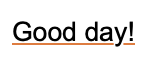
There are cases when the default color of the line does not match our design. For this purpose, the "text-line-color" property can be used. If you have set the "text-color" property, it will also affect the line color. If the text and line have the same color, it's better to use only the "text-color" property instead of setting values for both properties.
RUI
overline = true,
text-line-color = #FFED762F,
text = "Good day!",
Go
rui.Overline:      true,
rui.TextLineColor: 0xFFED762F,
rui.Text:          "Good day!",

RUI
strikethrough = true,
text-line-color = #FFED762F,
text = "Good day!",
Go
rui.Strikethrough: true,
rui.TextLineColor: 0xFFED762F,
rui.Text:          "Good day!",

RUI
underline = true,
text-line-color = #FFED762F,
text = "Good day!",
Go
rui.Underline:     true,
rui.TextLineColor: 0xFFED762F,
rui.Text:          "Good day!",
To get back the value of the "text-line-color" property, we can use the global function GetTextLineColor(), which will return the current color value of the line.
Go
lineColor := rui.GetTextLineColor(rootView, "text")

// Do something with the value
If, according to our design, the line thickness differs from the default value, we can specify it with the "text-line-thickness" property. By default, the thickness of the line (if not specified) is scaled proportionally with "text-size".
RUI
overline = true,
text-line-thickness = 3px,
text = "Good day!",
Go
rui.Overline:          true,
rui.TextLineThickness: rui.Px(3),
rui.Text:              "Good day!",
TIP: While showing overline text the line may not be completely visible, in this case just increase the value of "line-height" property.
RUI
strikethrough = true,
text-line-thickness = 3px,
text = "Good day!",
Go
rui.Strikethrough:     true,
rui.TextLineThickness: rui.Px(3),
rui.Text:              "Good day!",
RUI
underline = true,
text-line-thickness = 3px,
text = "Good day!",
Go
rui.Underline:         true,
rui.TextLineThickness: rui.Px(3),
rui.Text:              "Good day!",
TIP: While showing underline text the line may not be completely visible, in this case just increase the value of "line-height" property.
To retrieve the value of the "text-line-thickness" property, we can use the global function GetTextLineThickness(), which will return the current line thickness value as a SizeUnit type.
Go
lineColor := rui.GetTextLineThickness(rootView, "text")

// Do something with the value
If you are still unsure about which decoration to choose for your text, please find the table with some examples below.
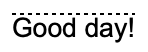
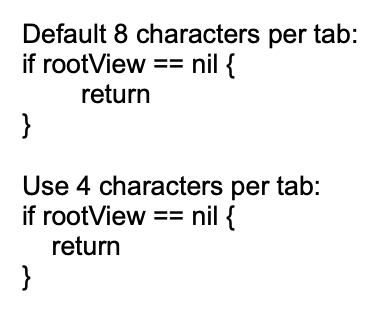
Text tab characters size
For controlling the width of tab characters in text content, and allowing to achieve consistent spacing and improve readability across different clients we can use the "tab-size" property. By adjusting the tab size, we can ensure proper alignment of formatted text, leading to a more polished and user-friendly interface. Property holding the value of an integer type and by default has the value of 8 characters.
Browsers combine multiple whitespaces characters including tabs into a single space when displaying text. To show tabs correctly in our text, we can use the "white-space" property. Set it to either "pre" or "pre-wrap" to keep all whitespace characters intact. Another solution could be to utilize the "semantics" property with the value "code".
When setting the value of the "tab-size" property in resource description file a text representation of an integer type is used.
RUI
ListLayout {
    width = 210px,
    padding = 1em,
    gap = 1em,
    orientation = up-down,
    content = [
        TextView {
            white-space = pre-wrap, // Whitespace behavior
            text = "Default 8 characters:<br>if rootView == nil {<br>\treturn<br>}",
        },
        TextView {
            tab-size = 4,           // Tab size in characters
            white-space = pre-wrap, // Whitespace behavior
            text = "Use 4 characters per tab:<br>if rootView == nil {<br>\treturn<br>}",
        }
    ]
}
Go
view := rui.NewListLayout(session, rui.Params{
    rui.Width:       rui.Px(210),
    rui.Padding:     rui.Em(1),
    rui.Gap:         rui.Em(1),
    rui.Orientation: rui.TopDownOrientation,
    rui.Content: []rui.View{
        rui.NewTextView(session, rui.Params{
            rui.WhiteSpace: rui.WhiteSpacePreWrap, // Whitespace behavior
            rui.Text:       "Default 8 characters:<br>if rootView == nil{<br>\treturn<br>}",
        }),
        rui.NewTextView(session, rui.Params{
            rui.TabSize:    4,                     // Tab size in characters
            rui.WhiteSpace: rui.WhiteSpacePreWrap, // Whitespace behavior
            rui.Text:       "Use 4 characters per tab:<br>if rootView == nil{<br>\treturn<br>}",
        }),
    },
})
We can easily retrieve the tab size value by using the global function rui.GetTabSize().
This function will return the number of space characters that represent a tab.
Go
tabSize := rui.GetTabSize(rootView, "view-id")

// Do something with the value
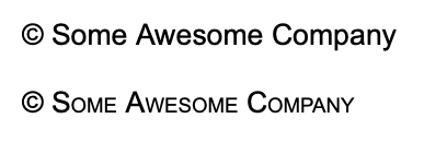
Text in small caps
Depending on your design there might be cases when we need to show the text in small caps letters. It can be particularly useful in various contexts where we want to draw attention, add visual interest, or adhere to specific design guidelines. The small caps text is controlled by "small-caps" property.
As other properties "small-caps" can be set either from resource description file or from code.
RUI
ListLayout {
    width = 100%,
    orientation = up-down,
    gap = 1em,
    content = [
        "© Some Awesome Company", // Implicitly converted to TextView
        TextView {
            id = text,
            small-caps = true, // Use small caps
            text = "© Some Awesome Company",
        },
    ]
}
Go
view := rui.NewListLayout(session, rui.Params{
    rui.Width:       rui.Percent(100),
    rui.Orientation: rui.TopDownOrientation,
    rui.Gap:         rui.Em(1),
    rui.Content: []any{
        "© Some Awesome Company", // Implicitly converted to TextView
        rui.NewTextView(session, rui.Params{
            rui.ID: "text",
            rui.SmallCaps: true, // Use small caps
            rui.Text:      "© Some Awesome Company",
        }),
    },
})
To retrieve the value of the property we can use a convenient global function IsSmallCaps(), which will return a boolean value.
Go
smallCaps := IsSmallCaps(rootView, "text")

// Do something with the value
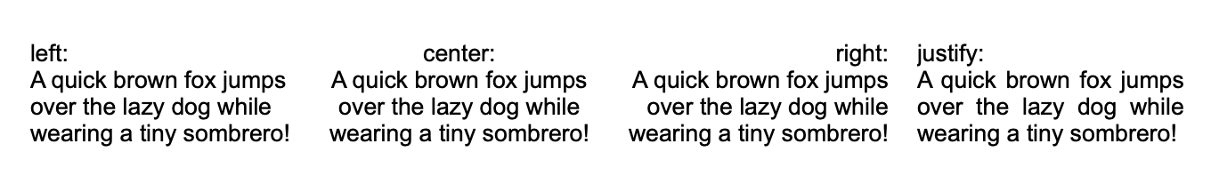
Text horizontal alignment
Displayed text can be aligned horizontally using the "text-align" property. The possible values for that property listed in table below. When specifying the value of that property in the resource description file, a name for the value must be used.
| Value | Name | Description |
|---|---|---|
LeftAlign |
"left" | Text left alignment |
RightAlign |
"right" | Text right alignment |
CenterAlign |
"center" | Test center alignment |
JustifyAlign |
"justify" | Text justify alignment |
Let's see a few examples.
RUI
ListLayout {
    width = 100%,
    padding = 2em,
    gap = 1em,
    content = [
        TextView {
            text-align = left,
            text = "left:<br>A quick brown fox jumps over the lazy dog while wearing a tiny sombrero!",
            width = 150px,
        },
        TextView {
            text-align = center,
            text = "center:<br>A quick brown fox jumps over the lazy dog while wearing a tiny sombrero!",
            width = 150px,
        },
        TextView {
            text-align = right,
            text = "right:<br>A quick brown fox jumps over the lazy dog while wearing a tiny sombrero!",
            width = 150px,
        },
        TextView {
            text-align = justify,
            text = "justify:<br>A quick brown fox jumps over the lazy dog while wearing a tiny sombrero!",
            width = 150px,
        },
    ]
}
Go
view := rui.NewListLayout(session, rui.Params{
    rui.Width:   rui.Percent(100),
    rui.Padding: rui.Em(2),
    rui.Gap:     rui.Em(1),
    rui.Content: []rui.View{
        rui.NewTextView(session, rui.Params{
            rui.TextAlign: rui.LeftAlign,
            rui.Text:      "left:<br>A quick brown fox jumps over the lazy dog while wearing a tiny sombrero!",
            rui.Width:     rui.Px(150),
        }),
        rui.NewTextView(session, rui.Params{
            rui.TextAlign: rui.CenterAlign,
            rui.Text:      "center:<br>A quick brown fox jumps over the lazy dog while wearing a tiny sombrero!",
            rui.Width:     rui.Px(150),
        }),
        rui.NewTextView(session, rui.Params{
            rui.TextAlign: rui.RightAlign,
            rui.Text:      "right:<br>A quick brown fox jumps over the lazy dog while wearing a tiny sombrero!",
            rui.Width:     rui.Px(150),
        }),
        rui.NewTextView(session, rui.Params{
            rui.TextAlign: rui.JustifyAlign,
            rui.Text:      "justify:<br>A quick brown fox jumps over the lazy dog while wearing a tiny sombrero!",
            rui.Width:     rui.Px(150),
        }),
    },
})
The convenient way of reading the property value back is to utilize a global GetTextAlign() function, which will return a numeric value of the alignment constant.
Go
align := GetTextAlign(rootView, "text")

// Do something with the value
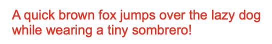
Text color
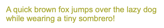
To change the default font color of the text we can use the "text-color" property.
That property is also used to set the color of the "overline", "strikethrough," and "underline" text lines if the "text-line-color" property was not defined.
The value of the property can contain a value of the Color type as well as its text representation.
Below are a few examples on how to set the value for that property.
RUI
TextView {
    width = 100%,
    text-color = red, // Red color constant
    text = "A quick brown fox jumps over the lazy dog while wearing a tiny sombrero!",
}
RUI
TextView {
    width = 100%,
    text-color = #FFAAAA00, // A color value
    text = "A quick brown fox jumps over the lazy dog while wearing a tiny sombrero!",
}
Go
view := rui.NewTextView(session, rui.Params{
    rui.Width:     rui.Percent(100),
    rui.TextColor: rui.Red, // Red color constant
    rui.Text:      "A quick brown fox jumps over the lazy dog while wearing a tiny sombrero!",
})
Go
view := rui.NewTextView(session, rui.Params{
    rui.Width:     rui.Percent(100),
    rui.TextColor: 0xFFAAAA00, // A color value
    rui.Text:      "A quick brown fox jumps over the lazy dog while wearing a tiny sombrero!",
})
To get more information on how to set the color property value, check our Color type reference documentation.
To retrieve the current value of the font color we can use the global GetTextColor() function, which will return the value using the Color type.
Go
fontColor := GetTextColor(rootView, "text")

// Do something with the value
Text direction
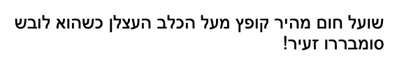
By default, text direction is using the system settings and depends on current locale. If we want to change the default behavior we can use the "text-direction" property.
The values of the property are restricted to the following set.
| Value | Name | Description |
|---|---|---|
SystemTextDirection |
"system" | Use the system text direction |
LeftToRightDirection |
"left-to-right" | For languages written from left to right (like English and most other languages) |
RightToLeftDirection |
"right-to-left" | For languages written from right to left (like Hebrew or Arabic) |
That property is also controls what will be the layout of the children for the several containers like ListLayout, GridLayout, ListView and other.
When setting the value in resource description file the name of the value has to be used.
RUI
TextView {
    width = 100%,
    text-direction = right-to-left, // Right to left text orientation
    text = "שועל חום מהיר קופץ מעל הכלב העצלן כשהוא לובש סומבררו זעיר!",
}
Go
view := rui.NewTextView(session, rui.Params{
    rui.Width:         rui.Percent(100),
    rui.TextDirection: rui.RightToLeftDirection, // Right to left text orientation
    rui.Text:          "שועל חום מהיר קופץ מעל הכלב העצלן כשהוא לובש סומבררו זעיר!",
})
To get back the value of that property conveniently we can use the global GetTextDirection() function, which will return the value of the corresponding constant.
Go
textDirection := GetTextDirection(rootView, "text")

// Do something with the value
Text indent
When first line of the text require an indentation that can be achieved by utilizing the "text-indent" property.
It allows the value to be set using different units since it is holding a SizeUnit type.
Indenting the first line of text in a paragraph enhances readability by creating visual separation between paragraphs, improving aesthetic appeal and maintaining consistency with traditional formatting standards.
RUI
ListLayout {
    width = 100%,
    orientation = up-down,
    gap = 1em,
    text-indent = 1em,
    content = [
        "Artificial Intelligence (AI) systems are sophisticated computer programs designed to perform tasks that typically require human intelligence. These systems are built using algorithms and statistical models that enable them to learn from data, recognize patterns, make decisions, and adapt to new situations. AI can be categorized into two main types: supervised learning, where the system is trained on labeled data to predict outcomes; and unsupervised learning, which involves analyzing unlabeled data to identify hidden patterns or structures. AI systems are used in various applications such as natural language processing, image recognition, autonomous vehicles, and personalized recommendations, transforming industries by enhancing efficiency and accuracy.",
        "Recent advancements in AI have been driven by the development of deep learning techniques, which use neural networks inspired by the human brain's structure. These models can process vast amounts of complex information, enabling breakthroughs in areas like computer vision and speech recognition. AI systems are increasingly integrated into daily life through virtual assistants, chatbots, and smart home devices. However, their widespread adoption also raises ethical considerations, such as privacy concerns, bias in decision-making, and the potential displacement of human jobs. As AI continues to evolve, it will be crucial to develop frameworks that ensure its responsible use and mitigate potential negative impacts on society.",
    ]
}
Go
view := rui.NewListLayout(session, rui.Params{
    rui.Width:       rui.Percent(100),
    rui.Orientation: rui.TopDownOrientation,
    rui.Gap:         rui.Em(1),
    rui.TextIndent:  rui.Em(1),
    rui.Content: []string{
        "Artificial Intelligence (AI) systems are sophisticated computer programs designed to perform tasks that typically require human intelligence. These systems are built using algorithms and statistical models that enable them to learn from data, recognize patterns, make decisions, and adapt to new situations. AI can be categorized into two main types: supervised learning, where the system is trained on labeled data to predict outcomes; and unsupervised learning, which involves analyzing unlabeled data to identify hidden patterns or structures. AI systems are used in various applications such as natural language processing, image recognition, autonomous vehicles, and personalized recommendations, transforming industries by enhancing efficiency and accuracy.",
        "Recent advancements in AI have been driven by the development of deep learning techniques, which use neural networks inspired by the human brain's structure. These models can process vast amounts of complex information, enabling breakthroughs in areas like computer vision and speech recognition. AI systems are increasingly integrated into daily life through virtual assistants, chatbots, and smart home devices. However, their widespread adoption also raises ethical considerations, such as privacy concerns, bias in decision-making, and the potential displacement of human jobs. As AI continues to evolve, it will be crucial to develop frameworks that ensure its responsible use and mitigate potential negative impacts on society.",
    },
})

The convenient way of getting back the property value is to use the GetTextIndent() global function, which will return the value using the SizeUnit type.
Go
indent := GetTextIndent(rootView, "text")

//Do something with the value
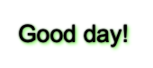
Text shadow
Text shadows enhance readability, create visual interest, add depth, and guide focus by separating text from its background and simulating light effects. The library allows us to specify several text shadows which is controlled by the "text-shadow" property.
Internally the value of the property is an array of ShadowProperty interface.
It is allowed to set just one shadow for the text, this value will internally be wrapped to an array.
For more information on how to work with the ShadowProperty please check our View Shadow page.
Text shadow has a few limitations comparing to "shadow" view property, it only accept "color", "blur", "x-offset", and "y-offset" properties. Other properties like "inset" and "spread-radius" will be ignored. Both the "color" and "blur" properties are essential, if they are not specified, no text shadow will appear.
RUI
TextView {
    width = 100%,
    text = "Good day!",
    text-shadow = _{
        color = black,
        blur = 2px,
        x-offset = 0px,
        y-offset = 0px,
    },
}
When creating the text shadow from source code there are two options, using either NewTextShadow() or NewShadowProperty().
Go
view := rui.NewTextView(session, rui.Params{
    rui.ID:         "text",
    rui.Width:      rui.Percent(100),
    rui.Text:       "Good day!",
    rui.TextShadow: rui.NewTextShadow(rui.Px(0), rui.Px(0), rui.Px(2), rui.Black),
})
Go
view := rui.NewTextView(session, rui.Params{
    rui.ID:    "text",
    rui.Width: rui.Percent(100),
    rui.Text:  "Good day!",
    rui.TextShadow: rui.NewShadowProperty(rui.Params{
        rui.ColorTag: rui.Black,
        rui.Blur:     rui.Px(2),
        rui.XOffset:  rui.Px(0),
        rui.YOffset:  rui.Px(0),
    }),
})
We can set the text shadow at any time using the Set() method of the view interface.
Go
if !view.Set(rui.TextShadow, rui.NewTextShadow(rui.Px(0), rui.Px(0), rui.Px(2), rui.Black)) {
    // Something went wrong
}
To retrieve the current text shadows, we can use the GetTextShadows() global method.
This method will return an array of ShadowProperty values, regardless of how many shadows the text has.
Go
shadows := rui.GetTextShadows(view, "text")
for _, shadow := range shadows {
    colorValue := shadow.Get(rui.ColorTag)
    if color, ok := colorValue.(rui.Color); ok {
        // Do something with the value
    }
}
As mentioned earlier we can specify several text shadows as well:
RUI
TextView {
    width = 100%,
    text = "Good day!",
    text-shadow = [
        // First shadow
        _{
            color = black,
            blur = 1px,
            x-offset = 0px,
            y-offset = 0px,
        },
        // Second shadow
        _{
            color = lime,
            blur = 2px,
            x-offset = 1px,
            y-offset = 1px,
        },
    ]
}
Go
view := rui.NewTextView(session, rui.Params{
    rui.Width: rui.Percent(100),
    rui.Text:  "Good day!",
    rui.TextShadow: []rui.ShadowProperty{
        rui.NewTextShadow(rui.Px(0), rui.Px(0), rui.Px(1), rui.Black),
        rui.NewTextShadow(rui.Px(1), rui.Px(1), rui.Px(2), rui.Lime),
    },
})
Or using the Set() method of the view.
Go
if !view.Set(rui.TextShadow, []rui.ShadowProperty{
    rui.NewTextShadow(rui.Px(0), rui.Px(0), rui.Px(1), rui.Black),
    rui.NewTextShadow(rui.Px(1), rui.Px(1), rui.Px(2), rui.Red),
}) {
    // Something went wrong
}
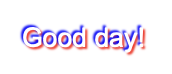
Example of combining the "text-color" property with a few text shadows:
RUI
TextView {
    width = 100%,
    text = "Good day!",
    text-color = white,
    text-shadow = [
        _{
            color = blue,
            blur = 1px,
            x-offset = -1px,
            y-offset = -1px,
        },
        _{
            color = red,
            blur = 1px,
            x-offset = 1px,
            y-offset = 1px,
        },
    ]
}
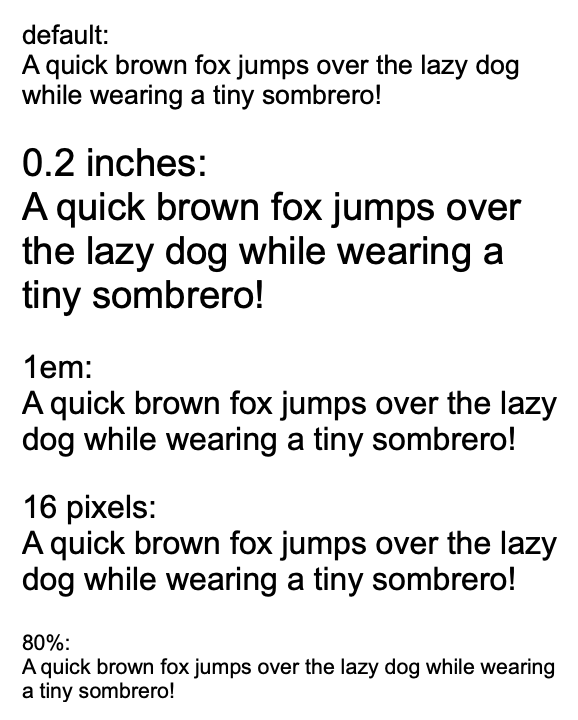
Text font size
Setting a font size is essential for ensuring text readability, maintaining design consistency, enhancing accessibility, and optimizing the overall user experience across various devices.
To control the font size a "text-size" property is used.
When setting the font size we can use different units since property support the values of the SizeUnit type.
RUI
ListLayout {
    width = 100%,
    orientation = up-down,
    gap = 1em,
    content = [
        TextView {
            text = "default:<br>A quick brown fox jumps over the lazy dog while wearing a tiny sombrero!",
        },
        TextView {
            text = "0.2 inches:<br>A quick brown fox jumps over the lazy dog while wearing a tiny sombrero!",
            text-size = 0.2in,
        },
        TextView {
            text = "1em:<br>A quick brown fox jumps over the lazy dog while wearing a tiny sombrero!",
            text-size = 1em,
        },
        TextView {
            text = "16 pixels:<br>A quick brown fox jumps over the lazy dog while wearing a tiny sombrero!",
            text-size = 16px,
        },
        TextView {
            text = "80%:<br>A quick brown fox jumps over the lazy dog while wearing a tiny sombrero!",
            text-size = 80%,
        },
    ]
}
Go
view := rui.NewListLayout(session, rui.Params{
    rui.Width:       rui.Percent(100),
    rui.Orientation: rui.TopDownOrientation,
    rui.Gap:         rui.Em(1),
    rui.Content: []rui.View{
        rui.NewTextView(session, rui.Params{
            rui.Text: "default:<br>A quick brown fox jumps over the lazy dog while wearing a tiny sombrero!",
        }),
        rui.NewTextView(session, rui.Params{
            rui.Text:     "0.2 inches:<br>A quick brown fox jumps over the lazy dog while wearing a tiny sombrero!",
            rui.TextSize: rui.Inch(0.2),
        }),
        rui.NewTextView(session, rui.Params{
            rui.Text:     "1em:<br>A quick brown fox jumps over the lazy dog while wearing a tiny sombrero!",
            rui.TextSize: rui.Em(1),
        }),
        rui.NewTextView(session, rui.Params{
            rui.Text:     "16 pixels:<br>A quick brown fox jumps over the lazy dog while wearing a tiny sombrero!",
            rui.TextSize: rui.Px(16),
        }),
        rui.NewTextView(session, rui.Params{
            rui.Text:     "80%:<br>A quick brown fox jumps over the lazy dog while wearing a tiny sombrero!",
            rui.TextSize: rui.Percent(80),
        }),
    },
})
As usual the property can be set at any time using the Set() method of the view:
Go
if !view.Set(rui.TextSize, rui.Em(0.8)) {
    // Something went wrong
}
To retrieve the current value of the font size we can use the GetTextSize() global function, which will return the value using the SizeUnit type.
Go
fontSize := rui.GetTextSize(rootView, "text")

// Do something with the value
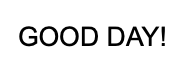
Text capitalization
Text capitalization is essential for controlling the case of text, ensuring consistency, improving readability, and achieving a desired visual style across application pages. To change the behavior we can use the "text-transform" property which accept the values listed in table below.
| Value | Name | Description |
|---|---|---|
NoneTextTransform |
"none" | Original case of the characters |
CapitalizeTextTransform |
"capitalize" | Every word starts with a capital letter |
LowerCaseTextTransform |
"lowercase" | All characters are converted to lowercase |
UpperCaseTextTransform |
"uppercase" | All characters are converted to uppercase |
When setting the value of the property from resource description file the name of the value is used.
RUI
TextView {
    width = 100%px,
    text-transform = none,
    text = "Good day!",
}
Go
view := rui.NewTextView(session, rui.Params{
    rui.Width:         rui.Percent(100),
    rui.TextTransform: rui.NoneTextTransform,
    rui.Text:          "Good day!",
})
Here is how the text appears for other property values, for simplicity we omit the repetitive code:
RUI
text-transform = capitalize,
RUI
text-transform = lowercase,
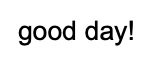
RUI
text-transform = uppercase,
As usual property can be set at any time through the source code by using the Set() method of the view.
Go
if !view.Set(rui.TextTransform, rui.CapitalizeTextTransform) {
    // Something went wrong
}
To retrieve the current value of the property we can use the convenient global function GetTextTransform(), which will return the numeric value of the constant.
Go
textTransform := rui.GetTextTransform(rootView, "text")

// Do something with the value
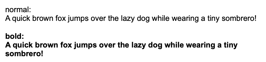
Text font weight
To emphasize certain elements and enhance the visual hierarchy of an application page effectively we can use the "text-weight" property which is essential for controlling the boldness or thickness of text. When certain fonts are only available in normal or bold styles, the specified value for this property will not have any effect. Below are accepted values we can pass in.
| Value | Name | Description |
|---|---|---|
ThinFont |
"thin" | Thin font |
ExtraLightFont |
"extra-light" | Extra light font |
LightFont |
"light" | Light font |
NormalFont |
"normal" | Normal font |
MediumFont |
"medium" | Medium font |
SemiBoldFont |
"semi-bold" | Semi-bold font |
BoldFont |
"bold" | Bold font |
ExtraBoldFont |
"extra-bold" | Extra bold font |
BlackFont |
"black" | Black font |
When setting the value of the property from resource description file the name of the value is used.
Below is an example that illustrate the normal and bold font.
RUI
ListLayout {
    width = 100%,
    orientation = up-down,
    gap = 1em,
    content = [
        TextView{
            text-weight = normal,
            text = "normal:<br>A quick brown fox jumps over the lazy dog while wearing a tiny sombrero!",
        },
        TextView{
            text-weight = bold,
            text = "bold:<br>A quick brown fox jumps over the lazy dog while wearing a tiny sombrero!",
        },
    ]
}
Go
view := rui.NewListLayout(session, rui.Params{
    rui.Width:       rui.Percent(100),
    rui.Orientation: rui.TopDownOrientation,
    rui.Gap:         rui.Em(1),
    rui.Content: []rui.View{
        rui.NewTextView(session, rui.Params{
            rui.TextWeight: rui.NormalFont,
            rui.Text:       "normal:<br>A quick brown fox jumps over the lazy dog while wearing a tiny sombrero!",
        }),
        rui.NewTextView(session, rui.Params{
            rui.TextWeight: rui.BoldFont,
            rui.Text:       "bold:<br>A quick brown fox jumps over the lazy dog while wearing a tiny sombrero!",
        }),
    },
})
To get back the current value of the font weight we can use the global GetTextWeight() function, which will return the numeric value of the constant.
Go
textWeight := rui.GetTextWeight(rootView, "text")

// Do something with the value
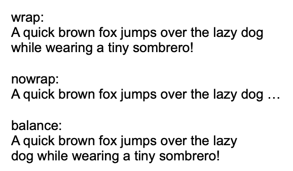
Text wrap
To control how view's text wraps, ensuring text fits within its view or behaves according to specified wrapping rules to prevent overflow we can use the "text-wrap" property. By default the text is wrapped when exceeding the content box of the view.
Below are all the acceptable values we can use for this property.
| Value | Name | Description |
|---|---|---|
TextWrapOn |
"wrap" | Text is wrapped at appropriate characters to minimize overflow |
TextWrapOff |
"nowrap" | Text does not wrap and will overflow the content box of the view |
TextWrapBalance |
"balance" | Text is wrapped in a way that best balances the number of characters on each line |
When setting the value of the property from resource description file the name of the value is used.
RUI
ListLayout {
    width = 100%,
    orientation = up-down,
    gap = 1em,
    content = [
        TextView{
            text-wrap = wrap,
            text = "wrap:<br>A quick brown fox jumps over the lazy dog while wearing a tiny sombrero!",
        },
        TextView{
            text-wrap = nowrap,
            text = "nowrap:<br>A quick brown fox jumps over the lazy dog while wearing a tiny sombrero!",
        },
        TextView{
            text-wrap = balance,
            text = "balance:<br>A quick brown fox jumps over the lazy dog while wearing a tiny sombrero!",
        },
    ]
}
Go
view := rui.NewListLayout(session, rui.Params{
    rui.Width:       rui.Percent(100),
    rui.Orientation: rui.TopDownOrientation,
    rui.Gap:         rui.Em(1),
    rui.Content: []rui.View{
        rui.NewTextView(session, rui.Params{
            rui.TextWrap: rui.TextWrapOn,
            rui.Text:       "wrap:<br>A quick brown fox jumps over the lazy dog while wearing a tiny sombrero!",
        }),
        rui.NewTextView(session, rui.Params{
            rui.TextWrap: rui.TextWrapOff,
            rui.Text:       "nowrap:<br>A quick brown fox jumps over the lazy dog while wearing a tiny sombrero!",
        }),
        rui.NewTextView(session, rui.Params{
            rui.TextWrap: rui.TextWrapBalance,
            rui.Text:       "balance:<br>A quick brown fox jumps over the lazy dog while wearing a tiny sombrero!",
        }),
    },
})
To get back the current value of the text wrap behavior we can use the global GetTextWrap() function, which will return the numeric value of the constant.
Go
textWeight := rui.GetTextWrap(rootView, "text")

// Do something with the value
Text selection
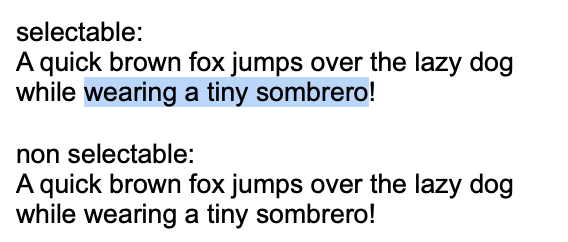
To prevent accidental highlighting or copying of view's content we can use the "user-select" property.
When setting values in the resource description file, we can use various representations that map to boolean values: "true", "yes", "on", "1" for true, and "false", "no", "off", "0" for false.
However, by default user is not capable to select the text in the view(exceptions are: EditView and a few other views which contain editable fields, when "semantics" property is set to a specific values).
RUI
ListLayout {
    width = 100%,
    orientation = up-down,
    gap = 1em,
    content = [
        TextView{
            user-select = true,
            text = "selectable:<br>A quick brown fox jumps over the lazy dog while wearing a tiny sombrero!",
        },
        TextView{
            text = "non selectable:<br>A quick brown fox jumps over the lazy dog while wearing a tiny sombrero!",
        },
    ]
}
Go
view := rui.NewListLayout(session, rui.Params{
    rui.Width:       rui.Percent(100),
    rui.Orientation: rui.TopDownOrientation,
    rui.Gap:         rui.Em(1),
    rui.Content: []rui.View{
        rui.NewTextView(session, rui.Params{
            rui.UserSelect: true,
            rui.Text:       "selectable:<br>A quick brown fox jumps over the lazy dog while wearing a tiny sombrero!",
        }),
        rui.NewTextView(session, rui.Params{
            rui.Text: "non selectable:<br>A quick brown fox jumps over the lazy dog while wearing a tiny sombrero!",
        }),
    },
})
As usual the property can be set at any time, not only during initial view hierarchy creation.
For this we can use a Set() method of the view.
Go
if !view.Set(rui.UserSelect, true) {
    // Something went wrong
}
For more information on how to work with properties see Property System tutorial.
To read back the current value we can use the global IsUserSelect() function, which will return the boolean value.
Go
selectable := rui.IsUserSelect(rootView, "text")

// Do something with the value
Text characters orientation
When the text is set to be displayed vertically, it is possible to control how the characters will appear, whether they will be rotated or not. See "writing-mode" property description or Text writing direction section. The behavior is controlled by the "vertical-text-orientation" which accept the following values:
| Value | Name | Description |
|---|---|---|
MixedTextOrientation |
"mixed" | Characters rotated 90° clockwise |
UprightTextOrientation |
"upright" | Characters are arranged normally(vertically) |
When setting the value of the property from resource description file the name of the value is used.
RUI
ListLayout {
    width = 100%,
    gap = 1em,
    content = [
        EditView{
            writing-mode = vertical-left-to-right,
            vertical-text-orientation = mixed,
        },
        EditView{
            writing-mode = vertical-left-to-right,
            vertical-text-orientation = upright,
        },
    ]
}
Go
view := rui.NewListLayout(session, rui.Params{
    rui.Width: rui.Percent(100),
    rui.Gap:   rui.Em(1),
    rui.Content: []rui.View{
        rui.NewEditView(session, rui.Params{
            rui.WritingMode:             rui.VerticalLeftToRight,
            rui.VerticalTextOrientation: rui.MixedTextOrientation,
        }),
        rui.NewEditView(session, rui.Params{
            rui.WritingMode:             rui.VerticalLeftToRight,
            rui.VerticalTextOrientation: rui.UprightTextOrientation,
        }),
    },
})
To change the value of the "vertical-text-orientation" property at run time we can use the Set() method of the view or the global rui.Set() function, see Property System tutorial to get more details on that.
Go
if !view.Set(rui.VerticalTextOrientation, rui.MixedTextOrientation) {
    //Something went wrong
}
When retrieving the value back there is a convenient global function GetVerticalTextOrientation(), which will return a numeric value of the constant.
Go
textOrientation := rui.GetVerticalTextOrientation(rootView, "text")

// Do something with the value
Text whitespace behavior
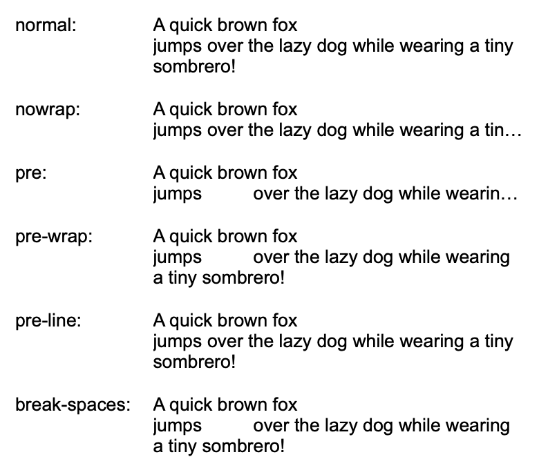
To control how whitespace, such as spaces and line breaks, is handled within a view we can use the "white-space" property. It allows us to maintain the exact formatting of text as it appears in the source or manage how text wraps within a view.
Property accept the following values.
| Value | Name | Description |
|---|---|---|
WhiteSpaceNormal |
"normal" | This is the default value. Whitespace is collapsed into a single space, and lines are wrapped as needed |
WhiteSpaceNowrap |
"nowrap" | Sequences of whitespace are collapsed into a single space, but lines are not wrapped. Text will continue on to the next line if it exceeds the width of the view content box |
WhiteSpacePre |
"pre" | Whitespace is preserved exactly as typed in the source. Spaces, tabs, and line breaks are all displayed as they appear in the code |
WhiteSpacePreWrap |
"pre-wrap" | This value preserves whitespace while allowing lines to wrap normally if needed. It's similar to WhiteSpacePre, but it allows line wrapping where necessary |
WhiteSpacePreLine |
"pre-line" | Whitespace is collapsed into a single space, but line breaks are preserved. Lines will wrap as needed to fit the view's width |
WhiteSpaceBreakSpaces |
"break-spaces" | This value collapses sequences of whitespace and preserves line breaks, while also allowing for better line breaking control |
The following table illustrates the behavior of different property values across various scenarios.
| New lines | Spaces and Tabs | Text wrapping | End of line spaces | End of line other space separators | |
|---|---|---|---|---|---|
WhiteSpaceNormal |
Collapse | Collapse | Wrap | Remove | Hang |
WhiteSpaceNowrap |
Collapse | Collapse | No wrap | Remove | Hang |
WhiteSpacePre |
Preserve | Preserve | No wrap | Preserve | No wrap |
WhiteSpacePreWrap |
Preserve | Preserve | Wrap | Hang | Hang |
WhiteSpacePreLine |
Preserve | Collapse | Wrap | Remove | Hang |
WhiteSpaceBreakSpaces |
Preserve | Preserve | Wrap | Wrap | Wrap |
Below is an example which demonstrates the behavior and usage of all the values.
RUI
GridLayout {
    width = 100%,
    gap = 1em,
    content = [
        TextView{
            row = 0,
            column = 0,
            text = "normal:",
        },
        TextView{
            row = 1,
            column = 0,
            text = "nowrap:",
        },
        TextView{
            row = 2,
            column = 0,
            text = "pre:",
        },
        TextView{
            row = 3,
            column = 0,
            text = "pre-wrap:",
        },
        TextView{
            row = 4,
            column = 0,
            text = "pre-line:",
        },
        TextView{
            row = 5,
            column = 0,
            text = "break-spaces:",
        },
        TextView{
            row = 0,
            column = 1,
            white-space = normal,
            text = "A quick brown fox <br>jumps          over the lazy dog while wearing a tiny sombrero!",
        },
        TextView{
            row = 1,
            column = 1,
            white-space = nowrap,
            text = "A quick brown fox <br>jumps          over the lazy dog while wearing a tiny sombrero!",
        },
        TextView{
            row = 2,
            column = 1,
            white-space = pre,
            text = "A quick brown fox <br>jumps          over the lazy dog while wearing a tiny sombrero!",
        },
        TextView{
            row = 3,
            column = 1,
            white-space = pre-wrap,
            text = "A quick brown fox <br>jumps          over the lazy dog while wearing a tiny sombrero!",
        },
        TextView{
            row = 4,
            column = 1,
            white-space = pre-line,
            text = "A quick brown fox <br>jumps          over the lazy dog while wearing a tiny sombrero!",
        },
        TextView{
            row = 5,
            column = 1,
            white-space = break-spaces,
            text = "A quick brown fox <br>jumps          over the lazy dog while wearing a tiny sombrero!",
        },
    ]
}
Go
view := rui.NewGridLayout(session, rui.Params{
    rui.Width: rui.Percent(100),
    rui.Gap:   rui.Em(1),
    rui.Content: []rui.View{
        rui.NewTextView(session, rui.Params{
            rui.Row:    0,
            rui.Column: 0,
            rui.Text:   "normal:",
        }),
        rui.NewTextView(session, rui.Params{
            rui.Row:    1,
            rui.Column: 0,
            rui.Text:   "nowrap:",
        }),
        rui.NewTextView(session, rui.Params{
            rui.Row:    2,
            rui.Column: 0,
            rui.Text:   "pre:",
        }),
        rui.NewTextView(session, rui.Params{
            rui.Row:    3,
            rui.Column: 0,
            rui.Text:   "pre-wrap:",
        }),
        rui.NewTextView(session, rui.Params{
            rui.Row:    4,
            rui.Column: 0,
            rui.Text:   "pre-line:",
        }),
        rui.NewTextView(session, rui.Params{
            rui.Row:    5,
            rui.Column: 0,
            rui.Text:   "break-spaces:",
        }),
        rui.NewTextView(session, rui.Params{
            rui.Row:        0,
            rui.Column:     1,
            rui.WhiteSpace: rui.WhiteSpaceNormal,
            rui.Text:       "A quick brown fox <br>jumps          over the lazy dog while wearing a tiny sombrero!",
        }),
        rui.NewTextView(session, rui.Params{
            rui.Row:        1,
            rui.Column:     1,
            rui.WhiteSpace: rui.WhiteSpaceNowrap,
            rui.Text:       "A quick brown fox <br>jumps          over the lazy dog while wearing a tiny sombrero!",
        }),
        rui.NewTextView(session, rui.Params{
            rui.Row:        2,
            rui.Column:     1,
            rui.WhiteSpace: rui.WhiteSpacePre,
            rui.Text:       "A quick brown fox <br>jumps          over the lazy dog while wearing a tiny sombrero!",
        }),
        rui.NewTextView(session, rui.Params{
            rui.Row:        3,
            rui.Column:     1,
            rui.WhiteSpace: rui.WhiteSpacePreWrap,
            rui.Text:       "A quick brown fox <br>jumps          over the lazy dog while wearing a tiny sombrero!",
        }),
        rui.NewTextView(session, rui.Params{
            rui.Row:        4,
            rui.Column:     1,
            rui.WhiteSpace: rui.WhiteSpacePreLine,
            rui.Text:       "A quick brown fox <br>jumps          over the lazy dog while wearing a tiny sombrero!",
        }),
        rui.NewTextView(session, rui.Params{
            rui.Row:        5,
            rui.Column:     1,
            rui.WhiteSpace: rui.WhiteSpaceBreakSpaces,
            rui.Text:       "A quick brown fox <br>jumps          over the lazy dog while wearing a tiny sombrero!",
        }),
    },
})
Setting the value at runtime is achieved by the Set() method of the view or the global rui.Set() function.
Go
if !view.Set(rui.WhiteSpace, rui.WhiteSpaceNowrap) {
    //Something went wrong
}
To get more information regarding how to set or retrieve the value of the property check our Property System tutorial.
Text word break behavior
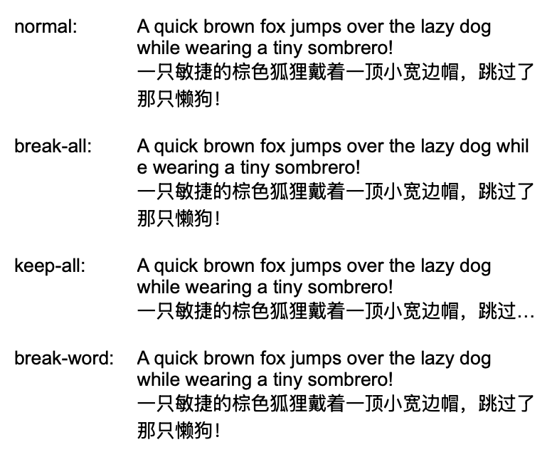
For controlling how words are broken when they reach the end of a line, preventing overflow and ensuring text remains readable we can use the "word-break" property. It allows us to handle different scenarios, such as breaking long words or preserving word boundaries in languages like CJK (Chinese, Japanese, Korean), thus enhancing the overall layout and user experience.
Below is the table with allowed values which we can pass in.
| Value | Name | Description |
|---|---|---|
WordBreakNormal |
"normal" | Default behavior for linefeed placement. Words are broken according to their natural word boundaries (spaces, hyphens etc.) |
WordBreakAll |
"break-all" | If the view boundaries are exceeded, a line break will be inserted between any two characters except for CJK (Chinese/Japanese/Korean) text |
WordBreakKeepAll |
"keep-all" | Line break will not be used in CJK text. For text in other languages, the default behavior(normal) will be applied |
WordBreakWord |
"break-word" | When the view boundaries are exceeded, the remaining whole words can be broken in an arbitrary place, if a more suitable place for line break is not found |
An example of using all the possible values of the property.
RUI
GridLayout {
    width = 100%,
    gap = 1em,
    content = [
        TextView{
            row = 0,
            column = 0,
            text = "normal:",
        },
        TextView{
            row = 1,
            column = 0,
            text = "break-all:",
        },
        TextView{
            row = 2,
            column = 0,
            text = "keep-all:",
        },
        TextView{
            row = 3,
            column = 0,
            text = "break-word:",
        },
        TextView{
            row = 0,
            column = 1,
            word-break = normal,
            text = "A quick brown fox jumps over the lazy dog while wearing a tiny sombrero!<br>一只敏捷的棕色狐狸戴着一顶小宽边帽,跳过了那只懒狗!",
        },
        TextView{
            row = 1,
            column = 1,
            word-break = break-all,
            text = "A quick brown fox jumps over the lazy dog while wearing a tiny sombrero!<br>一只敏捷的棕色狐狸戴着一顶小宽边帽,跳过了那只懒狗!",
        },
        TextView{
            row = 2,
            column = 1,
            word-break = keep-all,
            text = "A quick brown fox jumps over the lazy dog while wearing a tiny sombrero!<br>一只敏捷的棕色狐狸戴着一顶小宽边帽,跳过了那只懒狗!",
        },
        TextView{
            row = 3,
            column = 1,
            word-break = break-word,
            text = "A quick brown fox jumps over the lazy dog while wearing a tiny sombrero!<br>一只敏捷的棕色狐狸戴着一顶小宽边帽,跳过了那只懒狗!",
        },
    ]
}
Go
view := rui.NewGridLayout(session, rui.Params{
    rui.Width: rui.Percent(100),
    rui.Gap:   rui.Em(1),
    rui.Content: []rui.View{
        rui.NewTextView(session, rui.Params{
            rui.Row:    0,
            rui.Column: 0,
            rui.Text:   "normal:",
        }),
        rui.NewTextView(session, rui.Params{
            rui.Row:    1,
            rui.Column: 0,
            rui.Text:   "break-all:",
        }),
        rui.NewTextView(session, rui.Params{
            rui.Row:    2,
            rui.Column: 0,
            rui.Text:   "keep-all:",
        }),
        rui.NewTextView(session, rui.Params{
            rui.Row:    3,
            rui.Column: 0,
            rui.Text:   "break-word:",
        }),
        rui.NewTextView(session, rui.Params{
            rui.Row:       0,
            rui.Column:    1,
            rui.WordBreak: rui.WordBreakNormal,
            rui.Text:      "A quick brown fox jumps over the lazy dog while wearing a tiny sombrero!<br>一只敏捷的棕色狐狸戴着一顶小宽边帽,跳过了那只懒狗!",
        }),
        rui.NewTextView(session, rui.Params{
            rui.Row:       1,
            rui.Column:    1,
            rui.WordBreak: rui.WordBreakAll,
            rui.Text:      "A quick brown fox jumps over the lazy dog while wearing a tiny sombrero!<br>一只敏捷的棕色狐狸戴着一顶小宽边帽,跳过了那只懒狗!",
        }),
        rui.NewTextView(session, rui.Params{
            rui.Row:       2,
            rui.Column:    1,
            rui.WordBreak: rui.WordBreakKeepAll,
            rui.Text:      "A quick brown fox jumps over the lazy dog while wearing a tiny sombrero!<br>一只敏捷的棕色狐狸戴着一顶小宽边帽,跳过了那只懒狗!",
        }),
        rui.NewTextView(session, rui.Params{
            rui.Row:       3,
            rui.Column:    1,
            rui.WordBreak: rui.WordBreakWord,
            rui.Text:      "A quick brown fox jumps over the lazy dog while wearing a tiny sombrero!<br>一只敏捷的棕色狐狸戴着一顶小宽边帽,跳过了那只懒狗!",
        }),
    },
})
We can manipulate the property value at runtime using the Set() method of the view or the rui.Set() global function.
Go
if !view.Set(rui.WordBreak, rui.WordBreakWord) {
    // Something went wrong
}
Please check out our Property System tutorial to get more information on how to work with the view's properties.
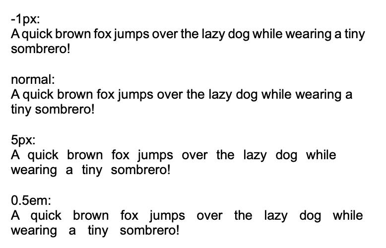
Text word spacing
For controlling the space between words within a view, enabling adjustments to enhance readability, create specific visual effects, and ensure consistent text spacing across different devices and browsers we can use the property "word-spacing".
The property holds the value of the SizeUnit type which allows us to specify value in different units.
The value can also be a negative one which will reduce the spacing by the specified amount.
RUI
ListLayout {
    width = 100%,
    orientation = up-down,
    gap = 1em,
    content = [
        TextView{
            word-spacing = -1px,
            text = "-1px:<br>A quick brown fox jumps over the lazy dog while wearing a tiny sombrero!",
        },
        TextView{
            text = "normal:<br>A quick brown fox jumps over the lazy dog while wearing a tiny sombrero!",
        },
        TextView{
            word-spacing = 5px,
            text = "5px:<br>A quick brown fox jumps over the lazy dog while wearing a tiny sombrero!",
        },
        TextView{
            word-spacing = 0.5em,
            text = "0.5em:<br>A quick brown fox jumps over the lazy dog while wearing a tiny sombrero!",
        },
    ]
}
Go
view := rui.NewListLayout(session, rui.Params{
    rui.Width:       rui.Percent(100),
    rui.Orientation: rui.TopDownOrientation,
    rui.Gap:         rui.Em(1),
    rui.Content: []rui.View{
        rui.NewTextView(session, rui.Params{
            rui.WordSpacing: rui.Px(-1),
            rui.Text:        "-1px:<br>A quick brown fox jumps over the lazy dog while wearing a tiny sombrero!",
        }),
        rui.NewTextView(session, rui.Params{
            rui.Text: "normal:<br>A quick brown fox jumps over the lazy dog while wearing a tiny sombrero!",
        }),
        rui.NewTextView(session, rui.Params{
            rui.WordSpacing: rui.Px(5),
            rui.Text:        "5px:<br>A quick brown fox jumps over the lazy dog while wearing a tiny sombrero!",
        }),
        rui.NewTextView(session, rui.Params{
            rui.WordSpacing: rui.Em(0.5),
            rui.Text:        "0.5em:<br>A quick brown fox jumps over the lazy dog while wearing a tiny sombrero!",
        }),
    },
})
Setting the value at runtime is easy by using the Set() method of the view or the global rui.Set() function.
Go
if !view.Set(rui.WordSpacing, rui.In(0.1)) {
    //Something went wrong
}
To get back the value of the property we can use the convenient global function GetWordSpacing(), which will return the value in a SizeUnit type.
Go
spacing := rui.GetWordSpacing(rootView, "text")

//Do something with the value
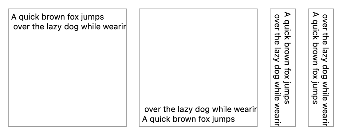
Text writing direction
To control the orientation of text within a view, enabling designers to create layouts that adapt to different writing systems and orientations, such as horizontal or vertical text flow
we can use the "writing-mode" property.
This property enhances flexibility by allowing for more dynamic and culturally diverse content presentation.
The property also affects the layout of the several UI controls like EditView and others.
| Value | Name | Description |
|---|---|---|
HorizontalTopToBottom |
"horizontal-top-to-bottom" | This is the default value. Text flows from left to right, and lines stack from top to bottom |
HorizontalBottomToTop |
"horizontal-bottom-to-top" | Text flows from left to right, and lines stack from bottom to top |
VerticalRightToLeft |
"vertical-right-to-left" | Vertical lines are output from right to left |
VerticalLeftToRight |
"vertical-left-to-right" | Vertical lines are output from left to right |
Check also the Text characters orientation section which explains how to change the behavior of the characters when the writing direction is set to one of the vertical variants.
RUI
ListLayout {
    width = 100%,
    gap = 1em,
    content = [
        EditView{
            writing-mode = horizontal-top-to-bottom,
            edit-view-type = multiline,
            text = "A quick brown fox jumps over the lazy dog while wearing a tiny sombrero!",
        },
        EditView{
            writing-mode = horizontal-bottom-to-top,
            edit-view-type = multiline,
            text = "A quick brown fox jumps over the lazy dog while wearing a tiny sombrero!",
        },
        EditView{
            writing-mode = vertical-right-to-left,
            edit-view-type = multiline,
            text = "A quick brown fox jumps over the lazy dog while wearing a tiny sombrero!",
        },
        EditView{
            writing-mode = vertical-left-to-right,
            edit-view-type = multiline,
            text = "A quick brown fox jumps over the lazy dog while wearing a tiny sombrero!",
        },
    ]
}
Go
view := rui.NewListLayout(session, rui.Params{
    rui.Width: rui.Percent(100),
    rui.Gap:   rui.Em(1),
    rui.Content: []rui.View{
        rui.NewEditView(session, rui.Params{
            rui.WritingMode:  rui.HorizontalTopToBottom,
            rui.EditViewType: rui.MultiLineText,
            rui.Text:         "A quick brown fox jumps over the lazy dog while wearing a tiny sombrero!",
        }),
        rui.NewEditView(session, rui.Params{
            rui.WritingMode:  rui.HorizontalBottomToTop,
            rui.EditViewType: rui.MultiLineText,
            rui.Text:         "A quick brown fox jumps over the lazy dog while wearing a tiny sombrero!",
        }),
        rui.NewEditView(session, rui.Params{
            rui.WritingMode:  rui.VerticalRightToLeft,
            rui.EditViewType: rui.MultiLineText,
            rui.Text:         "A quick brown fox jumps over the lazy dog while wearing a tiny sombrero!",
        }),
        rui.NewEditView(session, rui.Params{
            rui.WritingMode:  rui.VerticalLeftToRight,
            rui.EditViewType: rui.MultiLineText,
            rui.Text:         "A quick brown fox jumps over the lazy dog while wearing a tiny sombrero!",
        }),
    },
})
As any other property that one can be changed at runtime using the Set() method of the view or the rui.Set() global function.
Go
if !view.Set(rui.WritingMode, rui.HorizontalBottomToTop) {
    //Something went wrong
}
To retrieve the value back we can use the convenient global function GetWritingMode(), which will return the numeric value of the constant.
Go
writingMode := rui.GetWritingMode(rootView, "text")

//Do something with the value