

Popup
Table of contents
An element which allows to display any given View as a popup window. Once a Popup has been created, it can be displayed by using its Show() method. The ShowPopup() function simplifies this process by creating and showing the popup in one step. To close a popup window the Dismiss() method of the Popup interface has been used
Create from source
func NewPopup(view View, param Params) Popup
Creates a new Popup and return its interface
func ShowPopup(view View, param Params) Popup
Creates a new Popup and show it
Interface description
Dismiss()
Closes popup
Session() Session
Returns current client session
Show()
Displays popup
View() View
Returns content view of the popup
Properties
"arrow"
Add an arrow to popup. Default value is "none"
Constant: Arrow
Types: int, string
Values
| int | string | Description |
|---|---|---|
0(NoneArrow) |
"none" | No arrow |
1(TopArrow) |
"top" | Arrow at the top side of the pop-up window |
2(RightArrow) |
"right" | Arrow on the right side of the pop-up window |
3(BottomArrow) |
"bottom" | Arrow at the bottom of the pop-up window |
4(LeftArrow) |
"left" | Arrow on the left side of the pop-up window |
"arrow-align"
Set the horizontal alignment of the popup arrow. Default value is "center"
Constant: ArrowAlign
Types: int, string
Values
| int | string | Description |
|---|---|---|
0(TopAlign/LeftAlign) |
"top" | Top/left alignment |
1(BottomAlign/RightAlign) |
"bottom" | Bottom/right alignment |
2(CenterAlign) |
"center" | Center alignment |
"arrow-offset"
Set the offset of the popup arrow
Constant: ArrowOffset
Types: SizeUnit, SizeFunc, string, float, int
Internal type is SizeUnit, other types converted to it during assignment
See SizeUnit description for more details
Examples
content := rui.NewTextView(session, rui.Params{
    rui.Text:    "Description of the item",
    rui.Padding: rui.Em(1),
})

popup := rui.NewPopup(content, rui.Params{
    rui.Arrow:        "left",
    rui.ArrowAlign:   rui.CenterAlign,
    rui.ArrowOffset:  rui.Em(-1),
    rui.OutsideClose: true,
})

popup.Show()
"arrow-size"
Set the size(length) of the popup arrow. Default value is 16px defined by @ruiArrowSize constant
Constant: ArrowSize
Types: SizeUnit, SizeFunc, string, float, int
Internal type is SizeUnit, other types converted to it during assignment
See SizeUnit description for more details
Examples
content := rui.NewTextView(session, rui.Params{
    rui.Text:    "Description of the item",
    rui.Padding: rui.Em(1),
})

popup := rui.NewPopup(content, rui.Params{
    rui.Arrow:        "left",
    rui.ArrowAlign:   rui.CenterAlign,
    rui.ArrowSize:    rui.Em(2),
    rui.ArrowOffset:  rui.Em(-1),
    rui.OutsideClose: true,
})

popup.Show()
"arrow-width"
Set the width of the popup arrow. Default value is 16px defined by @ruiArrowWidth constant
Constant: ArrowWidth
Types: SizeUnit, SizeFunc, string, float, int
Internal type is SizeUnit, other types converted to it during assignment
See SizeUnit description for more details
Examples
content := rui.NewTextView(session, rui.Params{
    rui.Text:    "Description of the item",
    rui.Padding: rui.Em(1),
})

popup := rui.NewPopup(content, rui.Params{
    rui.Arrow:        "left",
    rui.ArrowAlign:   rui.CenterAlign,
    rui.ArrowWidth:   rui.Em(2),
    rui.ArrowOffset:  rui.Em(-1),
    rui.OutsideClose: true,
})

popup.Show()
"buttons"
Buttons that will be placed at the bottom of the popup
Constant: Buttons
Types: PopupButton, []PopupButton
Internal type is []PopupButton, other types converted to it during assignment
See PopupButton description for more details
Examples
content := rui.NewListLayout(session, rui.Params{
    rui.Padding:     rui.Em(1),
    rui.Orientation: rui.TopDownOrientation,
    rui.ListRowGap:  rui.Em(1),
    rui.Content: []rui.View{
        rui.NewTextView(session, rui.Params{
            rui.Text: "Name:",
        }),
        rui.NewEditView(session, rui.Params{}),
        rui.NewTextView(session, rui.Params{
            rui.Text: "Surname:",
        }),
        rui.NewEditView(session, rui.Params{}),
    },
})

popup := rui.NewPopup(content, rui.Params{
    rui.Title: "Create user",
    rui.Buttons: []rui.PopupButton{
        {Title: "Create", Type: rui.DefaultButton, OnClick: nil},
        {Title: "Cancel", Type: rui.CancelButton, OnClick: nil},
    },
})

popup.Show()
"buttons-align"
Set the horizontal alignment of popup buttons
Constant: ButtonsAlign
Types: int, string
Values
| int | string | Description |
|---|---|---|
0(LeftAlign) |
"left" | Left alignment |
1(RightAlign) |
"right" | Right alignment |
2(CenterAlign) |
"center" | Center alignment |
3(StretchAlign) |
"stretch" | Width alignment |
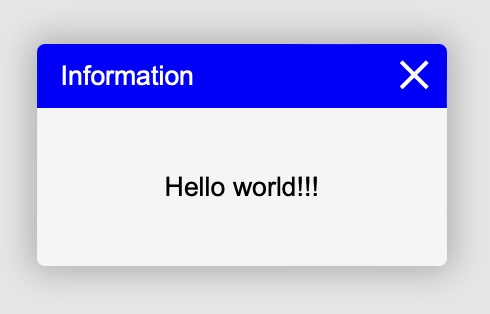
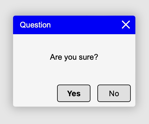
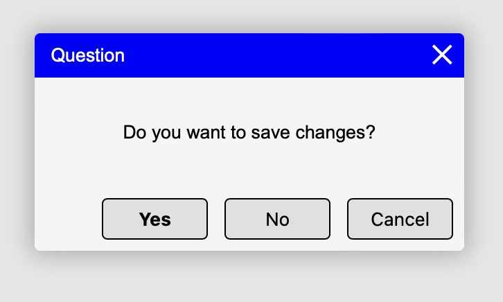
"close-button"
Controls whether a close button can be added to the popup. Default value is false
Constant: CloseButton
Types: bool, int, string
Values
| bool | int | string | Description |
|---|---|---|---|
true |
1 |
"true", "yes", "on", "1" | Close button will be added to a title bar of a window |
false |
0 |
"false", "no", "off", "0" | Popup without a close button |
"horizontal-align"
Horizontal alignment of the popup on the screen
Constant: HorizontalAlign
Types: int, string
Values
| int | string | Description |
|---|---|---|
0(LeftAlign) |
"left" | Left alignment |
1(RightAlign) |
"right" | Right alignment |
2(CenterAlign) |
"center" | Center alignment |
3(StretchAlign) |
"stretch" | Width alignment |
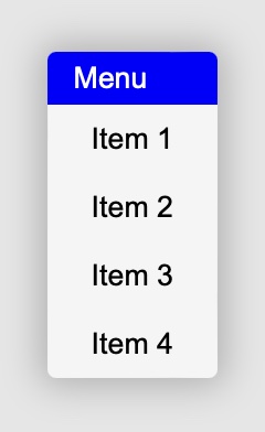
"items"
Array of menu items
Constant: Items
Types: ListAdapter, []string
Internal type is ListAdapter internal implementation, other types converted to it during assignment
Examples
rui.ShowMenu(session, rui.Params{
    rui.PopupMenuResult: menuSelected,
    rui.Items: []string{
        "Menu 1",
        "Menu 2",
        "Menu 3",
    },
})

return rui.NewView(session, rui.Params{})
func menuSelected(index int) {
    // Action goes here
}
"outside-close"
Controls whether popup can be closed by clicking outside of the window. Default value is false
Constant: OutsideClose
Types: bool, int, string
Values
| bool | int | string | Description |
|---|---|---|---|
true |
1 |
"true", "yes", "on", "1" | Clicking outside the popup window will automatically call the Dismiss() method |
false |
0 |
"false", "no", "off", "0" | Clicking outside the popup window has no effect |
"popup-menu-result"
Set the function to be called when the menu item of popup menu is selected
Constant: PopupMenuResult
Types: func(index int)
Examples
rui.ShowMenu(session, rui.Params{
    rui.PopupMenuResult: menuSelected,
    rui.Items: []string{
        "Menu 1",
        "Menu 2",
        "Menu 3",
    },
})

return rui.NewView(session, rui.Params{})
func menuSelected(index int) {
    // Action goes here
}
"show-duration"
Sets the length of time in seconds that a Popup show/hide animation takes to complete
Constant: ShowDuration
Types: float, int, string
Internal type is float, other types converted to it during assignment
Examples
content := rui.NewListLayout(session, rui.Params{
    rui.Padding:     rui.Em(1),
    rui.Orientation: rui.TopDownOrientation,
    rui.ListRowGap:  rui.Em(1),
    rui.Content: []any{
        "Name:",
        rui.NewEditView(session, rui.Params{}),
        "Surname:",
        rui.NewEditView(session, rui.Params{}),
    },
})

popup := rui.NewPopup(content, rui.Params{
    rui.Title: "Create user",
    rui.Buttons: []rui.PopupButton{
        {Title: "Create", Type: rui.DefaultButton, OnClick: nil},
        {Title: "Cancel", Type: rui.CancelButton, OnClick: nil},
    },
    rui.ShowDuration: 0.3,
    rui.ShowOpacity:  0.1,
    rui.ShowTiming:   rui.EaseInTiming,
    rui.ShowTransform: rui.NewTransformProperty(rui.Params{
        rui.TranslateY: rui.Percent(100),
    }),
})

popup.Show()
"show-opacity"
Sets the start opacity of Popup show animation (the finish animation opacity is 1) in range [0..1]. Opacity is the degree to which content behind the view is hidden, and is the opposite of transparency
Constant: ShowOpacity
Types: float, int, string
Internal type is float, other types converted to it during assignment
Examples
content := rui.NewListLayout(session, rui.Params{
    rui.Padding:     rui.Em(1),
    rui.Orientation: rui.TopDownOrientation,
    rui.ListRowGap:  rui.Em(1),
    rui.Content: []any{
        "Name:",
        rui.NewEditView(session, rui.Params{}),
        "Surname:",
        rui.NewEditView(session, rui.Params{}),
    },
})

popup := rui.NewPopup(content, rui.Params{
    rui.Title: "Create user",
    rui.Buttons: []rui.PopupButton{
        {Title: "Create", Type: rui.DefaultButton, OnClick: nil},
        {Title: "Cancel", Type: rui.CancelButton, OnClick: nil},
    },
    rui.ShowDuration: 0.3,
    rui.ShowOpacity:  0.1,
    rui.ShowTiming:   rui.EaseInTiming,
    rui.ShowTransform: rui.NewTransformProperty(rui.Params{
        rui.TranslateY: rui.Percent(100),
    }),
})

popup.Show()
"show-timing"
Sets how a Popup show/hide animation progresses through the duration of each cycle
Constant: ShowTiming
Types: string
Values
| string | Description |
|---|---|
"ease"(EaseTiming) |
Speed increases towards the middle and slows down at the end |
"ease-in"(EaseInTiming) |
Speed is slow at first, but increases in the end |
"ease-out"(EaseOutTiming) |
Speed is fast at first, but decreases in the end |
"ease-in-out"(EaseInOutTiming) |
Speed is slow at first, but quickly increases and at the end it decreases again |
"linear"(LinearTiming) |
Constant speed |
"step(n)(StepsTiming())" |
Timing function along stepCount stops along the transition, displaying each stop for equal lengths of time |
"cubic-bezier(x1, y1, x2, y2)(CubicBezierTiming())" |
Cubic-Bezier curve timing function. x1 and x2 must be in the range [0, 1] |
Examples
content := rui.NewListLayout(session, rui.Params{
    rui.Padding:     rui.Em(1),
    rui.Orientation: rui.TopDownOrientation,
    rui.ListRowGap:  rui.Em(1),
    rui.Content: []any{
        "Name:",
        rui.NewEditView(session, rui.Params{}),
        "Surname:",
        rui.NewEditView(session, rui.Params{}),
    },
})

popup := rui.NewPopup(content, rui.Params{
    rui.Title: "Create user",
    rui.Buttons: []rui.PopupButton{
        {Title: "Create", Type: rui.DefaultButton, OnClick: nil},
        {Title: "Cancel", Type: rui.CancelButton, OnClick: nil},
    },
    rui.ShowDuration: 0.3,
    rui.ShowOpacity:  0.1,
    rui.ShowTiming:   rui.EaseInTiming,
    rui.ShowTransform: rui.NewTransformProperty(rui.Params{
        rui.TranslateY: rui.Percent(100),
    }),
})

popup.Show()
"show-transform"
Specify start translation, scale and rotation over x, y and z axes as well as a distortion for an animated Popup showing/hidding
Constant: ShowTransform
Types: TransformProperty, string
Internal type is TransformProperty, other types converted to it during assignment
Conversion rules
TransformProperty - stored as is, no conversion performed
string - string representation of TransformProperty interface. Example: "_{translate-x = 10px, scale-y = 1.1}"
Examples
content := rui.NewListLayout(session, rui.Params{
    rui.Padding:     rui.Em(1),
    rui.Orientation: rui.TopDownOrientation,
    rui.ListRowGap:  rui.Em(1),
    rui.Content: []any{
        "Name:",
        rui.NewEditView(session, rui.Params{}),
        "Surname:",
        rui.NewEditView(session, rui.Params{}),
    },
})

popup := rui.NewPopup(content, rui.Params{
    rui.Title: "Create user",
    rui.Buttons: []rui.PopupButton{
        {Title: "Create", Type: rui.DefaultButton, OnClick: nil},
        {Title: "Cancel", Type: rui.CancelButton, OnClick: nil},
    },
    rui.ShowDuration: 0.3,
    rui.ShowOpacity:  0.1,
    rui.ShowTiming:   rui.EaseInTiming,
    rui.ShowTransform: rui.NewTransformProperty(rui.Params{
        rui.TranslateY: rui.Percent(100),
    }),
})

popup.Show()
"title"
Define the title
Constant: Title
Types: string
Examples
content := rui.NewTextView(session, rui.Params{
    rui.Padding: rui.Em(1),
    rui.Text:    "Some information",
})

popup := rui.NewPopup(content, rui.Params{
    rui.Title: "Information",
    rui.Buttons: []rui.PopupButton{
        {Title: "Dismiss", Type: rui.DefaultButton, OnClick: popupDismissedClicked},
    },
})

popup.Show()
func popupDismissedClicked(popup rui.Popup) {
    popup.Dismiss()
}
"title-style"
Set popup title style. Default title style is "ruiPopupTitle"
Constant: TitleStyle
Types: string
Examples
Description of theme with style listed
theme {
    colors = _{
        ruiPopupTitleColor = #FF0000FF,
        ruiPopupTitleTextColor = #FFFFFFFF,
    },
    colors:dark = _{
        ruiPopupTitleColor = #FF0000FF,
        ruiPopupTitleTextColor = #FFFFFFFF,
    },
    styles [
        ruiPopupTitle {
            background-color = @ruiPopupTitleColor,
            text-color = @ruiPopupTitleTextColor,
            min-height = 24px,
        },
    ]
}
content := rui.NewTextView(session, rui.Params{
    rui.Padding: rui.Em(1),
    rui.Text:    "Some information",
})

popup := rui.NewPopup(content, rui.Params{
    rui.Title:      "Information",
    rui.TitleStyle: "ruiPopupTitle",
    rui.Buttons: []rui.PopupButton{
        {Title: "Dismiss", Type: rui.DefaultButton, OnClick: popupDismissedClicked},
    },
})

popup.Show()
func popupDismissedClicked(popup rui.Popup) {
    popup.Dismiss()
}
"vertical-align"
Vertical alignment of the popup on the screen
Constant: VerticalAlign
Types: int, string
Values
| int | string | Description |
|---|---|---|
0(TopAlign) |
"top" | Top alignment |
1(BottomAlign) |
"bottom" | Bottom alignment |
2(CenterAlign) |
"center" | Center alignment |
3(StretchAlign) |
"stretch" | Height alignment |
Events
"dismiss-event"
Used to track the closing state of the Popup. It occurs after the Popup disappears from the screen
Constant: DismissEvent
General listener format:
func(popup rui.Popup)
where:
- popup - Interface of a popup which generated this event
Allowed listener formats:
func()
Related global functions
func ShowCancellableQuestion(title, text string, session Session, onYes func(), onNo func(), onCancel func())
Displays a message with the given title and text and three buttons "Yes", "No" and "Cancel". When the "Yes", "No" or "Cancel" button is pressed, the message is closed and the onYes, onNo or onCancel function (if it is not nil) is called, respectively
func ShowMenu(session Session, params Params) Popup
Displays the menu. Menu items are set using the "items" property. Set the function (format: func(int)) to be called when a menu item is selected
func ShowMessage(title, text string, session Session)
Displays the popup with the title given in the "title" argument and the message text given in the "text" argument.
func ShowQuestion(title, text string, session Session, onYes func(), onNo func())
Displays a message with the given title and text and two buttons "Yes" and "No". When the "Yes" button is clicked, the message is closed and the onYes function is called (if it is not nil). When the "No" button is pressed, the message is closed and the onNo function is called (if it is not nil)