

View Effects
Table of contents
Accent color
If working with themes to customize appearance of controls is an overhead we can use an accent color which is an easiest way of customizing controls to match our brand colors. It can be useful as well in cases when we need to enhance the visual feedback of user interactions, making the interface more engaging and improve contrast and visibility for users with disabilities by using high-contrast colors. Accent color usually affect appearance of standard controls like checkboxes, progress bars, drop down lists etc. It sets an accent color of the controls and controlled by the "accent-color" property:
| Property | Type | Description |
|---|---|---|
| "accent-color" | Color |
The accent color |
The property holds the values of the Color type and accept color constants and text representation of the colors.
Example of setting the property from the source code:
Go
view := rui.NewProgressBar(session, rui.Params{
    rui.ProgressBarValue: 0.7,
    rui.AccentColor:      rui.Red, // Red color constant
})
When setting that property in resource description file we can use color constants and color text representations:
RUI
ProgressBar {
    value = 0.7,
    accent-color = red, // Red color constant
}
using color text representation:
RUI
ProgressBar {
    value = 0.7,
    accent-color = "#FF0000", // Red color
}
Below is how the defined progress bar will look like.
The convenient way of getting back the value of the "accent-color" property is to use a global GetAccentColor() function:
Go
color := rui.GetAccentColor(view, "view-id")
// Do something with the value
We can find more information on how to apply a different color to that property by checking Color type in our reference documentation.
Filter and backdrop filter
To make our user interface more appealing we can use several filter effects. These effects can be applied to the content of the view or to the content behind the view. Filter effects are good when we need to apply some blur, change brightness, contrast and more. We can set filter effects using "filter" and "backdrop-filter" properties:
| Property | Type | Description |
|---|---|---|
| "filter" | FilterProperty |
View content filter settings |
| "backdrop-filter" | FilterProperty |
Backdrop view filter settings |
Both properties hold the value of the FilterProperty type which is an interface.
That type inherit Properties interface which allows us to set and get specific filter properties:
| Property | Type | Description |
|---|---|---|
| "blur" | float |
Content blur amount |
| "brightness" | float |
Brightness of the content |
| "contrast" | float |
Contrast of the content |
| "drop-shadow" | []ShadowProperty |
Content shadow effects |
| "grayscale" | float |
Content grayscaling |
| "hue-rotate" | AngleUnit |
Content hue rotation |
| "invert" | float |
Content colors inversion |
| "opacity" | float |
Content opacity |
| "saturate" | float |
Content saturation |
| "sepia" | float |
Content sepia effect |
To create an instance of the FilterProperty interface a global function rui.NewFilterProperty() is used:
Go
func NewFilterProperty(params Params) FilterProperty
To get more information on how to work with "drop-shadow" nested property follow the information on View Shadow page or ShadowProperty reference documentation.
When dealing with these properties in resource description file an object of specific format is used:
RUI
filter {
    blur = <value>,
    brightness = <value>,
    contrast = <value>,
    grayscale = <value>,
    hue-rotate = <angle-value>,
    invert = <value>,
    opacity = <value>,
    saturate = <value>,
    sepia = <value>,
    drop-shadow = _{
        blur = <value>,
        color = <color-value>,
        inset = <bool-value>,
        spread-radius = <size-value>,
        x-offset = <size-value>,
        y-offset = <size-value>,
    },
}
where <value> is the string representation of the float type, <angle-value> - string representation of the AngleUnit type, <color-value> is a string representation of the Color type, and <size-value> - string representation of the SizeUnit type.
We can get more information on these types in Reference documentation.
Now lets have a look at some examples of the "backdrop-filter" property to compare different effects:
RUI
ListLayout {
    width = 600px,
    height = 200px,
    padding = 20px,
    gap = 20px,
    background = image {
        src = background.jpg,
        fit = cover,
    },
    content = [
        TextView {
            width = 160px,
            height = 160px,
            text = "Blur 2px",
            border = _ {
                style = solid,
                width = 1px,
                color = white,
            },
            backdrop-filter = filter {
                blur = 2,
            }
        },
        TextView {
            width = 160px,
            height = 160px,
            text = "Brightness 150",
            border = _ {
                style = solid,
                width = 1px,
                color = white,
            },
            backdrop-filter = filter {
                brightness = 150,
            }
        },
        TextView {
            width = 160px,
            height = 160px,
            text = "Contrast 50",
            border = _ {
                style = solid,
                width = 1px,
                color = white,
            },
            backdrop-filter = filter {
                contrast = 50,
            },
        },
        TextView {
            width = 160px,
            height = 160px,
            text = "Grayscale 100",
            border = _ {
                style = solid,
                width = 1px,
                color = white,
            },
            backdrop-filter = filter {
                grayscale = 100,
            },
        },
        TextView {
            width = 160px,
            height = 160px,
            text = "Hue rotate 45deg",
            border = _ {
                style = solid,
                width = 1px,
                color = white,
            },
            backdrop-filter = filter {
                hue-rotate = 45deg,
            },
        },
        TextView {
            width = 160px,
            height = 160px,
            text = "Invert 100%",
            border = _ {
                style = solid,
                width = 1px,
                color = white,
            },
            backdrop-filter = filter {
                invert = 100,
            },
        },
        TextView {
            width = 160px,
            height = 160px,
            text = "Opacity 50%",
            border = _ {
                style = solid,
                width = 1px,
                color = white,
            },
            backdrop-filter = filter {
                opacity = 50,
            },
        },
        TextView {
            width = 160px,
            height = 160px,
            text = "Saturate 150%",
            border = _ {
                style = solid,
                width = 1px,
                color = white,
            },
            backdrop-filter = filter {
                saturate = 150,
            },
        },
        TextView {
            width = 160px,
            height = 160px,
            text = "Sepia 100%",
            border = _ {
                style = solid,
                width = 1px,
                color = white,
            },
            backdrop-filter = filter {
                sepia = 100,
            },
        },
    ]
}
We can also implement the same application with Go lang:
Go
view := rui.NewListLayout(session, rui.Params{
    rui.Width:   rui.Px(600),
    rui.Height:  rui.Px(200),
    rui.Padding: rui.Px(20),
    rui.Gap:     rui.Px(20),
    rui.Background: rui.NewBackgroundImage(rui.Params{
        rui.Source: "background.jpg",
        rui.Fit:    rui.CoverFit,
    }),
    rui.Content: []rui.View{
        rui.NewTextView(session, rui.Params{
            rui.Width:  rui.Px(160),
            rui.Height: rui.Px(160),
            rui.Text:   "Blur 2px",
            rui.Border: rui.NewBorder(rui.Params{
                rui.Style:    rui.SolidLine,
                rui.Width:    rui.Px(1),
                rui.ColorTag: rui.White,
            }),
            rui.BackdropFilter: rui.NewFilterProperty(rui.Params{
                rui.Blur: 2,
            }),
        }),
        rui.NewTextView(session, rui.Params{
            rui.Width:  rui.Px(160),
            rui.Height: rui.Px(160),
            rui.Text:   "Brightness 150",
            rui.Border: rui.NewBorder(rui.Params{
                rui.Style:    rui.SolidLine,
                rui.Width:    rui.Px(1),
                rui.ColorTag: rui.White,
            }),
            rui.BackdropFilter: rui.NewFilterProperty(rui.Params{
                rui.Brightness: 150,
            }),
        }),
        rui.NewTextView(session, rui.Params{
            rui.Width:  rui.Px(160),
            rui.Height: rui.Px(160),
            rui.Text:   "Contrast 50",
            rui.Border: rui.NewBorder(rui.Params{
                rui.Style:    rui.SolidLine,
                rui.Width:    rui.Px(1),
                rui.ColorTag: rui.White,
            }),
            rui.BackdropFilter: rui.NewFilterProperty(rui.Params{
                rui.Contrast: 50,
            }),
        }),
        rui.NewTextView(session, rui.Params{
            rui.Width:  rui.Px(160),
            rui.Height: rui.Px(160),
            rui.Text:   "Grayscale 100",
            rui.Border: rui.NewBorder(rui.Params{
                rui.Style:    rui.SolidLine,
                rui.Width:    rui.Px(1),
                rui.ColorTag: rui.White,
            }),
            rui.BackdropFilter: rui.NewFilterProperty(rui.Params{
                rui.Grayscale: 100,
            }),
        }),
        rui.NewTextView(session, rui.Params{
            rui.Width:  rui.Px(160),
            rui.Height: rui.Px(160),
            rui.Text:   "Hue rotate 45deg",
            rui.Border: rui.NewBorder(rui.Params{
                rui.Style:    rui.SolidLine,
                rui.Width:    rui.Px(1),
                rui.ColorTag: rui.White,
            }),
            rui.BackdropFilter: rui.NewFilterProperty(rui.Params{
                rui.HueRotate: rui.Deg(45),
            }),
        }),
        rui.NewTextView(session, rui.Params{
            rui.Width:  rui.Px(160),
            rui.Height: rui.Px(160),
            rui.Text:   "Invert 100%",
            rui.Border: rui.NewBorder(rui.Params{
                rui.Style:    rui.SolidLine,
                rui.Width:    rui.Px(1),
                rui.ColorTag: rui.White,
            }),
            rui.BackdropFilter: rui.NewFilterProperty(rui.Params{
                rui.Invert: 100,
            }),
        }),
        rui.NewTextView(session, rui.Params{
            rui.Width:  rui.Px(160),
            rui.Height: rui.Px(160),
            rui.Text:   "Opacity 50%",
            rui.Border: rui.NewBorder(rui.Params{
                rui.Style:    rui.SolidLine,
                rui.Width:    rui.Px(1),
                rui.ColorTag: rui.White,
            }),
            rui.BackdropFilter: rui.NewFilterProperty(rui.Params{
                rui.Opacity: 50,
            }),
        }),
        rui.NewTextView(session, rui.Params{
            rui.Width:  rui.Px(160),
            rui.Height: rui.Px(160),
            rui.Text:   "Saturate 150%",
            rui.Border: rui.NewBorder(rui.Params{
                rui.Style:    rui.SolidLine,
                rui.Width:    rui.Px(1),
                rui.ColorTag: rui.White,
            }),
            rui.BackdropFilter: rui.NewFilterProperty(rui.Params{
                rui.Saturate: 150,
            }),
        }),
        rui.NewTextView(session, rui.Params{
            rui.Width:  rui.Px(160),
            rui.Height: rui.Px(160),
            rui.Text:   "Sepia 100%",
            rui.Border: rui.NewBorder(rui.Params{
                rui.Style:    rui.SolidLine,
                rui.Width:    rui.Px(1),
                rui.ColorTag: rui.White,
            }),
            rui.BackdropFilter: rui.NewFilterProperty(rui.Params{
                rui.Sepia: 100,
            }),
        }),
    },
})
When we launch this application we can scroll the view to the right to see how backdrop filter affects content below the text view.
Here are a few screenshots which demonstrate the effects:
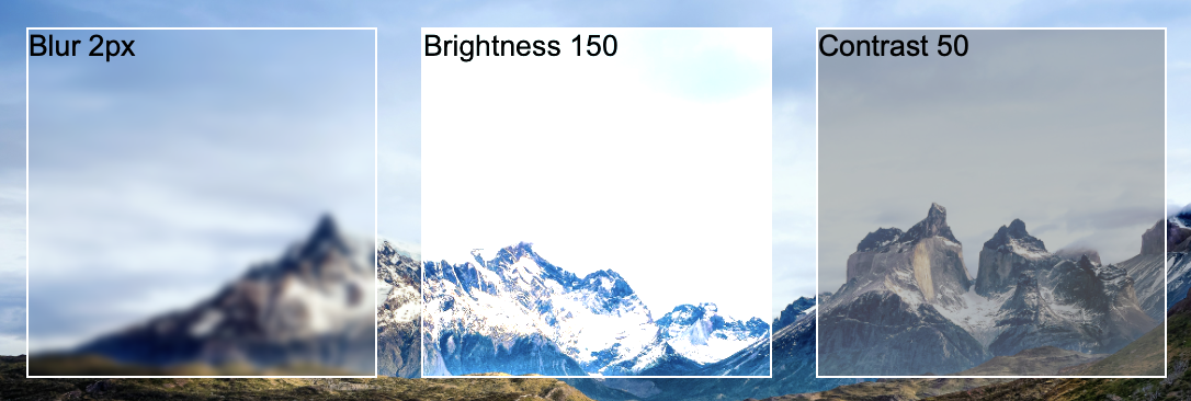
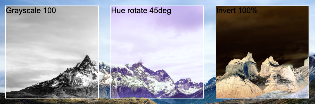
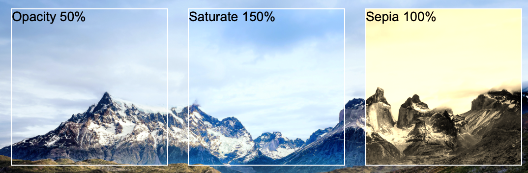
Keep in mind that the properties of filter have different nature. As an example the "blur" property is set in pixels, "hue-rotate" in angles and "brightness", "contrast", "saturate" accept the values greater than 100.
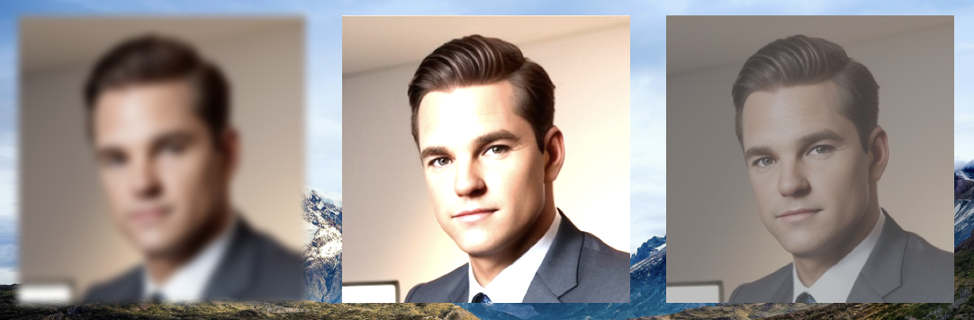
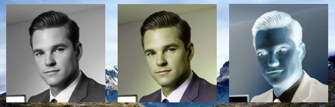
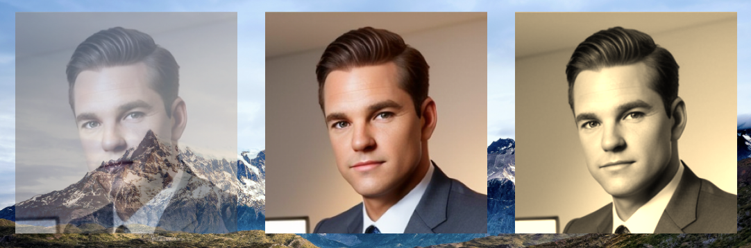
The difference between "filter" and "backdrop-filter" properties are that the former applied to the content of the view itself. Lets illustrate that using the same example but in that case we will use the avatar image instead of the text view:
RUI
ListLayout {
    width = 600px,
    height = 200px,
    padding = 20px,
    gap = 20px,
    background = image {
        src = background.jpg,
        fit = cover,
    },
    content = [
        ImageView {
            width = 160px,
            height = 160px,
            src = "avatar.png",
            fit = contain,
            filter = filter {
                blur = 2,
            }
        },
        ImageView {
            width = 160px,
            height = 160px,
            src = "avatar.png",
            fit = contain,
            filter = filter {
                brightness = 150,
            }
        },
        ImageView {
            width = 160px,
            height = 160px,
            src = "avatar.png",
            fit = contain,
            filter = filter {
                contrast = 50,
            },
        },
        ImageView {
            width = 160px,
            height = 160px,
            src = "avatar.png",
            fit = contain,
            filter = filter {
                grayscale = 100,
            },
        },
        ImageView {
            width = 160px,
            height = 160px,
            src = "avatar.png",
            fit = contain,
            filter = filter {
                hue-rotate = 45deg,
            },
        },
        ImageView {
            width = 160px,
            height = 160px,
            src = "avatar.png",
            fit = contain,
            filter = filter {
                invert = 100,
            },
        },
        ImageView {
            width = 160px,
            height = 160px,
            src = "avatar.png",
            fit = contain,
            filter = filter {
                opacity = 50,
            },
        },
        ImageView {
            width = 160px,
            height = 160px,
            src = "avatar.png",
            fit = contain,
            filter = filter {
                saturate = 150,
            },
        },
        ImageView {
            width = 160px,
            height = 160px,
            src = "avatar.png",
            fit = contain,
            filter = filter {
                sepia = 100,
            },
        },
    ]
}
For your convenience here is the Go lang implementation:
Go
view := rui.NewListLayout(session, rui.Params{
    rui.Width:   rui.Px(600),
    rui.Height:  rui.Px(200),
    rui.Padding: rui.Px(20),
    rui.Gap:     rui.Px(20),
    rui.Background: rui.NewBackgroundImage(rui.Params{
        rui.Source: "background.jpg",
        rui.Fit:    rui.CoverFit,
    }),
    rui.Content: []rui.View{
        rui.NewImageView(session, rui.Params{
            rui.Width:  rui.Px(160),
            rui.Height: rui.Px(160),
            rui.Source: "avatar.png",
            rui.Fit:    rui.ContainFit,
            rui.Filter: rui.NewFilterProperty(rui.Params{
                rui.Blur: 2,
            }),
        }),
        rui.NewImageView(session, rui.Params{
            rui.Width:  rui.Px(160),
            rui.Height: rui.Px(160),
            rui.Source: "avatar.png",
            rui.Fit:    rui.ContainFit,
            rui.Filter: rui.NewFilterProperty(rui.Params{
                rui.Brightness: 150,
            }),
        }),
        rui.NewImageView(session, rui.Params{
            rui.Width:  rui.Px(160),
            rui.Height: rui.Px(160),
            rui.Source: "avatar.png",
            rui.Fit:    rui.ContainFit,
            rui.Filter: rui.NewFilterProperty(rui.Params{
                rui.Contrast: 50,
            }),
        }),
        rui.NewImageView(session, rui.Params{
            rui.Width:  rui.Px(160),
            rui.Height: rui.Px(160),
            rui.Source: "avatar.png",
            rui.Fit:    rui.ContainFit,
            rui.Filter: rui.NewFilterProperty(rui.Params{
                rui.Grayscale: 100,
            }),
        }),
        rui.NewImageView(session, rui.Params{
            rui.Width:  rui.Px(160),
            rui.Height: rui.Px(160),
            rui.Source: "avatar.png",
            rui.Fit:    rui.ContainFit,
            rui.Filter: rui.NewFilterProperty(rui.Params{
                rui.HueRotate: rui.Deg(45),
            }),
        }),
        rui.NewImageView(session, rui.Params{
            rui.Width:  rui.Px(160),
            rui.Height: rui.Px(160),
            rui.Source: "avatar.png",
            rui.Fit:    rui.ContainFit,
            rui.Filter: rui.NewFilterProperty(rui.Params{
                rui.Invert: 100,
            }),
        }),
        rui.NewImageView(session, rui.Params{
            rui.Width:  rui.Px(160),
            rui.Height: rui.Px(160),
            rui.Source: "avatar.png",
            rui.Fit:    rui.ContainFit,
            rui.Filter: rui.NewFilterProperty(rui.Params{
                rui.Opacity: 50,
            }),
        }),
        rui.NewImageView(session, rui.Params{
            rui.Width:  rui.Px(160),
            rui.Height: rui.Px(160),
            rui.Source: "avatar.png",
            rui.Fit:    rui.ContainFit,
            rui.Filter: rui.NewFilterProperty(rui.Params{
                rui.Saturate: 150,
            }),
        }),
        rui.NewImageView(session, rui.Params{
            rui.Width:  rui.Px(160),
            rui.Height: rui.Px(160),
            rui.Source: "avatar.png",
            rui.Fit:    rui.ContainFit,
            rui.Filter: rui.NewFilterProperty(rui.Params{
                rui.Sepia: 100,
            }),
        }),
    },
})
Below are the results of execution of such application with filter applied to the same avatar image:
If we need to retrieve or update the values of the "filter" or "backdrop-filter" properties at runtime we can use rui.GetFilter() and rui.GetBackdropFilter() global methods and change properties to the desired values:
Go
// Assume that the filter was set during the view creation
if filter := rui.GetFilter(view, "view-id"); filter != nil {
    filter.Set(rui.Blur, 5)
    // Set other properties
}

// Assume that the backdrop filter was set during the view creation
if filter := rui.GetBackdropFilter(view, "view-id"); filter != nil {
    filter.Set(rui.Blur, 5)
    // Set other properties
}