

View Border
Each UI element or simpler view can have a border. The border lines like left, right, top and bottom are described by their style, width(thickness) and color. Each border line can be configured separately and have a different settings.
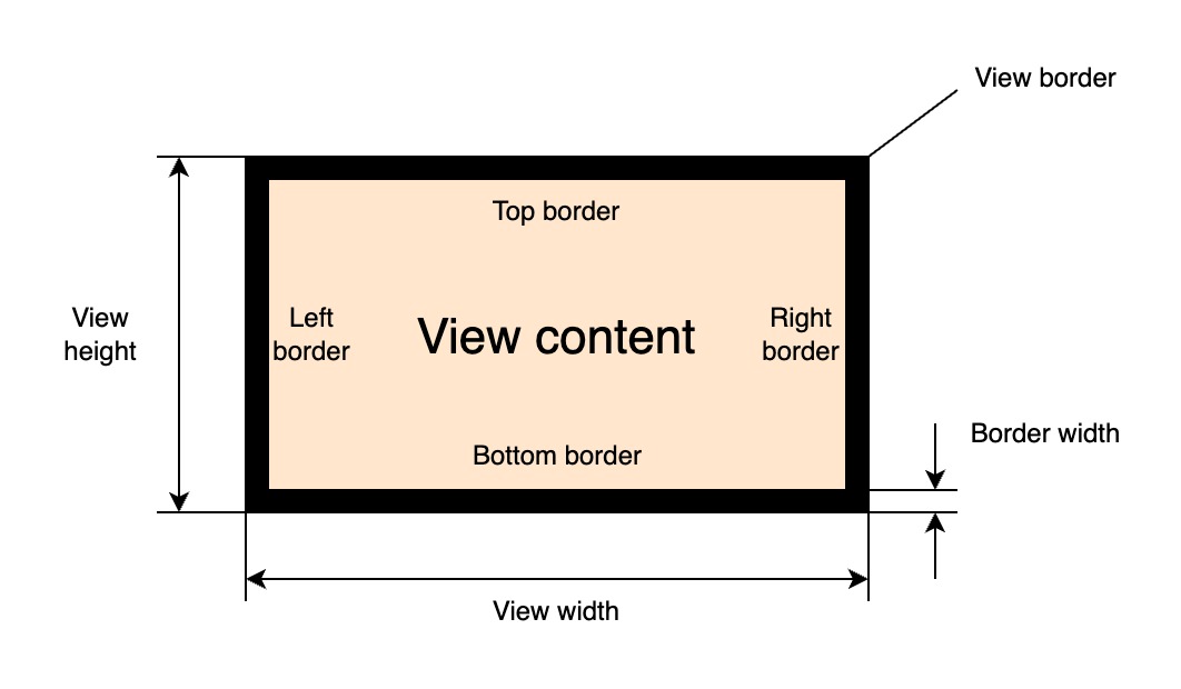
The values of the border lines thickness is added to corresponding padding values of the view. The border of the view can be set by the following primary property:
| Property | Type | Description |
|---|---|---|
| "border" | BorderProperty |
All borders settings |
The "border" property is a generic one and holds the value of the BorderProperty interface.
An instance of that interface can be created using the global rui.NewBorder() function:
Go
func NewBorder(params rui.Params) rui.BorderProperty
where rui.Params is a map which can contain the following properties:
| Property | Type | Description |
|---|---|---|
| "style" | int |
All borders line style |
| "left-style" | int |
Left border line style |
| "right-style" | int |
Right border line style |
| "top-style" | int |
Top border line style |
| "bottom-style" | int |
Bottom border line style |
| "width" | SizeUnit |
All borders line width |
| "left-width" | SizeUnit |
Left border line width |
| "right-width" | SizeUnit |
Right border line width |
| "top-width" | SizeUnit |
Top border line width |
| "bottom-width" | SizeUnit |
Bottom border line width |
| "color" | Color |
All borders line color |
| "left-color" | Color |
Left border line color |
| "right-color" | Color |
Right border line color |
| "top-color" | Color |
Top border line color |
| "bottom-color" | Color |
Bottom border line color |
Each border line style can be different and accept the following values:
| Value | Name | Description |
|---|---|---|
| NoneLine | "none" | No frame |
| SolidLine | "solid" | Solid line |
| DashedLine | "dashed" | Dashed line |
| DottedLine | "dotted" | Dotted line |
| DoubleLine | "double" | Double solid line |
If some of the border lines are not necessary they can be omitted.
Example
Setting a view border using the "border" property.
Go
view.Set(rui.Border, rui.NewBorder(rui.Params{
    rui.LeftStyle:   rui.SolidLine,
    rui.RightStyle:  rui.SolidLine,
    rui.TopStyle:    rui.SolidLine,
    rui.BottomStyle: rui.SolidLine,
    rui.LeftWidth:   rui.Px(1),
    rui.RightWidth:  rui.Px(1),
    rui.TopWidth:    rui.Px(1),
    rui.BottomWidth: rui.Px(1),
    rui.LeftColor:   rui.Black,
    rui.RightColor:  rui.Black,
    rui.TopColor:    rui.Black,
    rui.BottomColor: rui.Black,
}))
If all sides of the view border have the same look then we can simplify example above to this form:
Go
view.Set(rui.Border, rui.NewBorder(rui.Params{
    rui.Style   : rui.SolidLine,
    rui.Width   : rui.Px(1),
    rui.ColorTag: rui.Black,
}))
When setting the "border" property in resource description file it has a dedicated object format:
RUI
_{
    // All border lines settings
    style = <style> | "<top_style>, <right_style>, <bottom_style>, <left_style>",
    width = <width> | "<top_width>, <right_width>, <bottom_width>, <left_width>",
    color = <color> | "<top-color>, <right_color>, <bottom_color>, <left_color>",

    // Separate border lines settings
    top = _{
        style = <style>,
        width = <width>,
        color = <color>,
    },
    bottom = _{
        style = <style>,
        width = <width>,
        color = <color>,
    },
    left = _{
        style = <style>,
        width = <width>,
        color = <color>,
    },
    right = _{
        style = <style>,
        width = <width>,
        color = <color>,
    },
}
where <style>, <width>, and <color> are the specific border line attributes.
The top most properties "style", "width", and "color" may contain a single value or a string representation of multiple values.
Example
Setting a view border using the "border" property from resource description file.
RUI
GridLayout {
    width = 100%,
    height = 100%,
    // Center content on the screen
    cell-horizontal-align = center,
    cell-vertical-align = center,
    // Use plain View as a child
    content = View {
        width = 100px,
        height = 30px,
        border = _{
            // Setting all border lines style to have a solid line
            style = solid,
            // Customize each border line
            top = _{
                width = 2px,
                color = lightgray,
            },
            bottom = _{
                width = 2px,
                color = gray,
            },
            left = _{
                width = 1px,
                color = gray,
            },
            right = _{
                width = 1px,
                color = gray,
            },
        }
    }
}
which is equivalent to:
RUI
GridLayout {
    width = 100%,
    height = 100%,
    // Center content on the screen
    cell-horizontal-align = center,
    cell-vertical-align = center,
    // Use plain View as a child
    content = View {
        width = 100px,
        height = 30px,
        border = _{
            // Setting all border lines style to have a solid line
            style = solid,
            // Customize each border line (top, right, bottom, and left)
            width = "2px, 1px, 2px, 1px",
            color = "lightgray, gray, gray, gray",
        }
    }
}
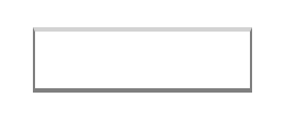
Here is how the above examples will look like:
To read the actual values of the view border we can use ViewBorders() method of the BorderProperty interface:
Go
switch bordersProp := view.Get(rui.Border).(type) {
case rui.BorderProperty:
    borders := bordersProp.ViewBorders(session)
    // Do something with the values
}
The ViewBorders() method will return top, bottom, left, and right borders attributes in a form of rui.ViewBorders structure.
Another way of getting these values is by using the global function rui.GetBorder():
Go
borders := rui.GetBorder(view, "view-id")
// Do something with the values
In this case there is no need to perform a type conversion and resolving a possible constant, everything is done behind the scene.
The rui.ViewBorders structure can be passed as a parameter to the Set() function when setting the value of the "border" property.
This converts the ViewBorders to the BorderProperty.
The view also support other border related properties that may be convenient to use:
| Property | Type | Description |
|---|---|---|
| "border-style" | int |
All borders line style |
| "border-width" | SizeUnit |
All borders line width |
| "border-color" | Color |
All borders line color |
| "border-left" | BorderProperty |
Left border line settings |
| "border-right" | BorderProperty |
Right border line settings |
| "border-top" | BorderProperty |
Top border line settings |
| "border-bottom" | BorderProperty |
Bottom border line settings |
| "border-left-style" | int |
Left border line style |
| "border-right-style" | int |
Right border line style |
| "border-top-style" | int |
Top border line style |
| "border-bottom-style" | int |
Bottom border line style |
| "border-left-width" | SizeUnit |
Left border line width |
| "border-right-width" | SizeUnit |
Right border line width |
| "border-top-width" | SizeUnit |
Top border line width |
| "border-bottom-width" | SizeUnit |
Bottom border line width |
| "border-left-color" | Color |
Left border line color |
| "border-right-color" | Color |
Right border line color |
| "border-top-color" | Color |
Top border line color |
| "border-bottom-color" | Color |
Bottom border line color |
When setting such properties library will first check whether the "border" property has been set and if not will create it implicitly, then update the corresponding values.
Properties "border-left", "border-right", "border-top", and "border-bottom" hold the BorderProperty interface which we discussed early.
The difference between these properties and the "border" property is that they only contain the attributes of the border like "style", "width", and "color".
Here is an example of how we can set them from the resource description file and code:
RUI
GridLayout {
    width = 100%,
    height = 100%,
    cell-horizontal-align = center,
    cell-vertical-align = center,
    content = View {
        id = "view-id",
        width = 100px,
        height = 30px,
        border-top = _{
            style = solid,
            width = 2px,
            color = lightgray,
        },
        border-bottom = _{
            style = solid,
            width = 2px,
            color = gray,
        },
        border-left = _{
            style = solid,
            width = 1px,
            color = gray,
        },
        border-right = _{
            style = solid,
            width = 1px,
            color = gray,
        },
    }
}
Go
view := rui.NewGridLayout(session, rui.Params{
    rui.Width:               rui.Percent(100),
    rui.Height:              rui.Percent(100),
    rui.CellHorizontalAlign: rui.CenterAlign,
    rui.CellVerticalAlign:   rui.CenterAlign,
    rui.Content: rui.NewView(session, rui.Params{
        rui.Width:  rui.Px(100),
        rui.Height: rui.Px(30),
        rui.BorderTop: rui.NewBorder(rui.Params{
            rui.Style:    rui.SolidLine,
            rui.Width:    rui.Px(2),
            rui.ColorTag: rui.LightGray,
        }),
        rui.BorderBottom: rui.NewBorder(rui.Params{
            rui.Style:    rui.SolidLine,
            rui.Width:    rui.Px(2),
            rui.ColorTag: rui.Gray,
        }),
        rui.BorderLeft: rui.NewBorder(rui.Params{
            rui.Style:    rui.SolidLine,
            rui.Width:    rui.Px(1),
            rui.ColorTag: rui.Gray,
        }),
        rui.BorderRight: rui.NewBorder(rui.Params{
            rui.Style:    rui.SolidLine,
            rui.Width:    rui.Px(1),
            rui.ColorTag: rui.Gray,
        }),
    }),
})
Not only BorderProperty can be passed as a value of these properties, library allows to use rui.ViewBorder structure as well:
Go
view := rui.NewGridLayout(session, rui.Params{
    rui.Width:               rui.Percent(100),
    rui.Height:              rui.Percent(100),
    rui.CellHorizontalAlign: rui.CenterAlign,
    rui.CellVerticalAlign:   rui.CenterAlign,
    rui.Content: rui.NewView(session, rui.Params{
        rui.Width:  rui.Px(100),
        rui.Height: rui.Px(30),

        // Setting all borders attributes to the same values
        rui.Border: rui.ViewBorder{
            Style: rui.SolidLine,
            Width: rui.Px(1),
            Color: rui.Black,
        },
    }),
})
and
Go
view := rui.NewGridLayout(session, rui.Params{
    rui.Width:               rui.Percent(100),
    rui.Height:              rui.Percent(100),
    rui.CellHorizontalAlign: rui.CenterAlign,
    rui.CellVerticalAlign:   rui.CenterAlign,
    rui.Content: rui.NewView(session, rui.Params{
        rui.Width:  rui.Px(100),
        rui.Height: rui.Px(30),

        // Setting border lines separately
        rui.BorderTop: rui.ViewBorder{
            Style: rui.SolidLine,
            Width: rui.Px(2),
            Color: rui.LightGray,
        },
        rui.BorderBottom: rui.ViewBorder{
            Style: rui.SolidLine,
            Width: rui.Px(2),
            Color: rui.Gray,
        },
        rui.BorderLeft: rui.ViewBorder{
            Style: rui.SolidLine,
            Width: rui.Px(1),
            Color: rui.Gray,
        },
        rui.BorderRight: rui.ViewBorder{
            Style: rui.SolidLine,
            Width: rui.Px(1),
            Color: rui.Gray,
        },
    }),
})
In some cases it might be convenient to use other border related view properties starting with "border-top-", "border-bottom-", "border-left-", and "border-right-" prefix, especially if we need to touch only a few attributes.
Go
view := rui.NewGridLayout(session, rui.Params{
    rui.Width:               rui.Percent(100),
    rui.Height:              rui.Percent(100),
    rui.CellHorizontalAlign: rui.CenterAlign,
    rui.CellVerticalAlign:   rui.CenterAlign,
    rui.Content: rui.NewView(session, rui.Params{
        rui.Width:  rui.Px(100),
        rui.Height: rui.Px(30),

        // Setting border lines separately
        rui.BorderBottomStyle: rui.DottedLine,
        rui.BorderBottomWidth: rui.Px(1),
        rui.BorderBottomColor: rui.Black,
    }),
})
For more information please refer to BorderProperty, ViewBorder, ViewBorders and specific property name of the View in our Reference documentation.