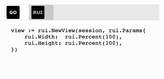
View Behavior In Containers
The view can be a child of any container supported by the library, such as ListLayout, GridLayout, or TabsLayout.
For proper view appearance and layout, some containers require additional information.
For this purpose, the base view control has additional properties.
Below is the list of such properties with their respective internal type and a short description.
We'll cover them one by one.
| Property | Type | Description |
|---|---|---|
| "column" | Range |
The column index or range of column indexes that the view occupies when placed inside a GridLayout container |
| "row" | Range |
The row index or range of row indexes that the view occupies when placed inside a GridLayout container |
| "orientation" | int |
The container orientation |
| "Order" | int |
View order inside of the container |
| "z-index" | int |
View display order |
| "float" | int |
A floating view that allows text to wrap around it |
| "title" | string |
Title of the tab view placed into TabsLayout |
| "icon" | string |
Icon of the tab view placed into TabsLayout |
| "tab-close-button" | bool |
Appearance of the tab close button. For tab view placed into TabsLayout |
When dealing with GridLayout we often want to place child views at the specific cell for precise layout.
This is done by specifying the cell where we want to place the view using the "column" and "row" properties.
When using these properties, we can specify either the index of the cell, which starts from 0, or the range of cells indices if the view spans multiple cells.
To specify the range we use the Range structure.
The specific text format is used when define the values of these properties in resource description file:
RUI
"<start_index>:<end_index>" | "<index>"
, where <start_index> is the first cell row or column index which view will occupy, and <end_index> is the last cell row or column index.
If child view occupy only one cell then we can use just one <index> value.
Indexes are positive integers.
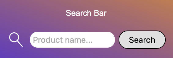
Example of the search bar:
RUI
GridLayout {
    width = 100%,
    padding = 1em,
    cell-vertical-align = center,
    cell-width = [auto, 1fr, auto], // Cell auto size for image and button. All the rest space for the text view.

    background = linear-gradient {
        direction = to-right-top,
        gradient = "#FF6138C6 0%, #FFD38039 100%",
    },

    content = [
        TextView {
            row = 0,      // First row
            column = 0:2, // Spans the entire first row
            margin = 1em,
            text = "Search Bar",
            text-color = white,
            text-align = center,
        },
        ImageView {
            row = 1,      // Second row
            column = 0,   // First column
            margin = 0.5em,
            src = search.svg,
            height = 1.5em,
            fit = contain,
        },
        EditView {
            id = search-text,
            row = 1,      // Second row
            column = 1,   // Second column
            hint = "Product name...",
            radius = 1em,
            padding = 0.3em,
            border = _{
                style = none,
            },
        },
        Button {
            row = 1,      // Second row
            column = 2,   // Third column
            id = search-btn,
            content = "Search",
            radius = 1em,
        },
    ],
}
Go
view := rui.NewGridLayout(session, rui.Params{
    rui.Width:             rui.Percent(100),
    rui.Padding:           rui.Em(1),
    rui.CellVerticalAlign: rui.CenterAlign,
    rui.CellWidth:         []rui.SizeUnit{rui.AutoSize(), rui.Fr(1), rui.AutoSize()}, // Cell auto size for image and button. All the rest space for the text view.
    rui.Background: rui.NewBackgroundLinearGradient(rui.Params{
        rui.Direction: rui.ToRightTopGradient,
        rui.Gradient:  " #FF6138C6, #FFD38039",
    }),
    rui.Content: []rui.View{
        rui.NewTextView(session, rui.Params{
            rui.Row:       0,                            // First row
            rui.Column:    rui.Range{First: 0, Last: 2}, // Spans the entire first row
            rui.Margin:    rui.Em(1),
            rui.Text:      "Search Bar",
            rui.TextColor: rui.White,
            rui.TextAlign: rui.CenterAlign,
        }),
        rui.NewImageView(session, rui.Params{
            rui.Row:    1,            // Second row
            rui.Column: 0,            // First column
            rui.Margin: rui.Em(0.5),
            rui.Source: "search.svg",
            rui.Height: rui.Em(1.5),
            rui.Fit:    rui.ContainFit,
        }),
        rui.NewEditView(session, rui.Params{
            rui.ID:      "search-text",
            rui.Row:     1,            // Second row
            rui.Column:  1,            // Second column
            rui.Hint:    "Product name...",
            rui.Radius:  rui.Em(1),
            rui.Padding: rui.Em(0.3),
            rui.Border: rui.NewBorder(rui.Params{
                rui.Style: rui.NoneLine,
            }),
        }),
        rui.NewButton(session, rui.Params{
            rui.Row:     1,            // Second row
            rui.Column:  2,            // Third column
            rui.ID:      "search-btn",
            rui.Content: "Search",
            rui.Radius:  rui.Em(1),
        }),
    },
})
To retrieve back the values of "row" and "column" properties we can use the rui.GetRow() and rui.GetColumn() global functions, which will return the value of Range type.
Go
rows := rui.GetRow(rootView, "view-id")

// Do something with the value

columns := rui.GetColumn(rootView, "view-id")

// Do something with the value
For several containers like ListLayout, ListView it is crucial for controlling the orientation and direction of the items within a container, allowing us to create responsive layouts that adapt to different screen sizes and design requirements.
By specifying whether items should be laid out horizontally or vertically, and in what order, we enable precise control over the layout structure and flow of content on an application page.
The "orientation" property is used for this purpose which accept the following values:
| Value | Name | Description |
|---|---|---|
TopDownOrientation |
"up-down" | Child views are arranged in a column from top to bottom |
StartToEndOrientation |
"start-to-end" | Child views are laid out in a row from start to end |
BottomUpOrientation |
"bottom-up" | Child views are arranged in a column from bottom to top |
EndToStartOrientation |
"end-to-start" | Child views are laid out in a line from end to start |
When specifying property value in resource description file the name of the value is used. By default all child views are laid out from start to end.
RUI
GridLayout {
width = 100%,
height = 100%,
background-color = salmon,
cell-vertical-align = center,
cell-horizontal-align = center,
content = ListLayout {
padding = 1em,
radius = 0.5em,
background-color = #AAFFFFFF, // Semitransparent background
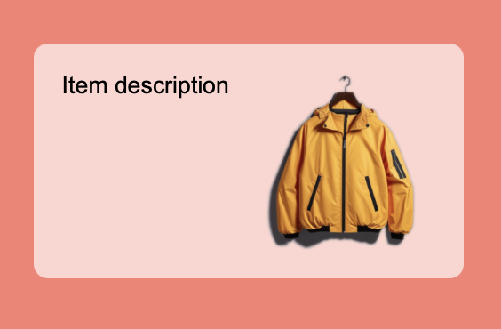
orientation = up-down, // Top-down layout
gap = 1em,
content = [
TextView {
text = "Item description",
},
ImageView {
src = "product.png",
fit = contain,
width = 100px,
height = 100px,
}
]
}
}
Go
view := rui.NewGridLayout(session, rui.Params{
    rui.Width:               rui.Percent(100),
    rui.Height:              rui.Percent(100),
    rui.BackgroundColor:     rui.Salmon,
    rui.CellVerticalAlign:   rui.CenterAlign,
    rui.CellHorizontalAlign: rui.CenterAlign,
    rui.Content: rui.NewListLayout(session, rui.Params{
        rui.Padding:         rui.Em(1),
        rui.Radius:          rui.Em(0.5),
        rui.BackgroundColor: 0xAAFFFFFF,             // Semitransparent background
        rui.Orientation:     rui.TopDownOrientation, // Top-down layout
        rui.Gap:             rui.Em(1),
        rui.Content: []rui.View{
            rui.NewTextView(session, rui.Params{
                rui.Text: "Item description",
            }),
            rui.NewImageView(session, rui.Params{
                rui.Source: "product.png",
                rui.Fit:    rui.ContainFit,
                rui.Width:  rui.Px(100),
                rui.Height: rui.Px(100),
            }),
        },
    }),
})
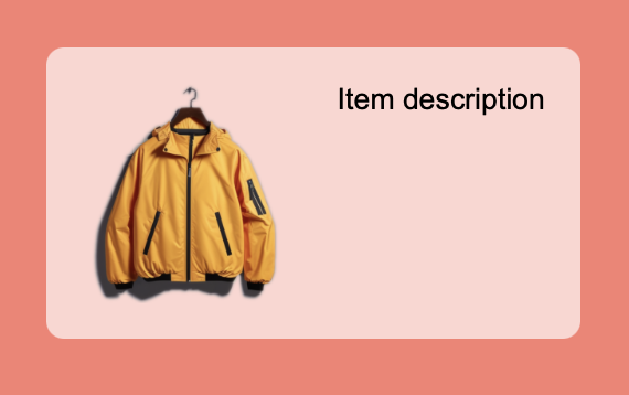
Lets have a look at other "orientation" property values.
RUI
orientation = bottom-up,
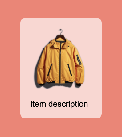
RUI
orientation = start-to-end,
RUI
orientation = end-to-start,
To get back the value of the "orientation" property we can use the global function rui.GetListOrientation(), which will return the value of the constant which was set.
Go
orientation := rui.GetListOrientation(rootView, "view-id")

// Do something with the value
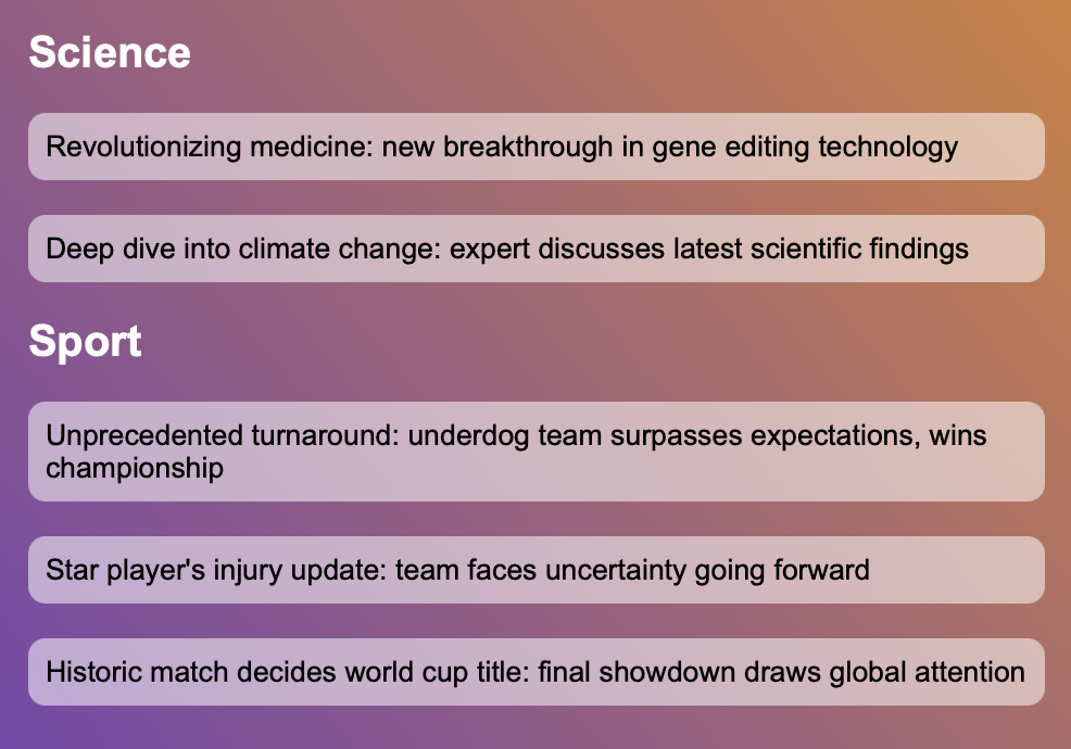
In addition to orientation of the child views within the container we can group similar items so they will appear near each other, for this purpose the "Order" property is used. The "Order" property accepts an integer that signifies its group. The items are displayed in ascending order based on these integers, with lower values appearing first. In cases where multiple items share the same integer value, they are positioned in the order they were added to the container.
The default "Order" property value is 0 which means that the order of the elements follows the order in which they were added to the container. To place a view or groups of views at the beginning of the sequence, we use negative values. The property only affects the visual order and does not impact the logical order or tabs.
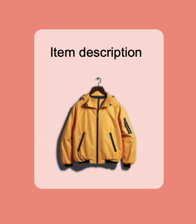
Below is an example of news sections whose order differs from the order in which they were added to the container. We can re-order them at any time by assigning different values to the "Order" property.
RUI
ListLayout {
    width = 100%,
    height = 100%,
    padding = 1em,
    gap = 1em,
    background = linear-gradient {
        direction = to-right-top,
        gradient = "#FF6138C6 0%, #FFD38039 100%",
    },
    orientation = up-down,
    content = [
        // News sections
        TextView {
            width = 100%,
            semantics = h2,
            Order = -2,         // Top-most Science group
            text-color = white,
            text = Science,
        },
        TextView {
            width = 100%,
            semantics = h2,
            Order = -1,         // Sport group
            text-color = white,
            text = Sport,
        },
        TextView{
            width = 100%,
            padding = 0.5em,
            Order = -2,        // In Science group
            radius = 0.5em,
            background-color = #88FFFFFF,
            text = "Revolutionizing medicine: new breakthrough in gene editing technology",
        },
        TextView {
            width = 100%,
            padding = 0.5em,
            Order = -2,        // In Science group
            radius = 0.5em,
            background-color = #88FFFFFF,
            text = "Deep dive into climate change: expert discusses latest scientific findings",
        },
        // Sport news group
        TextView{
            width = 100%,
            padding = 0.5em,
            Order = -1,        // In Sport group
            radius = 0.5em,
            background-color = #88FFFFFF,
            text = "Unprecedented turnaround: underdog team surpasses expectations, wins championship",
        },
        TextView {
            width = 100%,
            padding = 0.5em,
            Order = -1,        // In Sport group
            radius = 0.5em,
            background-color = #88FFFFFF,
            text = "Star player's injury update: team faces uncertainty going forward",
        },
        TextView {
            width = 100%,
            padding = 0.5em,
            Order = -1,        // In Sport group
            radius = 0.5em,
            background-color = #88FFFFFF,
            text = "Historic match decides world cup title: final showdown draws global attention",
        },
    ]
}
Go
view := rui.NewListLayout(session, rui.Params{
    rui.Width:   rui.Percent(100),
    rui.Height:  rui.Percent(100),
    rui.Padding: rui.Em(1),
    rui.Gap:     rui.Em(1),
    rui.Background: rui.NewBackgroundLinearGradient(rui.Params{
        rui.Direction: rui.ToRightTopGradient,
        rui.Gradient: []rui.BackgroundGradientPoint{
            {Pos: rui.Percent(0), Color: "#FF6138C6"},
            {Pos: rui.Percent(100), Color: "#FFD38039"},
        },
    }),
    rui.Orientation: rui.TopDownOrientation,
    rui.Content: []rui.View{
        rui.NewTextView(session, rui.Params{
            rui.Width:     rui.Percent(100),
            rui.Semantics: rui.H2Semantics,
            rui.Order:     -2,
            rui.TextColor: rui.White,
            rui.Text:      "Science",
        }),
        rui.NewTextView(session, rui.Params{
            rui.Width:     rui.Percent(100),
            rui.Semantics: rui.H2Semantics,
            rui.Order:     -1,
            rui.TextColor: rui.White,
            rui.Text:      "Sport",
        }),
        rui.NewTextView(session, rui.Params{
            rui.Width:           rui.Percent(100),
            rui.Padding:         rui.Em(0.5),
            rui.Order:           -2,
            rui.Radius:          rui.Em(0.5),
            rui.BackgroundColor: 0x88FFFFFF,
            rui.Text:            "Revolutionizing medicine: new breakthrough in gene editing technology",
        }),
        rui.NewTextView(session, rui.Params{
            rui.Width:           rui.Percent(100),
            rui.Padding:         rui.Em(0.5),
            rui.Order:           -2,
            rui.Radius:          rui.Em(0.5),
            rui.BackgroundColor: 0x88FFFFFF,
            rui.Text:            "Deep dive into climate change: expert discusses latest scientific findings",
        }),
        rui.NewTextView(session, rui.Params{
            rui.Width:           rui.Percent(100),
            rui.Padding:         rui.Em(0.5),
            rui.Order:           -1,
            rui.Radius:          rui.Em(0.5),
            rui.BackgroundColor: 0x88FFFFFF,
            rui.Text:            "Unprecedented turnaround: underdog team surpasses expectations, wins championship",
        }),
        rui.NewTextView(session, rui.Params{
            rui.Width:           rui.Percent(100),
            rui.Padding:         rui.Em(0.5),
            rui.Order:           -1,
            rui.Radius:          rui.Em(0.5),
            rui.BackgroundColor: 0x88FFFFFF,
            rui.Text:            "Star player's injury update: team faces uncertainty going forward",
        }),
        rui.NewTextView(session, rui.Params{
            rui.Width:           rui.Percent(100),
            rui.Padding:         rui.Em(0.5),
            rui.Order:           -1,
            rui.Radius:          rui.Em(0.5),
            rui.BackgroundColor: 0x88FFFFFF,
            rui.Text:            "Historic match decides world cup title: final showdown draws global attention",
        }),
    },
})
To retrieve the value of the "Order" property we can use the global convenient method rui.GetOrder(), which will return the integer value.
Go
order := rui.GetOrder(rootView, "view-id")

// Do something with the value
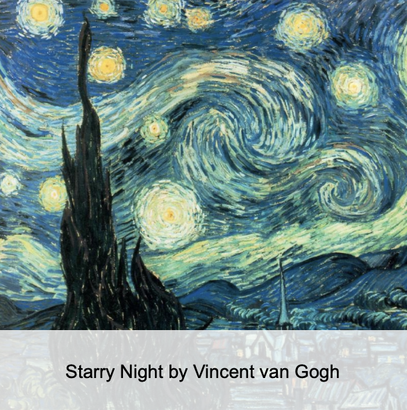
When working with positioned views like with these which were added to AbsoluteLayout there might be cases where we need to control the display order if views which overlap each other.
For this purpose the "z-index" property could be quite handy, by setting specific values we ensure that certain elements appear on top of others.
This is crucial for creating layered designs, enhancing user experience by keeping interactive elements accessible, and managing complex layouts with multiple layers.
The property accept the negative and positive integer values. Views with the higher values of "z-index" property will be displayed on top of the views with lower values.
RUI
AbsoluteLayout {
    width = 300px,
    height = 300px,
    content = [
        GridLayout {
            width = 100%,
            height = 20%,
            bottom = 0px,
            left = 0px,
            z-index = 1,                    // Place the image caption above the image
            cell-vertical-align = center,
            cell-horizontal-align = center,
            background-color = #CCFFFFFF,
            content = TextView {
                width = 100%,
                text = "Starry Night by Vincent van Gogh",
                text-align= center,
            }
        },
        ImageView {
            width = 100%,
            height = 100%,
            fit = cover,
            src = art.png,
        },
    ]
}
Go
view := rui.NewAbsoluteLayout(session, rui.Params{
    rui.Width:  rui.Px(300),
    rui.Height: rui.Px(300),
    rui.Content: []rui.View{
        rui.NewGridLayout(session, rui.Params{
            rui.Width:               rui.Percent(100),
            rui.Height:              rui.Percent(20),
            rui.Bottom:              rui.Px(0),
            rui.Left:                rui.Px(0),
            rui.ZIndex:              1,               // Display the image caption above the image
            rui.CellVerticalAlign:   rui.CenterAlign,
            rui.CellHorizontalAlign: rui.CenterAlign,
            rui.BackgroundColor:     0xCCFFFFFF,
            rui.Content: rui.NewTextView(session, rui.Params{
                rui.Width:     rui.Percent(100),
                rui.Text:      "Starry Night by Vincent van Gogh",
                rui.TextAlign: rui.CenterAlign,
            }),
        }),
        rui.NewImageView(session, rui.Params{
            rui.Width:  rui.Percent(100),
            rui.Height: rui.Percent(100),
            rui.Fit:    rui.CoverFit,
            rui.Source: "art.png",
        }),
    },
})
To get back the value of the "z-index" property we can use the convenient global function rui.GetZIndex(), which will return an integer value.
Go
zIndex := rui.GetZIndex(rootView, "view-id")

// Do something with the value
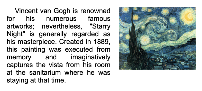
When organizing content on a page with multiple columns, we can easily achieve this layout by using the "float" property. This method allows text to wrap around images or other inline elements, similar to how it appears in print media.
See also GridLayout or ColumnLayout if you need more precise control on multi-column layouts.
The accepted values for the "float" property are listed below.
| Value | Name | Description |
|---|---|---|
NoneFloat |
"none" | Text and other views inside the container will not wrap around this view |
LeftFloat |
"left" | Text and other views inside the container will wrap around this view on the right side |
RightFloat |
"right" | Text and other views inside the container will wrap around this view on the left side |
When setting the value from a resource description file, we use the name of the value.
RUI
ColumnLayout {
    width = 400px,
    padding = 1em,
    orientation = up-down,
    content = [
        ImageView{
            width = 150px,
            height = 150px,
            float = right,      // Place image on the right side
            margin-left = 1em,
            src = art.png,
            fit = contain,
        },
        TextView {
            text-indent = 1em,
            text-align = justify,
            text = "Vincent van Gogh is renowned for his numerous famous artworks; nevertheless, \"Starry Night\" is generally regarded as his masterpiece. Created in 1889, this painting was executed from memory and imaginatively captures the vista from his room at the sanitarium where he was staying at that time.",
        }
    ]
}
Go
view := rui.NewColumnLayout(session, rui.Params{
    rui.Width:       rui.Px(400),
    rui.Padding:     rui.Em(1),
    rui.Orientation: rui.TopDownOrientation,
    rui.Content: []rui.View{
        rui.NewImageView(session, rui.Params{
            rui.Width:      rui.Px(150),
            rui.Height:     rui.Px(150),
            rui.Float:      rui.RightFloat,         // Place image on the right side
            rui.MarginLeft: rui.Em(1),
            rui.Source:     "art.png",
            rui.Fit:        rui.ContainFit,
        }),
        rui.NewTextView(session, rui.Params{
            rui.TextIndent: rui.Em(1),
            rui.TextAlign:  rui.JustifyAlign,
            rui.Text:       "Vincent van Gogh is renowned for his numerous famous artworks; nevertheless, \"Starry Night\" is generally regarded as his masterpiece. Created in 1889, this painting was executed from memory and imaginatively captures the vista from his room at the sanitarium where he was staying at that time.",
        }),
    },
})
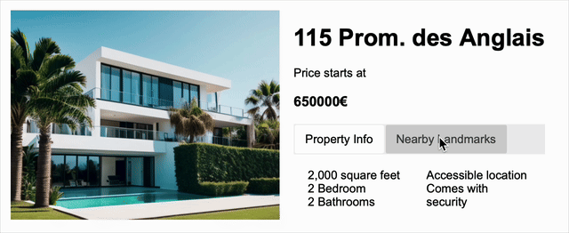
When working with the TabsLayout container, it's often necessary to control how tab buttons look.
The library provides several properties for this purpose.
These properties should be set on the top-most child views within the tabs layout.
The "title" property is used to specify the text displayed on each tab.
We can also add an optional image to a tab using the "icon" property.
If our tabs need to be dynamic, we can enable a close button on each tab by using the "tab-close-button" property.
To handle the tab close event, supply an event handler function to the "tab-close-event" property.
Below is a common use case of the tabs layout which demonstrate the "title" property.
RUI
GridLayout {
    width = 650px,
    height = 400px,
    padding = 1em,
    content = [
        ImageView {
            width = 100%,
            height = 100%,
            row = 0,
            column = 0,
            src = product.png,
            fit = contain,
        },
        ListLayout {
            width = 100%,
            height = 100%,
            gap = 1em,
            orientation = up-down,
            padding = 1em,
            row = 0,
            column = 1,
            content = [
                TextView {
                    width = 100%,
                    semantics = h1,
                    text = "115 Prom. des Anglais",
                },
                TextView {
                    width = 100%,
                    text = "Price starts at",
                },
                TextView {
                    width = 100%,
                    semantics = h3,
                    text = "650000€",
                },
                TabsLayout {
                    width = 100%,
                    height = 100%,
                    content = [
                        ColumnLayout {
                            title = "Property Info", // Title of the tab
                            width = 100%,
                            column-gap = 1em,
                            column-count = 2,
                            padding = 1em,
                            content = [
                                "2,000 square feet",
                                "2 Bedroom",
                                "2 Bathrooms",
                                "Accessible location",
                                "Comes with security",
                            ],
                        },
                        ColumnLayout {
                            title = "Nearby Landmarks", // Title of the tab
                            width = 100%,
                            padding = 1em,
                            content = [
                                "Parks",
                                "Country Club",
                                "Schools and Universities",
                            ],
                        },
                    ],
                },
            ],
        },
    ],
}
Go
view := rui.NewGridLayout(session, rui.Params{
    rui.Width:   rui.Px(650),
    rui.Height:  rui.Px(400),
    rui.Padding: rui.Em(1),
    rui.Content: []rui.View{
        rui.NewImageView(session, rui.Params{
            rui.Width:  rui.Percent(100),
            rui.Height: rui.Percent(100),
            rui.Row:    0,
            rui.Column: 0,
            rui.Source: "product.png",
            rui.Fit:    rui.ContainFit,
        }),
        rui.NewListLayout(session, rui.Params{
            rui.Width:       rui.Percent(100),
            rui.Height:      rui.Percent(100),
            rui.Gap:         rui.Em(1),
            rui.Orientation: rui.TopDownOrientation,
            rui.Padding:     rui.Em(1),
            rui.Row:         0,
            rui.Column:      1,
            rui.Content: []rui.View{
                rui.NewTextView(session, rui.Params{
                    rui.Width:     rui.Percent(100),
                    rui.Semantics: rui.H1Semantics,
                    rui.Text:      "115 Prom. des Anglais",
                }),
                rui.NewTextView(session, rui.Params{
                    rui.Width: rui.Percent(100),
                    rui.Text:  "Price starts at",
                }),
                rui.NewTextView(session, rui.Params{
                    rui.Width:     rui.Percent(100),
                    rui.Semantics: rui.H3Semantics,
                    rui.Text:      "650000€",
                }),
                rui.NewTabsLayout(session, rui.Params{
                    rui.Width:  rui.Percent(100),
                    rui.Height: rui.Percent(100),
                    rui.Content: []rui.View{
                        rui.NewColumnLayout(session, rui.Params{
                            rui.Title:       "Property Info",       // Title of the tab
                            rui.Width:       rui.Percent(100),
                            rui.ColumnGap:   rui.Em(1),
                            rui.ColumnCount: 2,
                            rui.Padding:     rui.Em(1),
                            rui.Content: []string{
                                "2,000 square feet",
                                "2 Bedroom",
                                "2 Bathrooms",
                                "Accessible location",
                                "Comes with security",
                            },
                        }),
                        rui.NewColumnLayout(session, rui.Params{
                            rui.Title:   "Nearby Landmarks",        // Title of the tab
                            rui.Width:   rui.Percent(100),
                            rui.Padding: rui.Em(1),
                            rui.Content: []string{
                                "Parks",
                                "Country Club",
                                "Schools and Universities",
                            },
                        }),
                    },
                }),
            },
        }),
    },
})
Appearance of the tabs is customizable, check out our Application Resources tutorial, section Theme files->Styles.
If according to our design we need only an icon in the tab we can do this by setting the image file path as a value for "icon" property:
RUI
TabsLayout {
    width = 400px,
    height = 200px,
    padding = 1em,
    content = [
        TextView {
            icon = go_logo.svg, // Tab icon
            width = 100%,
            padding = 1em,
            semantics = code,
            white-space = pre,
            tab-size = 4,
            text = "view := rui.NewView(session, rui.Params{\n\tid:         view,\n\trui.Width:  rui.Percent(100),\n\trui.Height: rui.Percent(100),\n})",
        },
        TextView {
            icon = rui_logo.svg, // Tab icon
            width = 100%,
            padding = 1em,
            semantics = code,
            white-space = pre,
            tab-size = 4,
            text = "View {\n\tid = view,\n\twidth = 100%,\n\theight = 100%,\n}",
        },
    ],
}
Go
view := rui.NewTabsLayout(session, rui.Params{
    rui.Width:   rui.Percent(100),
    rui.Height:  rui.Percent(100),
    rui.Padding: rui.Em(1),
    rui.Content: []rui.View{
        rui.NewTextView(session, rui.Params{
            rui.Icon:       "go_logo.svg",
            rui.Width:      rui.Percent(100),
            rui.Padding:    rui.Em(1),
            rui.Semantics:  rui.CodeSemantics,
            rui.WhiteSpace: rui.WhiteSpacePre,
            rui.TabSize:    4,
            rui.Text:       "view := rui.NewView(session, rui.Params{<br>\tid:         view,<br>\trui.Width:  rui.Percent(100),<br>\trui.Height: rui.Percent(100),<br>})",
        }),
        rui.NewTextView(session, rui.Params{
            rui.Icon:       "rui_logo.svg",
            rui.Width:      rui.Percent(100),
            rui.Padding:    rui.Em(1),
            rui.Semantics:  rui.CodeSemantics,
            rui.WhiteSpace: rui.WhiteSpacePre,
            rui.TabSize:    4,
            rui.Text:       "View {<br>\tid = view,<br>\twidth = 100%,<br>\theight = 100%,<br>}",
        }),
    },
})
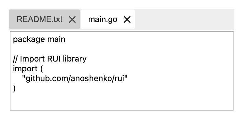
When implementing Multi-Document Interface (MDI) applications we can enable tabs close button by using the "tab-close-button" property. Internally property holds the value of the boolean type and accepts the following text values : "true", "yes", "on", "1", and "false", "no", "off", "0".
To handle the tab close event, supply an event handler function to the "tab-close-event" property.
RUI
TabsLayout {
    width = 100%,
    height = 100%,
    padding = 1em,
    content = [
        EditView {
            title = "README.txt",
            tab-close-button = yes,     // Show tab close button
            width = 100%,
            edit-view-type = multiline,
            text = "My awesome new project",
        },
        EditView {
            title = "main.go",
            tab-close-button = yes,     // Show tab close button
            width = 100%,
            edit-view-type = multiline,
            text = "package main\n\n// Import RUI library\nimport (\n\t\"github.com/anoshenko/rui\"\n)",
        },
    ],
}
Go
view := rui.NewTabsLayout(session, rui.Params{
    rui.Width:   rui.Percent(100),
    rui.Height:  rui.Percent(100),
    rui.Padding: rui.Em(1),
    rui.Content: []rui.View{
        rui.NewEditView(session, rui.Params{
            rui.Title:          "README.txt",
            rui.TabCloseButton: true,                    // Show tab close button
            rui.Width:          rui.Percent(100),
            rui.EditViewType:   rui.MultiLineText,
            rui.Text:           "My awesome new project",
        }),
        rui.NewEditView(session, rui.Params{
            rui.Title:          "main.go",
            rui.TabCloseButton: true,                    // Show tab close button
            rui.Width:          rui.Percent(100),
            rui.EditViewType:   rui.MultiLineText,
            rui.WhiteSpace:     rui.WhiteSpacePre,
            rui.Text:           "package main<br>// Import RUI library<br>import (<br>\t\"github.com/anoshenko/rui\"<br>)",
        }),
    },
})