View Background
To enhance the visual appearance of a view, we have multiple options for configuring its background. The background offers a versatile way to apply styles, including colors, images, and gradients. Understanding how these backgrounds interact with each other and with the element's border is crucial. When multiple background layers are applied, they are drawn in a specific order.
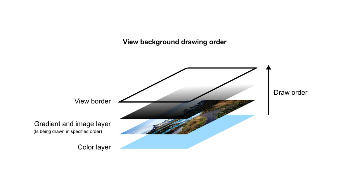
Image and gradient backgrounds have equal drawing priority. They will be displayed in the order we specify.
Below are all properties which we can use to manipulate view's background.
| Property | Type | Description |
|---|---|---|
| "background" | []BackgroundElement |
An array of background layers, either image or gradient |
| "background-blend-mode" | int |
Blending mode between view content and its background |
| "background-clip" | int |
Specifies the painting area for the background |
| "background-origin" | int |
Specifies the origin area from which the background will be displayed |
| "background-color" | Color |
Specifies a solid background color |
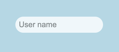
The easiest way to change a view's background is by setting its color using "background-color" property. Lets have a look at some simple examples.
User name prompt with light blue background described in the resource file:
RUI
GridLayout {
    width = 100%,
    height = 100%,
    cell-horizontal-align = center,
    cell-vertical-align = center,
    // Setting a background color of the user name prompt
    background-color = lightblue,
    content = EditView {
        hint = "User name",
        border = _{style = none}, // Get rid of the default border
        radius = 1em,
        opacity = 0.8,
        padding = 6px,
    },
}
We can do the same from the source code as well:
Go
view := rui.NewGridLayout(session, rui.Params{
    rui.Width:               rui.Percent(100),
    rui.Height:              rui.Percent(100),
    rui.CellHorizontalAlign: rui.CenterAlign,
    rui.CellVerticalAlign:   rui.CenterAlign,
    // Setting a background color of the user name prompt
    rui.BackgroundColor:     rui.LightBlue,
    rui.Content: rui.NewEditView(session, rui.Params{
        rui.Hint: "User name",
        rui.Border: rui.NewBorder(rui.Params{
            rui.Style: rui.NoneLine,
        }),
        rui.Radius:  rui.Em(1),
        rui.Opacity: 0.8,
        rui.Padding: rui.Px(6),
    }),
})
Here's an example of what it looks like:
For more information on the values that can be used with the "background-color" property, please refer to the Color type reference documentation.
To get the value of the background color property we can either use a global rui.GetBackgroundColor() function or Get() method of the view.
Go
color := rui.GetBackgroundColor(rootView, "view-id")
// Do something with the value
Besides the background color setting we can have a multiple layers of background images and gradients, all of them are set using "background" property.
The "background" property holds the value of the array of BackgroundElement interface.
An instance of that interface can be created using the several global functions:
Go
func NewBackgroundImage(params Params) BackgroundElement
func NewBackgroundLinearGradient(params Params) BackgroundElement
func NewBackgroundRadialGradient(params Params) BackgroundElement
func NewBackgroundConicGradient(params Params) BackgroundElement
func NewLinearGradient[DirectionType LinearGradientDirectionType | AngleUnit](direction DirectionType, repeating bool, point1 GradientPoint, point2 GradientPoint, points ...GradientPoint) BackgroundElement
func NewCircleRadialGradient[radiusType SizeUnit | RadialGradientRadiusType](xCenter, yCenter SizeUnit, radius radiusType, repeating bool, point1 GradientPoint, point2 GradientPoint, points ...GradientPoint) BackgroundElement
func NewEllipseRadialGradient[radiusType []SizeUnit | RadialGradientRadiusType](xCenter, yCenter SizeUnit, radius radiusType, repeating bool, point1 GradientPoint, point2 GradientPoint, points ...GradientPoint) BackgroundElement
where Params is a map which can contain the following properties:
| Property | Type | Applicability | Description |
|---|---|---|---|
| "src" | string |
Image background | Image file location |
| "attachment" | int |
Image background | Image scrolling behavior |
| "fit" | int |
Image background | Controls image scaling |
| "repeat" | int |
Image background | Controls repetition of the image |
| "width" | SizeUnit |
Image background | Image width |
| "height" | SizeUnit |
Image background | Image height |
| "image-horizontal-align" | int |
Image background | Image horizontal alignment |
| "image-vertical-align" | int |
Image background | Image vertical alignment |
| "direction" | AngleUnit |
Linear background gradient | Direction of the gradient line |
| "radial-gradient-radius" | SizeUnit |
Radial gradient background | Controls gradient radius |
| "radius" | SizeUnit |
Radial gradient background | Same as previous one |
| "radial-gradient-shape" | int |
Radial gradient background | Controls radial gradient shape type |
| "shape" | int |
Radial gradient background | Same as previous one |
| "center-x" | SizeUnit |
Radial and conic background gradients | Horizontal center point of the gradient |
| "center-y" | SizeUnit |
Radial and conic background gradients | Vertical center point of the gradient |
| "from" | AngleUnit |
Conic gradient background | Controls start angle position of the gradient |
| "gradient" | []BackgroundGradientPoint or []BackgroundGradientAngle |
All gradient backgrounds | Controls gradient stop points |
| "repeating" | bool |
All gradient backgrounds | Repetition of stop points after the last one |
Each property is dedicated to a specific type of the background like an image or some sort of the color gradient.
The best place to get more information on these properties is to check BackgroundElement reference documentation where each property described in detail.
Lets have a look on how we can set an image background using rui.NewBackgroundImage() function.
Go
view := rui.NewGridLayout(session, rui.Params{
    rui.Width:  rui.Percent(100),
    rui.Height: rui.Percent(100),
    // Setting background image
    rui.Background: rui.NewBackgroundImage(rui.Params{
        rui.Source: "background.jpg",
        rui.Fit:    rui.CoverFit,
    }),
    rui.CellVerticalAlign:   rui.CenterAlign,
    rui.CellHorizontalAlign: rui.CenterAlign,
    rui.Content: rui.NewTextView(session, rui.Params{
        rui.Text:      "Welcome",
        rui.TextColor: rui.White,
        rui.TextSize:  rui.Em(5),
    }),
})
When referencing property names such as "src" and "fit", we utilize library's predefined constants.
Possible outcome of the code above depending on an image used may look like:
When dealing with "background" property in resource description file it accepts the values of a several objects in a specific format which describe an image or different kinds of color gradients.
Below is an object format for describing an image background:
RUI
image {
    src = <image-location>,                                            // Image file location
    attachment = scroll | fixed | local,                               // Image scrolling behavior
    fit = none | contain | cover,                                      // Controls image scaling
    repeat = no-repeat | repeat | repeat-x | repeat-y | round | space, // Controls repetition of the image
}
, where <image-location> is the path to a background image file.
Some of the attributes of the object can be omitted if needed, in this case the default value will be used.
Let's explore how to define an image background using the specified object format in our resource file:
RUI
GridLayout {
    width = 100%,
    height = 100%,
    // Setting background image
    background = image {
        src = "background.jpg",
        fit = cover,
    },
    cell-vertical-align = center,
    cell-horizontal-align = center,
    content = TextView{
        text = Welcome,
        text-color = white,
        text-size = 5em,
    },
}
There are cases when setting a solid background color or an image is not enough, in this case we have a possibility to define a color gradient which can be blended with underneath layers.
Linear color gradient is the simplest one and can be created using rui.NewBackgroundLinearGradient() or rui.NewLinearGradient() global functions.
Go
view := rui.NewGridLayout(session, rui.Params{
    rui.Width:  rui.Percent(100),
    rui.Height: rui.Percent(100),
    // Setting background linear gradient
    rui.Background: rui.NewBackgroundLinearGradient(rui.Params{
        rui.Direction: rui.ToRightTopGradient, //Either predefined direction or an angle
        rui.Gradient: []rui.BackgroundGradientPoint{
            {Pos: rui.Percent(0), Color: "#FF6138C6"},   // Bottom-left point color
            {Pos: rui.Percent(100), Color: "#FFD38039"}, // Top-right point color
        },
    }),
    rui.CellVerticalAlign:   rui.CenterAlign,
    rui.CellHorizontalAlign: rui.CenterAlign,
    rui.Content: rui.NewTextView(session, rui.Params{
        rui.Text:      "Welcome",
        rui.TextColor: rui.White,
        rui.TextSize:  rui.Em(5),
    }),
})

view := rui.NewGridLayout(session, rui.Params{
    rui.Width:  rui.Percent(100),
    rui.Height: rui.Percent(100),
    // Setting background linear gradient
    rui.Background: rui.NewLinearGradient(
        rui.ToRightTopGradient, // Either predefined direction or an angle
        false,                  // Repetition
        rui.GradientPoint{Offset: 0, Color: 0xFF6138C6}, // Bottom-left point color
        rui.GradientPoint{Offset: 1, Color: 0xFFD38039}, // Top-right point color
    ),
    rui.CellVerticalAlign:   rui.CenterAlign,
    rui.CellHorizontalAlign: rui.CenterAlign,
    rui.Content: rui.NewTextView(session, rui.Params{
        rui.Text:      "Welcome",
        rui.TextColor: rui.White,
        rui.TextSize:  rui.Em(5),
    }),
})
We can configure the same background from the resource file, the following object format is used to describe linear color gradient:
RUI
linear-gradient {
    direction = <angle> | to-top | to-right-top | to-right | to-right-bottom | to-bottom | to-left-bottom | to-left | to-left-top, // Direction of the gradient line
    gradient = "<color>[ <position>][,<color>[ <position>]]", // An array of gradient stop points
    repeating = true | false,                             // Repetition of stop points after the last one
}
, where <angle> is a text representation of an AngleUnit value, we can also assign a predefined direction values if needed.
The <color> is the text representation of the Color value, and the <position> is the text representation of the SizeUnit value.
The <position> is an optional value when describing gradient stop points.
If it is not set then colors listed as a stop points will be evenly distributed along the direction of the gradient.
Here is an above example of setting the linear gradient but described in resource description file:
RUI
GridLayout {
    width = 100%,
    height = 100%,
    // Setting background linear gradient
    background = linear-gradient {
        direction = to-right-top,                  // Either predefined direction or an angle
        gradient = "#FF6138C6 0%, #FFD38039 100%", // Bottom-left and top-right colors with their offsets
    },
    cell-vertical-align = center,
    cell-horizontal-align = center,
    content = TextView{
        text = Welcome,
        text-color = white,
        text-size = 5em,
    },
}
Upon executing these examples, we'll observe a visually appealing diagonal gradient transitioning smoothly from the bottom-left to the top-right corner of the window:

The radial gradient can be created using the rui.NewBackgroundRadialGradient(), rui.NewCircleRadialGradient(), and rui.NewEllipseRadialGradient() global functions.
Go
view := rui.NewGridLayout(session, rui.Params{
    rui.Width:  rui.Percent(100),
    rui.Height: rui.Percent(100),
    // Setting background radial gradient
    rui.Background: rui.NewBackgroundRadialGradient(rui.Params{
        rui.RadialGradientRadius: rui.Percent(50),
        rui.Gradient: []rui.BackgroundGradientPoint{
            {Pos: rui.Percent(0), Color: "#FF7EDFAB"},
            {Pos: rui.Percent(100), Color: "#FF66A1A1"},
        },
    }),
    rui.CellVerticalAlign:   rui.CenterAlign,
    rui.CellHorizontalAlign: rui.CenterAlign,
    rui.Content: rui.NewTextView(session, rui.Params{
        rui.Text:      "Welcome",
        rui.TextColor: rui.White,
        rui.TextSize:  rui.Em(5),
    }),
})

view := rui.NewGridLayout(session, rui.Params{
    rui.Width:  rui.Percent(100),
    rui.Height: rui.Percent(100),
    // Setting background radial gradient
    rui.Background: rui.NewCircleRadialGradient(
        rui.Percent(50), // Center point x-coordinate
        rui.Percent(50), // Center point y-coordinate
        rui.Percent(50), // Gradient radius
        false,           // Repeating
        rui.GradientPoint{Offset: 0, Color: 0xFF7EDFAB}, // Center point color
        rui.GradientPoint{Offset: 1, Color: 0xFF66A1A1}, // Edge point color
    ),
    rui.CellVerticalAlign:   rui.CenterAlign,
    rui.CellHorizontalAlign: rui.CenterAlign,
    rui.Content: rui.NewTextView(session, rui.Params{
        rui.Text:      "Welcome",
        rui.TextColor: rui.White,
        rui.TextSize:  rui.Em(5),
    }),
})

view := rui.NewGridLayout(session, rui.Params{
    rui.Width:  rui.Percent(100),
    rui.Height: rui.Percent(100),
    // Setting background radial gradient
    rui.Background: rui.NewEllipseRadialGradient(
        rui.Percent(50),           // Center point x-coordinate
        rui.Percent(50),           // Center point y-coordinate
        rui.ClosestCornerGradient, // Gradient radius
        false,                     // Repeating
        rui.GradientPoint{Offset: 0, Color: 0xFF7EDFAB}, // Center point color
        rui.GradientPoint{Offset: 1, Color: 0xFF66A1A1}, // Edge point color
    ),
    rui.CellVerticalAlign:   rui.CenterAlign,
    rui.CellHorizontalAlign: rui.CenterAlign,
    rui.Content: rui.NewTextView(session, rui.Params{
        rui.Text:      "Welcome",
        rui.TextColor: rui.White,
        rui.TextSize:  rui.Em(5),
    }),
})
When describing radial gradient background in resource description file the following object format is accepted:
RUI
radial-gradient {
    radial-gradient-radius = <radius>,         // Gradient radius
    radius                 = <radius>,         // Same as above
    radial-gradient-shape = ellipse | circle,  // Gradient shape type
    shape                 = ellipse | circle,  // Same as above
    center-x = <x>,                                             // Horizontal center point of the gradient
    center-y = <y>,                                             // Vertical center point of the gradient
    gradient = "<color>[ <position>][,<color>[ <position>]]",   // An array of gradient stop points
    repeating = <boolval>,                                      // Repetition of stop points after the last one
}
, where <radius>, <x>, <y>, and <position> are text representation of SizeUnit value type.
The <color> is a text representation of Color value type.
And <boolval> is a text representation of the boolean type which can hold the following values: "true", "yes", "on", "1", and "false", "no", "off", "0".
The <position> is an optional value when describing gradient stop points.
If it is not set then colors listed as a stop points will be evenly distributed along the radius of the gradient.
Lets repeat our above example but describe it in the resource file for now:
RUI
GridLayout {
    width = 100%,
    height = 100%,
    // Setting background radial gradient
    background = radial-gradient {
        radius = 50%,
        gradient = "#FF7EDFAB 0%, #FF66A1A1 100%",
    },
    cell-vertical-align = center,
    cell-horizontal-align = center,
    content = TextView{
        text = Welcome,
        text-color = white,
        text-size = 5em,
    },
}
After launching such example we'll have something similar to the image below:

Remember that the amount of stop points can be different and they can be repeated using "repeating" property. Also the radius of the gradient can exceed the dimensions of the view itself this will allow to create some nice looking gradients.
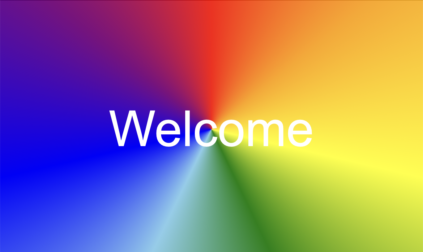
The last type of the background gradient we'll discuss is a conic gradient.
To make one we've to use rui.NewBackgroundConicGradient() global function:
Go
view := rui.NewGridLayout(session, rui.Params{
    rui.Width:  rui.Percent(100),
    rui.Height: rui.Percent(100),
    // Setting background conic gradient
    rui.Background: rui.NewBackgroundConicGradient(rui.Params{
        rui.From:     rui.Deg(0),      // Starting from 0 angle
        rui.CenterX:  rui.Percent(50),
        rui.CenterY:  rui.Percent(50),
        rui.Gradient: "red,orange,yellow,green,skyblue,blue,purple,red", // Rainbow
    }),
    rui.CellVerticalAlign:   rui.CenterAlign,
    rui.CellHorizontalAlign: rui.CenterAlign,
    rui.Content: rui.NewTextView(session, rui.Params{
        rui.Text:      "Welcome",
        rui.TextColor: rui.White,
        rui.TextSize:  rui.Em(5),
    }),
})
Default starting point or 0 degree is facing up from the center of the gradient. The center point of the gradient can be placed anywhere we want including points which are outside of the view shape. This technique is perfect for creating visually appealing gradients in our designs.
In the resource description file, we can also define a conic gradient background for a view. For this purpose, a specific object in the following format should be utilized:
RUI
conic-gradient {
    center-x = <x>,                                           // Horizontal center point of the gradient
    center-y = <y>,                                           // Vertical center point of the gradient
    from = <angle>,                                           // Starting angle
    gradient = "<color>[ <position>][,<color>[ <position>]]", // An array of gradient stop points
    repeating = <boolval>,                                    // Repetition of stop points after the last one
}
, where <x>, <y>, and <position> are text representation of SizeUnit value type.
The <color> is a text representation of Color value type.
The <angle> is a starting point for the gradient and is a text representation of the AngleUnit value type.
Finally, <boolval> is a text representation of the boolean type which can hold the following values: "true", "yes", "on", "1", and "false", "no", "off", "0".
The <position> is an optional value when describing gradient stop points.
If it is not set then colors listed as a stop points will be evenly distributed along the circumference of the gradient.
Below is an example of the same conic gradient we made above but described in resource description file:
RUI
GridLayout {
    width = 100%,
    height = 100%,
    // Setting background conic gradient
    background = conic-gradient {
        from = 0deg, // Starting from 0 angle
        gradient = "red,orange,yellow,green,skyblue,blue,purple,red", // Rainbow
    },
    cell-vertical-align = center,
    cell-horizontal-align = center,
    content = TextView{
        text = Welcome,
        text-color = white,
        text-size = 5em,
    },
}
Here's what the gradient looks like:
Instead of setting the background appearance when creating a view, we can change it at any time using either the global rui.Set() function or the Set() method on the view object:
Go
view.Set(rui.Background, rui.NewBackgroundConicGradient(rui.Params{
    rui.From:     rui.Deg(0),
    rui.CenterX:  rui.Percent(50),
    rui.CenterY:  rui.Percent(50),
    rui.Gradient: "red,orange,yellow,green,skyblue,blue,purple,red",
}))
Even if the "background" property uses an array of BackgroundElement as its internal data type, we can still assign a single value, and it will be wrapped into an array automatically.
To read the current values of the "background" property, we can use the rui.GetBackground() global function, which will return an array of the BackgroundElement values.
Go
backgrounds := rui.GetBackground(view, "view-id")
for _, bgElement := range backgrounds {
    rui.DebugLogF("View has background of type %s\n", bgElement.Tag()) // Tag could be "image", "linear-gradient", "radial-gradient", and "conic-gradient"

    switch bgElement.Tag() {
    case "image":
        // Do something with the value
    case "linear-gradient", "radial-gradient", "conic-gradient":
        // Do something with the value
    }
}
The BackgroundElement itself also contains properties the values of which can be retrieved using the Get() method of that interface.
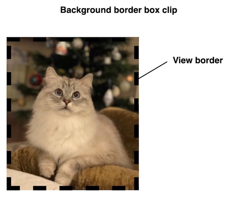
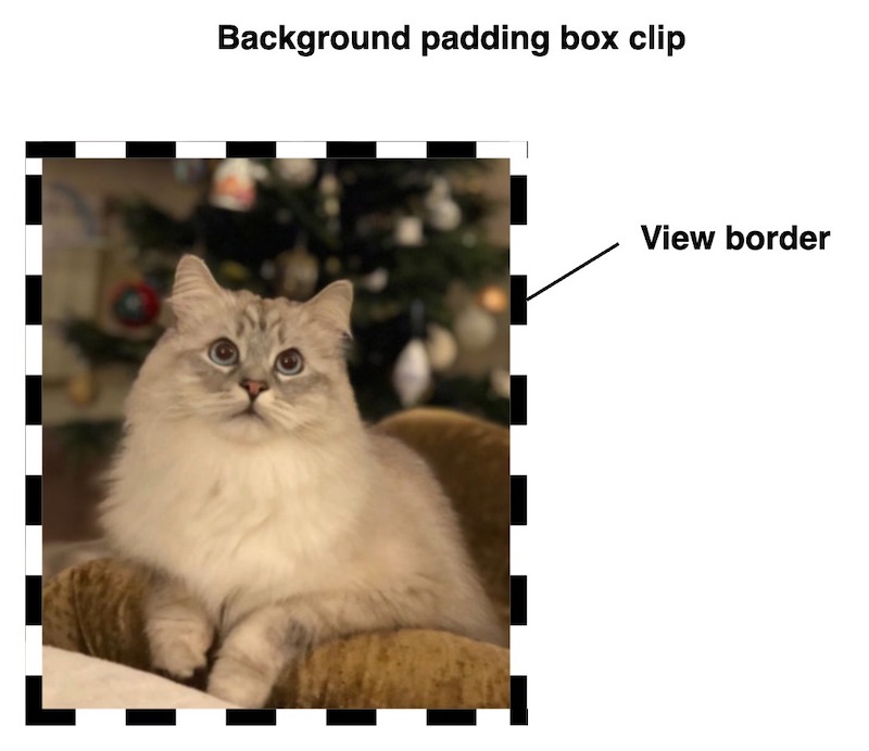
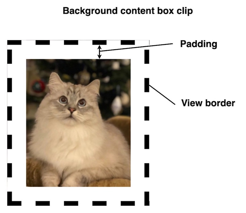
By default, the background extends to the outer edge of the border, but using the "background-clip" property, we can restrict this to other areas.
The property can contain one of the following values:
| Value | Name | Description |
|---|---|---|
BorderBox |
"border-box" | The background extends to the outer edge of the border(but below the border in z-order) |
PaddingBox |
"padding-box" | The background extends to the outer edge of the padding. No background is drawn below the border |
ContentBox |
"content-box" | The background is displayed inside of the content box |
When using rui.BorderBox as the background clip value, the background will conform to the shape of the view.
In this scenario, the border is drawn on top of the background, making it particularly noticeable when the border has a non-solid appearance.
To exclude the border of the view from the background we can use the rui.PaddingBox value:
If this still does not meet our requirements, we can configure the background to appear only inside of the view content area by using the rui.ContentBox value:
As any other property we can set it either during creation of the view(from resource file or code) and at runtime. Lets take a look at some examples.
Setting background clip property from code.
Go
if ok := view.Set(rui.BackgroundClip, rui.ContentBox); ok {
    // Success
}
Setting property from the resource file.
RUI
// View hierarchy
...
    // Setting view property
    background-clip = content-box,

// The rest of view hierarchy
...
To get back the value of the "background-clip" property we can use the rui.GetBackgroundClip() global function, which will return a numeric value of the constant.
Go
bgClip := rui.GetBackgroundClip(view, "view-id")

// Do something with the value
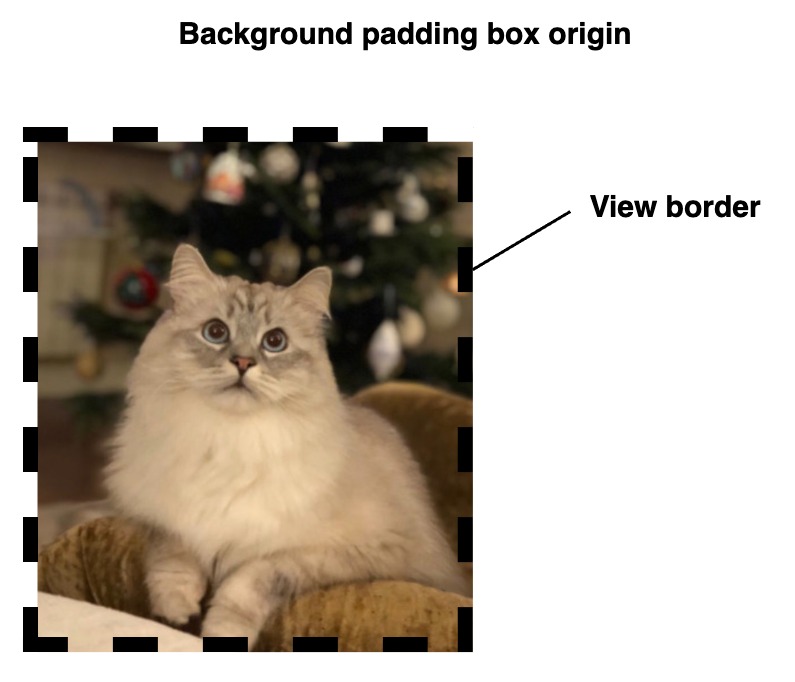
Besides the background clipping functionality we can control the origin point of the background, this is done by utilizing the "background-origin" property.
The property can contain one of the following values:
| Value | Name | Description |
|---|---|---|
BorderBox |
"none" | The background is positioned relative to the border box |
PaddingBox |
"solid" | The background is positioned relative to the padding box |
ContentBox |
"dashed" | The background is positioned relative to the content box |
When using rui.BorderBox as the background origin value, the background will be displayed starting from the shape of the view.
In this scenario, the border is drawn on top of the background, making it particularly noticeable when the border has a non-solid appearance.

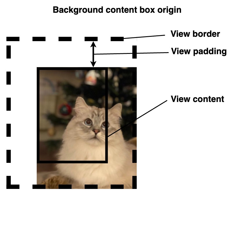
To display the background starting from the internal border edge we can use the rui.PaddingBox value:
Depending on the requirements, we may wish to display the background starting from the content box.
For this purpose, the rui.ContentBox value is used:
As any other property we can set it either during creation of the view(from resource file or code) and at runtime. Lets take a look at some examples.
Setting background origin property from code.
Go
if ok := view.Set(rui.BackgroundOrigin, rui.PaddingBox); ok {
    // Success
}
Setting property from the resource file.
RUI
// View hierarchy
...
    // Setting view property
    background-origin = padding-box,

// The rest of view hierarchy
...
To retrieve the value of the "background-origin" property we can use the rui.GetBackgroundOrigin() global function, which will return a numeric value of the constant.
Go
bgOrigin := rui.GetBackgroundOrigin(view, "view-id")

// Do something with the value
When dealing with multiple background layers we can set how they will be blended between each other.
For this purpose "background-blend-mode" property is used.
Each blending mode has its name and related integer constant, we can use either of them when setting this property.
To see all possible values of blending modes please check out the View's "background-blend-mode" property reference documentation.
To blend between background layers like color, image or gradient first we need to set them up. At least two background layers needs to be configured. It could be a background color with background image or gradient, or a few gradients, whatever suit your design.
As an example lets see how to combine two types of gradients:
Go
view := rui.NewGridLayout(session, rui.Params{
    rui.Width:               rui.Percent(100),
    rui.Height:              rui.Percent(100),
    rui.CellVerticalAlign:   rui.CenterAlign,
    rui.CellHorizontalAlign: rui.CenterAlign,
    // Setting background
    rui.Background: []rui.BackgroundElement{
        // Conic gradient with the center which is out of the view shape by -10%
        rui.NewBackgroundConicGradient(rui.Params{
            rui.CenterX:  rui.Percent(-10),
            rui.CenterY:  rui.Percent(-10),
            rui.From:     rui.Deg(45),
            rui.Gradient: "purple 0deg, blue 180deg, purple 360deg",
        }),
        // Radial gradient at the 0,0 (top left) point of the view shape
        rui.NewBackgroundRadialGradient(rui.Params{
            rui.CenterX:              rui.Percent(0),
            rui.CenterY:              rui.Percent(0),
            rui.Gradient:             "white,black",
            rui.RadialGradientRadius: rui.Percent(100),
        }),
    },
    // Multiply background layers
    rui.BackgroundBlendMode: rui.BlendMultiply,
    rui.Content: rui.NewTextView(session, rui.Params{
        rui.Text:      "Welcome",
        rui.TextColor: rui.White,
        rui.TextSize:  rui.Em(5),
    }),
})
For completeness lets make it in resource file as well.
RUI
GridLayout {
    width = 100%,
    height = 100%,
    // Setting background
    background = [
        conic-gradient {
            // Conic gradient with the center which is out of the view shape by -10%
            center-x = -10%,
            center-y = -10%,
            from = 45deg, // Starting from 45 degrees
            gradient = "purple 0deg, blue 180deg, purple 360deg",
        },
        // Radial gradient at the 0,0 (top left) point of the view shape
        radial-gradient {
            center-x = 0%,
            center-y = 0%,
            gradient = "white,black",
            radial-gradient-radius = 100%,
        },
    ],
    // Multiply background layers
    background-blend-mode = multiply,
    cell-vertical-align = center,
    cell-horizontal-align = center,
    content = TextView{
        text = Welcome,
        text-color = white,
        text-size = 5em,
    },
}
We can get an endless appealing results by mixing different types of gradients, below is a result of our example.

Lets have a look at some other variants of the backgrounds for inspiration.
Two linear gradients with multiply blending mode.
RUI
StackLayout {
    width = 100%,
    height = 100%,
    background = [
        linear-gradient {
            gradient = "#FF86BFB0 0px, #FF86BFB0 30px, #FFB7D9D1 30px, #FFB7D9D1 50px",
            direction = to-right,
            repeating = true,
        },
        linear-gradient {
            direction = to-bottom,
            gradient = "white,lightgray",
        },
    ],
    background-blend-mode = multiply,
}
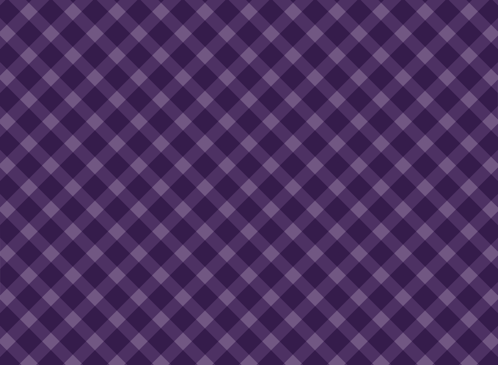
Crossed linear gradients with multiply blending effect using similar patterns.
RUI
StackLayout {
    width = 100%,
    height = 100%,
    background = [
        linear-gradient {
            gradient = "#FF7A528E 0px, #FF7A528E 30px, #FFAE94B9 30px, #FFAE94B9 50px",
            direction = 45deg,
            repeating = true,
        },
        linear-gradient {
            gradient = "#FF7A528E 0px, #FF7A528E 30px, #FFAE94B9 30px, #FFAE94B9 50px",
            direction = -45deg,
            repeating = true,
        },
    ],
    background-blend-mode = multiply,
}
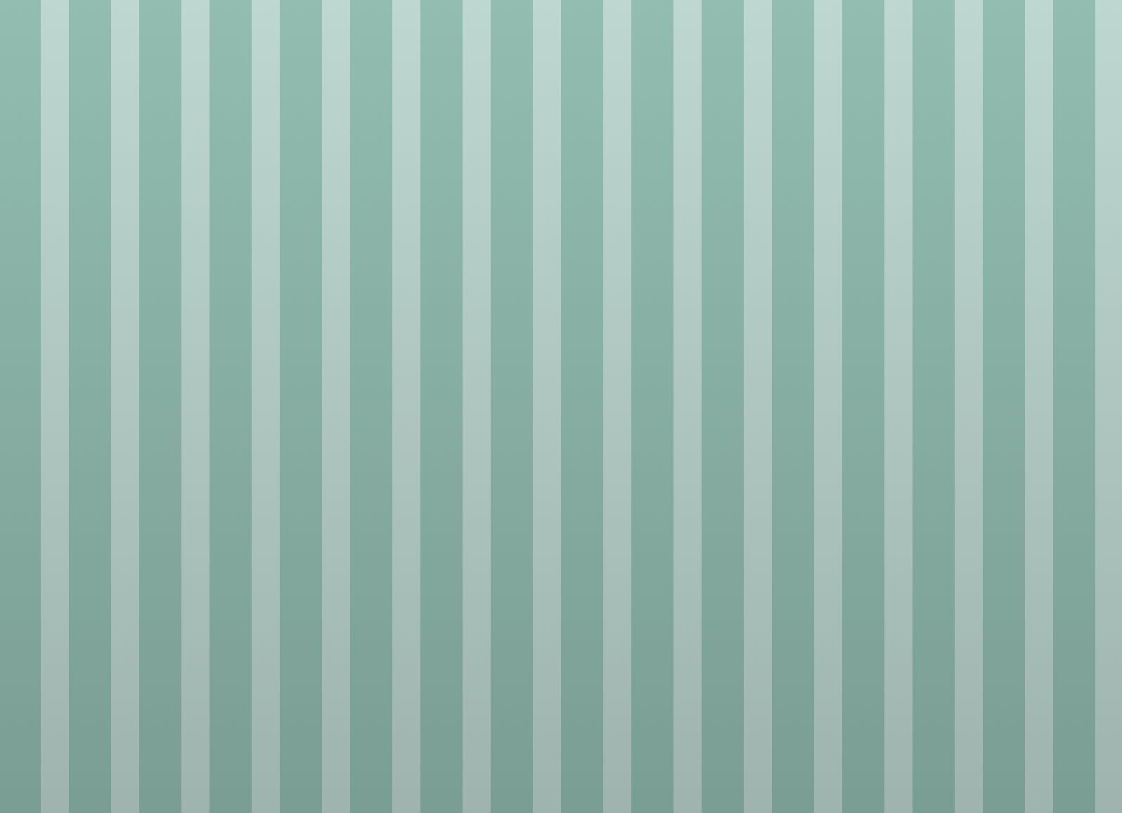
Notebook paper.
RUI
StackLayout {
    width = 100%,
    height = 100%,
    background = [
        image {
            src = "view_background_pattern.svg",
            repeat = repeat,
            width = 16px,
            height = 16px,
        },
        linear-gradient {
            direction = to-bottom,
            gradient = "#FFF3F3F3 0%, #FFF3F3F3 100%",
        },
    ],
    background-blend-mode = multiply,
}

Scrollable notebook paper.
RUI
ListLayout {
    width = 100%,
    height = 100%,
    orientation = up-down,
    padding = 1em,
    gap = 1em,
    background = [
        image {
            src = "view_background_pattern.svg",
            // Enable scrolling of the background with container's content
            attachment = local,
            repeat = repeat,
            width = 16px,
            height = 16px,
        },
        linear-gradient {
            direction = to-bottom,
            gradient = "#FFF3F3F3 0%, #FFF3F3F3 100%",
        },
    ],
    background-blend-mode = multiply,
    content = [
        // Some random data
        "93.246.72.48",
        "122.118.251.78",
        "21.98.71.230",
        "234.138.136.150",
        "46.102.90.241",
        "141.44.97.63",
        "64.240.172.86",
        "129.45.115.237",
        "65.123.121.130",
        "176.224.76.179",
    ]
}